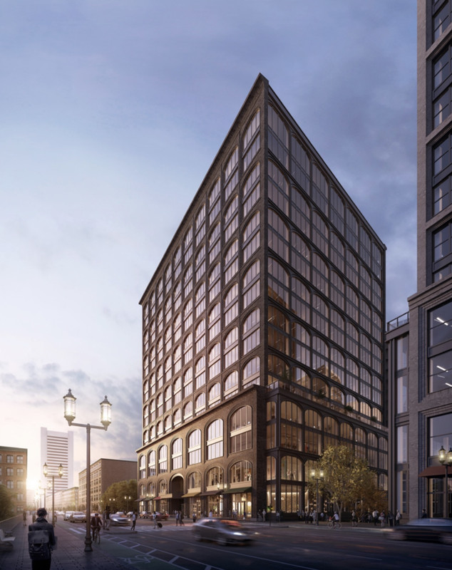
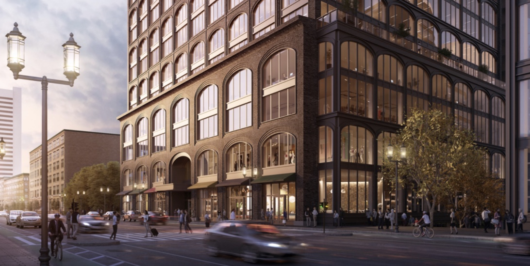
Seaport Sq. Block N | 350 Summer Street | Seaport

We just need a limestone liberty mutual now too in here. These along with the existing brick towers up by the wtc will give a nice mix of facades in the neighborhood.
 
NPC to office approved. WS says construction is imminent on P, and test boring rig has been working at N recently
Thats incredible news, these are badly needed to offset all of the glass and pull that fort point feel out deeper into the neighborhood. These are going to be wonderful additions that hopefully set yet another new precedent of masonry the likes of which vertex did for glass. Cant wait.
 
Can we nominate this as the best looking building of the 2021-2023 timeline? This is spectacular. I love the grey brick and the facade... Everything is perfect
 
Ive been yelling from the roof tops that the seaport needs a liberty mutual esque building for years now, and its finally happening. Oh man did they deliver... were not only getting 1 wonderful, detailed, masonry clad tower, but 2!! Hellll yea! Christmas really is just around the corner. Hopefully a library and fire station are just around the corner.
 
Last edited:
finally something that respects historical context (from scale/massing to materials), yet forward looking.
 
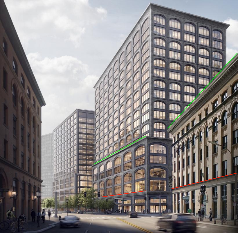
The podiums are perfect here. They are the same height as their Fort Point neighbors, allowing a continuation of the street wall from Fort Point on through the new development.


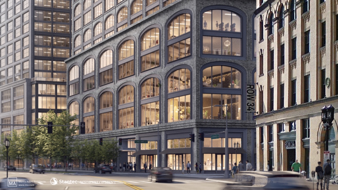
From Congress st the roof line of the building on the right continues seamlessly through both new podiums. Even the round windows and first floor floor beam are a nod between these two.


The way the street wall visually rounds the corner is wonderful.


Even Summer st, something I never thought Id see..


The podium cornice visually mates right up to the next building down.

^Theres also still an empty lot to the right of that building in Fort Point where those trees are that when developed will close the gap even more.


This is going to be absolutely amazing when completed and Im grateful that this is the direction they went here. This is one of those rare examples where they couldnt have done better.
 
Last edited:
In the first render what is that building all the way to the left of these? Don't see it in the other renders.
 
This is not homage it is caricature. Caricature to the point of mockery. Make some room International Place and 500 Boylston for a new member in your Shameless PoMo Club.
 
Caricature? Is respecting your neighbors and demonstrating context - in material and massing - such a bad thing?

This may not be to your taste, fine, but how do you fault it - brick, arched windows, cornice lines?

Comparing this to Johnson's designs is not a fair comparison. Not to my mind. The pejorative fits, I think, with Johnson's PoMo creations. (Johnson himself had an issue with IP, later on.)

I, for one, am happy to see these designs. Happy for its restraint. Happy for the break in the sadly underwhelming architectural creations in the rest of the Seaport.
 
Morris: If one arched window is good, then 200 will be stupendous amirite?
No, it will look like brick vector wallpaper and be a cynical, amateurish response to the location. He has done superb work that both looks good and has a fine sense of place but this ain't one of those. It's a phoned-in, overbearing imposter.
 
I like it. Architecture isn't as important as cityscape, especially for a building this size.... the context, the continuity of the street wall, the sense of place, that all matters a lot. This may not be great architecture but it's gorgeous cityscape.
 

Back
Top