The Casco | 201 Federal Street | Portland

An updated rendering. This project is going before the planning board next week to amend the downtown height overlay.
EsLWWbgW4AI5OB4.jpg
 
I think it fits in well to this area. It brings more 24/7 residents to the Old Port. Tall residential buildings actually enhance city life rather than diminish. I did a job in Vancouver a while back, and that city is primarily designed with tall residential buildings. The streets were lively with residents at night, which brings a greater sense of community.
 
Last edited:
This is a A+ for design. I would like to thank the Redfern design team for a great job. It just shows a local developer can design a great project vs the Brown Street design which has no character and low height for the building. They should learn for Redfern...and no TIF...
 
Looks great and I'm looking forward to seeing the structural steel rising in the future. Cosakita, have you or anyone seen any renderings of the Congress Street side of the facade? Am curious to see if the brick and off white design continues on the back side.
 
Last edited:
Looks great and I'm looking forward to seeing the structural steel rising in the future. Cosakita, have you or anyone seen any renderings of the Congress Street side of the facade? Am curious to see if the brick and off white design continues on the back side.

I haven't seen any renderings of the Congress St side. I would also love to see some renderings of what this will look like in the overall skyline. Maybe a view from Back Cove and from Bug Light in SoPo (hint hint to the Redfern folks on this forum ;) )
 
I haven't seen any renderings of the Congress St side. I would also love to see some renderings of what this will look like in the overall skyline. Maybe a view from Back Cove and from Bug Light in SoPo (hint hint to the Redfern folks on this forum ;) )

I posted this one a while back. I slapped it together when the images were first leaked on this forum earlier in 2020, but I never posted it once Redfern expressed concern over the leaked images. This reflects the original design, but the massing should be about right.
210 Federal Street.png
 
Nice job for being slapped together, I deleted my effort!
 
Feel free to use this photo Dr. StrangeHat if you'd like to attempt it from the harbor view.

I started working on it but abandoned it. The angles just aren't right with the available renderings. I'll see if I can take a stab using a Google Earth image tomorrow.
 
Very nice changes made! The big positives I see:

1. The corner glass on the street side extending all the way up really makes for a sleaker looking building.
2. The brick blocking extending to top of building and other material blocking extending up to top of building really lengthens and makes it more interesting visually. Definitely a more modern look than the original wrap around look on the top few floors.
3. The better placement of the HVAC/utilities on top of the building.
 
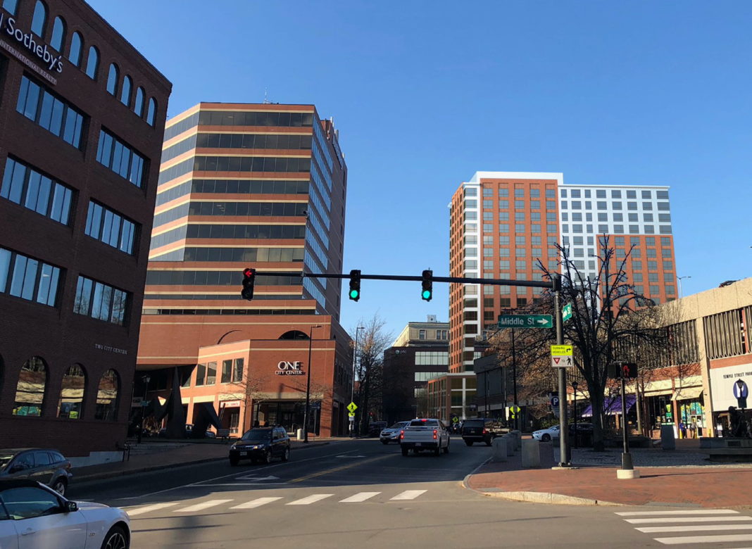
Good looking but probably not as tall as shown. Resi buildings are per floor not as tall as commercial (One City Center). Drop this rendering a bit and it would be more accurate. My guess anyway ...
 
Does anyone know the actual height of One City Center? I can probably peg it better knowing that. Emporis shows about 160 ft, but I've seen other references showing closer to 140. Perhaps the Emporis number includes the cell tower on the top?

Also, keep in mind that the lot on Federal Street is a little up hill from One City Center, so the building will naturally be viewed as a little taller from the perspective of the water.
 
Nice effort Dr. StrangeHat! One City Center is 152' to the roofline and I'd add another 10' to the top of the mechanical space. So with the new tower being around 40' taller to the top of it's mechanical partition (and adding a few feet for the elevation gain), if you shrink it down about a floor and a half it should be just about perfect.
 
Last edited:
Excellent and it will be a great addition to the skyline if it materializes. Redfern should bring you onboard to assist with future renderings!
 
Last edited:
Great work – really gives a great sense of the potential scale and impact! Looking at the distance between the two towers on either side of Preble Street, I think there could be a bit more space between One City Center and the new tower – also, in the previous elevation it looks like that southwest corner may be an obtuse angle rather than squared, which may also reinforce the feeling of 200 Federal being farther from One City Center – but I may be wrong and this is so well done. Thank you for sharing!
 
Great work – really gives a great sense of the potential scale and impact! Looking at the distance between the two towers on either side of Preble Street, I think there could be a bit more space between One City Center and the new tower – also, in the previous elevation it looks like that southwest corner may be an obtuse angle rather than squared, which may also reinforce the feeling of 200 Federal being farther from One City Center – but I may be wrong and this is so well done. Thank you for sharing!

Yeah, that was the hardest part of trying to place this. I think you might be right that there will be more of a gap, but it's not much. I tried to look from the same perspective on Google Earth as the picture, and my best guess is that this is the view angle:

Capture5.PNG


I think if you looked at it from Sunset Marina/Saltwater Grill, then you'd be looking more directly straight up Temple Street and see a wider gap.

It'll be cool to look back once built to see how close this was.
 
  • Like
Reactions: GIL
Would be interesting to see the East Brown Cow proposal for a 20+ story building shown here as well. I saw a rendering of that on here at one point from the same vantage point. Not sure if that project is still moving forward but it would be generally in the same neck of the woods.
 
Tim Soley's tower would sit to the right of One Canal Plaza in the photo leaving about a 50' gap between the two buildings with around three vertical window bays of Three Canal Plaza still visible between the two.
 

Back
Top