The Lucas | 136 Shawmut Ave | South End

81a2f8_a525bc1ca7314107aab533b79a876a69.jpg


There is something really awful looking about this. Combining the hump like protrusion of glass and the semi-gothic structure of the retained church walls and steeple, all I can thing of is Quasimodo.

"Hey they saved a beautiful old church."

"Umm, God that's kinda horrible."

It should have been some type of rec center imo.
 
Hhhhmmmmmm, they should have hired the architect for the Mexican embassy, and set a new standard.

487094-Large-fullheightview-full-front-elevation-from-across-pennsylvania-avenue-incorporating-historic-townhomes.jpg


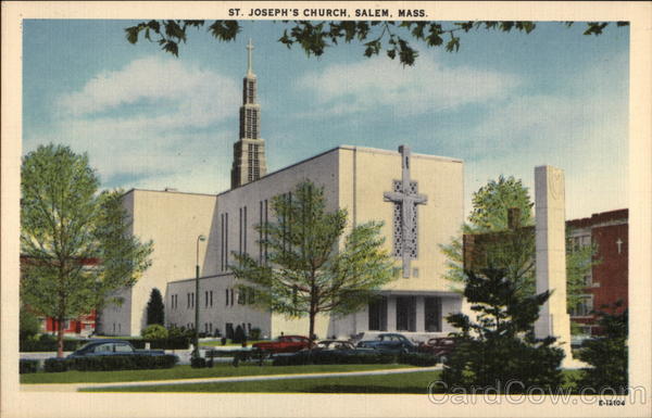
There were preservationists who sought to have this Catholic church in Salem, closed by the archdiocese, and converted into condos. But the archdiocese decided not to. And it was torn down. The design is pretty much art moderne, a somewhat fashionable style just before and immediately after WWII.

card00417_fr.jpg


(I think a lot of stuff built post WWII was built cheap: see Tappan Zee bridge, with an intended design life of 50 years, and now costing $3 billion to replace it.)

I try not to be too judgmental about efforts to convert/adapt buildings that were never intended for habitation (either living or working) into a new use (such as residential) because the conservation / conversion costs can be extraordinary.
 
Hhhhmmmmmm, they should have hired the architect for the Mexican embassy, and set a new standard.

487094-Large-fullheightview-full-front-elevation-from-across-pennsylvania-avenue-incorporating-historic-townhomes.jpg

Mexican Embassy reminds me of one of my favorite glob-on's (Walnut St. in Philly)...Brutalist Monster Eats Pre-War Appetizer...

picture.php


In this light, The Lucas (to me) isn't all that bad.
 
Mexican Embassy reminds me of one of my favorite glob-on's (Walnut St. in Philly)...Brutalist Monster Eats Pre-War Appetizer...
.

BigPicture -- we have one of our own in the Mass Eye & Ear expansion circa 1970 -- its a bit like th Borg

The old building was assimilated

mass_eye_and_ear_3.jpg
 
BigPicture -- we have one of our own in the Mass Eye & Ear expansion circa 1970 -- its a bit like th Borg

The old building was assimilated

mass_eye_and_ear_3.jpg

I've always hated this. I wonder how they even got away with nearly completely covering up the old building, rather than building around it. At this point, was it really worth it? It looks like it was a bad experiment from "The Fly."
 
This is madness. One more reason why i want all the brutalist shit gone, Rudolph garbage GONE. Erase it from history right now. fix these precious spaces for the benefit of future generations. i hate the Christian Science park too. Every inch of it. Not as bad as the others, but certainly, the most overrated Rudolph garbage evaar. take it down with 10,000 lb bombs.

The Federal Reserve building is good though, because at least the brutalism is a shiny skyscraper. Late at night, the side walls look very serious, like the building is saying, "this is Boston - and this is the no f_ckin around tower."

i like that. Brutalist mixing with post modernist works in this case.

sorry for the 80th repost....

http://www.thecrimson.com/article/1977/4/15/bostons-new-brutalism-ppreston-pollock-recognizes/
 
The vault uses brutalist tones wonderfully imo, taking it as far as it should go.

The height and clean lines make it work.
 
The Federal Reserve building is good though, because at least the brutalism is a shiny skyscraper. ..... Brutalist mixing with post modernist works in this case. [/url]

The original source of the term brutalism was "beton brut", French for concrete raw - or as we would order the adjective and noun, raw concrete. So "brutalism" was English shorthand translation for raw concrete buildings. I've seen some architectural historians stretch it to include what was called "brick brutalism".

Boston City Hall in its upper reaches is most definitely Brutalism in the original meaning of the word (and I opine for the umpteenth time that with some pretty significant surgery on its lower half and enclosure of dead spaces and open central court with glass and really good lighting schemes, it could be a great, great building). I would think that gawdawful plaza out front of City Hall (and perhaps that weird brick dead façade of City Hall along Congress street and the lower reaches of the building on the plaza) could be presented as Exhibit A of the "brick brutalism" variant of the term (and I opine that the plaza could only be repaired by first destroying it 100% and starting over, and the lower brick parts of City Hall are precisely what I would amputate away from the really cool upper concrete parts).

The Federal Reserve is clad mostly in aluminum. I do not claim to be Mr. Definer of What Building Goes in What Category, but I've never seen the Federal Reserve called Brutalism. Modernism? Absolutely. Post modern? Sometimes, though I don't see enough silly kitsch to fit into the po-mo slot, it seems more like straight up unabashed Modernism. I kind of like it, too, not a great deal, but on balance I like it.
 
thanks. i always thought they used aluminum to replicate the then-popular use of concrete without concrete's unpleasant discoloring over time. modernism/faux brutalist?

can we go off srsly off topic and discuss the secret floor? :)


Last edited:
can we go off srsly off topic and discuss the secret floor? :)

Well, we could, but then it wouldn't be a secret any more.

And besides, maybe "they" will come and kill anyone who reveals the secret.

So you go ahead and discuss it first, I'm behind you, I'm aaallllll the way behind you.
 
How on earth a thread about The Lucas turned into a discussion of The Fed's structural design is beyond me, but I take full responsibility for contributing to the tangent, for which I apologize. (The nerd in me thinks those enormous trusses are cool, though - what can I say). Tieback: clearly we've been trying to build stuff on top of/suspended over/overhanging/globbed-onto other stuff for a long time.
 
I also owe a mea culpa for assisting with the detour off topic.

Getting back to The Lucas, my first reaction was akin to HenryAlan's comment way up thread: "there's something deeply awful about this."

Having pondered the render some more, I'm surprised to be finding myself with some positive reactions creeping in. The beast is sort of growing on me, and given how conflicted I am, I'm embarrassed to admit it.

This is one I'll have to visit when it's done, as this might be a case where finished reality diverges dramatically from rendered projection. But by that I do not mean to assume that I'll like the reality more than I like the render. Perhaps I will, but maybe when I see it completed I will REALLY hate it.

One cannot accuse the architects of being gutless.
 
How on earth a thread about The Lucas turned into a discussion of The Fed's structural design is beyond me, but I take full responsibility for contributing to the tangent, for which I apologize. (The nerd in me thinks those enormous trusses are cool, though - what can I say). Tieback: clearly we've been trying to build stuff on top of/suspended over/overhanging/globbed-onto other stuff for a long time.

BigPicture -- maybe we need a thread devoted to construction from any era

Big Trusses and such are always a turn-on

Just to finish off this topic and get back to a far less interesting building -- here's an entire article about LeMessurier's Truss that supports the Fiduciary Trust Building
http://www.lemessurier.com/sites/de...ns/_FiduciaryTrust NEConstruction May1976.pdf
images
 
I understand this project has a lot of haters, but I wanted to chime in that I think this is a stunning adaptive reuse. Projects like The Lucas, Atlantic Wharf, fusing Burnham Building with Millennium Tower, and Boston Children's Museum (among many others) not only add value to their surroundings, but also contribute to Boston's alluring clash of old with new.
 

Back
Top