- Joined
- Jan 7, 2012
- Messages
- 14,173
- Reaction score
- 23,688
 IMG_8472 by Bos Beeline, on Flickr
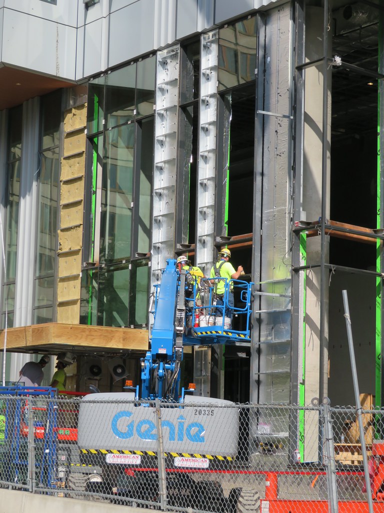 IMG_8473 by Bos Beeline, on Flickr
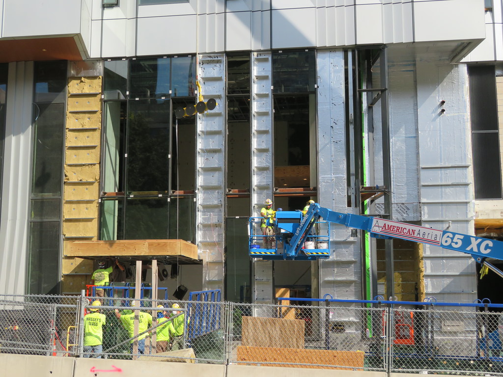 IMG_8474 by Bos Beeline, on Flickr
 IMG_8551 by Bos Beeline, on Flickr
Last edited:
IMG_8472 by Bos Beeline, on FlickrIMG_8473 by Bos Beeline, on FlickrIMG_8474 by Bos Beeline, on FlickrIMG_8551 by Bos Beeline, on FlickrCurious design choices here. The Sudbury and the future smaller residential tower are clearly influenced by the JFK across the street and blend well. The State Street Tower is meant to be a stand-out building, and takes advantage of the many viewing angles - the view up the Charles will be first class.
What about the lower rises though? They certainly don't match anything else along the greenway, and show a pretty lazy office-park design. They are a few years away, but I'd be amazed to see a seaport-box approved here.
 IMG_9594 by Bos Beeline, on Flickr
 IMG_9595 by Bos Beeline, on Flickr
 IMG_9596 by Bos Beeline, on Flickr
 IMG_9599 by Bos Beeline, on Flickr
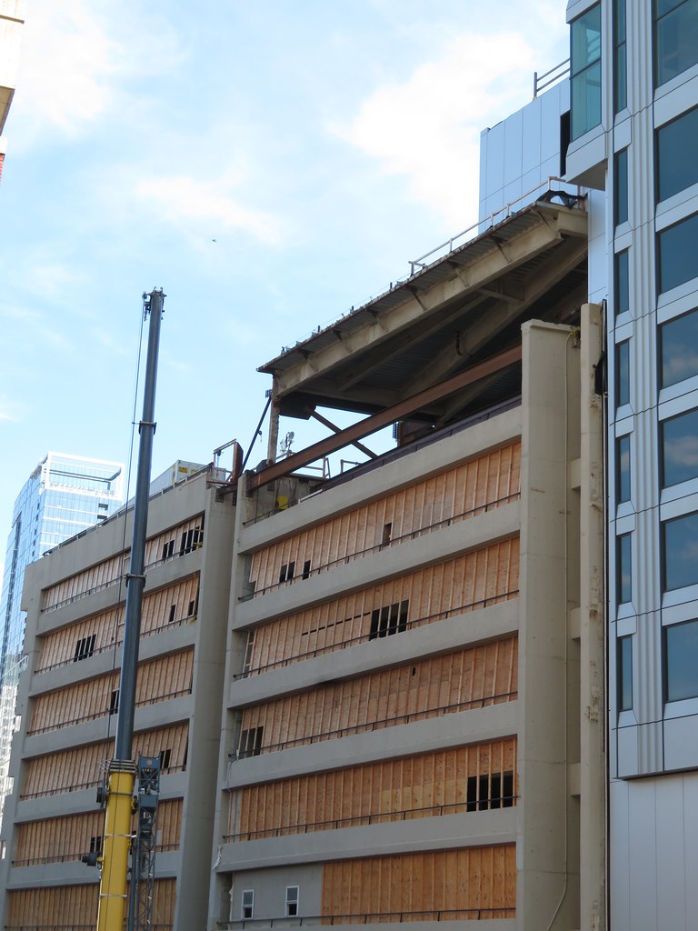 IMG_9600 by Bos Beeline, on Flickr
 IMG_0413 by Bos Beeline, on Flickr
 IMG_0421 by Bos Beeline, on Flickr
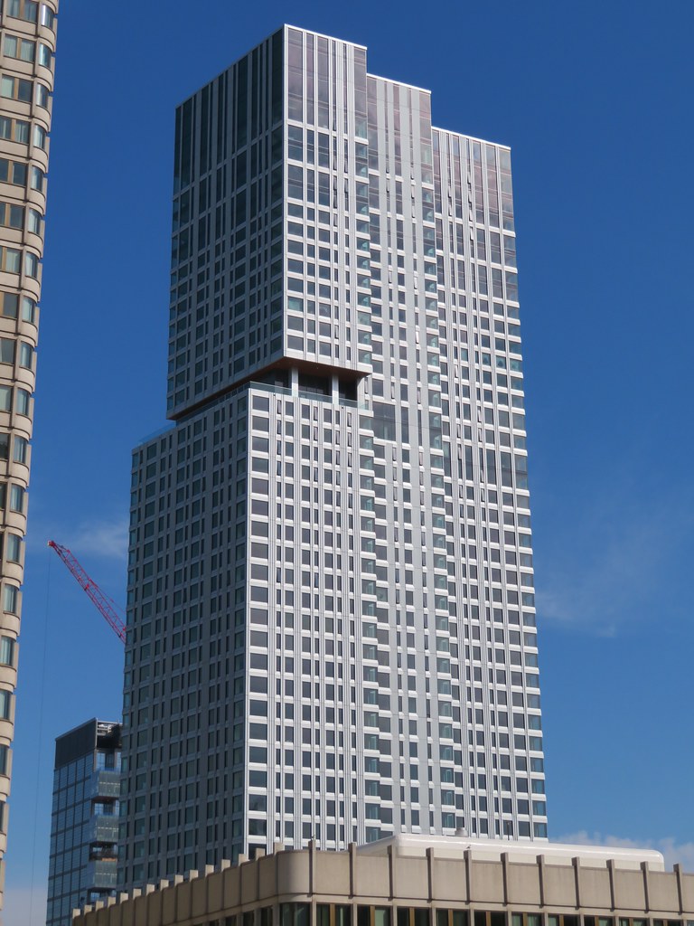 IMG_0420 by Bos Beeline, on Flickr
 IMG_0422 by Bos Beeline, on Flickr
 IMG_0382 by Bos Beeline, on Flickr
 IMG_0509 by Bos Beeline, on Flickr
 IMG_0435 by Bos Beeline, on Flickr
 IMG_0517 by Bos Beeline, on Flickr
Lol I respect the strong take! Its fine enough in my book, I appreciate it doesnt try to pull any cheap parlor tricks.that building is aggressively ugly and has a serious negative impact on the overall skyline. one federal is right up there for bragging rights, too.
I absolutely abhor the reason why theres pink/orange undertones in the photos, but, standing on its own the photos have a really nice pop with that lighting.
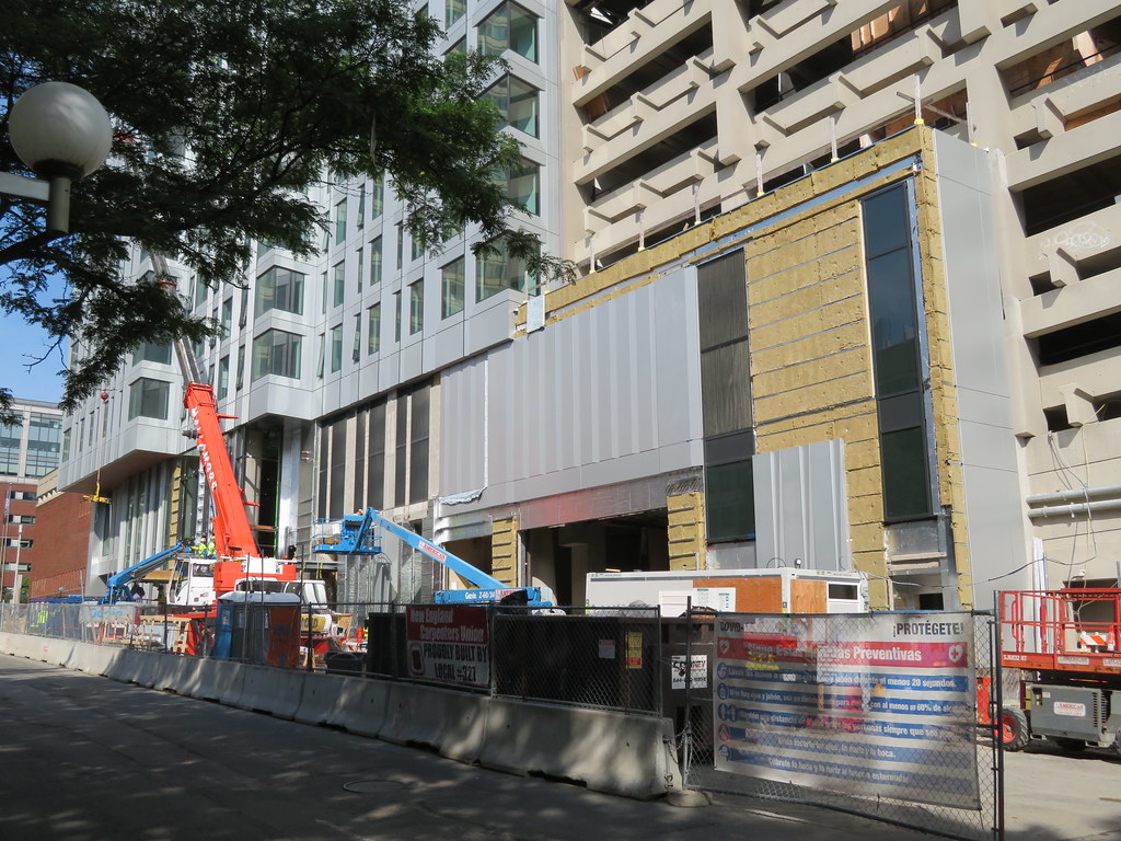
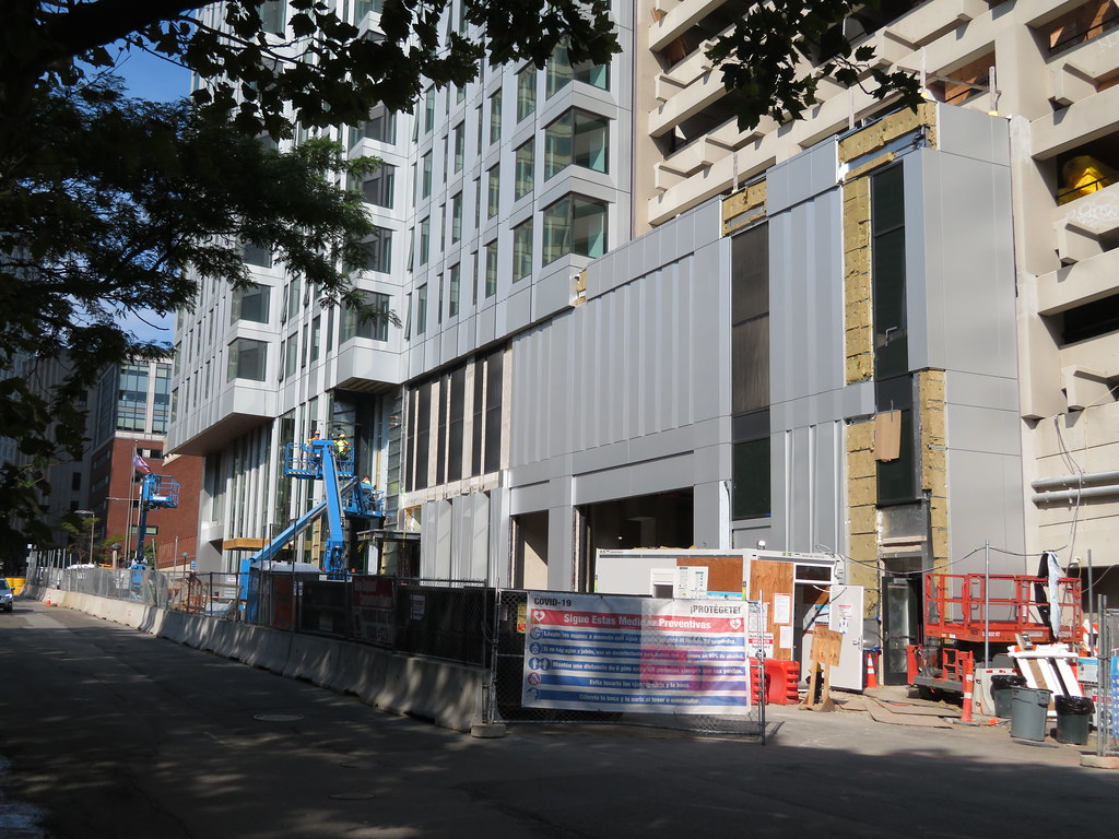
 IMG_1990
 IMG_1991
 IMG_2034
 IMG_2265
 IMG_2266
 IMG_2282
 IMG_2309
 IMG_2330
 IMG_2495
 IMG_2520
 IMG_2521
 IMG_2543
 IMG_2553
 IMG_2571
 IMG_2584
 IMG_2586
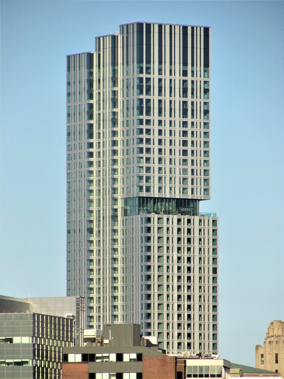 IMG_2588
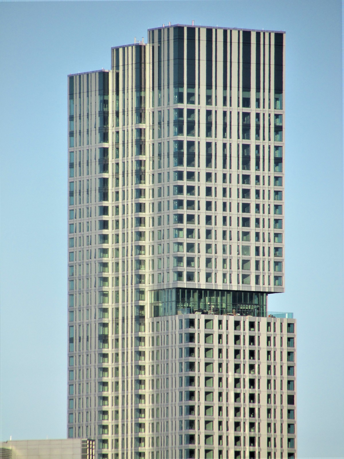 IMG_2589
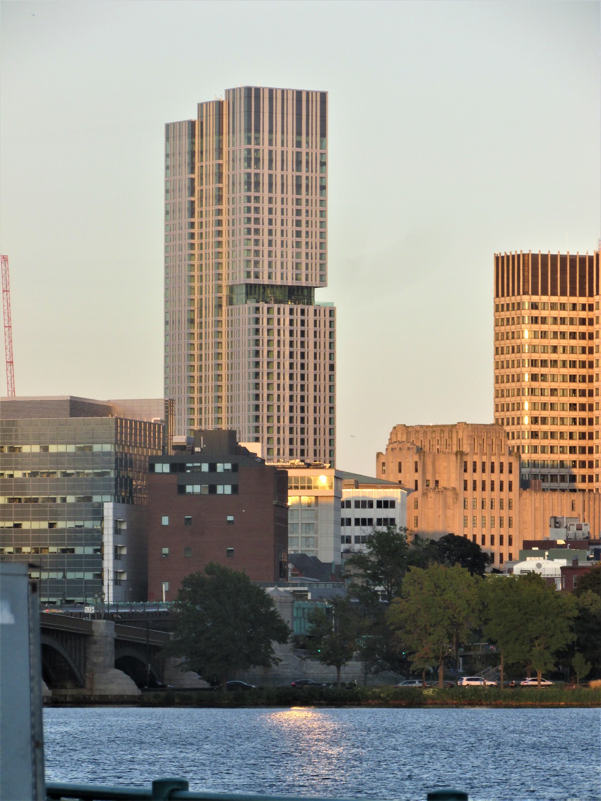 IMG_2681
 IMG_2683