You are using an out of date browser. It may not display this or other websites correctly.
You should upgrade or use an alternative browser.
You should upgrade or use an alternative browser.
The Apartments at 525 Huntington Ave @ Wentworth | 525 Huntington Ave | Fenway
- Thread starter datadyne007
- Start date
- Joined
- Jan 7, 2012
- Messages
- 14,072
- Reaction score
- 22,813
- Joined
- May 25, 2006
- Messages
- 7,034
- Reaction score
- 1,875
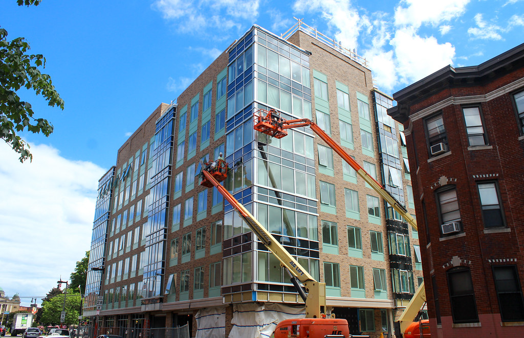
Well this has turned out much crappier than I imagined.
- Joined
- Sep 15, 2010
- Messages
- 8,894
- Reaction score
- 271
I completely forgot to upload these from a couple weeks ago:
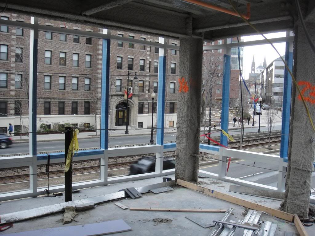
Awesome corner living room overlooking Huntington:

Tiny little HVAC diffuser for tiny little single bedrooms:
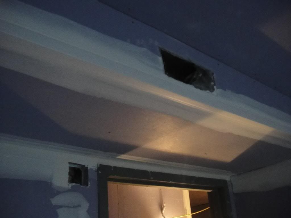
The spaces inside are so tight and awkward that those were the only interior pictures I ended up taking as it was impossible to really get a view of anything else. Just look at the plan and you can clearly see how all the angles make for very awkward spaces.
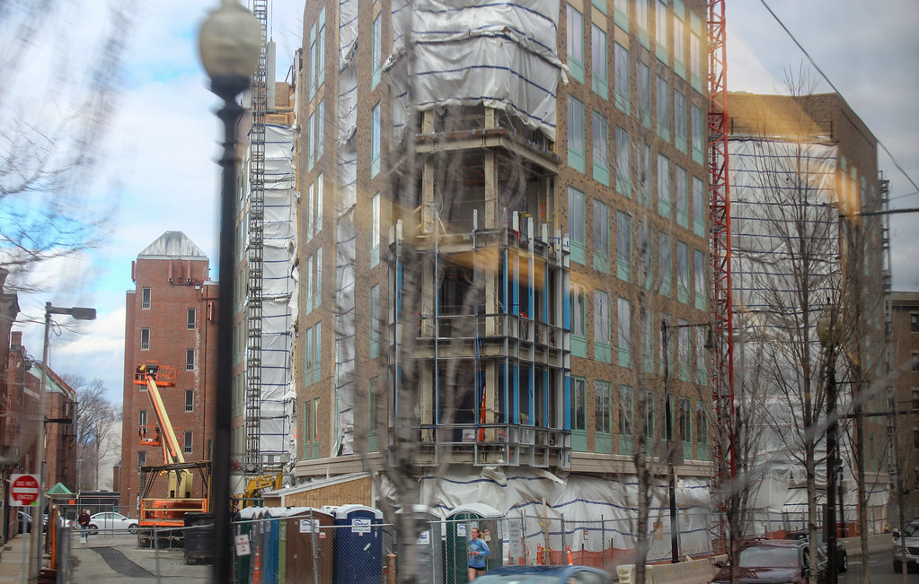
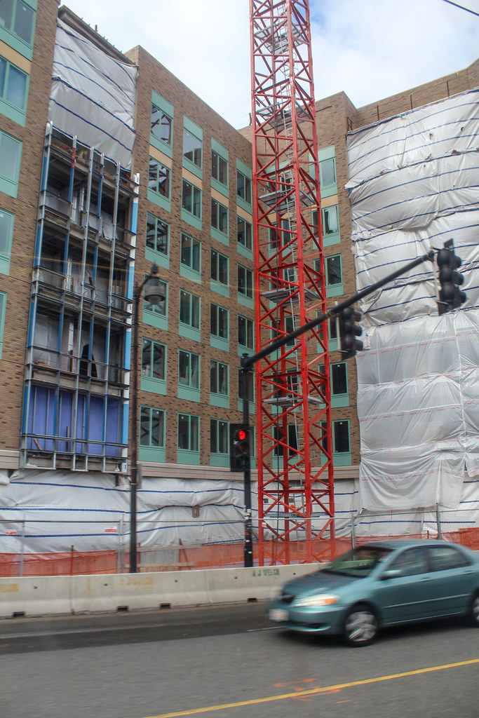
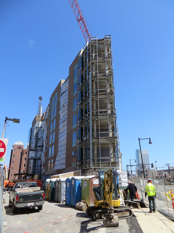
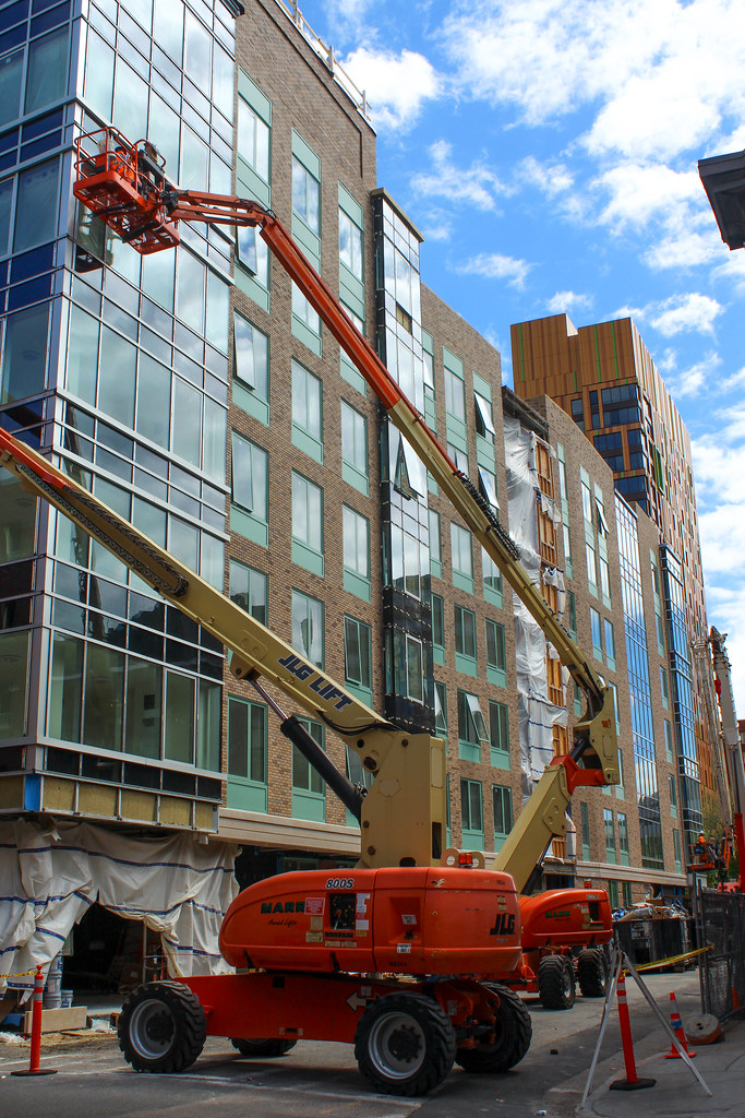
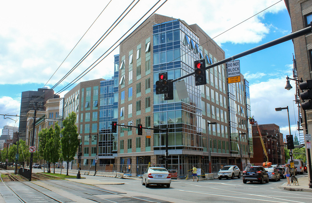
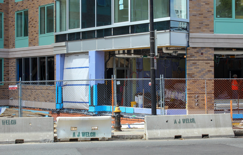
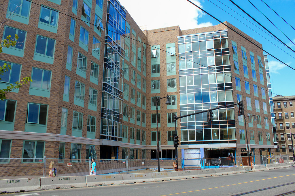
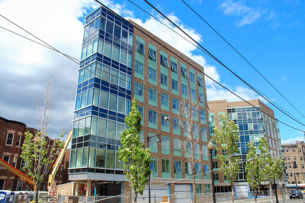
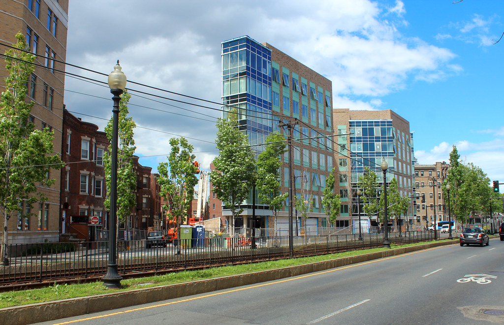
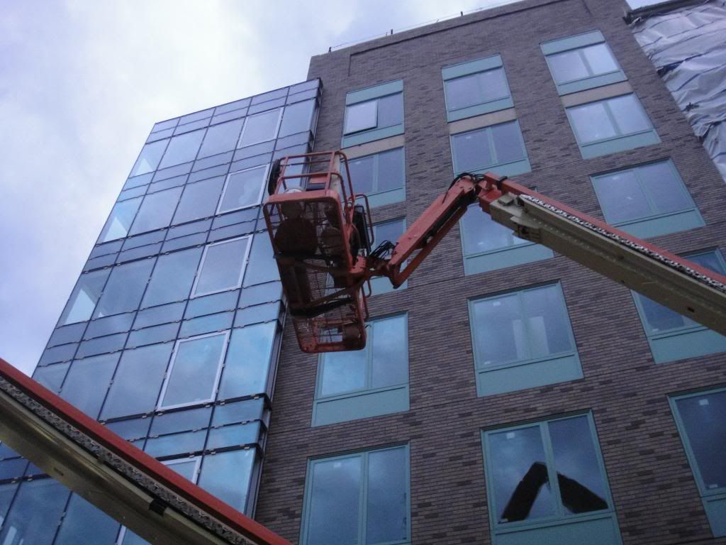
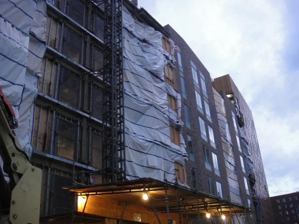
Exterior (older, of course):
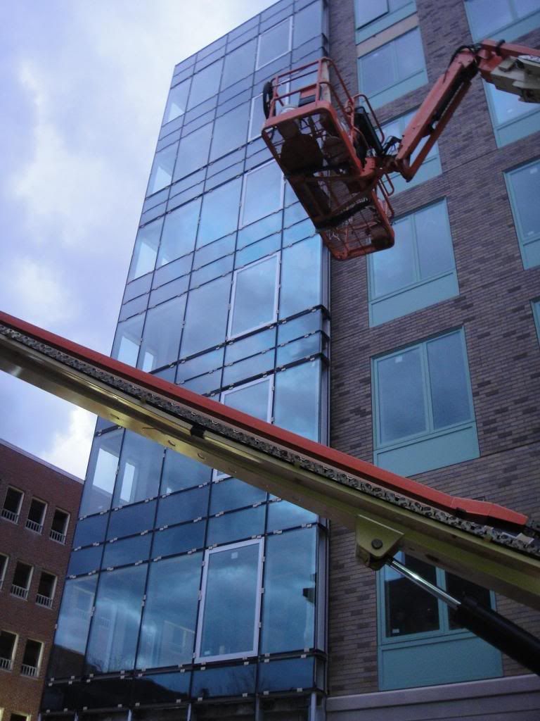
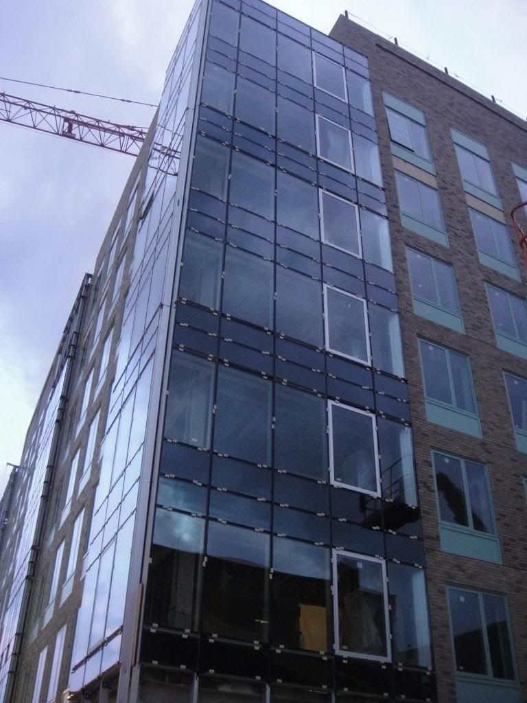
Awesome corner living room overlooking Huntington:


Tiny little HVAC diffuser for tiny little single bedrooms:

The spaces inside are so tight and awkward that those were the only interior pictures I ended up taking as it was impossible to really get a view of anything else. Just look at the plan and you can clearly see how all the angles make for very awkward spaces.
Exterior (older, of course):


- Joined
- Jan 22, 2012
- Messages
- 5,078
- Reaction score
- 1,661
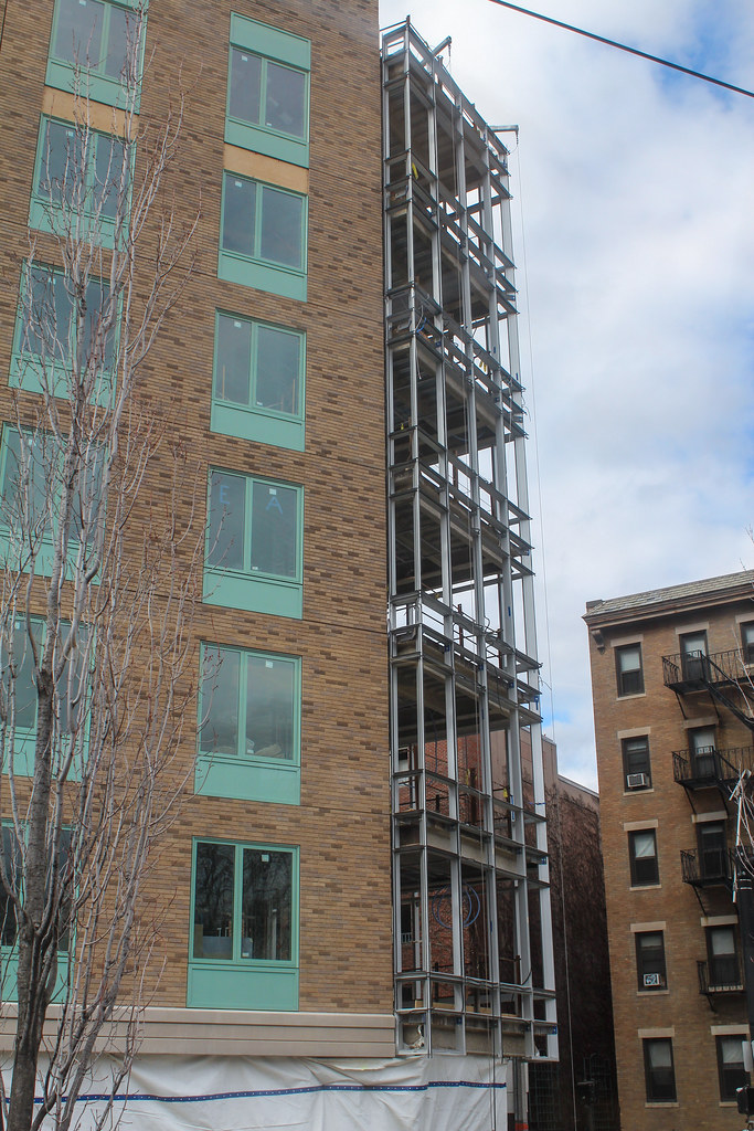
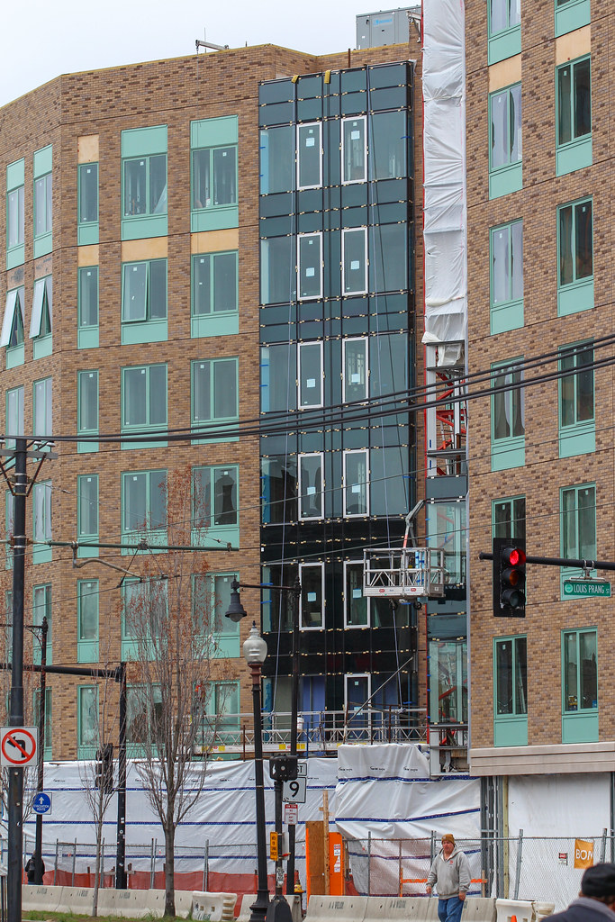
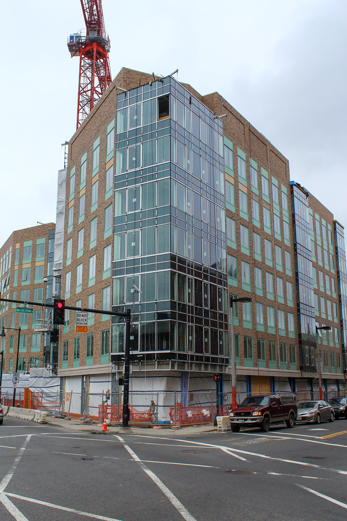
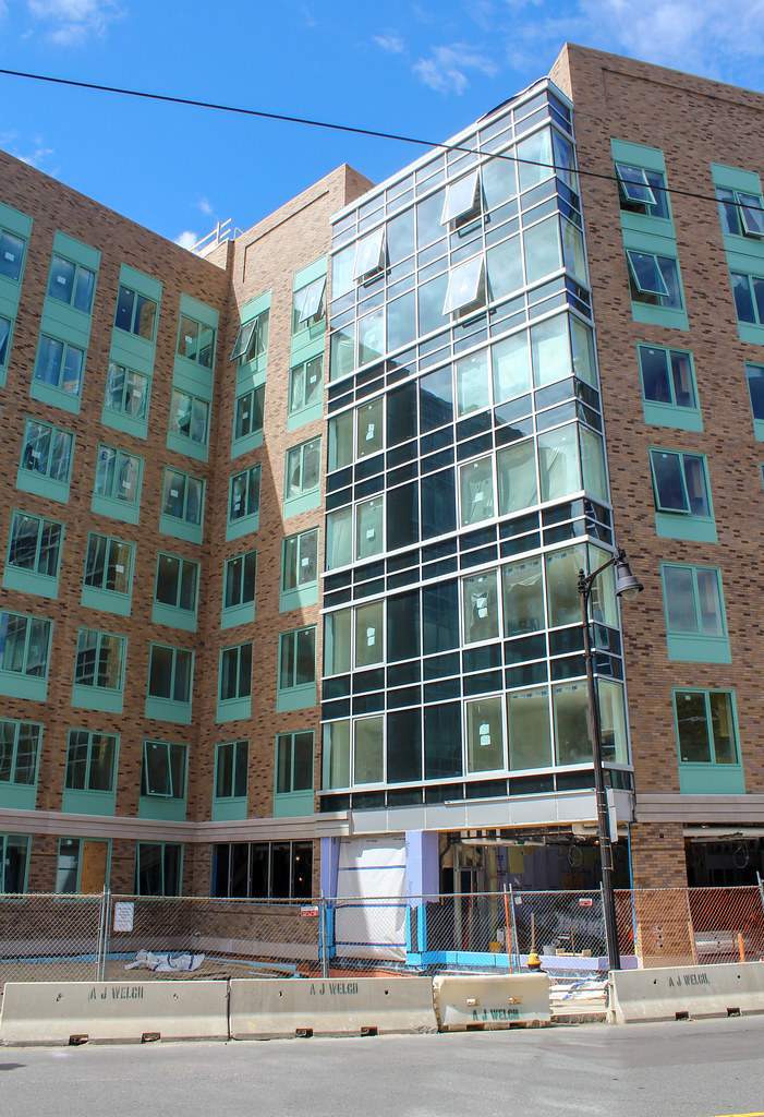
Oh, I did not expect those glassed corners... they don't fit in with the rest of the building at all IMO...
kz1000ps
Senior Member
- Joined
- May 28, 2006
- Messages
- 8,983
- Reaction score
- 11,813
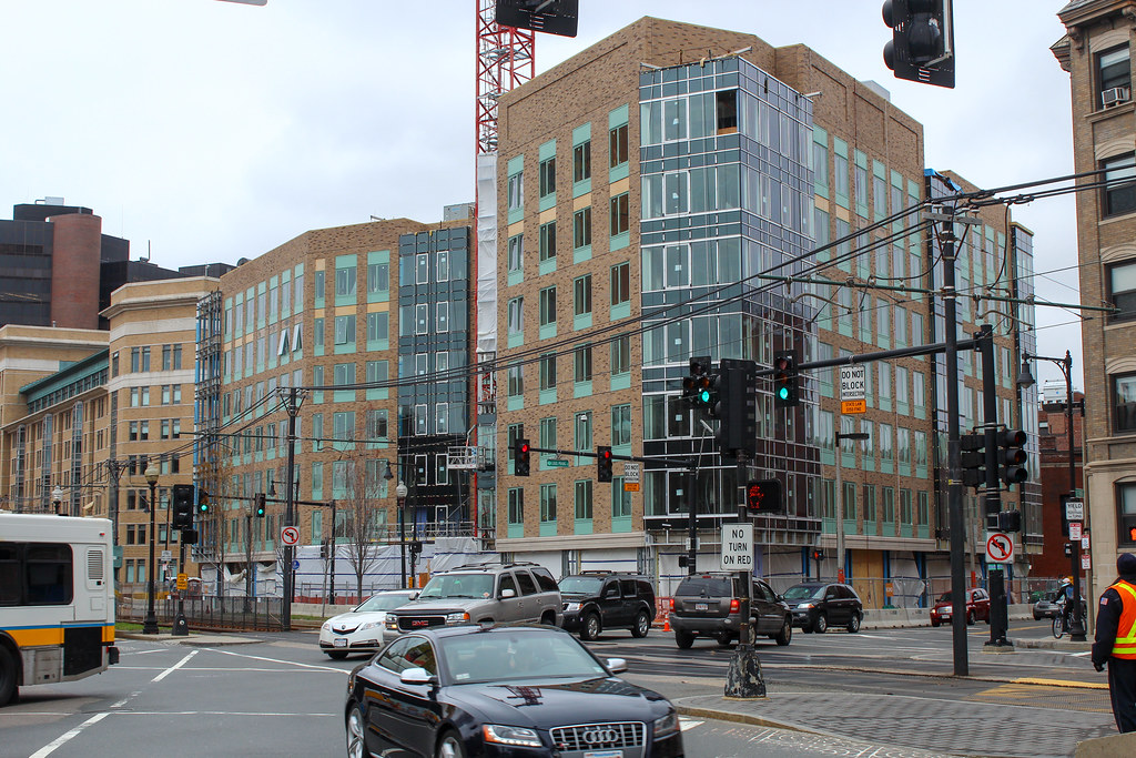
Well this has turned out much crappier than I imagined.
Agreed. All you have to do is look to the building at left, Wentworth's 555 Huntington, to see how much the state of architecture has slipped in the last 10 years.
cca
Senior Member
- Joined
- Aug 19, 2008
- Messages
- 1,408
- Reaction score
- 12
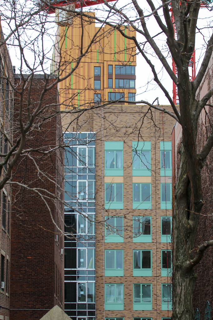
I was giving an architectural tour (tours actually) this weekend to some of the best architects in the country and had the misfortune of having to walk by this one when taking them from MassArt to the MFA. This thing misses on so many accounts.
No one was fooled by the patinaed copper colored paint. It just did not work.
cca
No one was fooled by the patinaed copper colored paint. It just did not work.
cca
- Joined
- Sep 15, 2010
- Messages
- 8,894
- Reaction score
- 271
Apparently Beacon Architectural Assoc. was asked to "take the design vocabulary of Triple 5 and 'modernize' it" for this building. I nearly fell off my chair in amazement upon hearing this. Really? THAT's what this is supposed to be?
I would rather them just clone Triple 5.
I would rather them just clone Triple 5.
atlantaden
Senior Member
- Joined
- May 31, 2006
- Messages
- 2,606
- Reaction score
- 2,750
To be honest, I hadn't a clue that the sea green color was supposed to look like weathered copper! But you're saying that it is?
- Joined
- Sep 15, 2010
- Messages
- 8,894
- Reaction score
- 271
To be honest, I hadn't a clue that the sea green color was supposed to look like weathered copper! But you're saying that it is?
Yes. Wentworth is obsessed with patinaed copper, as Wentworth Hall has a copper roof - ergo, they must must must use it in all construction... *rolls eyes*
atlantaden
Senior Member
- Joined
- May 31, 2006
- Messages
- 2,606
- Reaction score
- 2,750
Yes. Wentworth is obsessed with patinaed copper, as Wentworth Hall has a copper roof - ergo, they must must must use it in all construction... *rolls eyes*
Not to be argumentative, but since the window frames are the patinaed (my spell check is going crazy) copper color, I just assumed that the greenish color was just that, a greenish color. Copper window frames can't be all that common, are they?
RandomWalk
Senior Member
- Joined
- Feb 2, 2014
- Messages
- 3,332
- Reaction score
- 5,264
Apparently lack of cornice == modern. Got it.
Meh. This is no worse than any other unfortunate spawn of Modernism. It's an ungainly box made of awkwardly slapped together, cheap materials. Same as almost anything else being built in the world today. For that matter, in NYC at any moment there are about 100 major projects that are infinitely uglier than this. See: Kaufman, Gene, and be glad you live in Boston.
I'm sorry.
I was giving an architectural tour (tours actually) this weekend to some of the best architects in the country.
I'm sorry.
- Joined
- Sep 15, 2010
- Messages
- 8,894
- Reaction score
- 271
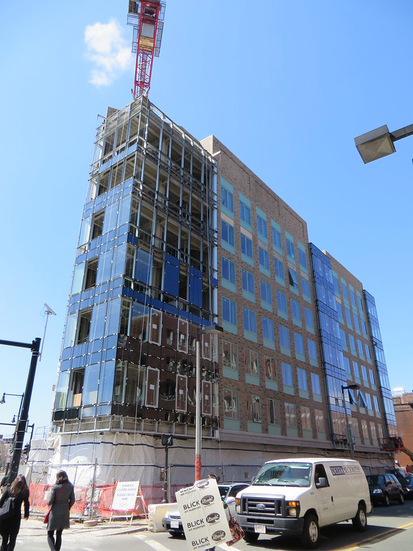
Hmph, the completed glass curtain walls actually help pull this building together.
BarbaricManchurian
Senior Member
- Joined
- Mar 12, 2007
- Messages
- 1,067
- Reaction score
- 65
Very nice.

