Kudos on your analysis, stick.
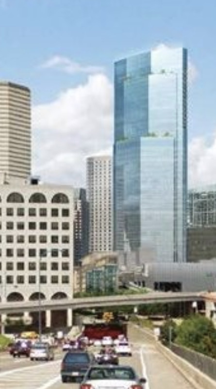
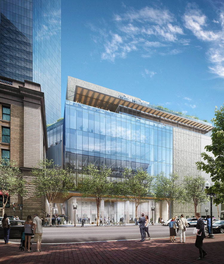
To clarify, my complaint here isn't about the form or silhouette of the tower, but the lack of expression on the facade. The smooth reflective glass is utterly featureless, and that needn't be the case. Given the depth and variation of South Station's facade, this tower looks "cheap" even if it isn't...
I think adding some stone like this building going up in Jersey City would help


