The Hub on Causeway (née TD Garden Towers) | 80 Causeway Street | West End

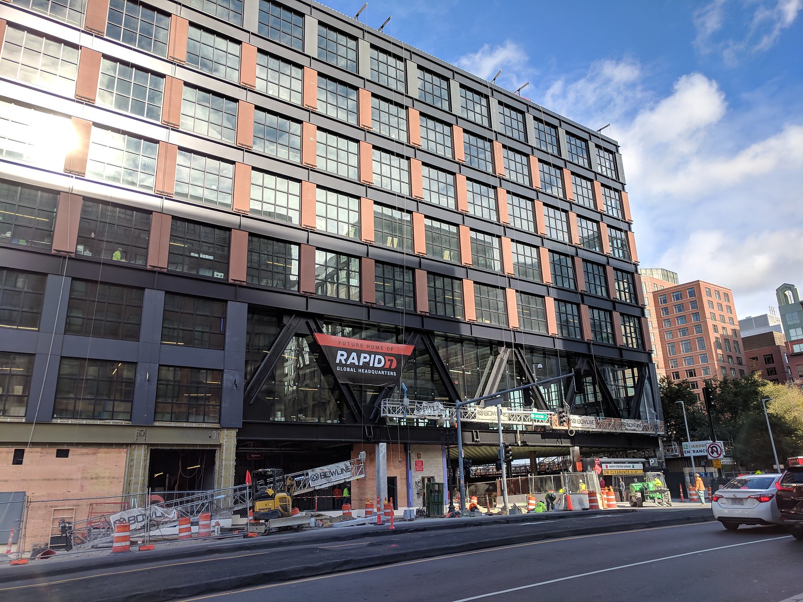
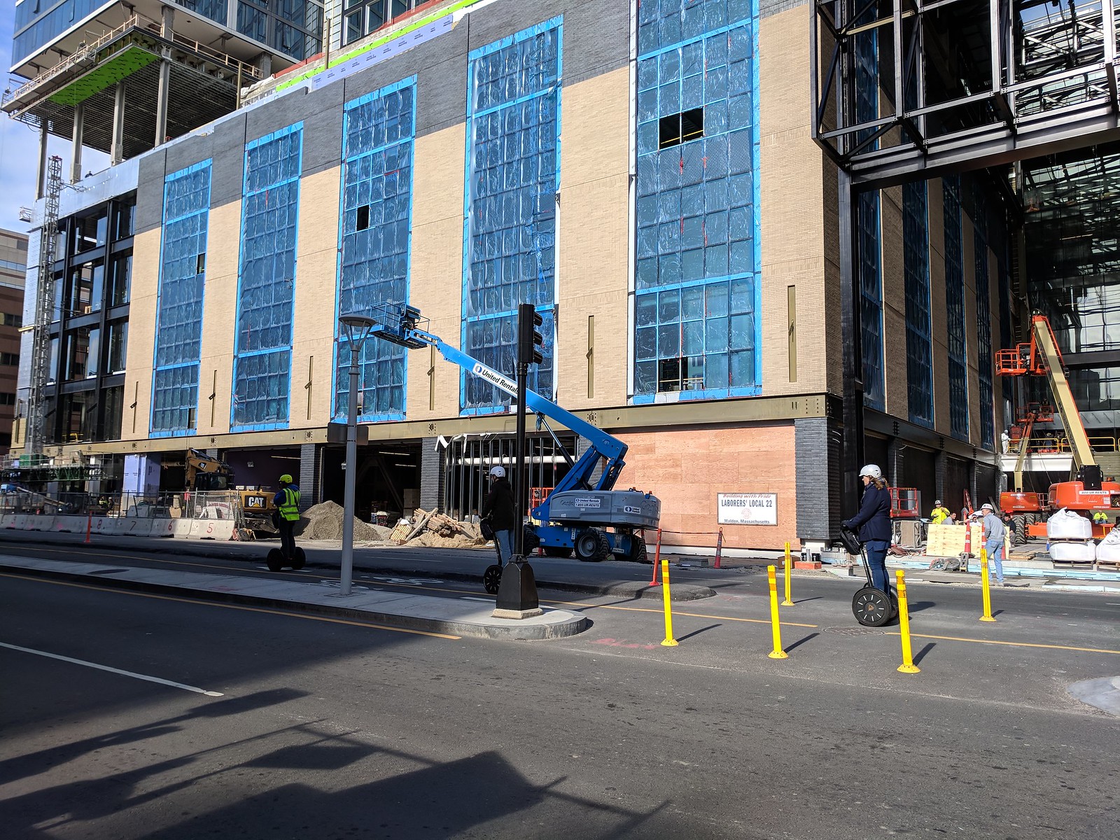
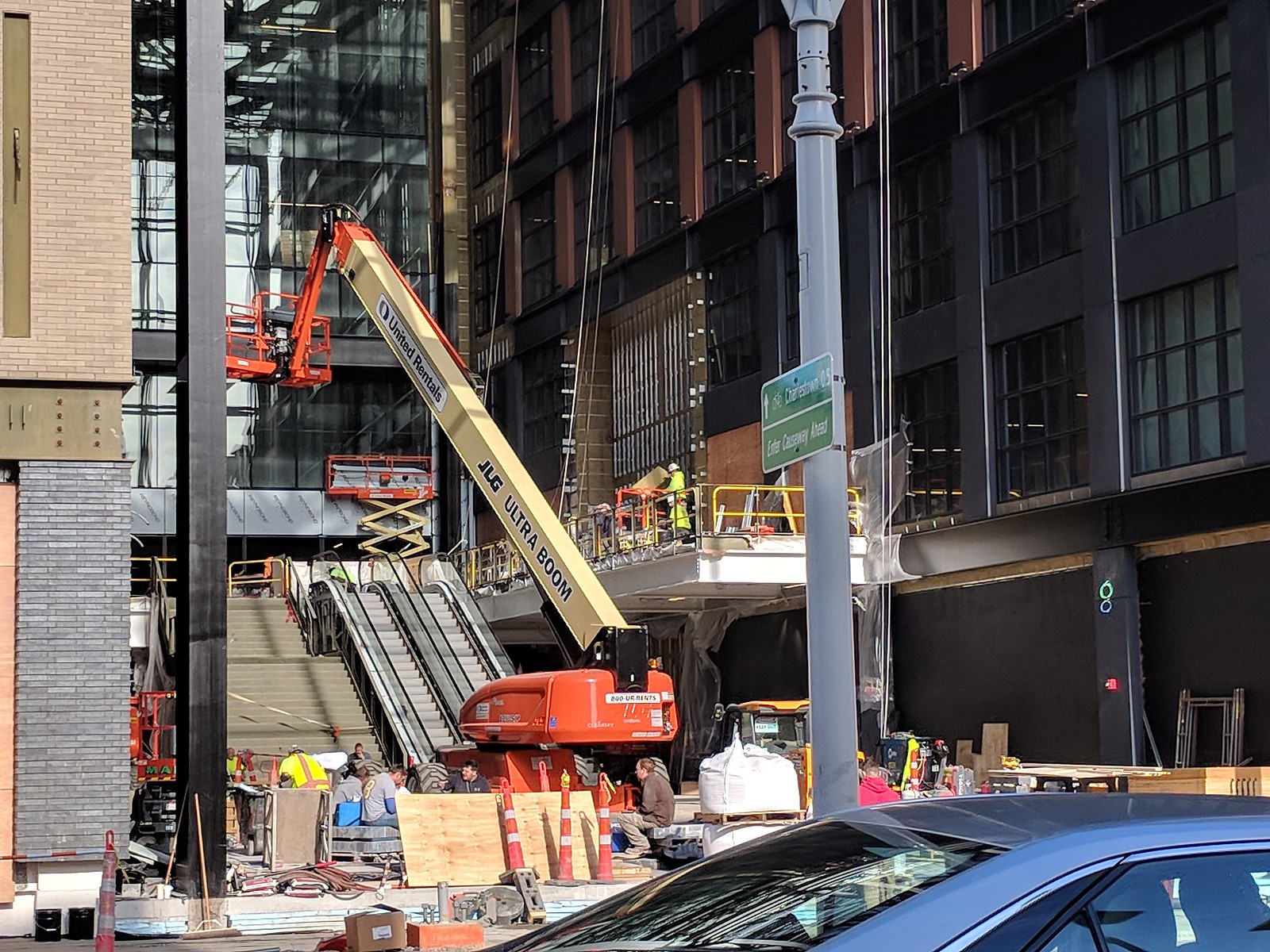
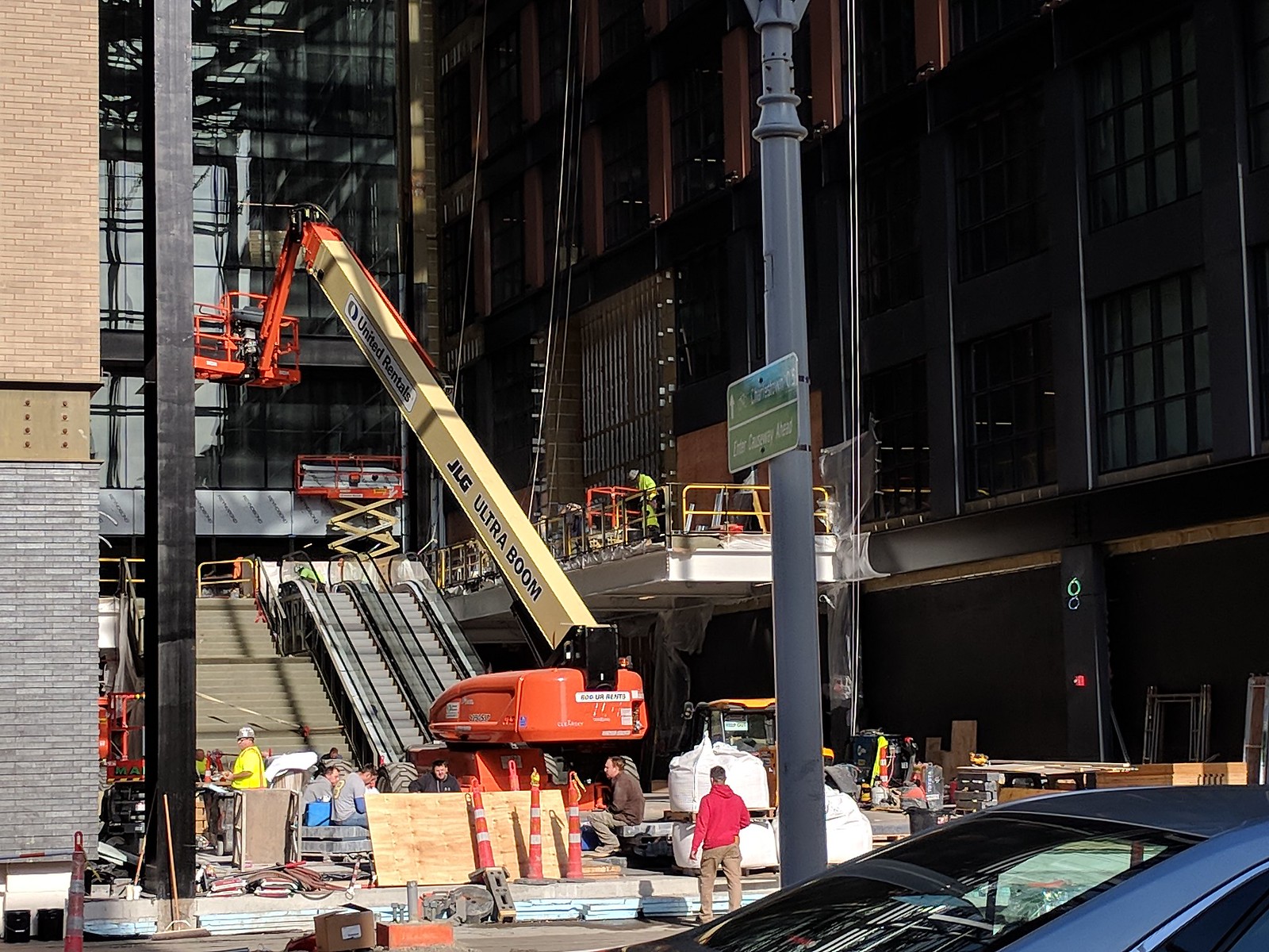
Somehow I can't get enough of this view:

zui9LNR.jpg


mb8IPo5.jpg


Even the coast guard appreciate it:

rCTI8sV.jpg


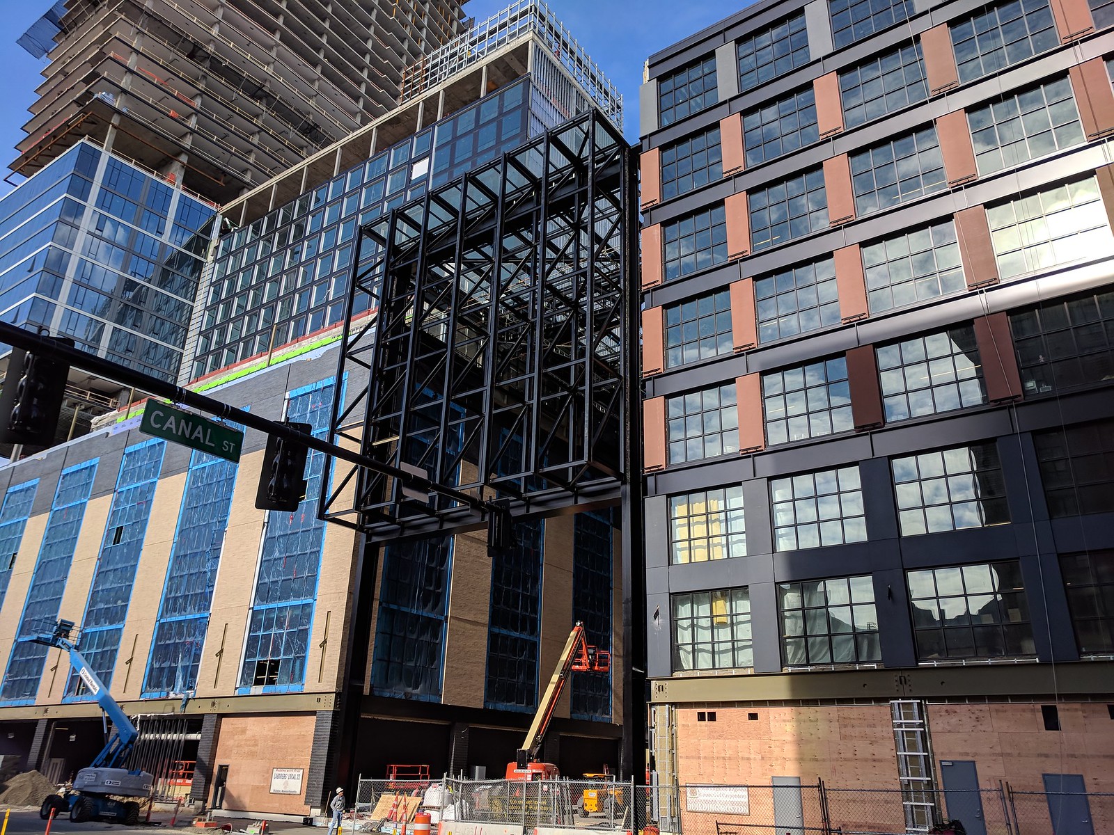
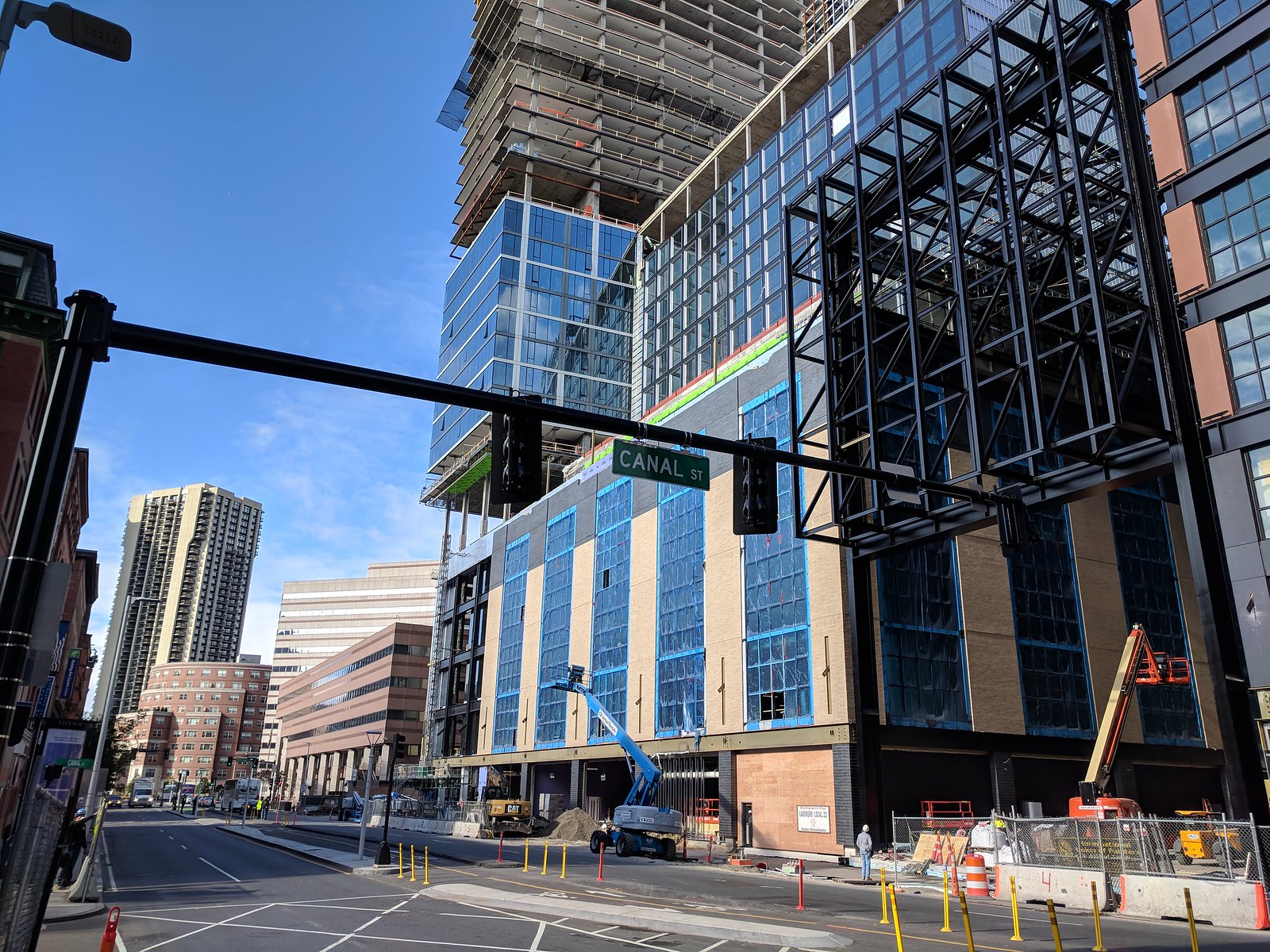
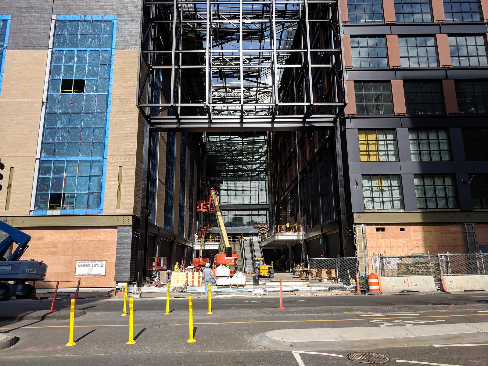
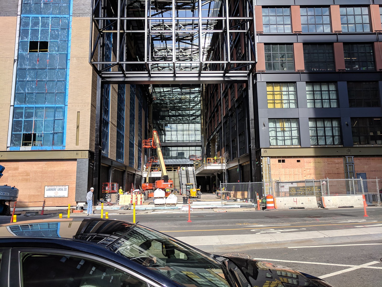
bonus el cheezo cell phone photo of the tunnel entry:

xg4n7f7.jpg
 
Thanks very much for these!!

Yes, there are many incredible angles Dave. But this one is REALLY great.

This tower was always destined to win over the haters....

but, with this angle in mind,

can we dare imagine if it had got the extra 163'?? !!
 
I really hate this design. That truss completely clashes with the rest of the facade. Shit, it would have been far nicer if they just went crazy with diagonals to bring it together! I have no idea what these architects were thinking. This is a total mess.
 
Once the retail is built out and the blue protective layers are taken off the windows its going to look great. Along with the glass over the entrance installed and the condo lower floors glassed in in the base.

012716thehuboncauseway006.jpg


3d-visualization-BostonProperties-20.jpg


3d-visualization-BostonProperties-18.jpg
 
*Sigh* I never thought I'd miss that version of the second tower as much as I do now. Such a shame.
 
That's the 2 versions ago version.....

or something like that out of 6 or 7 in all....

or something like that.
 
Still better than 7/7 imo. 1-6 were ALL better than the one that was chosen. I just don't get it.
 
I really hate this design. That truss completely clashes with the rest of the facade. Shit, it would have been far nicer if they just went crazy with diagonals to bring it together! I have no idea what these architects were thinking. This is a total mess.

Stop viewing this as a single building and you may feel better.
 
Those toothpicks holding up the resident tower scream 'that just doesn't look right.'

The Citicorp Tower will always be the champ....

But, you won't see that 'look' going up in Shakytown.
 
The North Station concourse and Garden entrance has always been a train wreck. Delaware North built the minimum necessary to satisfy the requirement to replace the old Boston Garden transit functions.
 
Stop viewing this as a single building and you may feel better.

That's a tall order for anyone who takes the greatest pleasure in art (regardless of medium) that is born of a commitment to organic unity (between its elements and its surroundings).

...looks like a building designed by committee, trying to please everybody. It's a bit of a mess.

At best, it's a collage. At worst, a cartoon of the past it tries to embody. Where the needle points for individual judgement of the whole is driven by personal taste and experience. I vacillate between feeling that too much or too little thinking went into this cut-and-paste shitshow.

As I've said before, urbanistically, it's probably a win. Aesthetically, it's a repellent exclamation point on the most unimaginatively executed collection of buildings in a well-established district of the city. Somewhere, Charles Bulfinch is tossing up his roast mutton...
 
That's a tall order for anyone who takes the greatest pleasure in art (regardless of medium) that is born of a commitment to organic unity (between its elements and its surroundings).


At best, it's a collage. At worst, a cartoon of the past it tries to embody. Where the needle points for individual judgement of the whole is driven by personal taste and experience. I vacillate between feeling that too much or too little thinking went into this cut-and-paste shitshow.

As I've said before, urbanistically, it's probably a win. Aesthetically, it's a repellent exclamation point on the most unimaginatively executed collection of buildings in a well-established district of the city. Somewhere, Charles Bulfinch is tossing up his roast mutton...


Nice post. I will just agree with Beton and move on.
 
I believe it's just two different colors of brick.

Is there some design-theory reason to make the topmost floor of each podium a different color? Because, to my lay eye, it just looks lame, and in the case of the west building the gray distracts from the Olde Garden homage that the yellow accentuates.
 
At best, it's a collage. At worst, a cartoon of the past it tries to embody. Where the needle points for individual judgement of the whole is driven by personal taste and experience. I vacillate between feeling that too much or too little thinking went into this cut-and-paste shitshow.

As I've said before, urbanistically, it's probably a win. Aesthetically, it's a repellent exclamation point on the most unimaginatively executed collection of buildings in a well-established district of the city. Somewhere, Charles Bulfinch is tossing up his roast mutton...
Seems overdramatic, but I'll bite. What makes this a shitshow/repellent?
 

Back
Top