Brad Plaid
Senior Member
- Joined
- Jan 17, 2013
- Messages
- 1,310
- Reaction score
- 1,559
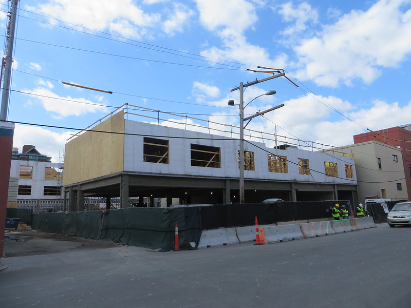
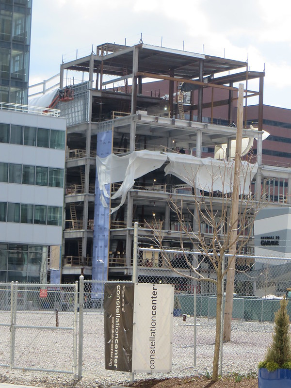
I like this too. Refreshing change from the sad vinyl-sided 2 families and triple deckers.Not sure when this was completed just north of Inman Square, but I like it;

I like this too. Refreshing change from the sad vinyl-sided 2 families and triple deckers.Not sure when this was completed just north of Inman Square, but I like it;
I like this too. Refreshing change from the sad vinyl-sided 2 families and triple deckers.

Leland Cheung first brought up limiting banks’ presence in July 2012, when North Massachusetts Avenue was being rezoned, but while he was interested in a cap on the number of big-bank locations that would mirror the cap on fast-food eateries at key locations, the focus of city planners during rezoning was on “frontage,” or the amount of storefront a business could put on a sidewalk. The limit was set at 25 feet of frontage.
But big banks keep coming into town “to buy up almost entire blocks and use them essentially as advertising … buying a storefront just to have their name plastered all over it,” Cheung said.
Unfortunately, the US didn't choose the best solution to this problem -- which would have been to let Citibank, Bank of America, and the other mega-banks fail instead of bailing them out.

Ron, if the US had let events take their course and let all those banks (and AIG) fail, well, I don't think we'd be seeing all these cranes around the city, we'd still have a gigantic hold in the ground where Filenes used to be along with an empty seaport, and as far as those storefronts in Harvard, Central, and Kendall Squares, they'd probably be quite a few empty ones which would make this city council proposal moot.
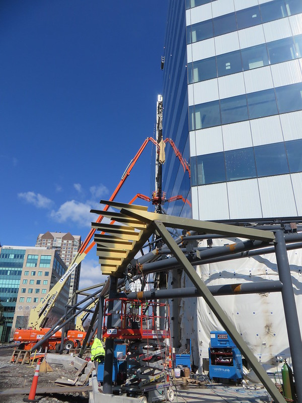
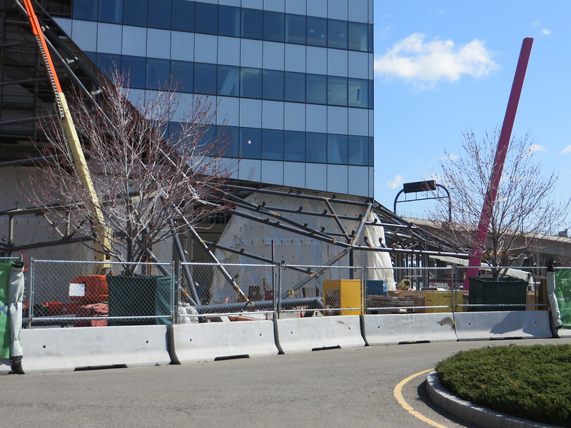
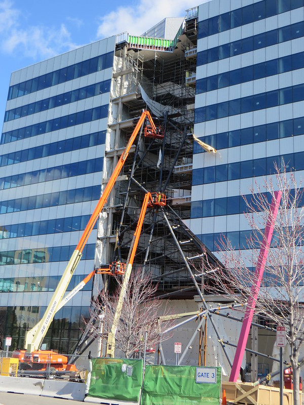
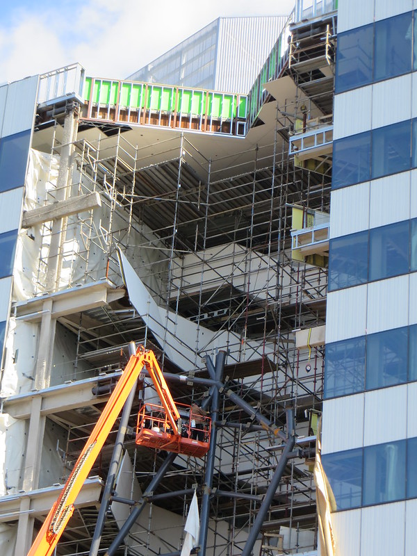
- They spent a ton of cash on the clear and white glass that can only be appreciated from 30 feet away or closer. Otherwise they spent lots of resources to make a building look like a route 128 spec office building circa 1950.
The glass is super clear and bright. It looks nice at night, even zooming by on the interstate. This will look nice in winter when it gets dark early but the building is still bustling with activity.
None of that makes up for the silly waterfall gimmick, but the building isn't quite the colossal failure some are making it out to be.
I want to make sure this is not directed at me. It is not a failure ... but it is a mistake in misplaced resources. Nothing annoys me more than when a designer has resources to work with, spends a lot of money, and makes something (sometimes out of naivete) that just looks cheap and thoughtless. It is clear the designers put lots of thought into this ... its just missing the mark.
Another example of what I am talking about is MIT's media lab. The metal siding used on that project looks like cheap industrial grade corrugated metal siding ..UNTIL .. you get withing 10 feet of it and realize that that panels are EXTRUDED ALUMINUM. Holy crap ... that costs lots of money .. to look like what? Good think that building has other tricks up its sleeve.
cca