stick n move
Superstar
- Joined
- Oct 14, 2009
- Messages
- 13,482
- Reaction score
- 24,533
i lean toward the Tabasco Tower gaining favor if not becoming beloved.
it won't have an awkward appearance from 98% of vantage points.
Agreed, this is the thing with renders. Lots of the angles shown are from angles that no one is going to see, so it doesnt really matter how it looks from those angles.The views of this tower that people will see in normal day to day life look good.
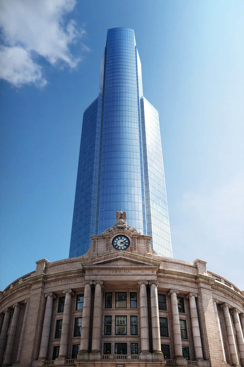
The view from out front of South Station will be seen by millions of commuters every year walking up to the entrance of south station. It looks great from here.
The view of the tower in the skyline will be seen by millions of people every year at Logan airport, millions of people driving on rt 1A south, I90 west, and from people living, working, and passing through Eastie, enjoying the East Boston waterfront, and piers park.
*Bonus, theres not a render, but the inverse of this angle is the view youll have from the South End.

Another angle that will be seen by millions of people driving on rt 93 North, and by people living/working/and passing through Southie and Dorchester.

Who cares if it looks like a bottle of tobasco sauce from 200’ in the air over the greenway? I dont... Once its built youre going to never see it from this angle again.

Last edited:

 Capture
")