You are using an out of date browser. It may not display this or other websites correctly.
You should upgrade or use an alternative browser.
You should upgrade or use an alternative browser.
Kendall/MIT Infill and Small Developments
- Thread starter Gameguy326
- Start date

bigpicture7
Senior Member
- Joined
- May 5, 2016
- Messages
- 4,068
- Reaction score
- 10,551
There's nothing intriguing about a box made of bricks...
I really do agree with the above statement in itself...
But with regard to Saarinen's MIT chapel, for instance, the whole point is that it only looks like a monolithic brick cylinder from a distance and if you're not paying attention. Afford it even a quick glance closer by and it becomes clear that a ton of thought went into that small building. (And even more so from the interior).
Check out this feature in ArchDaily:

AD Classics: MIT Chapel / Eero Saarinen
Completed in 1955 in Cambridge, United States. Eero Saarinen is one of the most respected architects of the 20th Century, often regarded as a master of his craft. Known for his dynamic and fluid...
 www.archdaily.com


And from MIT on the moat:
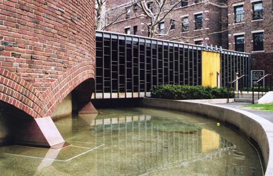
So, the question for this new music building is: will it really just be brick boxes, or will it bring the sort of intrigue that the chapel does (or more)?
I really don't think we can know so far with the info that's been posted. My point is: simple geometric forms do not necessitate crude, boring buildings.
FormFollowsBudget
Senior Member
- Joined
- Jan 15, 2015
- Messages
- 2,318
- Reaction score
- 4,106
I think it's well scaled and proportioned - it's not overpowering the space, and it's not becoming an immediate backdrop. And I suspect this will be a well-refined design, with architectural detailing that brings it up a level in terms of quality. This site stands directly behind Kresge, close to the MIT Chapel, and, from the fields, is in the same view as Simmon's Hall - that's a lot to contend with, and anything trying too hard will be too obvious. The material usage is likely a homage to the chapel and other brick buildings in this part of campus. The sweeping arch connecting the three masses seems to play off the Krsege Auditorium.
MIT also knew what they were getting with SANAA. They've made boxes before.

While the physical scale and ambition are different, there's still a play here between context, scale, and material, and what seems to be the most important driver of SANAA projects, the program. When this initially got published everywhere, I recall their narrative that they had found opportunities from simply following the program and not overdesigning around it, leading to new spaces and new potential program. I'm sure there may be some program opportunities in the new lobby space they created, and they won't be as opportune as New Museum, but the same ideas are at play.
MIT also knew what they were getting with SANAA. They've made boxes before.
While the physical scale and ambition are different, there's still a play here between context, scale, and material, and what seems to be the most important driver of SANAA projects, the program. When this initially got published everywhere, I recall their narrative that they had found opportunities from simply following the program and not overdesigning around it, leading to new spaces and new potential program. I'm sure there may be some program opportunities in the new lobby space they created, and they won't be as opportune as New Museum, but the same ideas are at play.
Bananarama
Active Member
- Joined
- Mar 18, 2020
- Messages
- 609
- Reaction score
- 1,262
I quite like the massing. But SANAA's presentation doesn't render the brick in any special way, so that's disappointing. The simple geometry could benefit from the exact kind of material play that Saarinen's chapel does so well.
Something nice in the plan and interior theater rendering is the inverted scalloping on the walls (within a rectilinear perimeter envelope). To me that's a nice echo of the chapel plan with its pure round exterior and the sinuous interior walls. A cool contrast of external and internal expression.
The views within the Lobby are wholly uninteresting and weirdly scaled though. Really unsold by that awkward staircase.
The "PV ready" annotation on page 15 is pretty funny too because you just know it was VE'd.
If you look at other SANAA designs, you'll notice they don't work with brick very often. That's not particularly surprising, since brick is a terrible building material in an earthquake-prone place like Japan, so I suspect they're using it here as a commentary/placing re: the neighboring structures, making use of their glass atrium as a point of contrast. The brick boxes themselves remind me a little bit of the Rothko Chapel in Houston, though I doubt it will have the same impact.
This structure reminds me most of the contemporary art museum of Kanazawa, for two reasons: 1) they way they layer glass with other materials to make multiple barriers between indoors and outdoors, and 2) the way the structure and the surrounding landscape are integrated. I like the way the multiple entrances are set up, mostly because of how that emphasizes the changes in materials.
Overall, I mostly like it, but I also prefer brick as a material over reinforced concrete, which is used all the time by Japanese architects - for good reason (earthquakes!) but to the point where it feels overused at times.
- Joined
- Jan 7, 2012
- Messages
- 14,173
- Reaction score
- 23,688
 IMG_3315 by Bos Beeline, on Flickr
 IMG_3318 by Bos Beeline, on Flickr
 IMG_3320 by Bos Beeline, on Flickr
 IMG_3323 by Bos Beeline, on Flickr
 IMG_3329 by Bos Beeline, on Flickr
- Joined
- Jan 7, 2012
- Messages
- 14,173
- Reaction score
- 23,688
 IMG_3968 by Bos Beeline, on Flick
 IMG_3969 by Bos Beeline, on Flickr
 IMG_3971 by Bos Beeline, on Flickr
 IMG_3973 by Bos Beeline, on Flickr
 IMG_3975 by Bos Beeline, on Flickr
 IMG_3977 by Bos Beeline, on Flickr
bigpicture7
Senior Member
- Joined
- May 5, 2016
- Messages
- 4,068
- Reaction score
- 10,551
Equilibria
Senior Member
- Joined
- May 6, 2007
- Messages
- 7,229
- Reaction score
- 8,759
I wonder if they already tried rendering the rest of the letters on the glass portions and just found that it looked dumb. I could also see trying some sort of art project where the missing letters are rendered in the interior to be seen through the glass.
FormFollowsBudget
Senior Member
- Joined
- Jan 15, 2015
- Messages
- 2,318
- Reaction score
- 4,106
The new home of the School of Architecture and Planning. I believe, when MIT's Cambridge campus was originally conceived, SA+P was located in a prime location adjacent to major departments that interacted with architecture, reflective of their conception of architecture bringing in new ideas from other industries and advancing architecture as a whole. I'm weary of this move to push architecture off the main quad and into its own, separate building across the street.
Regardless, it looks like it will be quite an extensive and expensive re-use:


... any guesses why there's a military vehicle?


Nice night time lighting
Regardless, it looks like it will be quite an extensive and expensive re-use:
... any guesses why there's a military vehicle?
Nice night time lighting
Last edited:
Mixed feelings on this. I am sure making the building useable for academic purposes makes it tough to keep the small windows appropriate for a storage facility. At the same time, the glass carbuncles are an unfortunate erasure of a fantastic historic structure. Tough call.
bigpicture7
Senior Member
- Joined
- May 5, 2016
- Messages
- 4,068
- Reaction score
- 10,551
IIRC, MIT pledged to fund the stretch of the Grand Junction Community Path spanning from Mass Ave. to Mem. Drive. Presumably that's what we're seeing alongside this building (because it certainly doesn't look like that now). I wonder if they'd perform that work in conjunction with this project.
Bananarama
Active Member
- Joined
- Mar 18, 2020
- Messages
- 609
- Reaction score
- 1,262
The small punched windows intersecting the existing ones gives me anxiety. But DSR has done it before and it can work... Just hard to imagine it being as clean with an (old) existing brick wall.

I'm not sold by the glas boxes either. They're just so neutral. I wish they were articulated more to engage the warehouse more.
But overall it's nice they're preserving the majority of it and leaving the whole face along Vasar virtually as is (plus smaller windows). They're letting the existing building pull most of the architectural weight instead of jamming something overwhelmingly contemporary into it.
The existing studios at MIT are pretty terrible and just renovating them won't fix their awkward location in 7 unfortunately.
Equilibria
Senior Member
- Joined
- May 6, 2007
- Messages
- 7,229
- Reaction score
- 8,759
The small punched windows intersecting the existing ones gives me anxiety. But DSR has done it before and it can work... Just hard to imagine it being as clean with an (old) existing brick wall.
The fact that I scrolled through that whole PDF and didn't even register that they were punching new windows gives some hope that the scheme works.
bigpicture7
Senior Member
- Joined
- May 5, 2016
- Messages
- 4,068
- Reaction score
- 10,551
Last edited:
FormFollowsBudget
Senior Member
- Joined
- Jan 15, 2015
- Messages
- 2,318
- Reaction score
- 4,106
Didn't take a hard look or capture a picture, but from glimpsing, the first pieces of steel for the new music building appear to be up.
stick n move
Superstar
- Joined
- Oct 14, 2009
- Messages
- 13,480
- Reaction score
- 24,527
Anyone know why this building is completely covered in scaffolding?

Im not sure what it is but it seems to be a utilities building like the long lines building in nyc.
Im not sure what it is but it seems to be a utilities building like the long lines building in nyc.
bigpicture7
Senior Member
- Joined
- May 5, 2016
- Messages
- 4,068
- Reaction score
- 10,551
Anyone know why this building is completely covered in scaffolding?
View attachment 17617
Im not sure what it is but it seems to be a utilities building like the long lines building in nyc.
I'm pretty sure they're just re-pointing all the brick. It's a telecom switching station for Verizon. There's one next door for AT&T.
Brad Plaid
Senior Member
- Joined
- Jan 17, 2013
- Messages
- 1,310
- Reaction score
- 1,559
- Joined
- Jan 7, 2012
- Messages
- 14,173
- Reaction score
- 23,688
 IMG_6210 by Bos Beeline, on Flickr
 IMG_6212 by Bos Beeline, on Flickr
 IMG_6211 by Bos Beeline, on Flickr
 IMG_6213 by Bos Beeline, on Flickr