Eh, MIT has a fairly long history of being hostile to the culture that's developed in their dorms. They really want people to identify with their class year, not their living hall. Eliminating the historic/cultural identify of Random Hall is probably seen as a positive to the administration. See both Bexley and Senior House as precedents where they used building renovation (even when legitimately needed) as cover to eliminate both cultural and architectural history (given that they ultimately ended up bulldozing Bexley).
You are using an out of date browser. It may not display this or other websites correctly.
You should upgrade or use an alternative browser.
You should upgrade or use an alternative browser.
Kendall/MIT Infill and Small Developments
- Thread starter Gameguy326
- Start date
- Joined
- Jan 7, 2012
- Messages
- 14,172
- Reaction score
- 23,677
 IMG_0015 by Bos Beeline, on Flickr
 IMG_0010 by Bos Beeline, on Flickr
 IMG_0012 by Bos Beeline, on Flickr
 IMG_0014 by Bos Beeline, on Flickr
 IMG_0018 by Bos Beeline, on Flickr
 IMG_0021 by Bos Beeline, on Flickr
 IMG_0022 by Bos Beeline, on Flickr
 IMG_0024 by Bos Beeline, on Flickr
 IMG_0026 by Bos Beeline, on Flickr
 IMG_0027 by Bos Beeline, on Flickr
- Joined
- Jan 7, 2012
- Messages
- 14,172
- Reaction score
- 23,677
 IMG_0139 by Bos Beeline, on Flickr
 IMG_0135 by Bos Beeline, on Flickr
 IMG_0136 by Bos Beeline, on Flickr
Brad Plaid
Senior Member
- Joined
- Jan 17, 2013
- Messages
- 1,310
- Reaction score
- 1,559
IMG_0012 by Bos Beeline, on Flickr
Well-designed, fine asset for the neighborhood. Is the bird a slide that the little darlings get pooped out of at the tail? They'll love that.
Gameguy326
Active Member
- Joined
- Aug 18, 2015
- Messages
- 390
- Reaction score
- 98
Fair point, unfortunately.Eh, MIT has a fairly long history of being hostile to the culture that's developed in their dorms. They really want people to identify with their class year, not their living hall. Eliminating the historic/cultural identify of Random Hall is probably seen as a positive to the administration. See both Bexley and Senior House as precedents where they used building renovation (even when legitimately needed) as cover to eliminate both cultural and architectural history (given that they ultimately ended up bulldozing Bexley).
Brad Plaid
Senior Member
- Joined
- Jan 17, 2013
- Messages
- 1,310
- Reaction score
- 1,559
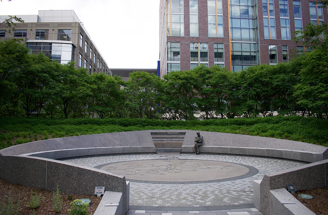
The North Plaza park (where the skating rink operates) was recently renovated and dedicated to Henri Termeer, a Kendall Square pioneer and Genzyme exec. It's now called Henri A. Termeer Square. The existing mound that was bisected by a sidewalk and fountain had one of the halves removed and is the focal point with Termeer's statue. This redesign opens up the plaza considerably and creates a lot of seating but as a whole it's pretty conventional, a missed opportunity for something more memorable.


Gameguy326
Active Member
- Joined
- Aug 18, 2015
- Messages
- 390
- Reaction score
- 98
I don't know if this has been posted, but I stumbled upon some renders of the new MIT Music Building being designed by SANAA. IMO, it looks quite nice.
I don't know if this has been posted, but I stumbled upon some renders of the new MIT Music Building being designed by SANAA. IMO, it looks quite nice.
Several sides of completely blank red brick walls?
Thank God this is contained in the interior of MIT's campus - - their problem.
Equilibria
Senior Member
- Joined
- May 6, 2007
- Messages
- 7,219
- Reaction score
- 8,728
I don't know if this has been posted, but I stumbled upon some renders of the new MIT Music Building being designed by SANAA. IMO, it looks quite nice.
Wow... that looks like a ventilation building. Does MIT explicitly ask architects to do their worst work for them, or is it something that just happens organically?
Just for an immediate comparison, here's what even a modicum of effort gets you with performance space. None of these is the Sydney Opera House, but come on.
bigpicture7
Senior Member
- Joined
- May 5, 2016
- Messages
- 4,043
- Reaction score
- 10,369
Actually, one can clearly see how the design plays directly off of this, which is directly across the way. Everything from the brick walls to the simple arches are an homage.
I think this really works in context. Saarinen's grand Kresge Auditorium, with its walls of glass and patina'd copper roof will abut this along one side, so no need for this to be a visual attention grabber.
I think this really works in context. Saarinen's grand Kresge Auditorium, with its walls of glass and patina'd copper roof will abut this along one side, so no need for this to be a visual attention grabber.
Equilibria
Senior Member
- Joined
- May 6, 2007
- Messages
- 7,219
- Reaction score
- 8,728
Actually, one can clearly see how the design plays directly off of this, which is directly across the way. Everything from the brick walls to the simple arches are an homage.
I think this really works in context. Saarinen's grand Kresge Auditorium, with its walls of glass and patina'd copper roof will abut this along one side, so no need for this to be a visual attention grabber.
I get that, but the fact that one person got away with a windowless brick box doesn't justify doing additional windowless brick boxes as an homage.
It's not about grabbing attention, it's about the fact that this place will be depressing to look at and to walk into in the morning. This is the sort of building you tear down these days, not build.
bigpicture7
Senior Member
- Joined
- May 5, 2016
- Messages
- 4,043
- Reaction score
- 10,369
I get that, but the fact that one person got away with a windowless brick box doesn't justify doing additional windowless brick boxes as an homage.
It's not about grabbing attention, it's about the fact that this place will be depressing to look at and to walk into in the morning. This is the sort of building you tear down these days, not build.
I think that chapel is one of the least depressing things to walk by in the area. Its peacefulness lowers my blood pressure. The water filled moat and hidden windows (under the cantilever) are brilliant. Even it's little modernist "drawbridge" is great.
This new performing arts center will be dwarfed by Kresge. It's replacing a paved surface lot; it has old growth trees on one side and the glass walls of Kresge on the other. I suspect it will not be depressing to most passersby.
Also, it's trying to cram a lot of performance space into a tiny lot. Those big beautiful buildings you posted usually have things between the performance space and the exterior walls - hallways, galleries, backstage. Here the exterior wall of the auditoriums is right up against the exterior wall of the building. Windows would actually be quite inconvenient for the user, right?
This counts as brutalist, right? Big brick cubes?
This counts as brutalist, right? Big brick cubes?
RandomWalk
Senior Member
- Joined
- Feb 2, 2014
- Messages
- 3,713
- Reaction score
- 6,502
Brutalist is a reference to the raw concrete, so this isn’t brutalist. It’s brutal, though.
kz1000ps
Senior Member
- Joined
- May 28, 2006
- Messages
- 9,140
- Reaction score
- 13,320
I think this one is going to come down to whether it feels large or small in person. If it's small-ish then the volumes will read almost cutesy like children's block toys, but if it looms then yeah you basically have a brutal '70s hulk.
This angle looms IMO

This angle looms IMO

FormFollowsBudget
Senior Member
- Joined
- Jan 15, 2015
- Messages
- 2,309
- Reaction score
- 4,100
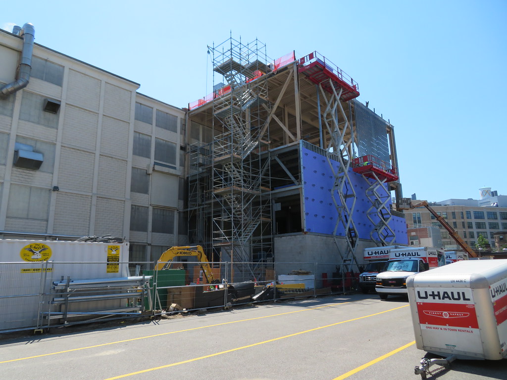
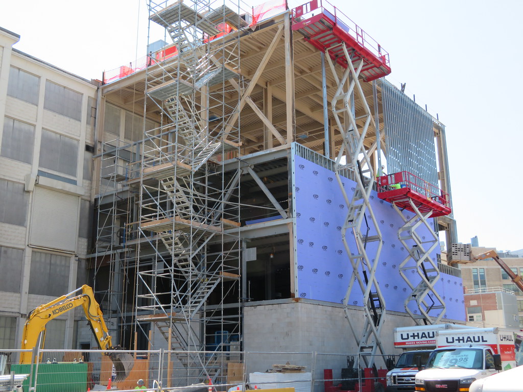
I think they've begun construction on it?

stellarfun
Senior Member
- Joined
- Dec 28, 2006
- Messages
- 5,719
- Reaction score
- 1,563
Recital and concert halls are often blank walls, for the acoustics.. The recital or studio part of this new music building is more of a classroom and less of a public performance space. One is looking more functionality than the aesthetics of an architectural statement.Also, it's trying to cram a lot of performance space into a tiny lot. Those big beautiful buildings you posted usually have things between the performance space and the exterior walls - hallways, galleries, backstage. Here the exterior wall of the auditoriums is right up against the exterior wall of the building. Windows would actually be quite inconvenient for the user, right?
This counts as brutalist, right? Big brick cubes?
https://www.avantacoustics.com/acoustics-of-glass/Sound is best blocked by limp, massive materials, and air-space (or even better, gaps devoid of air – i.e. a vacuum). Glass is rigid, and its massiveness is limited by transparency requirements that keep it thin. Glass transmits a lot of sound energy at its resonant frequency and at low frequencies.
Laminated glass and insulated glazing units both reduce sound transmission through glass by reducing resonance and adding air-space. However, a properly constructed stud or masonry wall will almost always outperform glazing.
Stanford's new concert hall.

Gameguy326
Active Member
- Joined
- Aug 18, 2015
- Messages
- 390
- Reaction score
- 98
I legit don't get the hate for this building. It looks like a mix between a tiny music city and a set of gramophones pointed outward. It should have a big, welcoming glass pavilion beneath the towers. My biggesy complaint is the gsf...not a lot of room for office and workspaces, I think they will regret not making this bigger in the future.
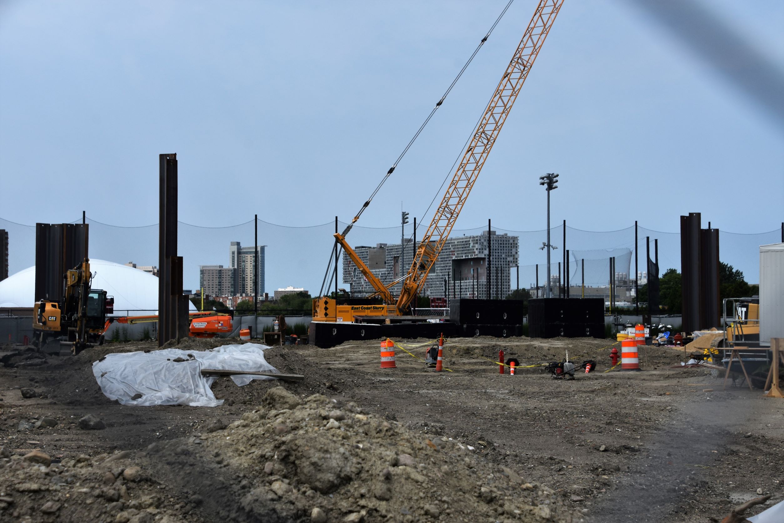
Anyway, some site pics. Is this under construction?


Anyway, some site pics. Is this under construction?
