nicanbot
Active Member
- Joined
- Jun 18, 2019
- Messages
- 176
- Reaction score
- 245
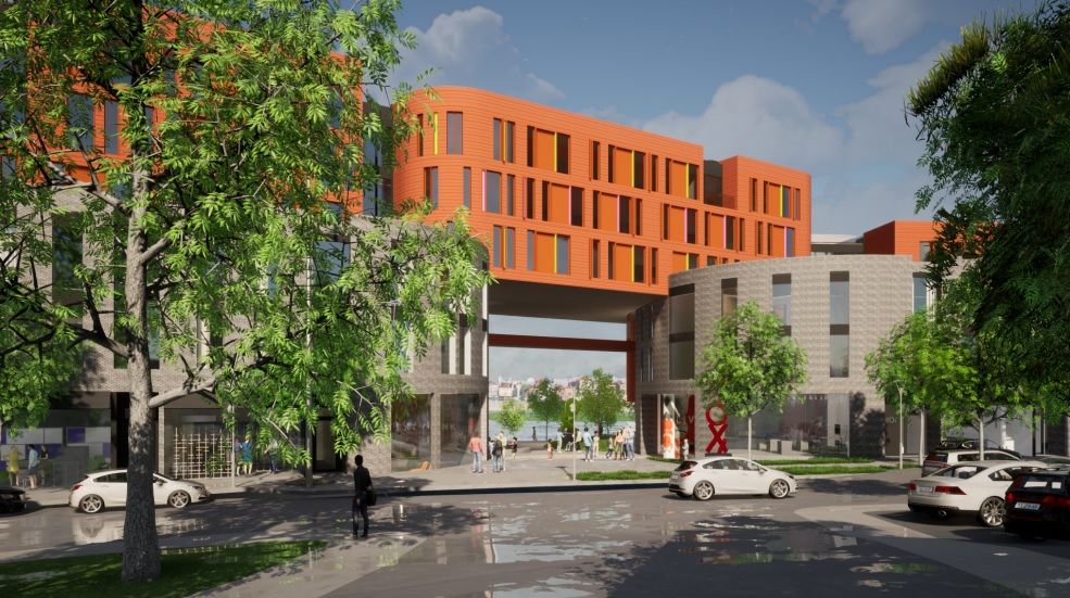
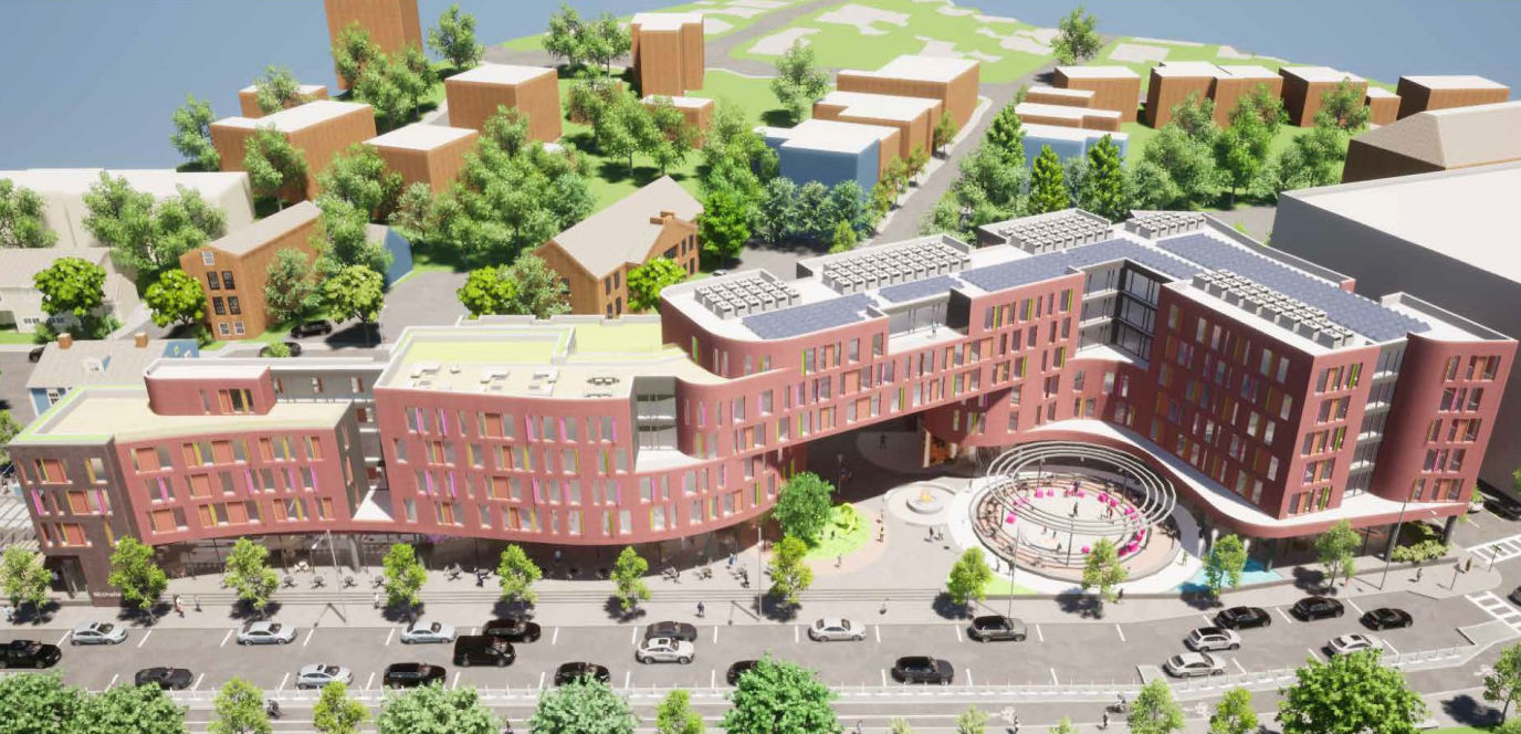
Two proposals for Parcel 2 on the agenda for the Sept. 20 committee meeting:
PowerPoint Presentation (195district.com)
PPCR_Presentation_v.2.pdf (195district.com)
Kewl!
Also - there is a Jewelry District Association said that Wexford is proposing something for Parcel 25 See here: JDA Meeting Announcement — 9/14/21 (mailchi.mp) Having trouble digging up anything else!
PowerPoint Presentation (195district.com)
PPCR_Presentation_v.2.pdf (195district.com)
Kewl!
Also - there is a Jewelry District Association said that Wexford is proposing something for Parcel 25 See here: JDA Meeting Announcement — 9/14/21 (mailchi.mp) Having trouble digging up anything else!