Parcel 2 I 195 District I Providence

Besides the 500'-600' Hope Point Tower proposal, have they just decided to cap the rest of the 195 district at 6 stories?
 
Fane's plot was zoned for 100' unless I am mistaken. That's the key part of the opposition. In general I think the plan was for "human sized" buildings everywhere but the parcels along the highway where folks could go higher.
 
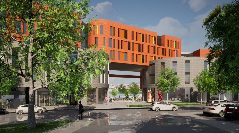
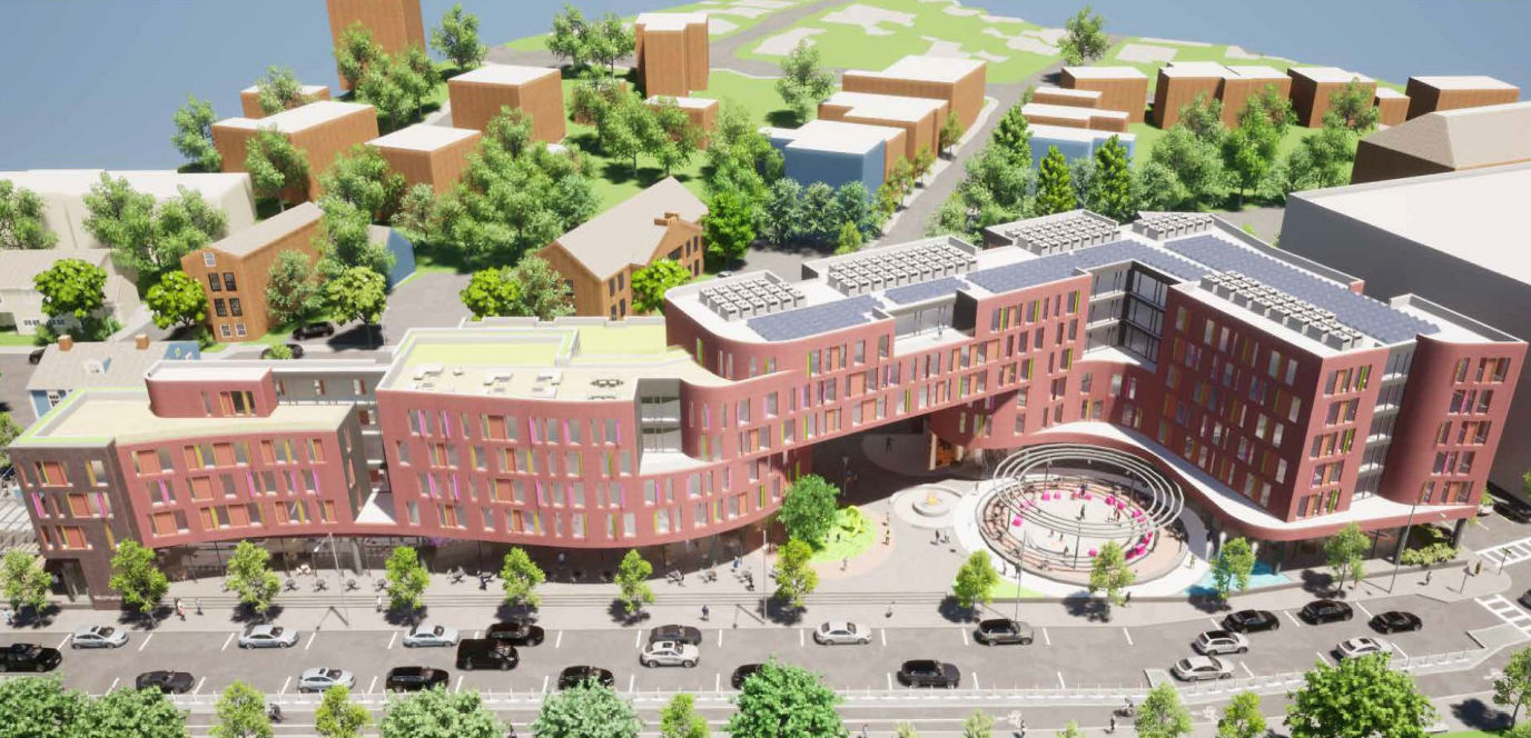
Thanks for the links, nicanbot. I like how all proposals provide a pedestrian connection to Transit St to the east while embracing the pedestrian bridge to the west. Each proposal includes ground floor retail, which is great, and attempts to activate the outdoor space. I also like that the Eden Properties and Urbanica are proposing more bike parking than car parking. And a lot of it is covered! Incidentally, both of those projects include more residential units than the P&D proposal. None of the projects strike me as being aesthetically inspired tho Collage from Urbanica features an unusual color scheme, fwiw.
 
Interestingly I sat in on a meeting with the Jewelry District Association this eve and there seemed to be an attempt to set pace on a tone that ground floor retail was not preferable given all the empty retail space in the neighborhood (including unfinished new builds). That position seemed pretty backward to me. Seems like there needs to be some understanding around placemaking and future planning and it's not always a "poof we have an active urban space immediately" situation.
 
Here are some compiled figures:
Floors (height)Residential sq. ft. (units)Retail sq. ft. (units)Parking spacesBike parking
Eden6 (~70')156,000 (163)8,600 (2)52 (ground floor)89 spaces
PPCR6 (73')134,953 (120)25,000 (4)140 (underground)24 spaces
Urbanica6 (~68')120,666 (194)16,000 (4)90 (underground)120 spaces

As I see it:
ProsCons
Eden
  • Sliding glass doors on South Water St. and James St. create a soft edge that invites pedestrians
  • Passage between buildings is raised high enough and opens widely enough (at least on the east side) to seem welcoming to pedestrian traffic
  • Proposal almost entirely ignores the South Main Street side (renderings aren't even provided)
  • Outdoor public space seems limited to reserved outdoor seating for restaurant, meaning limited potential public use
  • Little to no sense of place in material choice or form
  • Exterior looks a bit chaotic and cheap
PPCR
  • Brick and wood combination is handsome and better engages with surrounding context
  • Public realm seems more publicly accessible
  • Landscaping the on west side appears to be a nice continuation of the pedestrian bridge landscape
  • Combination of curved and zig-zag facade appears sort of awkward and disjointed
  • Massing seems comparatively poor
  • Corridor between buildings is neither obvious nor inviting
Urbanica
  • Landscape program is somewhat fleshed out
  • Passage between buildings is raised high enough and massed in a way that seems welcoming to pedestrian traffic
  • Orange siding seems garish and uncomfortably similar to that of the new Aloft hotel across the river
  • Massing and rounded corners feel dated and clash with surrounding context

I'm on the same page as Tom in that aesthetically all three proposals are underwhelming and seem passable at best.

Thoughts?
 
Last edited:

Back
Top