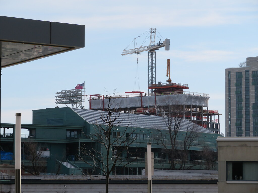
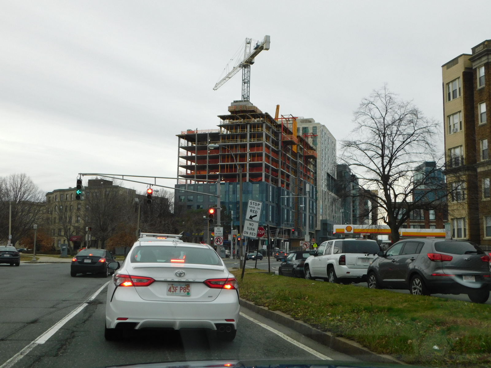
I'm getting a little uneasy about the lack of stylistic unity in all the new Boylston construction. There doesn't seem to be (at least from what I can see in the photos posted on aB) any sort of common architectural or design element to relate the buildings to one another or establish an overall streetwall context. It reads more like a sampler of facades from which you'd pick one or two styles to use in an actual streetwall. Maybe it will work out OK in the end, but I like it more when the facades on a streetwall share some commonality, however small.
You are using an out of date browser. It may not display this or other websites correctly.
You should upgrade or use an alternative browser.
You should upgrade or use an alternative browser.
The Bon | 1260 Boylston Street | Fenway
- Thread starter Equilibria
- Start date
JumboBuc
Senior Member
- Joined
- Jun 26, 2013
- Messages
- 2,789
- Reaction score
- 1,923
I don’t see this as a problem. Boston architecture generally clings too closely to commonality, so I’m okay with a little freedom of expression here. Even if it does end up making the street look like one big Elkus bag-o’-facades samplerama.I'm getting a little uneasy about the lack of stylistic unity in all the new Boylston construction. There doesn't seem to be (at least from what I can see in the photos posted on aB) any sort of common architectural or design element to relate the buildings to one another or establish an overall streetwall context. It reads more like a sampler of facades from which you'd pick one or two styles to use in an actual streetwall. Maybe it will work out OK in the end, but I like it more when the facades on a streetwall share some commonality, however small.
As long as the street levels and density keep being fantastic (which they are), I’ll take it.
stick n move
Superstar
- Joined
- Oct 14, 2009
- Messages
- 13,361
- Reaction score
- 23,947
The concave effect around the windows plus the fake copper patina look looks pretty good imo.
HenryAlan
Senior Member
- Joined
- Dec 15, 2009
- Messages
- 4,446
- Reaction score
- 5,176
I see that as a feature, not a bug. I love the way Boylston St. looks with its varied facades. It's far more interesting to me, than, say Assembly Row.I'm getting a little uneasy about the lack of stylistic unity in all the new Boylston construction. There doesn't seem to be (at least from what I can see in the photos posted on aB) any sort of common architectural or design element to relate the buildings to one another or establish an overall streetwall context. It reads more like a sampler of facades from which you'd pick one or two styles to use in an actual streetwall. Maybe it will work out OK in the end, but I like it more when the facades on a streetwall share some commonality, however small.
- Joined
- Jan 7, 2012
- Messages
- 14,172
- Reaction score
- 23,677
 IMG_0401 by Bos Beeline, on Flickr
 IMG_0402 by Bos Beeline, on Flickr
 IMG_0444 by Bos Beeline, on Flickr
 IMG_0454 by Bos Beeline, on Flickr
 IMG_0456 by Bos Beeline, on Flickr
 IMG_0460 by Bos Beeline, on Flickr
 IMG_0461 by Bos Beeline, on Flickr
 IMG_0463 by Bos Beeline, on Flickr
stick n move
Superstar
- Joined
- Oct 14, 2009
- Messages
- 13,361
- Reaction score
- 23,947
Im glad the facade is brick, it looked like vinyl in the render.
Blackbird
Senior Member
- Joined
- Feb 2, 2014
- Messages
- 1,240
- Reaction score
- 1,818
My fiancée just asked "why are the windows like that?" and I too am asking that that plus a handful of other questions. The other sides are passable but that Boylston facade is kinda gross.
Ha! I'm actually the opposite: I think the patchy, discolored copper on the back side is pretty gross but I like the funky windows on Boylston.
stick n move
Superstar
- Joined
- Oct 14, 2009
- Messages
- 13,361
- Reaction score
- 23,947
Ha! I'm actually the opposite: I think the patchy, discolored copper on the back side is pretty gross but I like the funky windows on Boylston.
Is it really copper? I figured it was some kind of fake copper patina-ish looking precast… because it kinda looks like it is… or thats just what is pretty much expected these days. That being said I kinda like it and if its actually copper that changes my perspective.
Tbh I actually think this is coming out pretty good, the renders were pretty low quality so it made it look like it was vinyl or something, but the materials in real life look much better. If the renders looked like vinyl and instead we get brick and copper… thats a huge win. The windows look better in real life too imo.
Last edited:
FormFollowsBudget
Senior Member
- Joined
- Jan 15, 2015
- Messages
- 2,309
- Reaction score
- 4,100
The initial PNF referenced "brick" and real copper.
Give the copper some time..
Renders can't be 100% relied upon: a developer or architect can pay the extra cash for some nice visualizations, but that's totally up to them and their style/preferences. Visualizations can be an art and take a lot of time and money, or an architecture firm can simply rely upon a basic rendering software with minor photoshop editing and annotations and explanations on the materials, as they did here..
Bananarama
Active Member
- Joined
- Mar 18, 2020
- Messages
- 605
- Reaction score
- 1,249
The tilt out of the windows on the Boylston face is too shallow of an angle and looks like a mistake rather than an intentional design move. I'm getting echos of the unintelligible facade of its neighbor...
I quite like some of the rear facades with the taller windows in brick and square tilted windows (all tilting in same direction too).
I quite like some of the rear facades with the taller windows in brick and square tilted windows (all tilting in same direction too).
JohnCostello
Active Member
- Joined
- May 14, 2008
- Messages
- 302
- Reaction score
- 276
Late December

HBH
Senior Member
- Joined
- Apr 17, 2018
- Messages
- 1,557
- Reaction score
- 4,704
A lot would depend on this: https://archboston.com/community/threads/bowker-overpass-replacement.1708/page-22Does anyone know if there are any plans to simplify the tangle of roads in this area? To benefit the pedestrians, I mean.
All the confusing and poorly done roads are DCR. There's also a project to fix the intersections at the other end that's a year or two out in theory.
BACsop
Senior Member
- Joined
- Jun 1, 2019
- Messages
- 1,839
- Reaction score
- 7,643
Does anyone know if there are any plans to simplify the tangle of roads in this area? To benefit the pedestrians, I mean.
not if the Department of Cars and Roads has anything to say about it
A lot would depend on this: https://archboston.com/community/threads/bowker-overpass-replacement.1708/page-22
All the confusing and poorly done roads are DCR. There's also a project to fix the intersections at the other end that's a year or two out in theory.
In other words, No.
Thanks for the link. I've never seen that BO thread before.
- Joined
- Jan 7, 2012
- Messages
- 14,172
- Reaction score
- 23,677
 IMG_1319 by Bos Beeline, on Flickr
 IMG_1320 by Bos Beeline, on Flickr
 IMG_1267 by Bos Beeline, on Flickr
 IMG_1273 by Bos Beeline, on Flickr
 IMG_1274 by Bos Beeline, on Flickr
 IMG_1277 by Bos Beeline, on Flickr

