You are using an out of date browser. It may not display this or other websites correctly.
You should upgrade or use an alternative browser.
You should upgrade or use an alternative browser.
BU Development Thread
- Thread starter bosdevelopment
- Start date
blade_bltz
Active Member
- Joined
- Jul 9, 2006
- Messages
- 808
- Reaction score
- 0
Hasn't BU always had some kind of identity crisis due to the campus' lack of unity/integrity? This seems like a simple (and er, superficial) measure to address that.
Doesn't seem out of place in America, where the separation between town/gown is supposed to be pronounced. Unlike, say, Oxford.
Doesn't seem out of place in America, where the separation between town/gown is supposed to be pronounced. Unlike, say, Oxford.
- Joined
- May 25, 2006
- Messages
- 7,064
- Reaction score
- 1,990
I was walking through Kenmore today and noticed this:
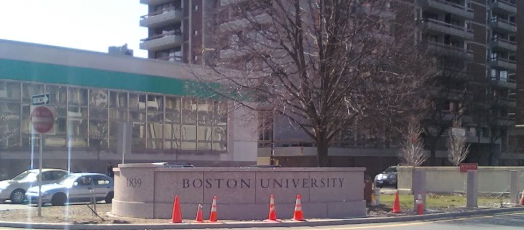
New Boston University gateway -- big improvement over the red sign (still pictured behind it).
Cut down that tree and put up a giant statute or monument (to Menino?)
TomOfBoston
Senior Member
- Joined
- Mar 29, 2007
- Messages
- 1,272
- Reaction score
- 512
What exactly is the point of this? Universities have given up on brand and now need bigass signs? Harvard does not have a big stone sign that says "This is Harvard!"
Ah yes, just another reminder to all of us that Harvard is so vastly superior to all of the "little" schools like Northeastern and BU.
czsz
Senior Member
- Joined
- Jan 12, 2007
- Messages
- 6,043
- Reaction score
- 8
BU lives in the shadow of BC on the national level, so I guess they feel the need for a sign.
The sign will surely put them on the national radar! I mean, everyone in the country drives through Kenmore Square!
Ah yes, just another reminder to all of us that Harvard is so vastly superior to all of the "little" schools like Northeastern and BU.
It's not that it's a bigger or better university. I hate a lot about Harvard, but it's not worth getting into here. I do think, though, that it understands why hoisting a giant sign like that is a bit garish for a university. BU and Northwestern should announce their presence with architectural continuity instead. In the few places where Harvard does have signs, it's because those sites have deviated from its design trend.
BU lives in the shadow of BC on the national level, so I guess they feel the need for a sign. Northeastern needed it as a pat on the back, maybe?
It really doesn't -- not in the way, that say, Northeastern lives in the shadow of BU.
On the undergraduate level, BC has always had a national stage whereas BU has focused much more of it's resources on research and graduate level programs (which it shows in the rankings and such).
What exactly is the point of this? Universities have given up on brand and now need bigass signs? Harvard does not have a big stone sign that says "This is Harvard!"
Campus beautification -- no point in reading into it. Most schools have such signs. Harvard is clearly in the minority here (though that can be disputed since there are Harvard signs virtually everywhere).
czsz
Senior Member
- Joined
- Jan 12, 2007
- Messages
- 6,043
- Reaction score
- 8
I don't think it's very "beautiful".
I don't mind signs that identify a building or whatnot. Or banners on streetpoles with the campus emblem. NYU has purple flags flying from all its hodge-podge buildings.
It just seems gauche to have one of these signs designating the entrance to an entire campus, particularly an urban one. It feels like branding failure. But maybe the real problem is that it feels suburban. It says "here is the university zone" in the same way that signs mark the entrance to residential subdivisions or country clubs. It screams out to drivers more than pedestrians.
BarbaricManchurian
Senior Member
- Joined
- Mar 12, 2007
- Messages
- 1,067
- Reaction score
- 65
I think the sign looks nice, and I don't understand the complaints against it. There's also similar signs announcing "you are entering Back Bay" or East Boston or Beacon Hill or other neighborhoods, and do they look suburban? Just because they are used by some suburbs doesn't mean that cities can't use them, it's a ridiculous reductionist argument.
I don't think it's very "beautiful".
Ok.
I don't mind signs that identify a building or whatnot. Or banners on streetpoles with the campus emblem. NYU has purple flags flying from all its hodge-podge buildings.
I personally think street pole banners are much cheesier than actual stone or marble walls with engraved university emblems.
It just seems gauche to have one of these signs designating the entrance to an entire campus, particularly an urban one. It feels like branding failure. But maybe the real problem is that it feels suburban. It says "here is the university zone" in the same way that signs mark the entrance to residential subdivisions or country clubs. It screams out to drivers more than pedestrians.
BU can be accused of a lot of things; suburban isn't one of them.
kennedy
Senior Member
- Joined
- Feb 12, 2007
- Messages
- 2,820
- Reaction score
- 7
The sign will surely put them on the national radar! I mean, everyone in the country drives through Kenmore Square!
It really doesn't -- not in the way, that say, Northeastern lives in the shadow of BU.
Ask most people who are looking at colleges that don't live in the Northeast, and ask them if they know anything about BU. More often than not, they ask if you meant to say BC. Northeastern is even less known, they think you meant to say Northwestern.
I know that the sign doesn't actually solve this, but it's part of a larger branding effort to differentiate themselves from other universities - at the very physical level of declaring the entrance to the "BU zone."
I think the old system, of red BU banners on the light poles was better than this. Besides, it's not even the entrance to the campus, various buildings are further east, and the citizens bank and commi-building pictured arent owned by BU.
Many urban campuses "hide". I've never seen an Emerson sign.
Many urban campuses "hide". I've never seen an Emerson sign.
BostonUrbEx
Senior Member
- Joined
- Mar 13, 2010
- Messages
- 4,346
- Reaction score
- 140
Many urban campuses "hide". I've never seen an Emerson sign.

In the footsteps of Suffolk.
czsz
Senior Member
- Joined
- Jan 12, 2007
- Messages
- 6,043
- Reaction score
- 8
I think the sign looks nice, and I don't understand the complaints against it. There's also similar signs announcing "you are entering Back Bay" or East Boston or Beacon Hill or other neighborhoods, and do they look suburban? Just because they are used by some suburbs doesn't mean that cities can't use them, it's a ridiculous reductionist argument.
These signs look and feel stupid, too. They're often not even that informative; there's a "Welcome to South Boston" sign over Fort Point, simply because Southie wanted to claim the Seaport for itself. They're especially absurd in Boston where neighborhoods are so well defined by geography, architecture, and even accent. They are definitely suburban imports; they're printed to be read by speeding motorists and would not even be considered by someone planning the city from a pedestrian's POV - which is why they didn't appear until the latter half of the 20th century.
And no, bduren, I'm not accusing BU of being suburban, but it's taking a step in that direction with the sign. The banners were far nicer - and more urban. First, they were fluid. They allowed the university to expand wherever and cheaply demarcate its territory. More importantly, they integrated the campus with the furniture of the surrounding cityscape, rather than erecting a sort of permanent boundary marker between the town and the gown.
And no, bduren, I'm not accusing BU of being suburban, but it's taking a step in that direction with the sign. The banners were far nicer - and more urban.
I remain unconvinced by the entire argument. The street pole banners, which still exist on West Campus at BU, are ugly, as are the 70s style cobra head street lights they are on which the city is so admirably replacing all over town.
I believe you are confusing "suburban" with physical boundaries, especially when discussing BU. There is almost nothing suburban about BU -- aside from a few parking lots. A granite gateway entrance sign is not going to change this, or even hint that a university the size and shape of BU is somehow trying to decentralize (to become suburban). In fact, the University's conceptual master plan, which is a few pages back here, will suggest just the opposite -- which is to create a well defined, urban campus.
AmericanFolkLegend
Senior Member
- Joined
- Jun 29, 2009
- Messages
- 2,214
- Reaction score
- 248
a well defined, urban campus.
If it's so well defined, why the sign?
(And I'm not suggesting that it's not well defined. For an urban campus it absolutely is.)
Ron Newman
Senior Member
- Joined
- May 30, 2006
- Messages
- 8,395
- Reaction score
- 14
Coming from Columbus, where many signs inform you that you are entering The Ohio State University from various directions, this seems to me totally unremarkable. I think UCLA and Berkeley have them, too.
BarbaricManchurian
Senior Member
- Joined
- Mar 12, 2007
- Messages
- 1,067
- Reaction score
- 65
These signs look and feel stupid, too. They're often not even that informative; there's a "Welcome to South Boston" sign over Fort Point, simply because Southie wanted to claim the Seaport for itself. They're especially absurd in Boston where neighborhoods are so well defined by geography, architecture, and even accent. They are definitely suburban imports; they're printed to be read by speeding motorists and would not even be considered by someone planning the city from a pedestrian's POV - which is why they didn't appear until the latter half of the 20th century.
And no, bduren, I'm not accusing BU of being suburban, but it's taking a step in that direction with the sign. The banners were far nicer - and more urban. First, they were fluid. They allowed the university to expand wherever and cheaply demarcate its territory. More importantly, they integrated the campus with the furniture of the surrounding cityscape, rather than erecting a sort of permanent boundary marker between the town and the gown.
OK, but something that benefits car drivers (such as this sign) does not always negatively impact pedestrians or the cityscape, and when it doesn't, I don't have a problem with it.
czsz
Senior Member
- Joined
- Jan 12, 2007
- Messages
- 6,043
- Reaction score
- 8
Designing the city for cars inherently devalues the cityscape, whether or not pedestrians are technically catered for and safe. Pedestrians don't need this out-of-scale sign at all.
Overhead traffic lights do the same thing, disrupting boulevardian vistas for the sake of being more visible to distant cars.
But this is exactly it. The Platonic ideal of urban = mixed use, diverse. Zoning and boundary drawing pushed cities down the road to suburbdom.
Overhead traffic lights do the same thing, disrupting boulevardian vistas for the sake of being more visible to distant cars.
I believe you are confusing "suburban" with physical boundaries, especially when discussing BU.
But this is exactly it. The Platonic ideal of urban = mixed use, diverse. Zoning and boundary drawing pushed cities down the road to suburbdom.