🔹 What's Happening With Project X?

I don't hate the base, though I remember it not being popular a couple of years ago when these first came out. What don't people like about it?
 
I think the base is interesting. I kind of like it too. And the gerbil tube was eliminated from the project, which improves the project.
 
You missed the significantly bigger story.... Hancock having 2nd thoughts about building that hideous inverted 390' office tower.

Where in the article does it say that? Because I saw this...

"Hancock, which traces its founding to 1862, has also received the city’s approval to build a 26-story tower on Stuart Street near its two Back Bay properties.

Several Boston-area real estate professionals said that if Hancock is rooting itself in the Back Bay, the proposed building would provide the logical next place to grow. In her memo, Harrison told employees that Hancock is continuing to work on plans for the tower, but did not elaborate."
 
I don't hate the base, though I remember it not being popular a couple of years ago when these first came out. What don't people like about it?

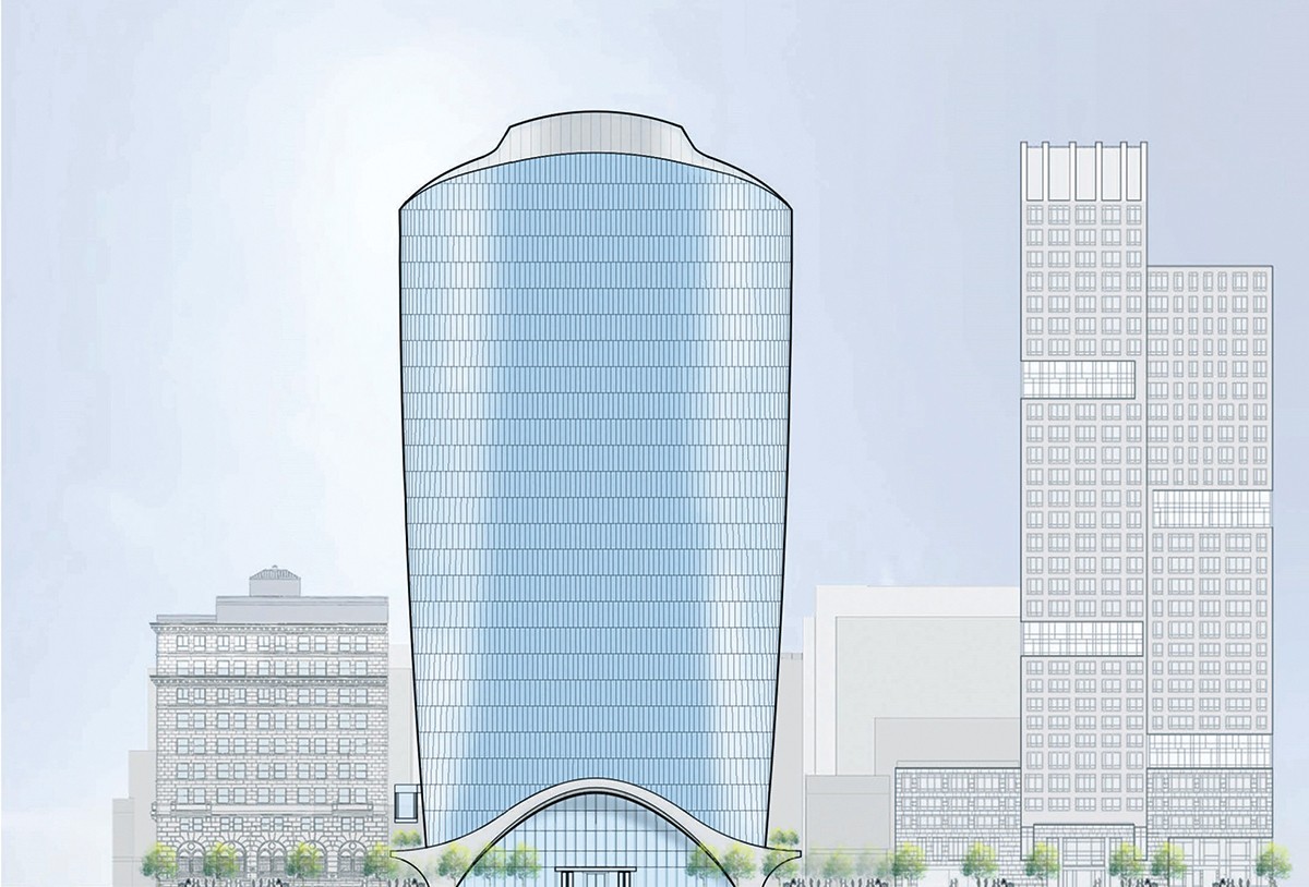
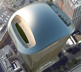
fIuzCDB.png


380-stuart-street-21.jpg


Plus the horrendous crown.

john_hancock_tower_boston_back_bay.jpg


The overall shape and the glass is very nice though. Get rid of that trash base and make a nice glass lobby and give it a proper top and we have a winner. This is yet another fine example of if regular ol' glass looks better than why? I base many things on this like the hub residential and 888 boylston. If your going to go out of your way to add a bunch of frilly bs all over the place make it nice and cohesive, if it looks worse than regular glass would than just put glass there and call it a day. Its short so it doesn't even need to stand out, calm down on the insanity, trim it up a bit and it will fit well. The glass is nice and would look good at street level.
 
Where in the article does it say that? Because I saw this...

"....Hancock is continuing to work on plans for the tower, but did not elaborate."

Interesting. Unless i'm hallucinating, that's quite different from what i read when the article first appeared. Chesto must have changed the wording from the first submission. ....btw, it's been 2 and a half years since the building was approved. i hope whatever time their taking to "continuing to work on plans" includes a redo. i'm worried that top heavy garbage will quickly be received as a disaster as it unfolds.... and in fact, may come to be one of the most hated buildings in the City.

Oh; Boston Properties again? Why do they have it in for Boston that they would be dropping some of the worst architectural bombs seen anywhere in decades?

I'm pissed i couldn't make Monday's and Tuesday's meetings. i had to leave town at the last minute.

The overall shape and the glass is very nice though.

No. The tower's massing is extremely bad.
1. Once up–you can't go back and fix it.
2. it's exceedingly dreadful.

Yes. The glass is very good.
 
Last edited:
Any news on Assembly Row Phase 3 (between the new apartment/condo towers and the partners building)?
 
Stick, I'm looking at the same thing you're looking at, no offense but it doesn't help to post the pictures like they make your point obvious.

I think the crown and the overall massing are really weird in not the best way. Bulbous, like the walkie talkie tower in London. Don't love that. And fat. Just look at the proportions of the Stern building next to it in that elevation.

Do like the glass, it looks like it'd be high quality, and SOM being the design architect could deliver.

I think the gesture at the base is pretty elegant for what it is, and not doing too much. It's a modern awning, and I'd rather not just see the glass come all the way to the ground in such a severe way. There's still glass underneath the awning, nothing says the lobby can't be nice. Even though it won't matter because just like most office towers all you're going to see is a security desk, turnstiles and a wall concealing the elevator banks.
 
I think the crown and the overall massing are really weird in not the best way. Bulbous, like the walkie talkie tower in London.

No doubt -- the proportions are all wrong. Even artful gestures and high-quality finishes will do nothing to help this from looking like anything more than a space-age mail box.

Do like the glass, it looks like it'd be high quality, and SOM being the design architect could deliver.

Sadly, this might be another example of reliable architects coming to Boston to do their worst work...

I think the gesture at the base is pretty elegant for what it is, and not doing too much. It's a modern awning, and I'd rather not just see the glass come all the way to the ground in such a severe way.

The base is my favorite part; it calls Saarinen, Nervi, and Candela to mind, though the curves will likely be executed in Alucobond, rather than poured-in-place concrete. Indeed, the "grandness" of the arch (that harkens back to dramatic entrances from the pens of H.H. Richardson, Louis Sullivan, and Frank Lloyd Wright, deserves a taller, sleeker tower.
 
No doubt -- the proportions are all wrong. Even artful gestures and high-quality finishes will do nothing to help this from looking like anything more than a space-age mail box.


Sadly, this might be another example of reliable architects coming to Boston to do their worst work...


The base is my favorite part; it calls Saarinen, Nervi, and Candela to mind, though the curves will likely be executed in Alucobond, rather than poured-in-place concrete. Indeed, the "grandness" of the arch (that harkens back to dramatic entrances from the pens of H.H. Richardson, Louis Sullivan, and Frank Lloyd Wright, deserves a taller, sleeker tower.

Since you mention Saarinen, the CBS building(NYC) is perfectly proportioned, I believe, for this parcel. It doesn't have Saarinen's characteristic curves, but it shows that a well proportioned not-too-tall (490' in the case of CBS) tower can look sleek, simple, and elegant. A much better way to get ~similar square footage (I'm guessing) than the JHT3 blob:

PR-AB416_DWEEK_DV_20090728161750.jpg
 
Agreed. Sadly, it ain't gonna be; because at 490, it blasts through the red signal/s of the Shadow Law....

Public Garden, Common, Mall and Copley Square.

Totally sucks. but it is what it is.
 
I thought people were against knock offs and bringing back older styles to supplement where were missing some key pieces and only want to move forward? Anyways I love that tower and we need more diversity of color here including black. I dont mind glass but why does it ALL have to be blue. You can have silver glass, black glass, green glass... A very simple glass tower with a black glass facade imo is a must have in any city. Especially if it has a razor thin edge like the hancock or in a wider building maybe like the way 4wtc makes its razor edge by angling the floor plan. Thats why I wasnt mad at the black glass office tower originally planned at the hub on causeway. I think it brings a level of "seriousness" to the skyline, where blue glass gives kind of a light and calming look reflecting the sky. I will say though Im not a fan of light green glass or red in some cases, but it can work. 1 Bromfield was kind of black and the original copley place tower was black glass. We need more variation, and also I dont see any problem with bringing back some older designs for the skyline. If you weren't allowed to bring back anything from the past Washington DC wouldn't even be recognizable, quincy market wouldn't exist in its current form...etc. Nothing wrong with it imo as long as its done right.
 
I thought people were against knock offs and bringing back older styles to supplement where were missing some key pieces and only want to move forward?

It's not a binary conversation, it's pretty nuanced. In the broadest sense, knock-offs of "trendy" architecture give me douche-chills. But a new building that is imbued with the gravitas and conceptual rigor of a classic Miesian tower would be a welcome addition to our skyline. Classics never get old...

It's very difficult for me to get excited about the tarted-up nonsense planned for North Station or Pelli's rolled-up glass newspaper on Congress Street. One Dalton is the only truly world class tower this city has seen in a generation.

And yet, as a matter design ethos, I'm more impressed with the Bolling Building in Dudley Square, 10 Farnsworth, and The Viola than any proposed tower.
 
I find it weird that after alllll this time there has never been a serious, or even unserious proposal for the final parcel (E) on fan pier. Literal radio silence from the inception to right now. All we ever get is placeholders when other developments are being shown and they always change and are as generic as can be. This is kind of weird how theres been....nothing. Anybody know why this is? The placeholders are different basically in every render so you can tell that there is literally nothing at all planned yet. Even some of the placeholders in other renders were actually very close to what ended up being built and stayed consistent so you now know in hindsight that they knew what was going up behind the scenes. 88 Seaport you can now see in later renderings that it had started being shown in final form as a placeholder before we knew what we were getting. Theres always been a general idea of whats going on for basically every parcel so far thats in line to be developed. I cant think of another parcel in Boston history (that I know of) that is as imminent to be built as this is that has so little information. Theres literally nothing, but its 100% being built and probably sooner than later. Doesn't make sense. Were all so used to it at this point that we dont even stop and think or ask about it anymore. I just wanted to stop and be like why is that, whats going on here, somebody has to have something new over all these years as little as it could be? Its imminent that its built to finish off fan pier, but we know absoluuuuuuutely nothing at all in any way shape or form besides "something" will go here at "some time". Its as under the radar as it gets, more so than anything I can remember. Does anybody know anything at all about parcel E on fan pier?
 
Last edited:
This is an embarrassment. This is architecture? This is intended to be a meaningful contribution to the city of Boston? A well-considered addition to Stuart Street? Really? Explain to me how? Please.

This from a distinguished firm? It's hard to imagine this is what they came up with. Who in the firm stood in front of an audience and presented this?

To me this is "pop" architecture at it's worst, an affront, a bloody nose, a flipped-bird, to everything else on the street.

This from a local business leader whose contributions to the city on many levels - the once eponymous tower being one - are cherished and praiseworthy.

What we will be losing to gain this meaningless gesture is another example of how development in Boston has gone astray. Who is minding the store and protecting our civic heritage? Every living city evolves, yes, but care must be taken or you diminish - worse, soil - what makes the city the city itself.

We are being endlessly nibbled at and rarely rewarded with quality design. The tipping point looms.

Granted, the current building may not warrant significant design or historical praise - but it is a fine and worthy neighbor who plays well with others and makes sense for the street it lives on. It is a dignified edifice to walk past every day. This new building will sit like a Jeff Coons balloon work on the sidewalk. Curious and unknowable.

This building is a mistake, but what it portends is an even greater misdeed.
 
i couldn't quite find the right words to explain how angry i feel about this. You've said it all so well. You know, if enough people provide sound reasons, and make a concerted effort. You never know.

Thanks a lot.
 
Thats how I feel as well, but as you can see by the responses different strokes for different folks. To me that base and crown is literally a slap in the face as a resident of Boston and a fan of architecture. Its the worst base I can remember ever seeing and literally goes out of its way to look bad, its not like they tried something that was a good idea but the execution fell flat. Surprisingly though others on here like it so it just goes to show how individual style and taste is. Its really just about the majority. The majority agree the ESB is iconic so it is. Im not sure after seeing responses here now and in the past on the base what the majority thinks. It seems to be pretty 50/50.

Anyways anyone know about the final parcel on fan pier? I dont get how there is 0 information on a plot that is so imminent for development. Anything?
 

Back
Top