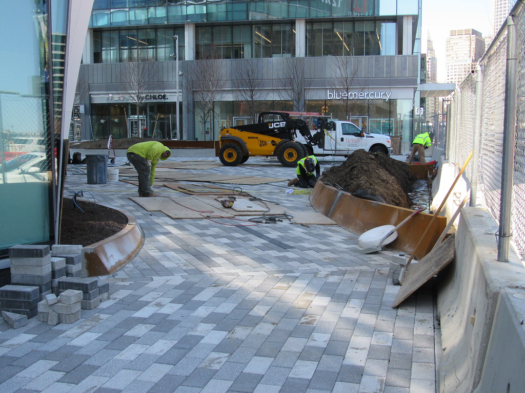
121 Seaport Boulevard | Parcel L2 | Seaport Square

I don't outright disagree with either of you - I think both architecture and time are important. I don't think residents on Newbury Street in 1890 foresaw that their street a century later would be the premier shopping district in the city. Some buildings stayed, some changed, and the character evolved. Even the beautiful buildings of the Back Back went through a period of time in the mid-20th century where they were considered obsolete and rundown at worst, "quaint" at best. So for the buildings of the Seaport to run that same course wouldn't surprise me. And in 50 years, when that happens, it is likely some will be demolished, some altered to a style that will is impossible to predict, or, as some have half-jokingly (or very seriously) mentioned, may even be underwater. And in 100 years, the neighborhood may be largely unrecognizable to us again, just as it is to those who remember it being nothing but parking lots and rail yards. If planes learn to fly without runways, the Seaport could become a glittering district of 1000' towers, and the added FAR would make it economically feasible to demolish these stumpy boxes.

Is what we see today an improvement? To me, I believe it is. It's investment, it's development, and though not perfect, it's a start and will evolve with time. As an Urban Planner I wish the street layout was a little more interesting, a little more intimate, and yes, the buildings a little more creative. But in 50 or 100 years, this neighborhood could undergo a second transformation just as Newbury Street, the North End, and so many other neighborhoods have undergone. It's frustrating that we cannot just build these neighborhoods right-out-of-the-box to be historic and amazing, but that's just how it goes. If we could live to be 200, I think we'd have a more keen understanding of how dramatic an effect time has on a place. Nothing is permanent.

https://drive.google.com/open?id=1MmT22kH_Yv4kC81DnLEU9kxirq9XFJsp

https://drive.google.com/open?id=11ykE9xizI-ZzAZ-ghMTipIJSIUKezP8K

Well said, UD. I appreciate that very thoughtful post.

And I agree that what has been built in the Seaport is a great improvement over the vast parking wasteland that had preceded it.

However, I cannot squint hard enough to go as far to state that it is just as the Back Bay started out. That is not a subjective viewpoint. There are physical-objective differences (i.e. one building per block is something that is not an "opinion"). Hopefully, someday changes will be made at the sidewalk/potential window level to make it more friendly to the human being who is not in the building.

Somehow the analogy of breaking in a new baseball glove comes to mind this spring. The Seaport could use a dose of Linseed oil.
 
Last edited:
I don't think your critiques are unique to the specific developments in the Seaport. I'm not sure if there is any new development that closely resembles and expands upon the styles, motifs, and designs of buildings from long ago. Happy to be proven wrong if I'm the ignorant one here. The closest thing I could think of is the Commonwealth Hotel in Kenmore, and that actually looks a little too Disney-esque to me.

I'm going to interpret your comment about "a glass wall youre not supposed to breach" as having feelings of being unwelcomed. Perhaps that's more of a personal feeling rather than a function of modern architecture or style itself? For example, while no longer true today, I remember as a kid feeling unwelcomed walking by the various doorsteps that line Commonwealth, Marlborough, and Beacon (commercial or otherwise). There was really no good reason to feel that way though.

I think theres a lot of psychology that is ignored by the architects and designers.

For example, we have tons of studies proving the health benefits of trees. And I dont just mean air quality, but mental health. Just seeing trees brightens peoples moods and calms anger. It helps with depression.

I haven't read anything on how glass affects moods, but based on my own personal feelings, I find them to be sterile and cold. They make me think of a doctors office, medical lab, or corporate lobby.

None of those uses make me think "I want to go for a stroll and sit down for an extended lunch".

Part of that may be because in the quantity it is being used in this district, all the glass is just reflecting back more glass and metal.

Personally, I hate the "disney fake" criticism.

USC in Los Angeles recently built a new village and got the same type of critique. Im not saying the Seaport should look like this, but I think it looks great. Its a mixture of dorms and retail like Target

USC_Village_27_706x450.jpg


I love that - - - the USC archways at ground level are akin to the buildings opening their arms to the pedestrians. THAT is a welcoming development. Too many today say "Go Away".
 
One approach that could satisfy both sides would be to not have the developer build out retail facades at all, leaving it totally up to the tenant. This is what they did at 300 Mass Ave in Cambridge. Once tenants (Roxy's, Heartbreak Running, University Stationary) moved in they all built out their spaces with their own different facade materials as they saw fit, preventing the standardized glass look and adding more variety to the street level. Heartbreak running went primarily with glass, but the others didn't. The Harlo in the Fenway also went with this approach, but in the end all three tenants ended up going with similar black-and-grey facades anyway.

This is neither "Disney" nor "generic glass", it's "choose your own (retail) adventure".

The main downside here is that if you don't land a retail tenant right away you're stuck with plywood, and everyone has to agree that that sucks. You also end up with more friction from tenant-to-tenant when one retailer moves out and another wants their old space.
 

Just to add another element to this, while I think grey pavers can look great in some environments, this place is desperately in need of some warmer colors. I know good old red brick is "out" right now, but just imagining this landscape with red/orange/brown makes it so much more appealing.

This is part of the problem with building a neighborhood all at once. Everything follows the current trends and you end up with depressing homogenized blandness. Even the signage is colorless.
 
One approach that could satisfy both sides would be to not have the developer build out retail facades at all, leaving it totally up to the tenant. This is what they did at 300 Mass Ave in Cambridge. Once tenants (Roxy's, Heartbreak Running, University Stationary) moved in they all built out their spaces with their own different facade materials as they saw fit, preventing the standardized glass look and adding more variety to the street level. Heartbreak running went primarily with glass, but the others didn't. The Harlo in the Fenway also went with this approach, but in the end all three tenants ended up going with similar black-and-grey facades anyway.

This is neither "Disney" nor "generic glass", it's "choose your own (retail) adventure".

The main downside here is that if you don't land a retail tenant right away you're stuck with plywood, and everyone has to agree that that sucks. You also end up with more friction from tenant-to-tenant when one retailer moves out and another wants their old space.

Huh, thats actually a really interesting idea. It certainly breaks up the one building problem, and gives the retailers a unique way to market themselves.

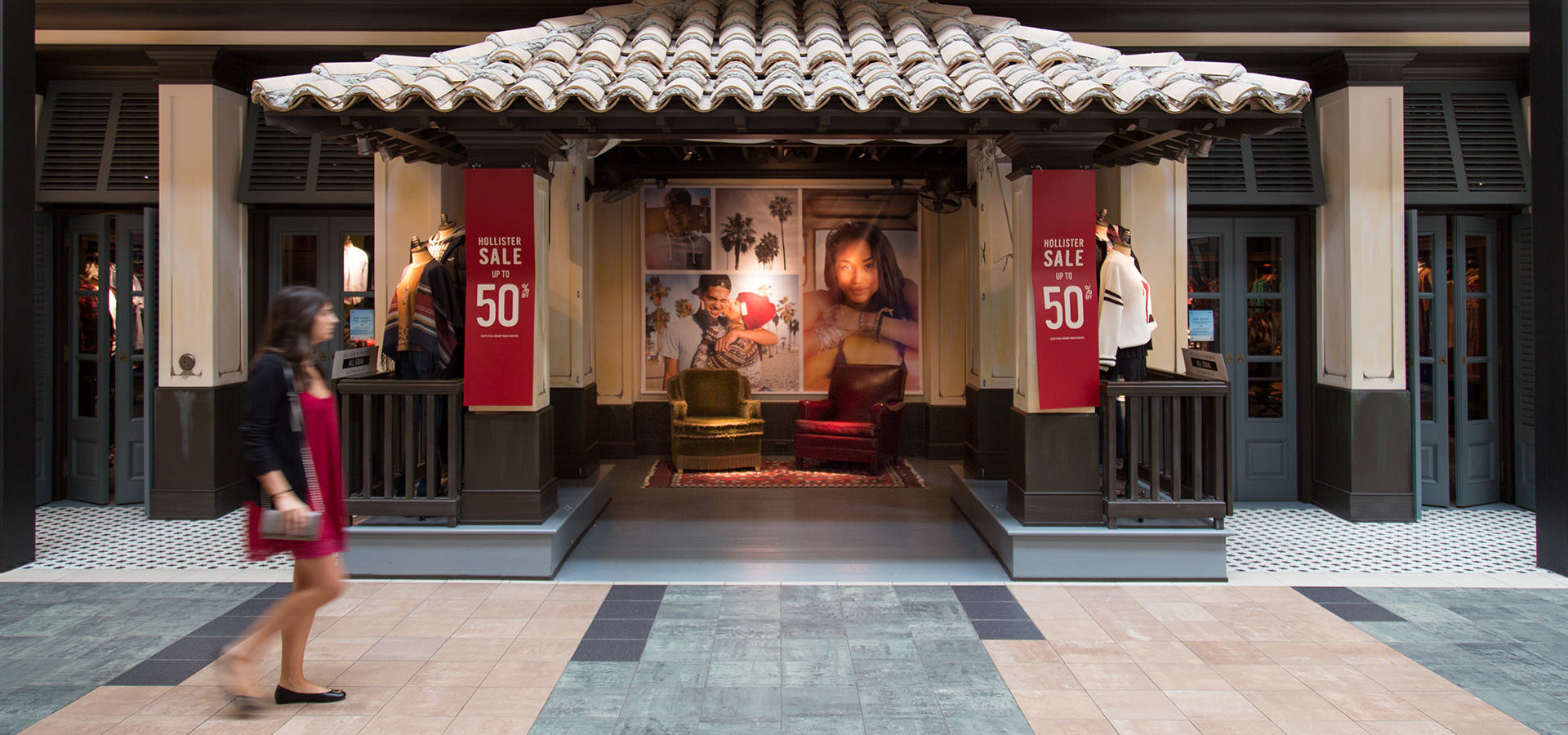
Thats also how regular malls do things - most stores end up looking the same, but a few stores put in their own facade. The most recognizable is:

d_t_c__hollister_1920x900.jpg
 
Brick pavers would have tied this to the rest of town a smidge better.
 
Brick pavers inevitably succumb to frost heaving and become hazards to those with mobility impairments.
 
One approach that could satisfy both sides would be to not have the developer build out retail facades at all, leaving it totally up to the tenant. This is what they did at 300 Mass Ave in Cambridge. Once tenants (Roxy's, Heartbreak Running, University Stationary) moved in they all built out their spaces with their own different facade materials as they saw fit, preventing the standardized glass look and adding more variety to the street level. Heartbreak running went primarily with glass, but the others didn't. The Harlo in the Fenway also went with this approach, but in the end all three tenants ended up going with similar black-and-grey facades anyway.

This is neither "Disney" nor "generic glass", it's "choose your own (retail) adventure".

The main downside here is that if you don't land a retail tenant right away you're stuck with plywood, and everyone has to agree that that sucks. You also end up with more friction from tenant-to-tenant when one retailer moves out and another wants their old space.

Thanks. I went by 300 Mass Ave. Today to snap a pic if just what you mentioned.
I've brought it up in the past when this same discussion comes up.

I'd post, but since I switched back to Flickr after the Photobucket debacle, I haven't figured out how yet.
 
Brick pavers inevitably succumb to frost heaving and become hazards to those with mobility impairments.

I usually can't wait to get off the brick portions of the sidewalks in Kendall in the winter. The ice coats the smooth finish much better, and I've tweaked a hip or knee plenty of times hustling to the train, or just strolling to work in the am.

Pavers can be any color. They need to spice it up, but doesn't have to be brick.
 
Thanks. I went by 300 Mass Ave. Today to snap a pic if just what you mentioned.
I've brought it up in the past when this same discussion comes up.

I'd post, but since I switched back to Flickr after the Photobucket debacle, I haven't figured out how yet.

Generally speaking, I think 300 Mass Ave. is a success story in how this can work. It's a really nice blend of customized storefronts for a diverse blend of businesses.
 
Thanks. I went by 300 Mass Ave. Today to snap a pic if just what you mentioned.
I've brought it up in the past when this same discussion comes up.

I'd post, but since I switched back to Flickr after the Photobucket debacle, I haven't figured out how yet.

That's more or less what I was trying to articulate in my earlier post. There can be flexibility for the tenant to do what they want with the retail front. It's usually easier when tenants have already signed on prior to or during development, but it's doable.
 
Thanks. I went by 300 Mass Ave. Today to snap a pic if just what you mentioned.
I've brought it up in the past when this same discussion comes up.

I'd post, but since I switched back to Flickr after the Photobucket debacle, I haven't figured out how yet.

More built out here.
 
That helps, but the cantilever detracts from it the effect.
 
Agreed, all storefronts at Assembly are unique to the specific tenant
 
You are FINALLY using the right descriptive noun.

Haha finally!


That side of the street came out very nice, but then look around to the other side and the ground level looks good there as well, but I don't get why it looks like the top portion looks like someone painted a bunch of circles on some plywood. I don't get it.
 
That side of the street came out very nice, but then look around to the other side and the ground level looks good there as well, but I don't get why it looks like the top portion looks like someone painted a bunch of circles on some plywood. I don't get it.

Agreed. The AMC building is the ugliest building in the Assembly development (not including the strip mall).

It's not easy to make windowless concrete look good. Other parts of assembly have nice storefronts though.
 

Back
Top