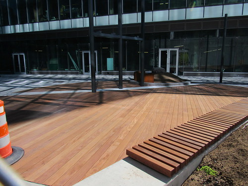
That glass which is copy and pasted from every new building is the problem. It's souless. Theres no texture. It's supposed to be transparent but it just reflects nothing back to you. Tenants cant actually do anything to it. You walk past a restaurant, a bike shop, a 7-11, a staples and they all look the same aside from the small company name on standard font.
I havent been to Outlook Kitchen and Bar, but looking
on Streetview, I see the same glass and repetition. Take out the tables, which is probably the case for 6 months, and you have another dead space.
A better example IMO is the
Daily Catch. Not perfect, but better.
Edit: Youll find the same issues with new development in DC. Look at CityCenter. City did a great job with the streetscape, but the ground floor of the building kills any vibrancy.
https://goo.gl/maps/C2kjSamULeJ2
You have food, boutiques, even a Tesla...walking past it all feels the same. Like a glass wall youre not supposed to breach.
They try to brighten it up...
https://goo.gl/maps/3G8kDWtR8Fs
But wouldnt you rather shop on Newbury Street where every building is unique?

