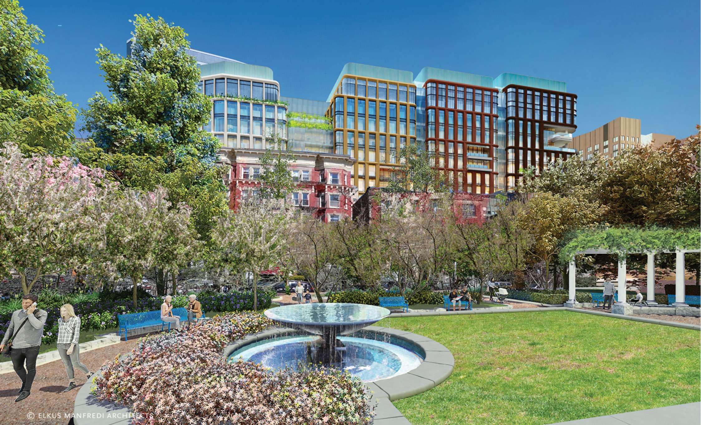
I disagree. The uniform color only emphasizes this landscraper's landscraperness. I find it totally gross.I will say though that the new facadee is definitely an upgrade from before at least. The rainbow was fugly as hell imo. The new facade seems to be brown brick, much better than whatever the hell this was.
https://www.bldup.com/posts/plans-filed-for-500k-sf-office-block-in-fenway
I disagree. The uniform color only emphasizes this landscraper's landscraperness. I find it totally gross.
The former scheme was almost certainly a half-assed riff on Renzo Piano's Central St. Giles in London. I didn't love it, but I thought it was about a thousand times better than this latest design.
Central Saint Giles:
View attachment 42868
View attachment 42869
View attachment 42870
I don't much care for the first view, viewed from the Riverway. The render looks incredibly fat next to the slender Pierce building. It should compliment the other side of the intersection, to appear like a gateway to the next part of the city. It fails miserably at this function.
They've rendered the "Civic Building" as though it will be a branch library...
Agree, but is it really a concession to residents? The residents in this part of town are overwhelmingly young, transient, and renting - exactly the demographic that typically doesn’t demand parking. Seems more likely that they think the lab space will demand higher rents if it comes with parking.I know it's been mentioned before, but it's crazy they're sticking with over 400 parking spaces here. Traffic in the fenway is already absolutely nuts, and double so during games--encouraging more driving there will make it even worse. I'm sure it's a concession to residents worrying about losing more street parking, but it'll just serve to worsen an already bad problem in a neighborhood perfectly set up to be more walkable and bikeable than it currently is.
…will it not be?
I don't much care for the first view, viewed from the Riverway. The render looks incredibly fat next to the slender Pierce building. It should compliment the other side of the intersection, to appear like a gateway to the next part of the city. It fails miserably at this function.
No idea, just thought it was interesting. I didn't dig deep enough in the DPIR to find out.
But if BPL had signed off on it, they would have labeled it "BPL Fenway Branch" and not "Civic Building", no?
Yeah, it’s disappointing that they didn’t go for something more iconic here (not necessarily something taller, just something that announces itself). This intersection has already surpassed Kenmore as the most important square* in the Fenway. It crushes Kenmore in terms of pedestrian activity, commercial space, and residential density. It needs something more interesting than this.
*Side note: this square needs a name. I’m herewith proposing Muddyside Square, and am just going to start calling it that on my own.
Doesn't the Landmark Center on the other side already kind of ruin that concept?
That's not bad, but I think maybe Fenway Square works better. The neighborhood is already described as Fenway/Kenmore. It makes sense for that to be defined as an area between Kenmore Square and a newly christened Fenway Square. It also works with the eponymous D-Line station being right there.What about landmark square? Most squares in Boston just took a store name or local “landmark” and added square to it. The landmark here is.. landmark center, maybe its destiny.