You are using an out of date browser. It may not display this or other websites correctly.
You should upgrade or use an alternative browser.
You should upgrade or use an alternative browser.
401 Park Drive (née Landmark Center) | Fenway
- Thread starter Mike
- Start date
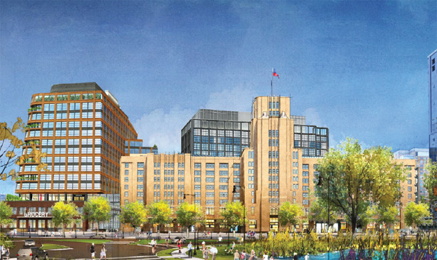
Landmark Center owner wants to add more life-sciences space and a Star Market to expansion project
Samuels & Associates yesterday filed plans with the BPDA for a new 13-story building next to the existing Landmark Center that would include 550,000 square feet of lab and related office space and room for a large new Star Market that would replace the current one on Boylston Street. Read more.
JumboBuc
Senior Member
- Joined
- Jun 26, 2013
- Messages
- 2,661
- Reaction score
- 1,559
NPC (with a bunch of renders):
Landmark Center owner wants to add more life-sciences space and a Star Market to expansion project
Samuels & Associates yesterday filed plans with the BPDA for a new 13-story building next to the existing Landmark Center that would include 550,000 square feet of lab and related office space and room for a large new Star Market that would replace the current one on Boylston Street. Read more.www.universalhub.com
I love the site plan, but the architecture looks very Elkus.
#bancars
Senior Member
- Joined
- Jun 1, 2019
- Messages
- 1,658
- Reaction score
- 6,692
NPC (with a bunch of renders):
View attachment 12646
I love the site plan, but the architecture looks very Elkus.
Love to see all this new development along the Fens but really something needs to be done about those DCR roads. They totally kill the potential of all those walking / cycling paths and various athletic facilities.
BronsonShore
Active Member
- Joined
- Feb 13, 2014
- Messages
- 454
- Reaction score
- 1,350
I hate that they're leaving all that open space between the building and the street. Really hurts the pedestrian experience.
Bananarama
Active Member
- Joined
- Mar 18, 2020
- Messages
- 582
- Reaction score
- 1,172
It's disappointing that neither of these additions to Landmark remotely engage the existing building. They could go on any block in Fenway. Such a cool opportunity being next to arguably one of the most handsome buildings in this part of the city and it's totally ignored.
The space in front of the building marked "drop off" is drawn oddly. Like a parking lot without defined spot?
But I don't really think there's much they could do to effectively move the building forward. Park Dr is steeply sloped there (something their lush rendering from the intersection conveniently ignores) so any of that stuff around the entrance is only really accessible after walking downhill then turning in where Landmark starts. They'd need a split level or multi-level ground floor if the pedestrian access and presence along the street was priority #1 - not happening with a grocery store.
Equilibria
Senior Member
- Joined
- May 6, 2007
- Messages
- 7,083
- Reaction score
- 8,310
It's disappointing that neither of these additions to Landmark remotely engage the existing building. They could go on any block in Fenway. Such a cool opportunity being next to arguably one of the most handsome buildings in this part of the city and it's totally ignored.
I think the point was to not engage it, to cut down on the superblock effect.
Bananarama
Active Member
- Joined
- Mar 18, 2020
- Messages
- 582
- Reaction score
- 1,172
I mean in the architectural expression of the facade and general massing shape. Not a literal connection (although they do abut).I think the point was to not engage it, to cut down on the superblock effect.
You can acknowledge context without creating a superblock.
The sloped wall looks very awkward. I'm not saying it couldn't be done, but it doesn't look fleshed out. Right now it looks quite foreign, next to the very orthogonal original Landmark Center, the new building currently going up, and the Pierce.
- Joined
- Jan 7, 2012
- Messages
- 14,062
- Reaction score
- 22,728
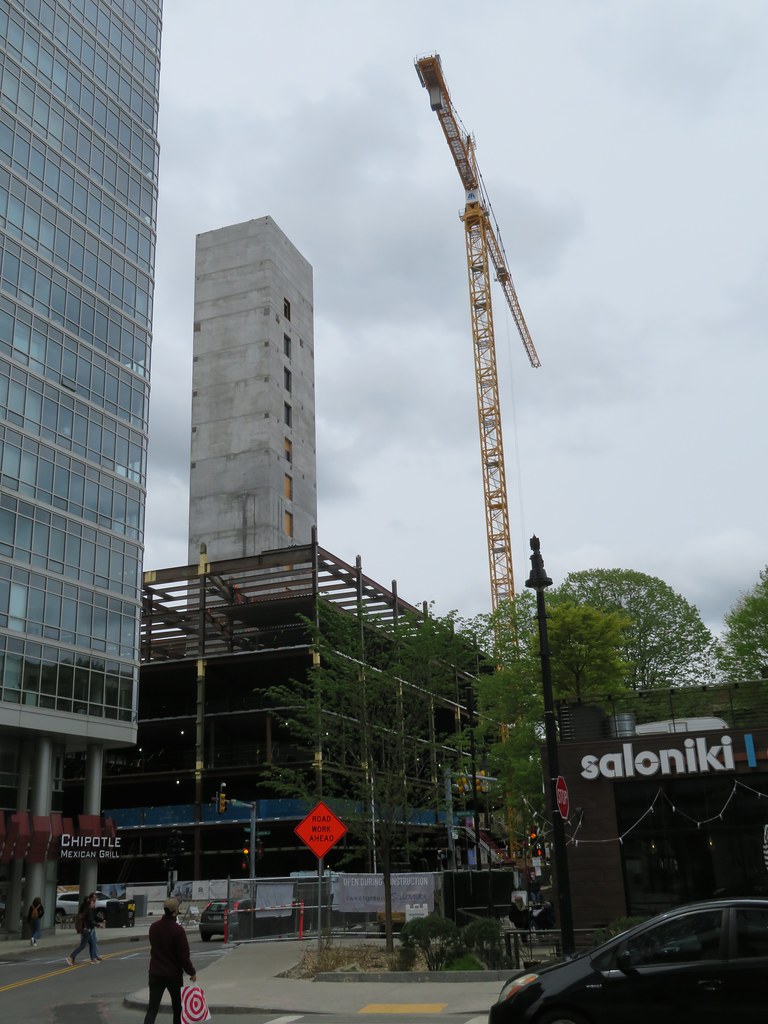 IMG_5961 by Bos Beeline, on Flickr
 IMG_5962 by Bos Beeline, on Flickr
 IMG_5966 by Bos Beeline, on Flickr
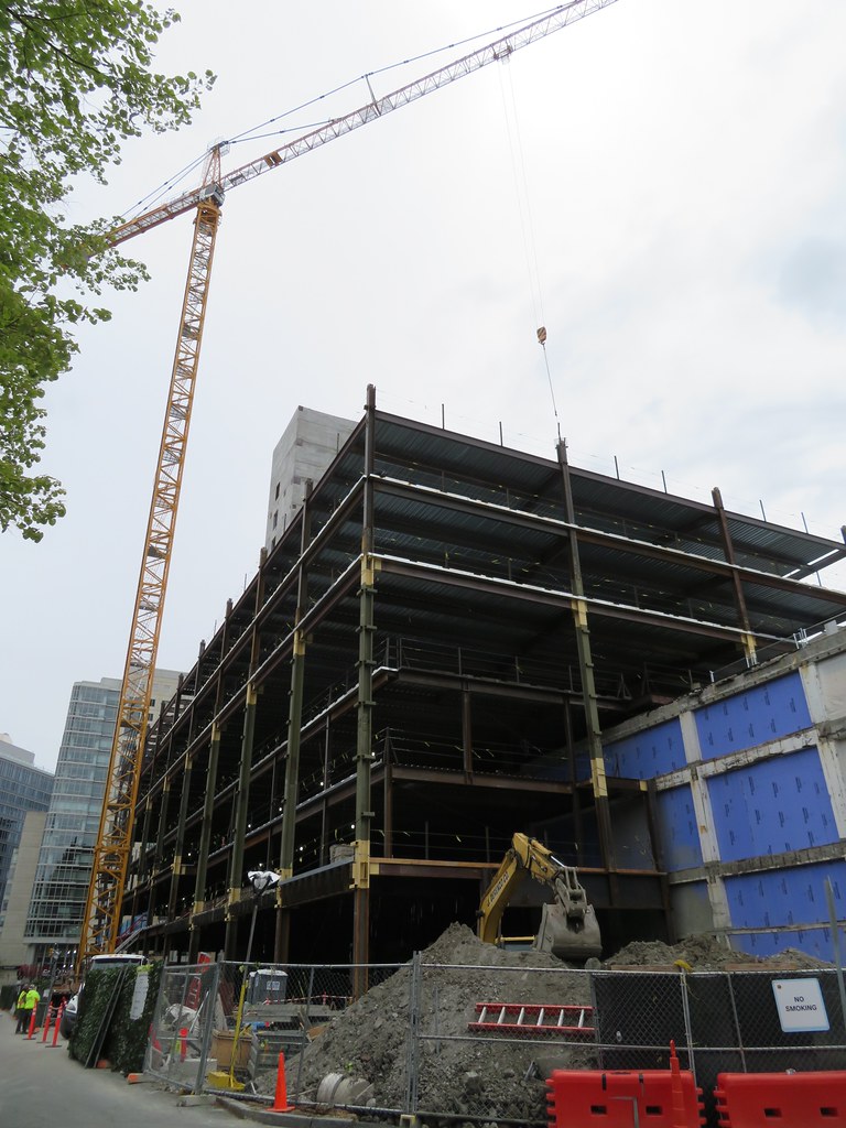 IMG_5969 by Bos Beeline, on Flickr
 IMG_5967 by Bos Beeline, on Flickr
Last edited:
Lots of good upcoming work in that notice:
Landmark Center owner wants to add more life-sciences space and a Star Market to expansion project
Samuels & Associates yesterday filed plans with the BPDA for a new 13-story building next to the existing Landmark Center that would include 550,000 square feet of lab and related office space and room for a large new Star Market that would replace the current one on Boylston Street. Read more.www.universalhub.com
- bike path all the way to Landsdowne
- connection to the Fens, although not sure if it finally snags that last section under the bridge
- Star Market land swap
- FINALLY replacing that eyesore of a gas station
Suffolk 83
Senior Member
- Joined
- Nov 14, 2007
- Messages
- 2,996
- Reaction score
- 2,402
"the company expects increased demand to be handled by the greenline and its new cars" -ok give some money to the T then.
HenryAlan
Senior Member
- Joined
- Dec 15, 2009
- Messages
- 4,184
- Reaction score
- 4,450
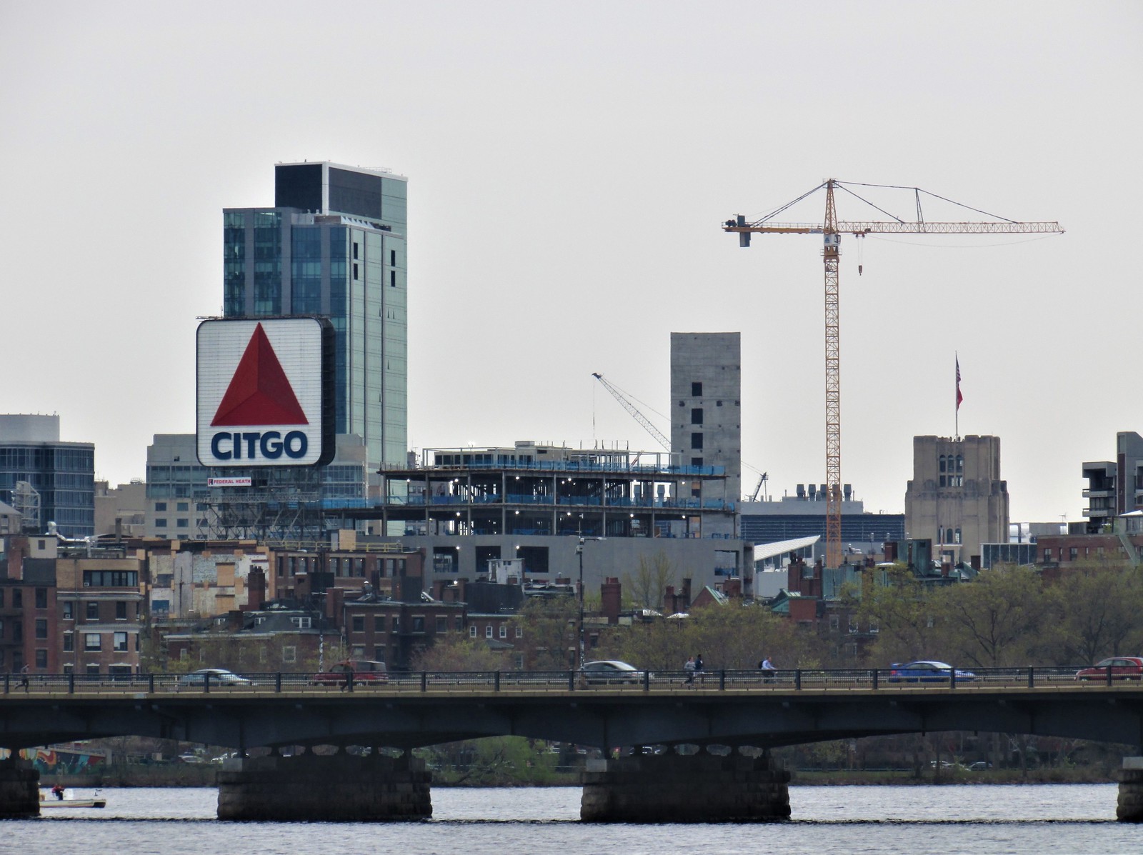
Cool pictures! It's interesting how the narrowed depth of field makes it look like this and a other buildings at the merge of Boylston and Brookline Ave. are right in Kenmore Square. Makes the square area look incredibly dense.
Cool pictures! It's interesting how the narrowed depth of field makes it look like this and a other buildings at the merge of Boylston and Brookline Ave. are right in Kenmore Square. Makes the square area look incredibly dense.
The Boston of today is becoming amazing as it is, no? Isn't the reality better than an optical illusion?
Equilibria
Senior Member
- Joined
- May 6, 2007
- Messages
- 7,083
- Reaction score
- 8,310
Cool pictures! It's interesting how the narrowed depth of field makes it look like this and a other buildings at the merge of Boylston and Brookline Ave. are right in Kenmore Square. Makes the square area look incredibly dense.
It also shows off an even worse side of Kenmore North, I think. That's how your building faces the river? With a blank, grey wall? Can these architects be criminally charged?
It also shows off an even worse side of Kenmore North, I think. That's how your building faces the river? With a blank, grey wall? Can these architects be criminally charged?
Sent me on a google search for what the architect is saying about this. Here's what BU posted on their behalf:
“Our architects, Roger Ferris + Partners, have designed a building that really holds the corner, extending that masonry six-story street wall that you see prevalent across the square,” Provost says.
I'd love to see them say that with a straight face. I suppose they aren't lying though. You will see this prevalent across the square.
Back to this, I was hoping that curve/bulge massing would grow on me. So far, it's not... Hopefully the BCDC can push some actual good change here. (Can't say that with a straight face...)
kingofsheeba
Senior Member
- Joined
- Aug 22, 2013
- Messages
- 1,075
- Reaction score
- 1,403

 IMG_8462
 IMG_8555
 IMG_8562

 IMG_8768
 IMG_8769