89 Elm Street | Port Properties Bayside Phase 1B | Portland

Cosakita18

Senior Member
Joined
Jun 14, 2016
Messages
1,052
Reaction score
2,050
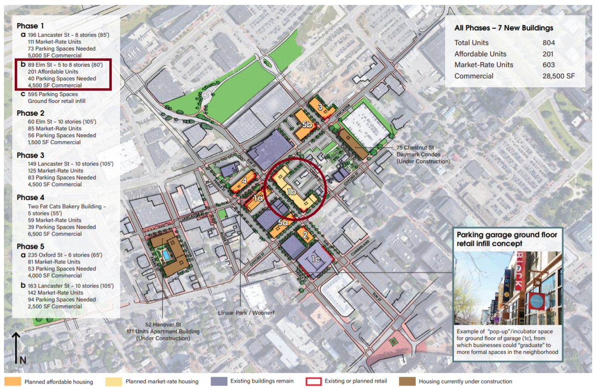
It seems that a Site Plan application has been filed for Phase 1B. (The block between Elm, Lancaster and Oxford Streets) No information or renderings yet.

PL-002403-2023 (portlandmaine.gov)

It's a bit odd that they would file a site plan application before their overall Master Plan has even had its first workshop.
1678707299112.png
 
My hunch is that they're facing a deadline to apply for this year's competitive tax credit financing from Maine Housing. Applications that have their site plan approvals in hand get extra points in the scoring process.
 
During this week's workshop there was lots of discussion, concern and gaming out how consolidating all affordable units into one building could play out in the future. I'm wondering if they're trying to build this first to test out if it's possible to put the IZ units for the entire MDP in one building - the answer to this will inform design of all buildings in the MDP.
 
I think I remember them saying that IZ units can be "off site" within limitations - within 1500ft - and the whole development is within 1500ft. But there are other limitations - unclear from the meeting what those are. Another main concern dealt with what happens if one of the building is sold in the future - or the an undeveloped lot is sold - how are the IZ units calculated.
 
That's a large building and appears to be similar to The Armature in size and scope. Now that the Aucosisco, Longfellow Hotel, Maine Med, and Hobson Landing projects are wrapping up, HOPEFULLY we'll have this, Herald Square, Maine Public Broadcasting HQ, Commercial and Casco Street residential buildings, Time & Temperature building renovation, Portland Square, PMA addition and the Portland Company projects to keep us entertained for a while. Did I miss anything?
 
Last edited:
That view from the east side, showing the two wings, reminds me of Portland High School! Just need to find a 200 year old brick building to hook on in the middle.

Also: I just realized that the color codes in the overall map at the top of the thread might be reversed. This building is shown in the "Market Rate" color, and the others are all "Affordable," but the text says the opposite.

Finally: in order to build affordable housing, they're taking out the Avesta headquarters? Oh the irony. Do they own the Salvation Army building too?

Oops... that's Oxford, not Cumberland on the south side. My bad.
 
Last edited:
That's a large building and appears to be similar to The Armature in size and scope. Now that the Aucosisco, Longfellow Hotel, Maine Med, and Hobson Landing projects are wrapping up, HOPEFULLY we'll have this, Herald Square, Maine Public Broadcasting HQ, Commercial and Casco Street residential buildings, Time & Temperature building renovation, Portland Square, PMA addition and the Portland Company projects to keep us entertained for a while. Did I miss anything?
I believe the Roux Institute campus is scheduled to start construction next year.
 
On the upside, that section of Elm Street will no longer have that barren urban wasteland feel to it anymore and the influx of new residents will continue to add vitally to a long neglected part of downtown. (y)
 
Can we please make the exterior more interesting? I think Portland is getting tired of this design.
But it's in my favorite color palette, Soviet Bloc Greige! Architects are supposed to be creative beings but a good portion of them are just spitting out cookie cutter crap. The planning board needs to step up and demand better. You will not get anything more attractive unless you mandate it.
 
But it's in my favorite color palette, Soviet Bloc Greige! Architects are supposed to be creative beings but a good portion of them are just spitting out cookie cutter crap. The planning board needs to step up and demand better. You will not get anything more attractive unless you mandate it.
Nothing like making Portland look like an Eastern Europe that didn't age well ....
 
But it's in my favorite color palette, Soviet Bloc Greige! Architects are supposed to be creative beings but a good portion of them are just spitting out cookie cutter crap. The planning board needs to step up and demand better. You will not get anything more attractive unless you mandate it.
Architectual embellishment is generally expensive and when developers are squeezed by high construction costs, higher interest rates, restrictive zoning and onerous housing regulations, the only way to make projects like this pencil out is to cut corners where corners can be cut.

I tend to take a "beggars can't be choosers" philosophy. Portland DESPERATELY needs market rate and affordable housing. I'm ok with letting aesthetics take a backseat. (Although I really don't think this design looks bad at all. At worst i'd describe it as "unremarkable" but definitely not ugly)
 
Last edited:
And just about every multi story residential project under construction or recently built in cities all across the country look similar to this. Portland is not exempt from average looking design and if this building was planned for the center of downtown, Old Port or the waterfront I'd have more issues with it.
 
Architectual embellishment is generally expensive and when developers are squeezed by high construction costs, higher interest rates, restrictive zoning and onerous housing regulations, the only way to make projects like this pencil out is to cut corners where corners can be cut.

I tend to take a "beggars can't be choosers" philosophy. Portland DESPERATELY needs market rate and affordable housing. I'm ok with letting aesthetics take a backseat. (Although I really don't think this design looks bad at all. At worst i'd describe it as "unremarkable" but definitely not ugly)
Too bad we tore down all those more interesting and beautiful buildings that we can't afford to rebuild, then. This goes for pretty much everywhere across the country.
 
Welcome to Portland Maine, where we have the dullest and most depressing architecture in New England, but we will complain about having a beautiful cityscape. Don't get us started on constructing a high-rise over 7 stories!
 
But it's in my favorite color palette, Soviet Bloc Greige! Architects are supposed to be creative beings but a good portion of them are just spitting out cookie cutter crap. The planning board needs to step up and demand better. You will not get anything more attractive unless you mandate it.

Speaking of creativity, I would love to read a critique that doesn't resort to Red Scare cliches while complaining about affordable housing.

In fairness, though, it's pretty funny if you think that the solution to this imaginary problem is to have a government committee mandate the "correct" form of architecture
 

Back
Top