You are using an out of date browser. It may not display this or other websites correctly.
You should upgrade or use an alternative browser.
You should upgrade or use an alternative browser.
Assembly Innovation Park | 5 Middlesex Ave | Somerville
- Thread starter tysmith95
- Start date
Boston02124
Senior Member
- Joined
- Sep 6, 2007
- Messages
- 6,893
- Reaction score
- 6,639
stick n move
Superstar
- Joined
- Oct 14, 2009
- Messages
- 12,096
- Reaction score
- 18,875
Heres the renders https://www.somervillebydesign.com/wp-content/uploads/2018/10/H3-Compiled-Arch-Renderings.pdf
the “townhouses” are.. interesting.
the “townhouses” are.. interesting.
Bananarama
Active Member
- Joined
- Mar 18, 2020
- Messages
- 582
- Reaction score
- 1,173
Heres the renders https://www.somervillebydesign.com/wp-content/uploads/2018/10/H3-Compiled-Arch-Renderings.pdf
the “townhouses” are.. interesting.
Do developers think people are convinced by the 10" deep setbacks and flimsy cornices, using the same gridded casement window, like this is a true built-up organic neighborhood? Definitely one of the worst trends.
This could be anywhere.
Do developers think
Not usually
JumboBuc
Senior Member
- Joined
- Jun 26, 2013
- Messages
- 2,661
- Reaction score
- 1,559
Small scale 5-over-1 developers think and know, they just don't care. In a rental market this tight, exterior aesthetics for any given building just doesn't matter. So design is done to 1) minimize cost and 2) gain regulatory approval. The cheap design with silly gimmicks you see here check both boxes. It's unfortunate, but that's where we are.Do developers think people are convinced by the 10" deep setbacks and flimsy cornices, using the same gridded casement window, like this is a true built-up organic neighborhood? Definitely one of the worst trends.
This could be anywhere.
But while aesthetics for any given building doesn't really matter, aesthetics for a neighborhood does matter on a more macro scale. People's willingness to pay isn't really affected by living in the lamest looking building in the neighborhood, but willingness-to-pay is affected by living in a lame looking neighborhood. Exterior aesthetics are something of an externality in this sense, whereby on the aggregate they affect the people not living in the building more than the people living in it.
The original Assembly Row buildings got a lot of flack on this forum for their "Disney" look, but the XMBLY designs really show just how much better the FRIT architecture just up the street is. One of the reasons for this is that FRIT does care how its buildings look, because it's building up (and selling) the neighborhood more than it is the individual buildings. So FRIT, to some extent, is internalizing their externalities. The XMBLY developer is basically selling access to the neighborhood and amenities FRIT has developed, so they're happy to free ride on FRIT's investments but not invest in the aesthetics of their own building.
This looks remarkably cheaper than the rest of Assembly. wowHeres the renders https://www.somervillebydesign.com/wp-content/uploads/2018/10/H3-Compiled-Arch-Renderings.pdf
the “townhouses” are.. interesting.
This is the key- if supply can catch up a bit with demand, pricing will better reflect quality instead of just availability. I really like that this neighborhood now has a secondary owner to compete with on price and services. Add in a few more towers like what's proposed at One Mystic and we might have ourselves an actual market-based neighborhood.In a rental market this tight, exterior aesthetics for any given building just doesn't matter.
As for the townhouses... They don't even fit the rest of the XMBLY block style- no idea what happened there. They could have at least tried to blend like at Northpoint.
42°22'17.1"N 71°04'29.4"W · 42.371428, -71.074824
 maps.app.goo.gl
Last edited:
Boston02124
Senior Member
- Joined
- Sep 6, 2007
- Messages
- 6,893
- Reaction score
- 6,639
stick n move
Superstar
- Joined
- Oct 14, 2009
- Messages
- 12,096
- Reaction score
- 18,875
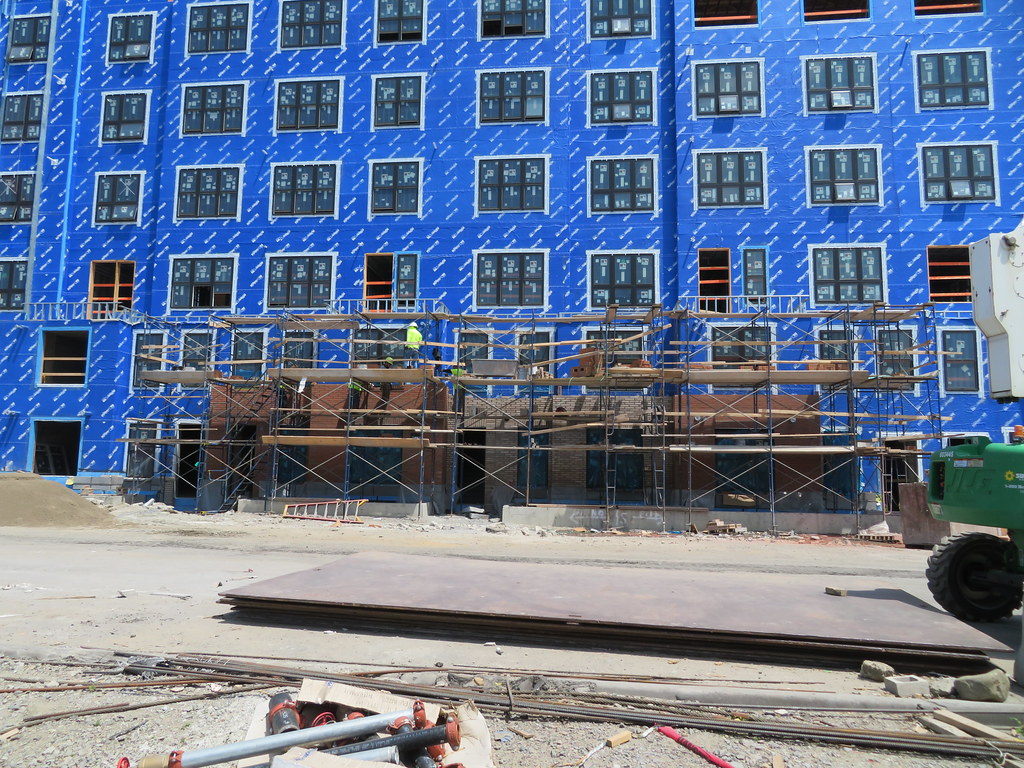
I'm curious, since when did 5 over 1's become 6 over 1's and then become 6 over 2's? This is 8 stories, mostly made of wood. We used to stop at 6.
It appears to be 5 over 3, where the first 3 floors are concrete instead of steel. Not sure on the regulations there with concrete vs steel but its still only 5 wood floors.
- Joined
- Jan 7, 2012
- Messages
- 14,062
- Reaction score
- 22,731
 IMG_7023 by Bos Beeline, on Flickr
 IMG_7034 by Bos Beeline, on Flickr
 IMG_7039 by Bos Beeline, on Flickr
 IMG_7035 by Bos Beeline, on Flickr
 IMG_7045 by Bos Beeline, on Flickr
 IMG_7048 by Bos Beeline, on Flickr
 IMG_7049 by Bos Beeline, on Flickr
 IMG_7051 by Bos Beeline, on Flickr
 IMG_7054 by Bos Beeline, on Flickr
 IMG_7068 by Bos Beeline, on Flickr
Czervik.Construction
Senior Member
- Joined
- Apr 15, 2013
- Messages
- 1,932
- Reaction score
- 1,162
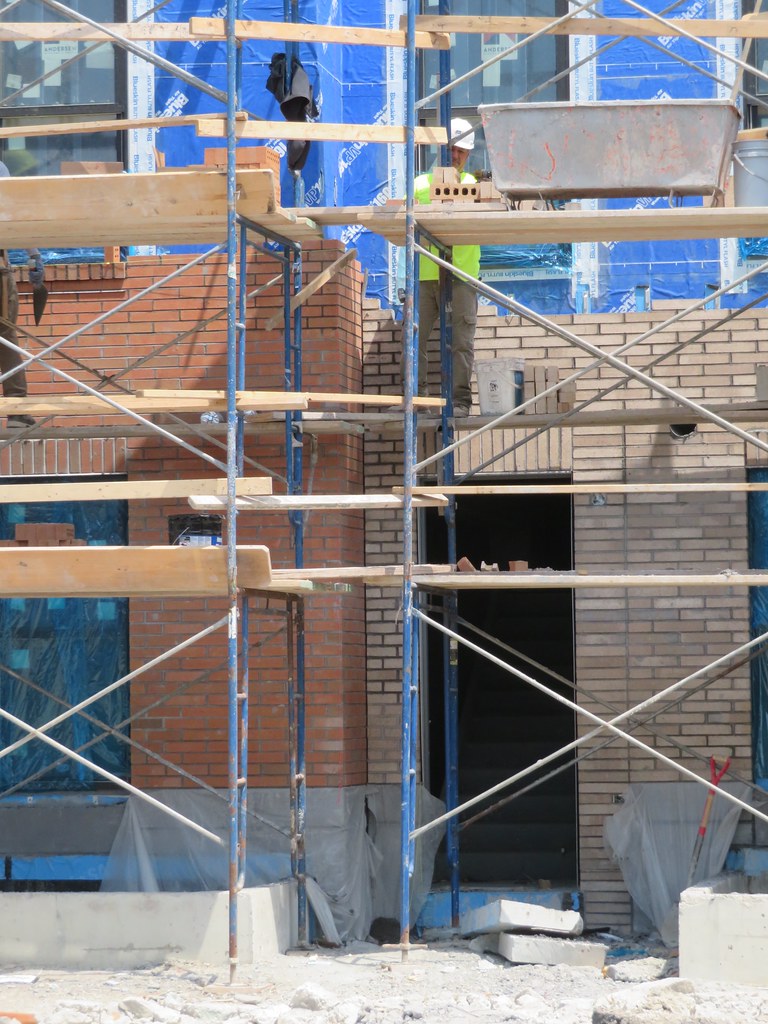
I just noticed in the middle of all those pics that they are hand-laying the brick. Kudos to them.
How much more does that cost vs. precast panels?
How much more does that cost vs. precast panels?
F-Line to Dudley
Senior Member
- Joined
- Nov 2, 2010
- Messages
- 9,553
- Reaction score
- 10,421
I'd guess a little bit but not a lot more on labor, a little bit but not a lot less on materials, and generally canceling out in the end.I just noticed in the middle of all those pics that they are hand-laying the brick. Kudos to them.
How much more does that cost vs. precast panels?
I don't think current panel-overdosing cladding fads are necessarily because there's been some no-return tipping point crossed in the last decade re: the relative costs. It's probably more that the trendy fad-chasers always gonna chase teh trendy fads straight into the ground, then get bored and chase something else into the ground. Brick has been on an almost neverending ebb-and-flow cycle for the last 100 years as a result.
I too applaud them for not wanting to be repulsed by the banality of their own creation 10 years hence. It's a rare trait these days.

 IMG_8476
