You are using an out of date browser. It may not display this or other websites correctly.
You should upgrade or use an alternative browser.
You should upgrade or use an alternative browser.
Boston College Master Plan
- Thread starter palindrome
- Start date
Life Coach Mike
Active Member
- Joined
- Aug 26, 2019
- Messages
- 317
- Reaction score
- 481
The O'Neill makes no pretense. It's pride is inside among the stacks and reading rooms. It is a bastion for research on the slope. It doesn't pretend to be any thing other than it is. I like the earliest iterations of Gothic at BC, but the later bastardizations IMO are really terrible, trite, and trying too hard to achieve a kind of over-scaled, single architectural blend. We're past the stage when libraries were designed from ecclesiastical architectural elements...even HH Richardson used the church as a model for many of his libraries (see his first, Woburn Public Library), with central naves, side chapels (book alcoves), transepts, apses and even leaded or stained glass. One of the reasons why the BPL is so wonderful is that it takes its cue from the Italian Renaissance palazzo, making sense of it with a central court and arranging rooms around it according to their individual purpose. The same is true of the O'Neill, not so much a palazzo as a bastion, as if to say, "Enjoy all the fake Gothic surrounding you, but know that I am a place for serious business where your status will be stripped down to the quality of your intellectual inquiry." Even Harvard began this way, housing itself in no-nonsense contemporary architecture...that is until pseudo-Georgian took control in the early 20th C along with the fascinatingly "churchy" Memorial Hall. At least Widener Library give off the same vibe as O'Neill. Completely different styles, but that front staircase and monumental columns communicate the same challenge as does the O'Neill's Brutalism/International style.What is it about the "brutalism" (apparently it is actually in the 'International Style', but, yes, it does look 'brutal' to me) of O'Neill that you Like?
- Joined
- Jan 7, 2012
- Messages
- 14,062
- Reaction score
- 22,726
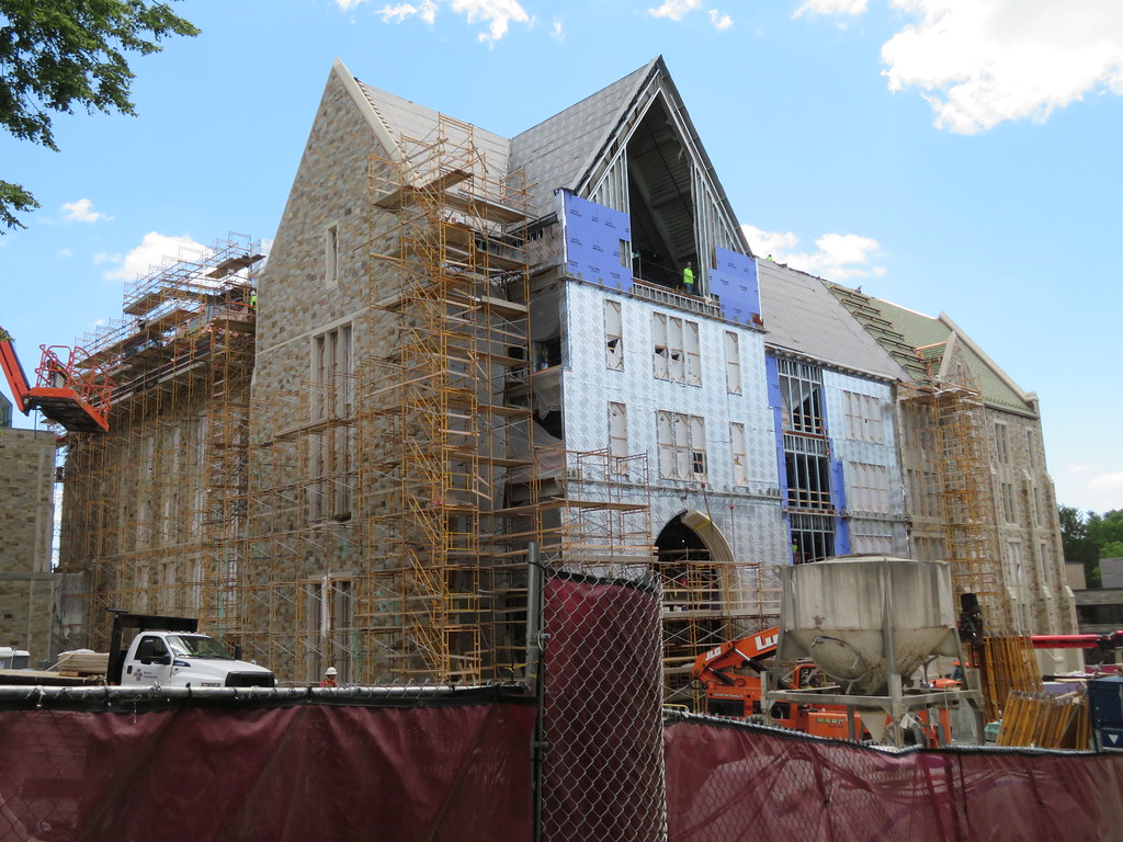 IMG_7089 by Bos Beeline, on Flickr
 IMG_7086 by Bos Beeline, on Flickr
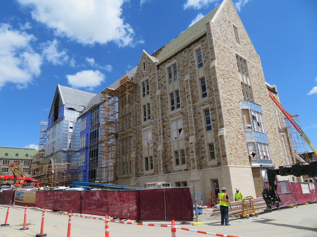 IMG_7096 by Bos Beeline, on Flickr
 IMG_7102 by Bos Beeline, on Flickr
 IMG_7101 by Bos Beeline, on Flickr
 IMG_7104 by Bos Beeline, on Flickr
 IMG_7109 by Bos Beeline, on Flickr
- Joined
- Jan 7, 2012
- Messages
- 14,062
- Reaction score
- 22,726
 IMG_7116 by Bos Beeline, on Flickr
 IMG_7118 by Bos Beeline, on Flickr
 IMG_7119 by Bos Beeline, on Flickr
 IMG_7120 by Bos Beeline, on Flickr
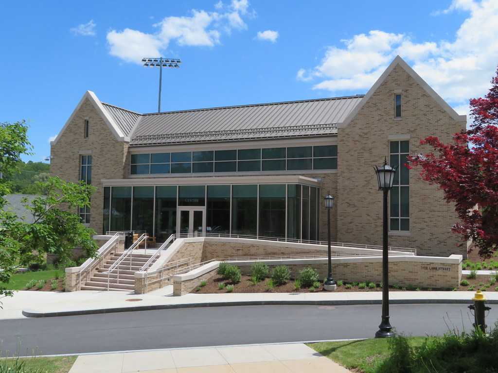 IMG_7122 by Bos Beeline, on Flickr
 IMG_7123 by Bos Beeline, on Flickr
 IMG_7127 by Bos Beeline, on Flickr
 IMG_7124 by Bos Beeline, on Flickr
 IMG_7127 by Bos Beeline, on Flickr
Czervik.Construction
Senior Member
- Joined
- Apr 15, 2013
- Messages
- 1,932
- Reaction score
- 1,162
The BC modern gothic whatever is really bizarre. Why don't they just cut the cord and build modern stuff. The old quad with Gasson & Fulton Hall, etc. is fantastic. No reason why this weirdness has to spread all over. Imagine how the ISEC at NU would look nestled in along with all that old gothic stuff.
Equilibria
Senior Member
- Joined
- May 6, 2007
- Messages
- 7,080
- Reaction score
- 8,304
The BC modern gothic whatever is really bizarre. Why don't they just cut the cord and build modern stuff. The old quad with Gasson & Fulton Hall, etc. is fantastic. No reason why this weirdness has to spread all over. Imagine how the ISEC at NU would look nestled in along with all that old gothic stuff.
Because as awkward as this is, most modern architecture at universities is far, far worse.
I think humanity figured out how to design beautiful buildings by World War II. It's been downhill since, on the balance.
- Joined
- Jan 7, 2012
- Messages
- 14,062
- Reaction score
- 22,726
 IMG_7112 by Bos Beeline, on Flickr
 IMG_7114 by Bos Beeline, on Flickr
 IMG_7111 by Bos Beeline, on Flickr
 IMG_7082 by Bos Beeline, on Flickr
 IMG_7080 by Bos Beeline, on Flickr
stellarfun
Senior Member
- Joined
- Dec 28, 2006
- Messages
- 5,711
- Reaction score
- 1,544
The first set of photos is the Schiller Institute for Science and Society. The second set is the Frates Center in Brighton, on the grounds of the former St. John's Seminary that BC acquired so the Archdiocese could pay the claims of victims of pedophile priests. I believe the third set is of the green space created by demolishing the old student recreation center, the Flynn recreation Complex, after the new center, the Margaret Connell Recreation Center, was built. Connell is just beyond the tennis courts.
I had not realized how big the Brighton property is until I took a Google drive through the campus.
I had not realized how big the Brighton property is until I took a Google drive through the campus.
Equilibria
Senior Member
- Joined
- May 6, 2007
- Messages
- 7,080
- Reaction score
- 8,304
PPT on proposed renovations to Conte Forum: https://bpda.box.com/s/sas4fqtcij22i0beuayys30k1pfb5r11
I think humanity figured out how to design beautiful buildings by World War II.
Yes, and 80% of what's come since then has been a willful, spiteful unlearning.
- Joined
- Jan 7, 2012
- Messages
- 14,062
- Reaction score
- 22,726
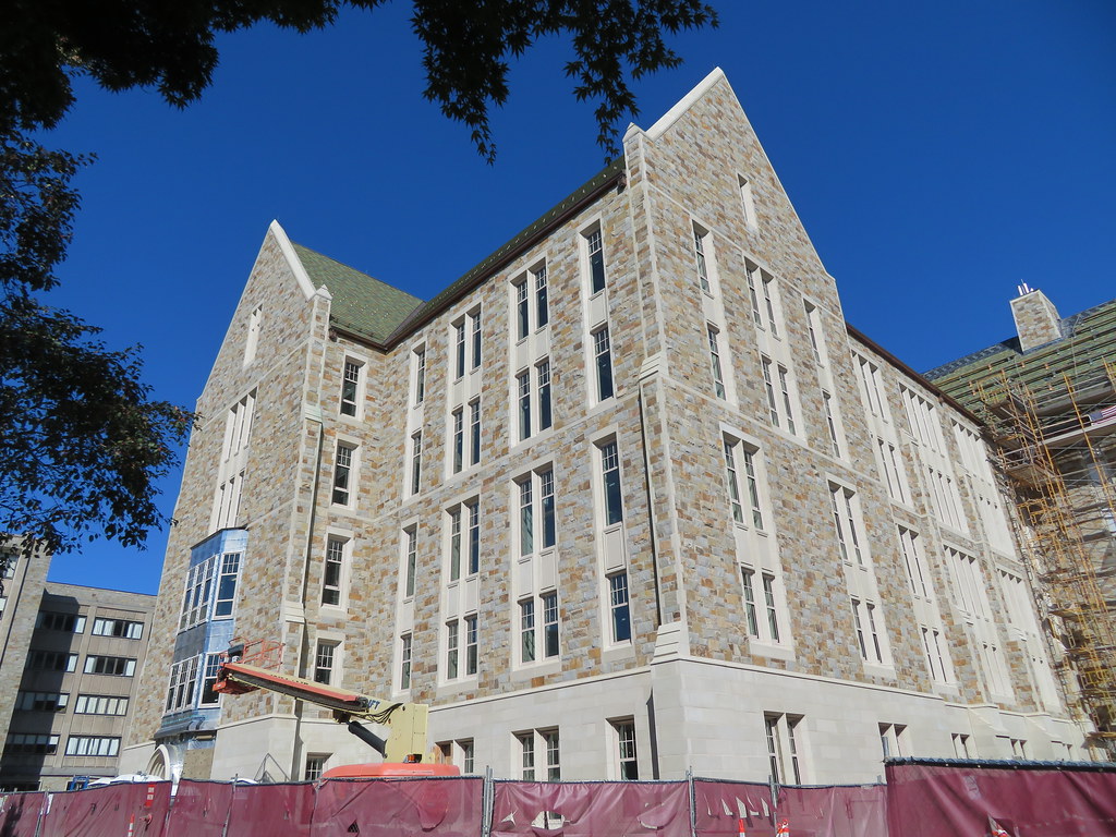 IMG_4150 by Bos Beeline, on Flickr
 IMG_4152 by Bos Beeline, on Flickr
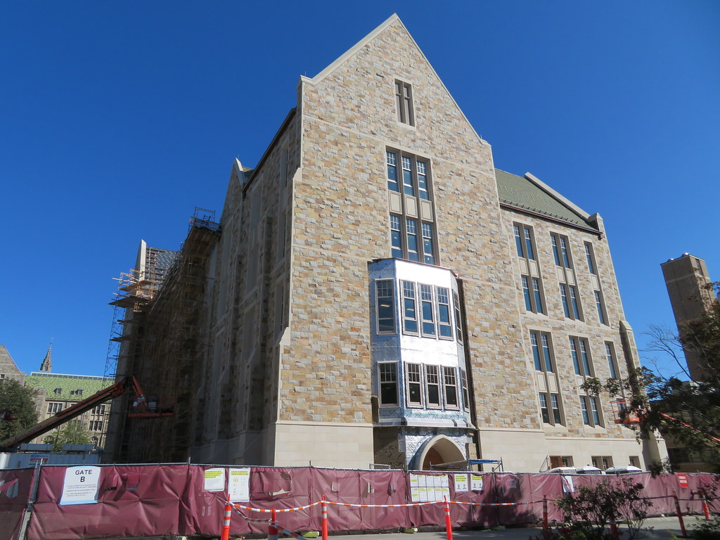 IMG_4155 by Bos Beeline, on Flickr
 IMG_4157 by Bos Beeline, on Flickr
 IMG_4160 by Bos Beeline, on Flickr
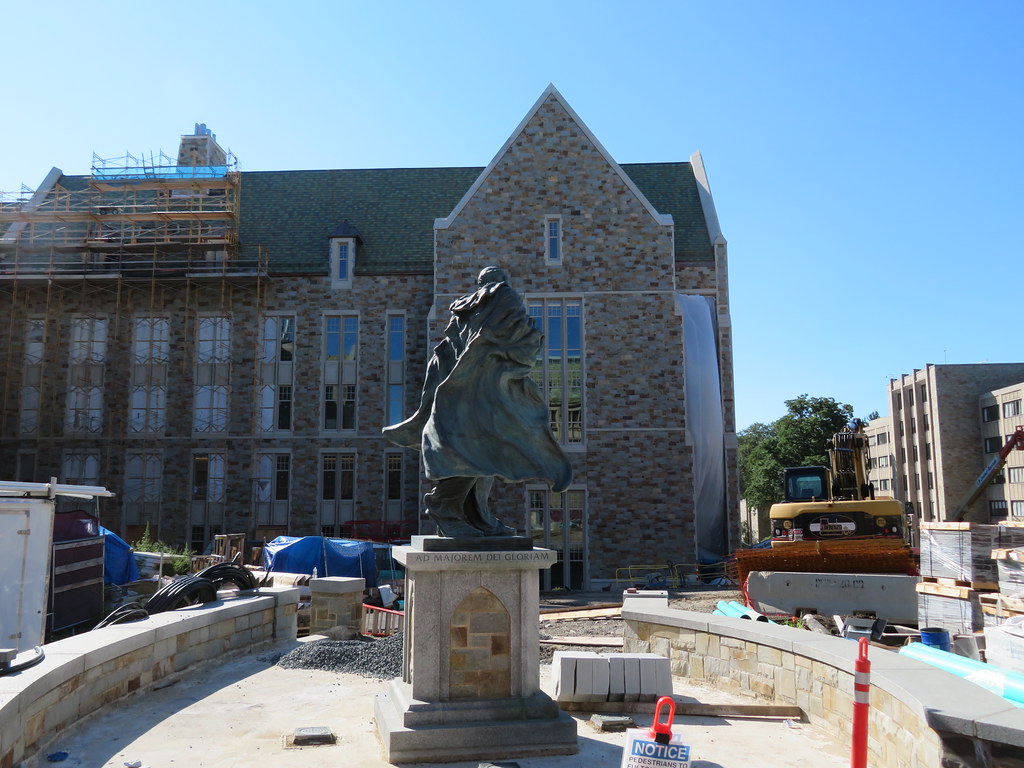 IMG_4166 by Bos Beeline, on Flickr
- Joined
- Jan 7, 2012
- Messages
- 14,062
- Reaction score
- 22,726
 IMG_9633 by Bos Beeline, on Flickr
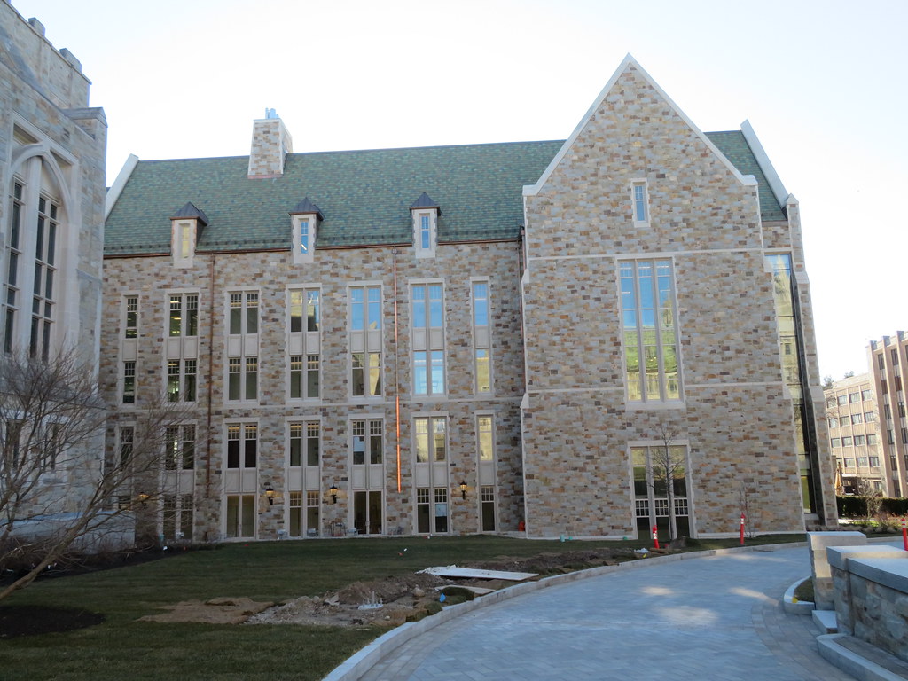 IMG_9635 by Bos Beeline, on Flickr
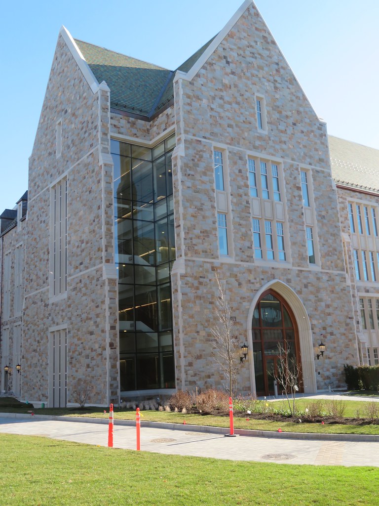 IMG_9636 by Bos Beeline, on Flickr
 IMG_9637 by Bos Beeline, on Flickr
 IMG_9640 by Bos Beeline, on Flickr
 IMG_9643 by Bos Beeline, on Flickr
stick n move
Superstar
- Joined
- Oct 14, 2009
- Messages
- 12,066
- Reaction score
- 18,807
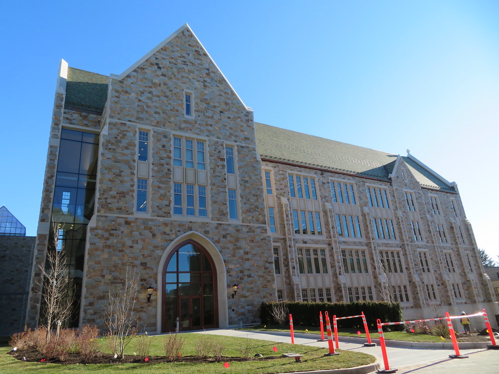
Looks like a pretty decent example of collegiate gothic.
- Joined
- Jan 7, 2012
- Messages
- 14,062
- Reaction score
- 22,726
 IMG_9648 by Bos Beeline, on Flickr
 IMG_9649 by Bos Beeline, on Flickr
 IMG_9652 by Bos Beeline, on Flickr
Looks like a pretty decent example of collegiate gothic.
The criticisms of this seem valid. For all the effort put in to this style, it comes back a bit plain and basic.
stick n move
Superstar
- Joined
- Oct 14, 2009
- Messages
- 12,066
- Reaction score
- 18,807
I think its ok for what it is. There definitely is a lot of possibility these days with high quality precast.
The new robert stern additions at yale are precast and look great imo.
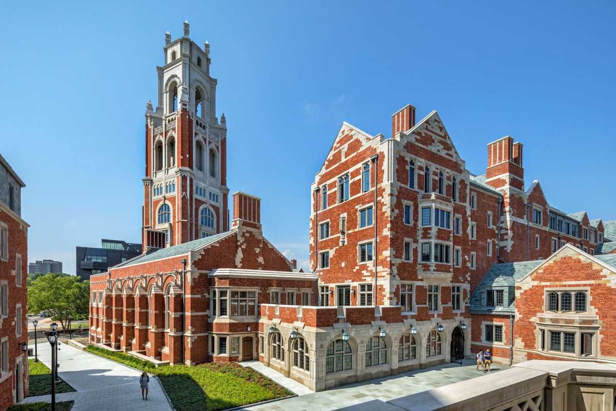
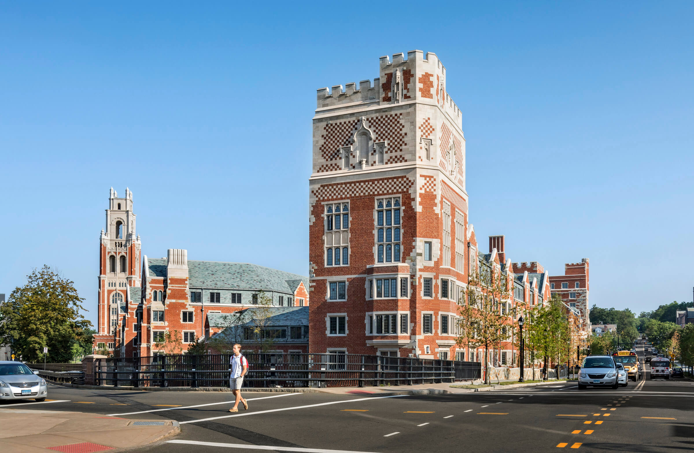
The new robert stern additions at yale are precast and look great imo.


IMG_9633 by Bos Beeline, on Flickr
IMG_9635 by Bos Beeline, on Flickr
IMG_9636 by Bos Beeline, on Flickr
IMG_9637 by Bos Beeline, on Flickr
IMG_9640 by Bos Beeline, on Flickr
IMG_9643 by Bos Beeline, on Flickr
Desert Camo?
It's pretty good. Certainly not at the level of the Yale addition shown above (or of Princeton's Whitman College, a 2007 Collegiate Gothic addition). But reams above the one-dimensional college modernism that predominates today (see Princeton's most recent construction, New College East and West, much of which looks like postwar English council estates).
I prefer BC's aesthetic to that of Yale, it's more reflective of America's penchant for mixing styles. Yale looks like Hampton Court as built by tacky new money, and while I love RAMS, their recent additions only add to the flip flops and caviar vibe.
