Equilibria
Senior Member
- Joined
- May 6, 2007
- Messages
- 7,083
- Reaction score
- 8,310
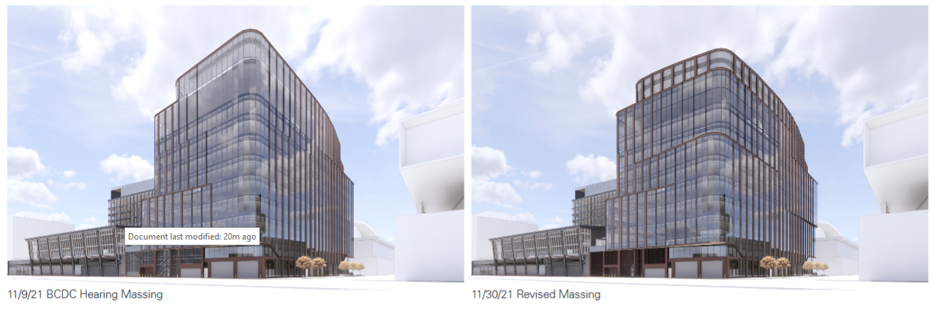
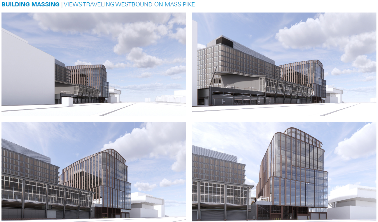
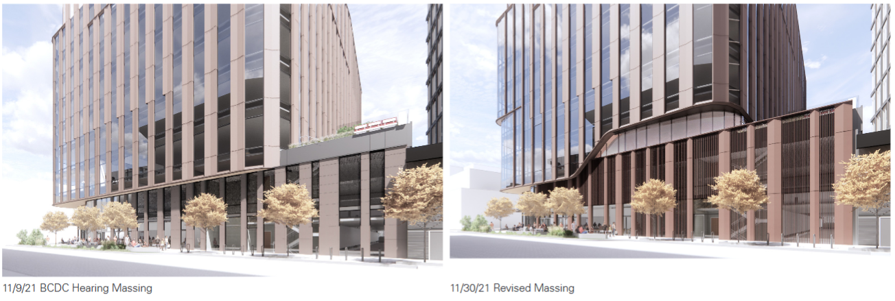
BCDC for 60 Guest: https://bpda.app.box.com/s/9fyedotb2y8zv690nw0b98y821ush4l7
Changes here all seem to be for the best.


Changes here all seem to be for the best.

 IMG_9688
 IMG_9690
 IMG_9692
 IMG_9694
 IMG_9695
 IMG_0811
 IMG_0812
 IMG_0816
 IMG_0818
 IMG_0820
 IMG_0823
 IMG_0822
 IMG_0825
 IMG_0832
 IMG_2919
 IMG_2921
 IMG_2922
 IMG_2923
 IMG_2927