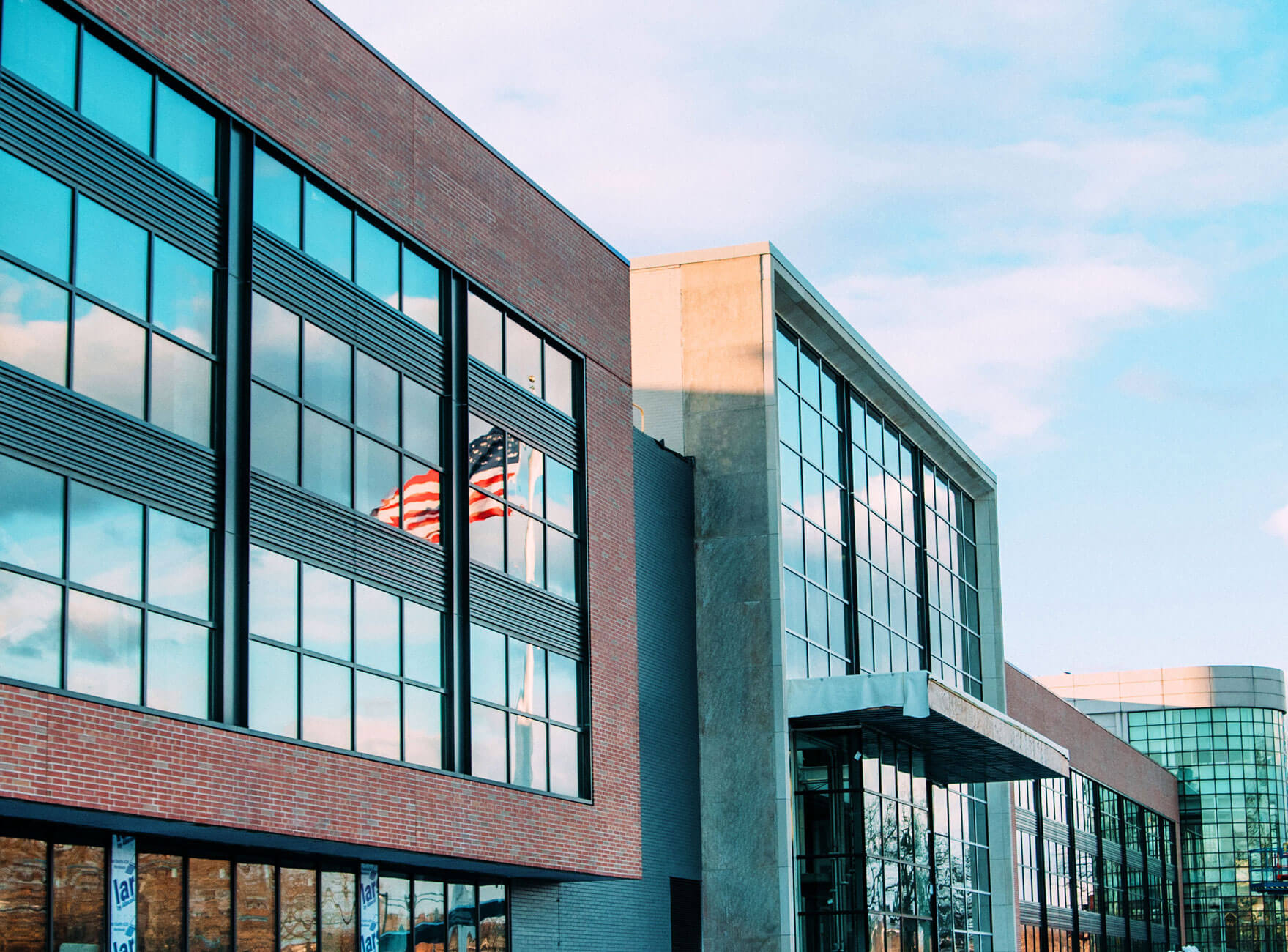
I've read many comments on aB about where suburban office park designs belong. The first designs are more suburban, unobtrusive and functional, something a Burlington 2030 committee would love. The new designs are much more reflective of Brighton as a growing part of Boston, and as test cases for future bold designs around it.
HarvardP -- much of what you will see here in AB is about context and precedence
You need to look at the history of suburban office parks in Greater Boston which were derived from suburban industrial parks in Greater Boston -- essentially where they began:
Industrial Parks began when the limited access incarnation of Rt-128 opened Post WWII which allowed old and new companies [e.g. Raytheon, Sylvania] to build modern industrial buildings on virgin territory [OK farmland]
The key characteristic of these buildings was large footprints and typically one or two floors in a roughly square shape -- to optimize material handling and machine layout over the traditional urban factories [e.g. Waltham Watch] which had been organized around natural light and line shafts for motive power [the ultimate incarnation being the textile mills in Lowell and Lawrence. Rt-128 began to sprout industrial parks which all mostly looked alike -- a bunch of individual factories surrounded by parking on a rough grid of internal streets connected by one or two entrance streets to the basic town road network -- e.g. Nordblom's Northwest Park in Burlington located off Middlesex Turnpike
from their website
Thoughtful, Professional and Impactful 5 Family generations100 Years in the market5M SF under management3M SF developed since 2018 Previous slide Next slide HISTORY A Century of Expertise 2024 Complete the 270,000 sf Life Science/GMP development pre-leased to the Broad Institute and Vericel 2023...

www.nordblom.com
1955-1960 Developed Northwest Park - one of the first modern suburban parks in partnership with George Macomber upon the completion of Boston’s first circumferential highway, Route 128/I-95.
1970's Completes its 40th and last R&D building at Northwest Park.
As the businesses in the Boston Area became less focused on mass manufacturing and more on technological innovation -- there was more and more need for office space to house engineers and support personnel and less need for factory floor space.
DEC being a prime example as in a decade their prime product [VAX super minicomputer] shrank from two dozen wire-wrapped circuit boards each over a foot square with hundreds of chips on each to a single printed circuit board [a bit larger than your outstretched hand] with essentially a handful of chips -- and yet it had several hundred times the performance of the original. Ken Olsen, founder and CEO of DEC told me personally in 1990 that he could build all of the computers the world would ever need without hiring another person for the factory work.
Developers began to build new parks along Rt-128 and then I-495 with most of the buildings being offices or office / R&D space -- but they mostly followed the original model of squarish low buildings surrounded by lots of parking because the land was relatively cheap
The first couple of examples of the next evolution into corporate office campuses were provided by Sun Microsystems in Burlington [now Network Drive] designed for a single tenant and the New England Executive Park next to the Burlington Mall designed for multiple tenants -- but mostly single tenant buildings.
These office parks could be as big as a downtown skyscraper in floor area [e.g. New England Executive Park is over 1.2 Million sq ft in 13 buildings] but the floor area was distributed amongst mostly low buildings although New England Office Park had one "Suburban Skyscraper" of about 12 floors
and Bay Colony a cluster of 3 and 4 story brick and glass buildings huddled into and on the hillside behind the Cambridge Reservoir on Winter St. in Waltham -- now owned by Boston Properties. This one took advantage of the free parkland and vistas courtesy of the Cambridge Reservoir to deliver something unique in terms of Suburban Office Park
Note there is an adjacent Office Park on lower numbers of Winter St. called Reservoir Woods [visible to the left center in the photo] -- which houses among other companies the corporate HQ of Raytheon
A few buildings designed for specific clients were totally different such as the North American HQ for Dassault Systèmes the French Aerospace aerospace software company [the parent company is responsible for the Mirage fighter and the Exocet cruise missle] along Wyman St. in Waltham [inside the 70's/80's era Hobbs Brook Park] which features a fountain / waterfall right on the property boundary
Then all of a sudden [2010] -- everything was about downtowns and the evolution of the tech company worker profile from the suburban family man to the young, hip, latte-swilling urbanite. The suburban developers saw the handwriting or the vacancy rate and started to rebuild and repurpose the office parks with more amenities and more urban style roads, and taller buildings. However, more changes were in the pipeline such as large floor-plates and more space for bio/pharma with its specialized requirements. So the developers started to rethink and repurpose once again
For example Post -- a redevelopment of the mammoth mail processing center on Smith Street just off Rt-128 in Waltham -- now the home of Boston Dynamics [dancing robots]
and the redevelopment of one of the original single story Hobbs Brook sites into a 500k sq ft lab/office structure
Moral of the story -- Cambridge Crossing is not a cliché "Waltham suburban office park" -- but neither do most of the the suburban office parks fit the cliché image either


