Boston University - Warren Towers Renovation | 700 Commonwealth Avenue | Fenway

stick n move

Superstar
Joined
Oct 14, 2009
Messages
10,391
Reaction score
11,778
IMG_0148.jpeg


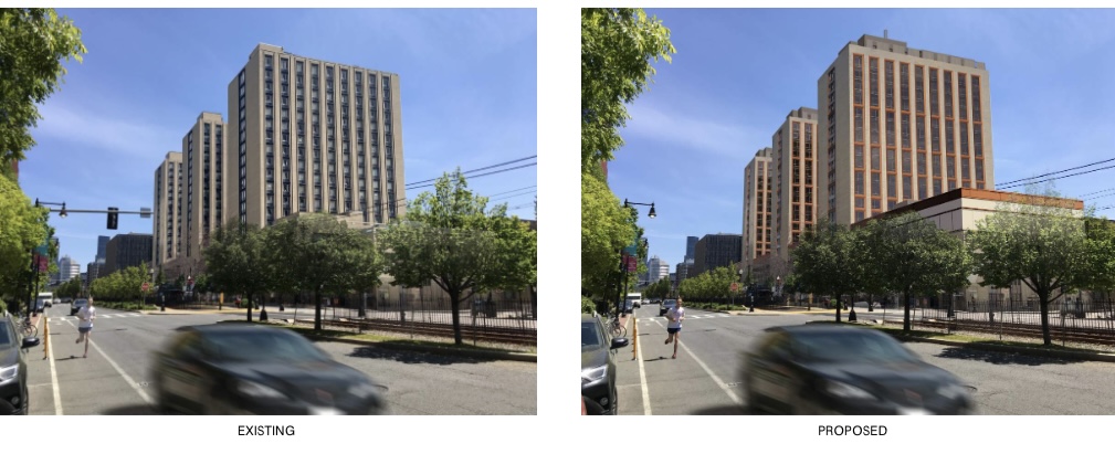
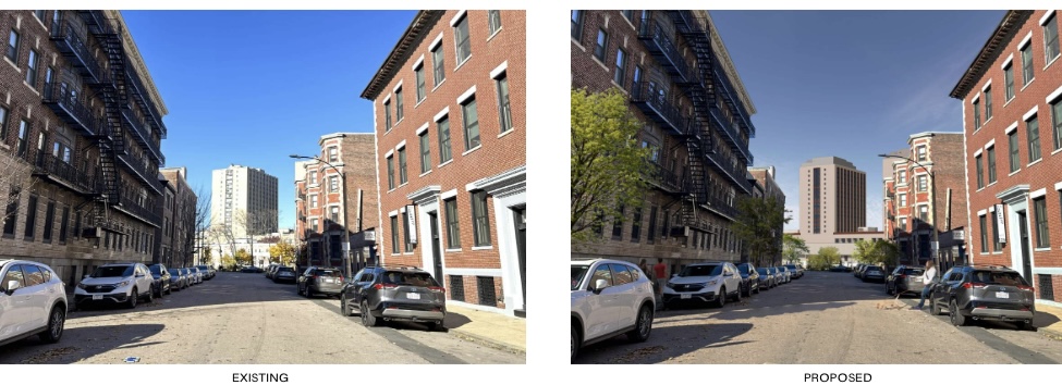
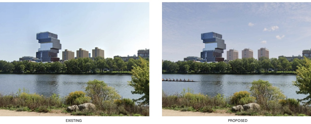
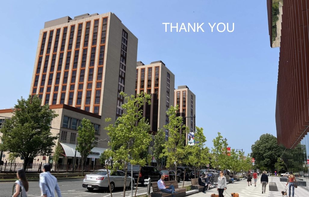
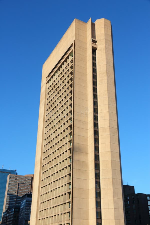
“The Trustees of Boston University (the "Proponent") proposes to renovate 380,200 square feet ("sf") of Warren Towers gross floor area ("GFA"), the three-tower student residence (the "Project") which is home to approximately 1,800 undergraduate students at 700 Commonwealth Avenue (the "Project Site") on the Boston University (the "University" or "BU") Charles River Campus. The Project will include repairs to the building’s envelope, reconfiguration of bathroom cores, accessibility improvements, modernization of elevators and escalators, and new mechanical, electrical, and plumbing (“MEP”) systems.

For more information see the Boston University Charles River Campus Institutional Master Plan page.“

https://bpda.app.box.com/s/9x7lw7e4hjtympg9s46qzf4rpitfakxi

https://www.bostonplans.org/projects/development-projects/warren-towers-renovation
 
Last edited:
Adding colossal order windows is not an improvement.
Perhaps not. Personally, I think the faux colossal order works pretty well in this particular application, but I do think adding some contrasting color to the ribbing is the more important enhancement. In general, BU has done a pretty good job on renovating its brutalist collection, usually by adding some color to make the 3 dimensionality pop, while still managing to preserve the overall core elements. The School of Law building is a great example. This could be another.
 
I like the color. Like the contrast. Like the simplifying effect off the windows. Most importantly the buildings will behave in the background of the stack of books. Do that as soon as you can.
 
Better defined cornice on the lower levels but please tell me they plan to address those awnings and replace them. Better yet, remove them all together and add in appropriate building-enhancing awnings where needed around entrances. Ironically, the only section of the building left uncovered is the entrance to the student residences, where a thousand students or more come and go daily. Why not create an interesting awning feature at that location at gives the building a better focal point at the pedestrian level.
 
Those awnings weren’t put in for shade they are there to protect the pedestrians from the students

On the other hand it’s not true that the building design is rejected Massachusetts prison plan
 
Perhaps not. Personally, I think the faux colossal order works pretty well in this particular application, but I do think adding some contrasting color to the ribbing is the more important enhancement. In general, BU has done a pretty good job on renovating its brutalist collection, usually by adding some color to make the 3 dimensionality pop, while still managing to preserve the overall core elements. The School of Law building is a great example. This could be another.

Are these considered brutalist? To me they always came across as like extremely bare bones art deco towers. The continuous lines of pale limestone separated by black floor plates looks like the middle section of any art deco tower from the 30’s, its just like they never added the decorative crown or base and only used the filing cabinet middle portion.

1711704479271.jpeg


1711704518026.jpeg


1711704638098.jpeg


1711705171882.jpeg

If you chopped out the repetitive middle section of many of the art deco towers and pasted only that on the ground as a tower youd end up with a very similar result.

Compared to brutalism
1711704840751.jpeg

boston-united-states-june-christian-science-administration-building-ft-tall-fine-example-brutalist-architecture-291392019.jpg

1711704997585.jpeg


Its kind of like theyre art deco without the art or the deco and just the middle filler portion between the base and crown. How that portion of those towers would be described as a style I’m not sure but it definitely looks very similar to that.
 
Interesting take, @stick n move, and honestly, I don't know. I've always thought of them as brutalist, but that opinion formed a long time ago, and might not have been well informed. They are mostly something I've always tried not to look at, so now I feel compelled to reevaluate. Technically speaking, I suppose they cannot be considered brutalist because they lack the rough concrete. But the massing really evokes brutalism to me, just the same.
 
Interesting point. Maybe they are in reference to the original BU buildings across Com Ave
 
Are these considered brutalist? To me they always came across as like extremely bare bones art deco towers. The continuous lines of pale limestone separated by black floor plates looks like the middle section of any art deco tower from the 30’s, its just like they never added the decorative crown or base and only used the filing cabinet middle portion.

View attachment 49089

View attachment 49090

View attachment 49091

View attachment 49094
If you chopped out the repetitive middle section of many of the art deco towers and pasted only that on the ground as a tower youd end up with a very similar result.

Compared to brutalism
View attachment 49092
boston-united-states-june-christian-science-administration-building-ft-tall-fine-example-brutalist-architecture-291392019.jpg

View attachment 49093

Its kind of like theyre art deco without the art or the deco and just the middle filler portion between the base and crown. How that portion of those towers would be described as a style I’m not sure but it definitely looks very similar to that.
I wouldn't describe them as brutalist, which pretty much requires exposed concrete. They are the international style that was popular in the middle of the last century. It can be done well but, all too often as in this case, was just a building stripped down to the bare essentials.
 
It may be mentioned in the submission, but I assume that BU will do one tower at a time. Each tower would need to be vacated in turn. Does BU have an extra 600 beds in other dorms to accommodate the displaced students?
 
I wonder if they should have gone with green instead of red akin to the Law Tower and then red up the Comm Ave facing windows.
 

Back
Top