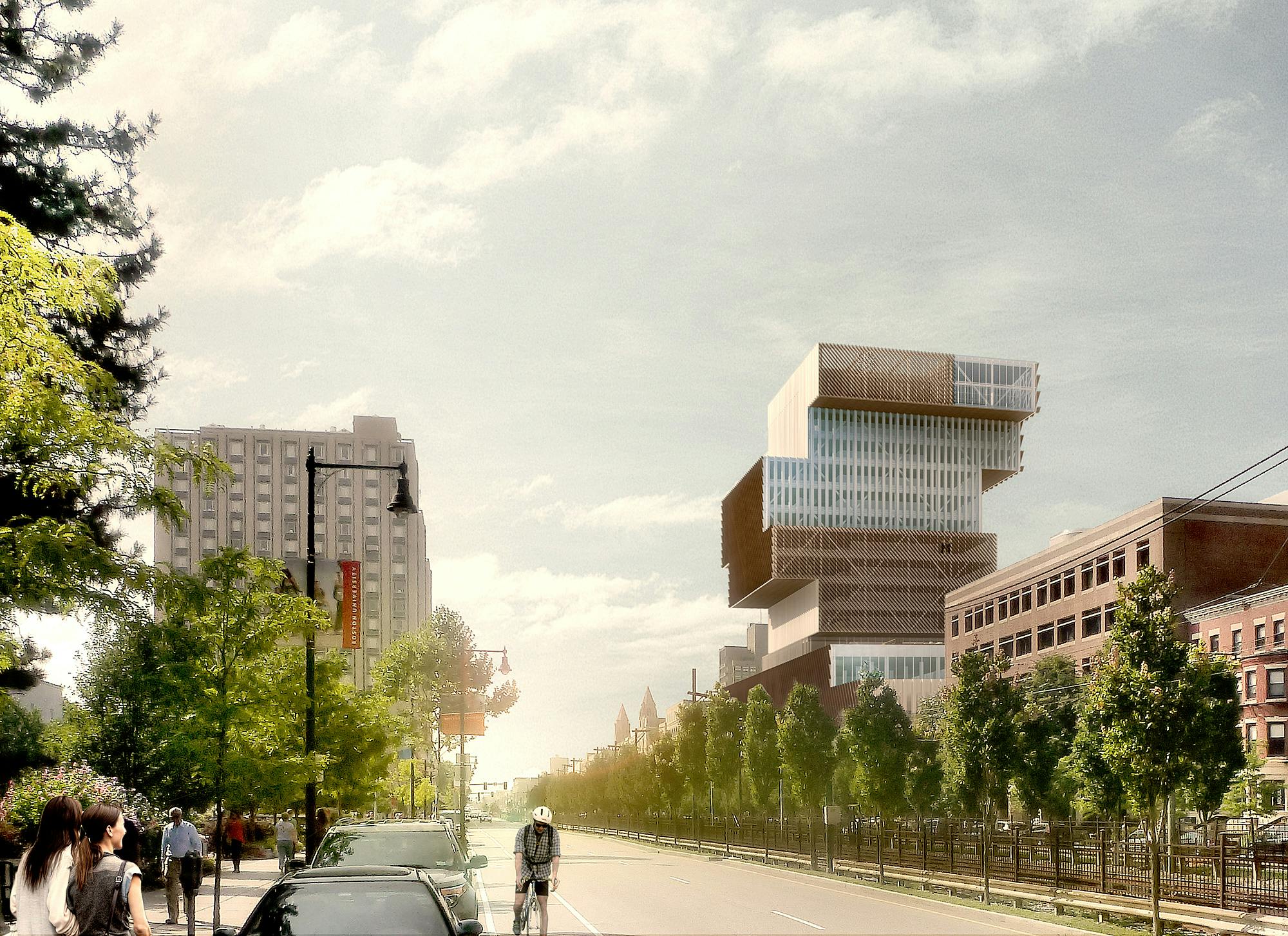
BU Data Sciences Center | 665 Commonwealth Avenue | BU Central

“Boston University building that will look like a stack of books is officially under construction”


“Boston University officially broke ground December 5 on one of the more interesting developments architecture-wise in Boston in recent memory.

Mayor Marty Walsh and BU President Robert Brown were the guests of honor at the groundbreaking for the school’s future Center for Computing and Data Sciences, which will house BU’s mathematics, computer science, and statistics departments under one—very environmentally sustainable—roof at 645-665 Commonwealth Avenue in Kenmore Square....”
Link
 
I freely admit, I don't know all that much about architecture other than personal preferences, but when I saw the rendering many months ago, I thought it was a joke and it would be revised to something more aesthetically pleasing.

A building that is suppose to resemble a poorly orchestrated stack of books? Seriously, this is just an abomination.

1577985670647.png
 
Last edited:
I freely admit, I don't know all that much about architecture other than personal preferences, but when I saw the rendering many months ago, I thought it was a joke and it would be revised to something more aesthetically pleasing.

A building that is suppose to resemble a poorly orchestrated stack of books? Seriously, this is just an abomination.


i agree 100%.
It's an abomination to Boston and specifically, this area of town.
They needed fat, interactive, educational floors. Understood.
How about massing (talking specifically to shape/not style, Gothic or otherwise)
that's aesthetically pleasing, to go along? They blew it.

PHOTO 1 CNY 1119_012_002 300 dpi.jpeg
 
Last edited:
I disagree

I prefer balance and symmetry. The rendering makes me want to squish those floors together. It makes my head hurt just looking at it. There is also a crazy building (dorm?) at MIT that is much worse. (just as an example of what I hate)

Anyway, maybe, just maybe, the actual building will look better than the rendering. We'll see.
 
From a skyline perspective, the base won't be visible, so it will really just be the stack of books. It will be a large building for its specific area (although minimized some by the 2 300'+ proposed in Kenmore) but overall, it won't even be a Top 75 tallest building in the city. It's not as big a risk in that sense. If this was going to be a new tallest building or close to it, I could see it being a lot more controversial and a potential eyesore. However, at its height and location it will be more of an oddity than anything else, and I think the oddities are pretty interesting as long as they don't dominate the city.
 
Everything good that has been said about this new BU building was also said about Boston City Hall when built in 1966. How's that working out for you today?
 
I hated the early renderings; this one is okay. BU is likely looking for attention, that quirky uniqueness that MIT has in its classical order, in the quirky Strata, and in some unusual dorm designs, some of which have lasted the test of time. Harvard has the pseudo-Georgian look mixed with Richardson Romanesque and the starkly modern. Northeastern has a consistent palate with some exciting newer structures that hold one's attention. What does BU have that is distinct, beyond the Cram Comm Ave. buildings that never got finished and the Law school tower? The rest of the campus, which I attended in the seventies has been improved but is still made up of renovated warehouses, industrial buildings, and auto show rooms, aside from a few newer buildings and some bland dorms. So I understand the yearning for something that will smack people between the eyes, near or far, and will be seen from Cambridge. My only caveat: we need only one building of this design within a 15 mile radius of Boston. And yes, expect tastes to change. Who knows what people will think of this 50 years from now (that is, if the Back Bay is not flooded due to rising oceans). I still love City Hall for what it represents architecturally, especially the interior public spaces. What it ought to become in the future is debatable.
 
I think in the wild it looks pretty cool. Just like dzh said though its small. It has a short height and small footprint, and funky buildings in that context are cool. Skyline-changing-middle-of-downtown-tall-funky/cooky buildings are bad (1 Bromfield). When its something small that you really only see from the street theyre on/vacinity I think theyre a good thing sometimes.

Its not the most beautiful thing ever, but its cool. Plus itll be part of the new fenway/kendall skyline cluster, so itll be cool imo.

This is N O T H I N G like city hall. Its far west of the core, and one already empty lot. Come on...

52e8ff5ddf07866f69c689cade903ca8.jpg
 
Last edited:
I think in the wild it looks pretty cool. Just like dzh said though its small. It has a short height and small footprint, and funky buildings in that context are cool. Skyline-changing-middle-of-downtown-tall-funky/cooky buildings are bad (1 Bromfield). When its something small that you really only see from the street theyre on/vacinity I think theyre a good thing sometimes.

Its not the most beautiful thing ever, but its cool. Plus itll be part of the new fenway/kendall skyline cluster, so itll be cool imo.

This is N O T H I N G like city hall. Its far west of the core, and one already empty lot. Come on...

52e8ff5ddf07866f69c689cade903ca8.jpg

Are those stacked containers in Tripoli???? Baghdad????? Actually, a far better fit for the Conley Terminal.

.
 
There are ample renders (see above) that out this silly thing.
Bonus: to strive to build the most polarizing thing/s in the neighborhoods.
 
I started out strongly disliking this building, but over time it has grown on me in the context of BU's campus and Comm Ave. Is a university a good place to test new architecture? Arguably the best location. However, its impact from afar (BU Bridge and Cambridge) is still jarring to me. It looks incomplete/off, like the designers were on a good path and then got 80% there and called it.

I also dislike the stack-of-books narrative. The inspiration may have been there, but the proportion (and balance) are somewhat off for that to ring true in the final product. It reads more as a drunkenly constructed, blocky, Jenga tower, which has become a running joke between BU students, which brings up my last point. We're all architecture enthusiasts on here to some degree, and our conversations and knowledge may run far deeper than the average Boston resident/visitor or BU student/faculty member. While a lot of us may appreciate it for its bold design and bold architecture in general in a rather drab period of design in Boston (not just this project), by saying 'you just don't understand good design,' to those that express doubts or criticisms (not saying anyone on here is doing this, but in general, I've observed this kind of rhetoric on this site, other architecture forums, social media, etc.), we are detracting the whole profession's relevance and credibility; people begin to take us less seriously and say we've lost touch with reality/gone crazy. Sure, architecture as an art form is supposed to get people talking, and you can argue that's what a lot of bold project's intents are, but is provocation alone enough merit a building's design? And are the design decisions made here warranted?
 
Everything good that has been said about this new BU building was also said about Boston City Hall when built in 1966. How's that working out for you today?
The problem with City Hall is the plaza, not the building. A few of us in this thread have questioned the placement for this one. I'm still on the fence about that, but I do think it's a very interesting building, especially when you delve in to how it serves its core purpose.
 
I also dislike the stack-of-books narrative. The inspiration may have been there, but the proportion (and balance) are somewhat off for that to ring true in the final product.
To me it looks like a stack of servers, which actually kind of fits with the data sciences topic.
 

Back
Top