Bulfinch Crossing | Congress Street Garage | West End

Kill it with fire!

....This building definitely is wrong for this site......

This building is going to end up being just as hated as the garage, probably even more so. Just as much a barrier, only taller and more jarring, and once it's up it will never be torn down. Between this and the Back Bay Garage, somehow this amazing boom is going to end up producing the 2 worst highrises in the city. The planning departments really dropped the ball with this one.

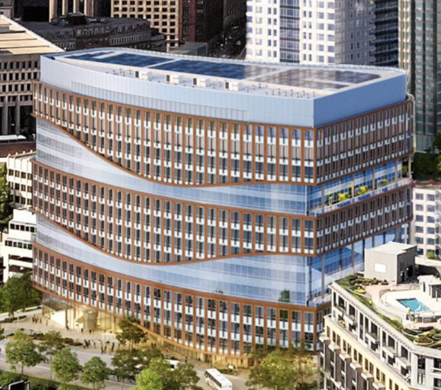
This building looks like it escaped from North Point and has infected downtown with the "putrid proportions" virus. It's obvious from this render that it's the worst proportioned building within the entire main skyline (you could argue the residentials to the right, but they're less tall and thus less intrusive). These fat lab buildings do not belong downtown!!!

1656854722812.jpeg

 
I dislike a lot of features of the proposal, but the one I hate the most are the horizontal blue wave thingies. Those, along with the overall curviness, the excessive setback, and of course the landscaper massing, all add up to a gigantic blob.
 
The overall massing of the building wouldn't be all that bad. It's in the same ballpark as One Canal, The Beverly, etc. However, unlike those buildings, this cladding emphasizes width over height. The lines of the design run horizontally instead of vertically. That's what makes it look so out of place in a city IMO.
 
The overall massing of the building wouldn't be all that bad. It's in the same ballpark as One Canal, The Beverly, etc. However, unlike those buildings, this cladding emphasizes width over height. The lines of the design run horizontally instead of vertically. That's what makes it look so out of place in a city IMO.

I shared this thought upthread as well, but I'd like to connect it with W-4's observation here: I really think a stepped roofline would have dramatically improved this building. They could have concentrated the mechanicals/stacks on one end, and staggered the building's visible top line in at least three steps upward (stepping, in aggregate, perhaps 75' or 100' upward). Now, W-4's additional observation made me think of a recent development that did both (staggered roofline and vertical emphasis of facade) to great effect: Echelon in the Seaport. That really looks like a cluster of little towers, even though it's really just a well-executed blob. It would have cost more, but given the prominent location here, there's no reason the city shouldn't have asked these developers to do something like that here.
 
If they got rid of the stupid blue glass swirls the red facade would blend in perfectly to the rest of the city. The proportions are still shitty but at least itd blend in. The facade minus the blue glass actually reminds me of international place.

 
Last edited:
Inspectors began an investigation into Monsini’s death as well as the structural integrity of the garage. That led to the abrupt closure of the MBTA Green and Orange Lines on June 23, as investigators discovered a support column near Haymarket Station that had been deteriorated by what appeared to be decades of water damage. Crews fortified the damaged column with steel bracing, and by Sunday, June 26, officials had deemed the tunnels safe enough for Orange and Green Line trains to resume service.

A representative from the federal workplace safety organization OSHA said its investigation into the garage collapse is ongoing.

“OSHA’s investigation continues and OSHA does not discuss the specifics of ongoing investigations,” an OSHA representative said by email.

 
If they got rid of the stupid blue glass swirls the red facade would blend in perfectly to the rest of the city. The proportions are still shitty but at least itd blend in. The facade minus the blue glass actually reminds me of international place.


That and they need set backs. This is just bad, massive, instantly dated, doesn't fit the site at all.
 
Yea that's bad. Wow. I was at least giving it a chance when we didn't have a good overhead render, but yikes
 

Back
Top