F-Line to Dudley
Senior Member
- Joined
- Nov 2, 2010
- Messages
- 9,970
- Reaction score
- 12,303
Is nonstandard window size theatre the new builder's flavor of the month? It would drive me crazy trying to shop for curtains that fit those on the 2nd floor.
I've noticed that many people don't buy curtains or sheers anymore. They use those fancy blinds or somehow are fine with no privacy at all.Is nonstandard window size theatre the new builder's flavor of the month? It would drive me crazy trying to shop for curtains that fit those on the 2nd floor.
 IMG_3887 by Bos Beeline, on Flickr
 IMG_3886 by Bos Beeline, on Flickr
 IMG_3885 by Bos Beeline, on Flickr
 IMG_3881 by Bos Beeline, on Flickr
 IMG_3878 by Bos Beeline, on Flickr
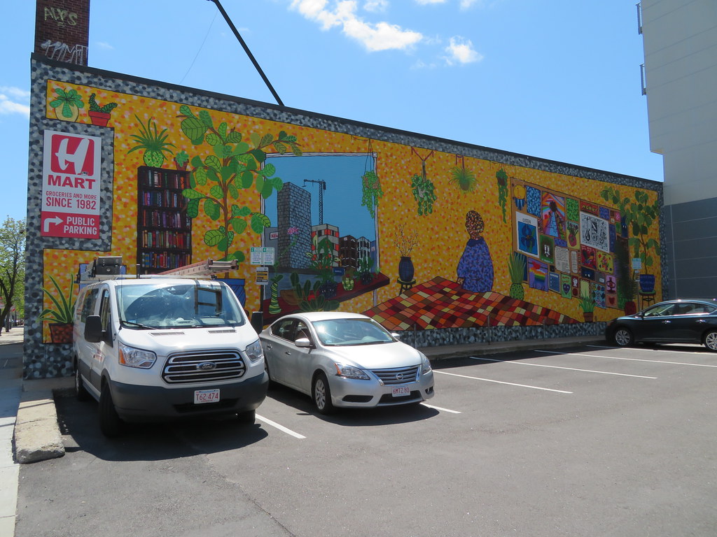 IMG_3879 by Bos Beeline, on Flickr
And the best result from this project is a new wall painting.
Jeeze, a missed nomination for worst completed development..
Eh, it's not that bad in person. Doesn't fit in Cambridge at all, but that kind of makes it interesting, and the stone facade is nice at street level.

Thanks, Javier. In the first pic, you caught some nice brickwork going up, especially on the top of the building. I like the two tone brick colors as well.