- Joined
- Jan 7, 2012
- Messages
- 14,072
- Reaction score
- 22,812
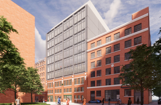
 7 Channel Center
I perfer the design on the right.To my eye it holds with the warehouse theme while making a modern statement on the skyline. The one on the left is too much of the brick thing. I love brick, but in this area we need a bit of glass.


 IMG_8467
 IMG_8469
 IMG_8471
 IMG_8473