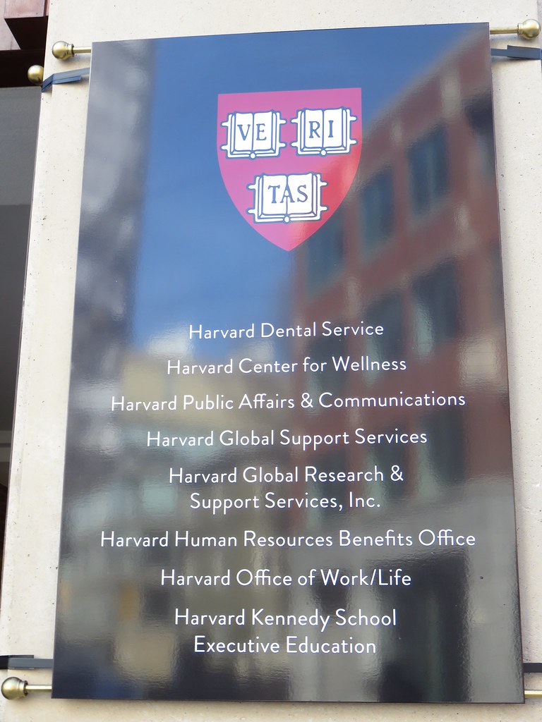
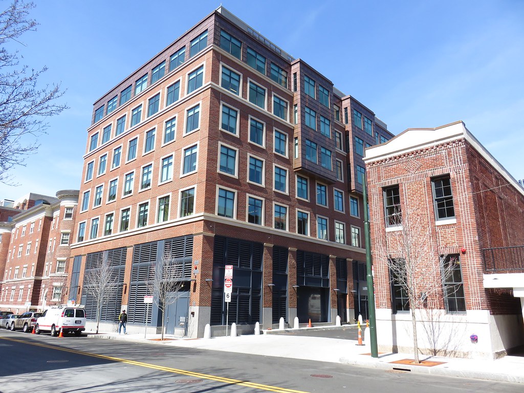
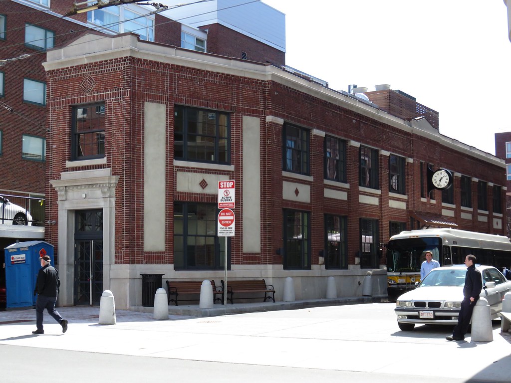
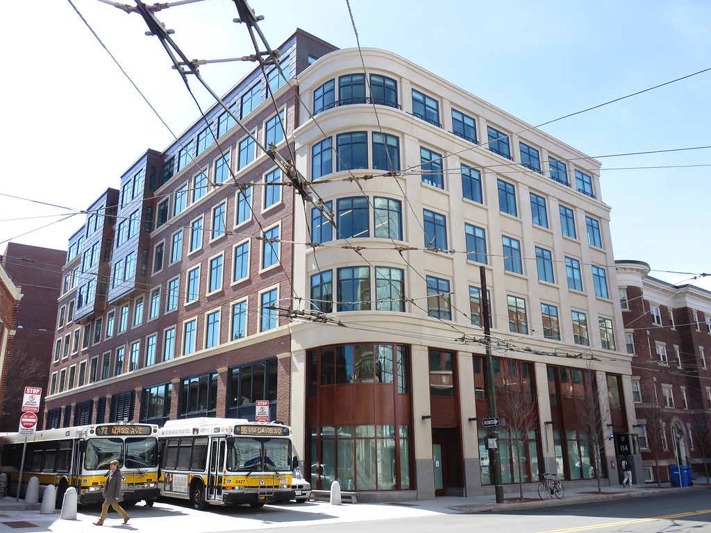
Charles Place | Harvard Square | Cambridge

Just walked by it this morning. It's not exciting, it copies a past style, but it looks nice which is more than can be said about the shit we see all over the place. Im not a huge fan of museum pieces, but this one Im ok with.
 
Its all faux* unless its Beton Brut, or Glass Boxes, ... and you guys seem to hate both of those things ... so maybe we need finer distinctions of fake and real?

cca

* yes Boston, even the beloved brick MUST by law be a veneer.
 
* yes Boston, even the beloved brick MUST by law be a veneer.

Thanks. You've answered a question I've wondered about for a while. What about something like the Ames building, though? Aside from being absurdly expensive to build a granite block building today, would it be possible to do under modern code?
 
Possible .. yes. But terribly expensive because of everything you would have to do to make it perform to the current codes and standards that we now expect all of our buildings to perform to. Energy, fire, seismic and the like.

cca
 
Developer: Design me something that is completely uninspired, totally unoriginal, and makes you forget about it even as you're looking at it.
Architect: I have just the thing for you!
 
Developer: Design me something that is completely uninspired, totally unoriginal, and makes you forget about it even as you're looking at it.
Architect: I have just the thing for you!

That isn't fair at all. Look at all the projects around Boston with architects churning out glass boxes not fit four Rt 128. Charles Place TRIES. It tries too hard but it tries where other don't even bother. Don't hate this.
 
That isn't fair at all. Look at all the projects around Boston with architects churning out glass boxes not fit four Rt 128. Charles Place TRIES. It tries too hard but it tries where other don't even bother. Don't hate this.

+1. I like Charles Place, the old Grampy's site, and a lot of the infill in Southie - they're (mostly) contextual, they take a few hints from the local vernacular architecture. They're good enough for what they aspire to, and I'd argue most of the most successful, dense nodes in Cambridge and Boston are built overwhelmingly on the back of what would have been considered "infill" or austere, but functional buildings when they were built. In fact that's why I think the Design Research building is the best piece of brutalist/heroic architecture in the whole region - it's simple, not overbearing, performs it's function nicely, fits in at the street level - certainly better than either Holyoke Center or Peabody terrace.

Now the question is what happens to the HS Hotel and that worthless parking garage (ok just kidding, it's barely a shed).
 
Handsome building. It has a solidity, a robustness, to it.
 
Also, nice job on all the clumsy screening on the ground floor back and sides, very friendly.
And also, not obvious in these photos, the grey box surrounding the roof mechanicals is enormous and oppressive. This is a problem on many new buildings, not just this one. It may be more understandable on labs but it's lazy nonetheless. There is little attempt to effectively integrate roof mechs into the building and mitigate their visual impact. "Oh it's just stuff on the roof, no one will even notice from the street."
 
Developer: Design me something that is completely uninspired, totally unoriginal, and makes you forget about it even as you're looking at it.
Architect: I have just the thing for you!

This exact conversation should be the genesis of 90% of everything built. If only.

We have too many hamfisted architects trying to hide the mass of their buildings with clever tricks and baubles rather than just designing buildings that look like fucking buildings.

P.S. That is not to say that this particular building is perfect, just that it is more on the right track than a lot of what we've seen lately.
 

Back
Top