Charlie_mta
Senior Member
- Joined
- Jul 15, 2006
- Messages
- 5,090
- Reaction score
- 7,618
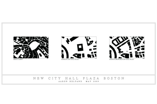
THIS from that article is freaking awesome:All great City Hall Plaza musings converge into this:

As is this as well:

Build it!
THIS from that article is freaking awesome:All great City Hall Plaza musings converge into this:


THIS from that article is freaking awesome:

As is this as well:

Build it!
Again, I’ll further challenge you to personally say how much you actually use the space and a frequent basis. Or do you just draw colored pictures on top of photos? Or just reminiscence about the good old days? Boom.
All great City Hall Plaza musings converge into this:
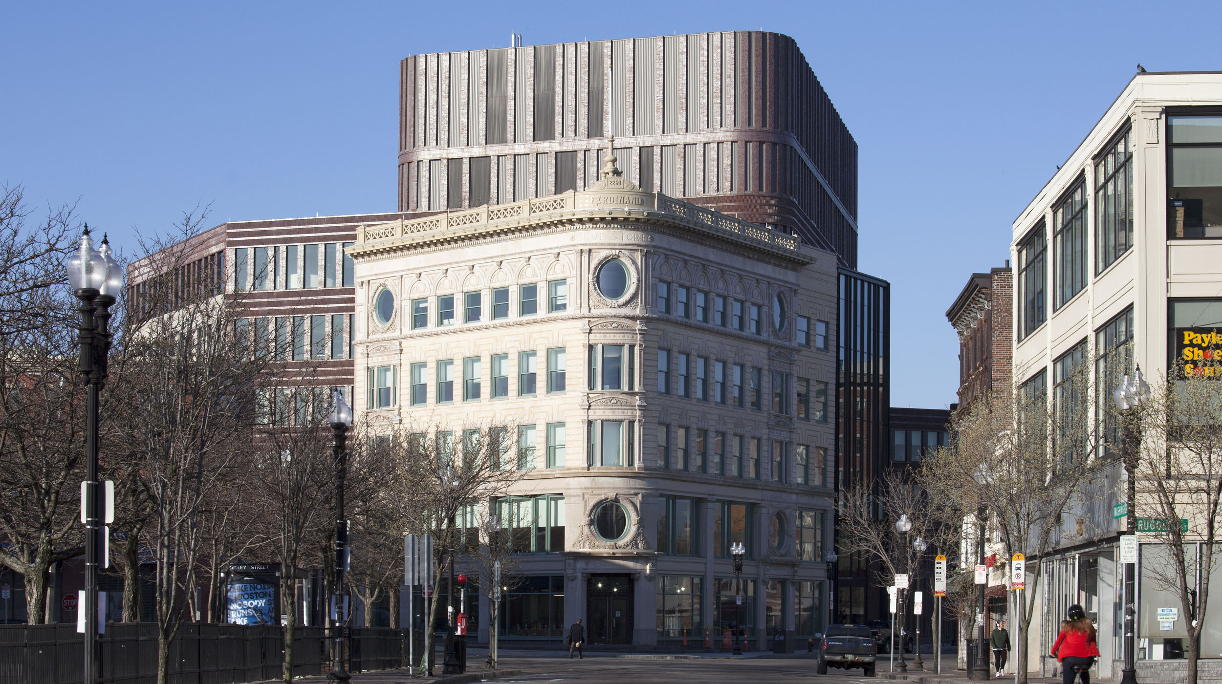
I'd love it in theory, but I just don't see how something like that gets built in a way that doesn't scream "Disney knockoff!" The lower levels would almost certainly be concrete instead of granite. I don't think we'd see real masonry instead of precast panels on the brick segments, and the cornice would all almost certainly be concrete as well. It's a municipal building, so I doubt the money exists to give the facade the same treatment as this building. I could also see much of the detail being value engineered out. Maybe it could past muster with the average passerby, but I don't know if a real world attempt at this could feasibly be done in a way that doesn't make half of this board roll their eyes.
It's a municipal building, so I doubt the money exists to give the facade the same treatment as this building.
Simple: the City can pay to do it properly. A fair number of schools, for instance, are being built with masonry that isn't precast or concrete.
I'm all for it if they could do it properly. I just don't believe they would. Masonry is a big part of it, but it's not the only thing that needs to be done well for this not to look like a cheap replica more at home in Vegas or a theme park than center of one of the country's most historic cities. The cost of anything these days makes me even less optimistic that they'd do it right.They just spent one billion dollars to plant 30 trees and build a playground on a corner of the plaza
I'm all for it if they could do it properly. I just don't believe they would. Masonry is a big part of it, but it's not the only thing that needs to be done well for this not to look like a cheap replica more at home in Vegas or a theme park than center of one of the country's most historic cities. The cost of anything these days makes me even less optimistic that they'd do it right.

View attachment 37951
View attachment 37952
Holy shit, yes please! The little spire is such a great focal point of the plaza. They really nailed it here! Love the gold dome too that evokes the state house but in a more city hall federalist style building. This would have went from the worst to best city hall in one fell swoop.
Bonus shots, the inside still looks the same, dark. All four escalators in the public area are all closed off for repair, sad. But there is a new security desk at the North entrance /Hanover side which allows this entry to be open.
View attachment 38784
View attachment 38785 View attachment 38786
View attachment 38787
Reminds me of a DC Metro subway station.Bonus shots, the inside still looks the same, dark. All four escalators in the public area are all closed off for repair, sad. But there is a new security desk at the North entrance /Hanover side which allows this entry to be open.
View attachment 38784
View attachment 38785 View attachment 38786
View attachment 38787
Reminds me of a DC Metro subway station.
Bonus shots, the inside still looks the same, dark. All four escalators in the public area are all closed off for repair, sad. But there is a new security desk at the North entrance /Hanover side which allows this entry to be open.
You're welcome to your opinion, but when was the last time you were there? I have found there to be significantly more than 3 people on the past several occasions that brought me to that space. I usually find it fairly crowded and active. And as @Dr. Rosen Rosen points out, the view lines are fantastic. Nevertheless, it could be better. So I won't argue that it's the best plaza we can get or deserve. But I don't at all agree with the idea that it's awful or unpleasant in its current iteration.You have uploaded snapshots that we all recognize because we've all been there - to a desolate, windswept expanse of salt-worn brick, perhaps with 3 people walking through at any given time as they cross from one side diagonally to the other, or a lone city employee taking a smoke breach on a backless stone slab. These are not showing dynamic and enthusiastic engagement from a city of over half a million people,
You're welcome to your opinion, but when was the last time you were there? I have found there to be significantly more than 3 people on the past several occasions that brought me to that space. I usually find it fairly crowded and active. And as @Dr. Rosen Rosen points out, the view lines are fantastic. Nevertheless, it could be better. So I won't argue that it's the best plaza we can get or deserve. But I don't at all agree with the idea that it's awful or unpleasant in its current iteration.
