You are using an out of date browser. It may not display this or other websites correctly.
You should upgrade or use an alternative browser.
You should upgrade or use an alternative browser.
Copley Square Revamp | Back Bay
- Thread starter FormFollowsBudget
- Start date
HenryAlan
Senior Member
- Joined
- Dec 15, 2009
- Messages
- 4,446
- Reaction score
- 5,176
That sucks, I had expected this to be done in time for the marathon.(Sad trombone)
Looking like December 2024

Copley Square Park Improvements
Copley Square Park Improvements - The raised grove and plaza were reopened in April 2025 in time for the Boston Marathon and the farmers market season. Additional portions of the park and perimeter sidewalks were opened throughout the summer and fall. Work on the fountain and lawn areas is...www.boston.gov
Longfellow
Active Member
- Joined
- Dec 12, 2023
- Messages
- 413
- Reaction score
- 993
These planks around planted trees, do ther actually work to hold it up? Seems so odd and I see it a lot
They're commonly used to protect the base of the tree from the errant hit by a bobcat or workers moving bulk material onto sites.These planks around planted trees, do ther actually work to hold it up? Seems so odd and I see it a lot
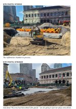
"Shaded Grove" - I was lead to believe that any shade on Copley Square would instantly cause Trinity to burst into a fireball engulfing the Square and old wing of the library. Also, "grove", given the picture, writes its own jokes I feel.
Last edited:
BosDevelop
Senior Member
- Joined
- Jul 25, 2006
- Messages
- 1,533
- Reaction score
- 396
Unacceptable that this will be closed for 2 summers for this project which is really not that complex.
Bananarama
Active Member
- Joined
- Mar 18, 2020
- Messages
- 605
- Reaction score
- 1,249
Mid-construction photo before the existing trees grow any leaves, or any of the new ones get planted. The jokes write themselves."Shaded Grove" - I was lead to believe that any shade on Copley Square would instantly cause Trinity to burst into a fireball engulfing the Square and old wing of the library instantly. Also, "grove", given the picture, writes its own jokes I feel.
Smuttynose
Active Member
- Joined
- May 26, 2006
- Messages
- 741
- Reaction score
- 4,165
Unacceptable that this will be closed for 2 summers for this project which is really not that complex.
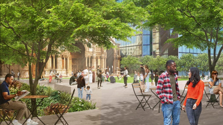
It's amazing to me that this is a $17 million project. Is there anything really new here, besides some added trees and tables/chairs? Even the fountain will be 'renovated' and not new. Yes, they are shifting some hardscape and grassy areas and adding some pedestrian paths, but none of that would seem to be especially costly.
Beantropolis
New member
- Joined
- Jun 6, 2021
- Messages
- 69
- Reaction score
- 143
I'm shocked at how incompetent this revamp actually is. The design approach seems to be to just plop down more inexplicable landscape features and paths in random directions through the square. Raised Grove? WTF is this?
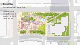
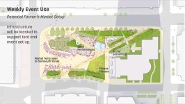
But these aspects are merely frustrating. What really bothers me is the utter lack of deference this design extends towards Trinity Church. It's difficult to see any harmony at all between the new design and Trinity. It places a bewildering lawn right off the portico of the church, like a green barrier segregating it from the square. Are the crowds entering and exiting supposed to be corralled onto the narrow path approaching from 90 degree angles? This strikes me as perhaps a conscious act of denigration. It's very strange and unfortunate.
This new design does seem far more concerned with attempting to create a stronger relationship with the McKim Building, and that's not a bad thing. But, why not create relationships with both buildings and between one building and the other? Seems like yet another tremendous design blunder among many others being committed here.
Last edited:
So having read the updates, a few notes.
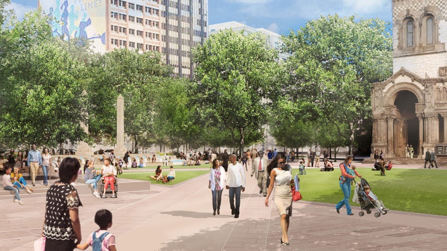
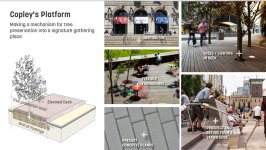
1) think of the raised grove as sort of a deck. The old paving around the trees apparently was stressing the trees due to restricted soil volume, and constricting their root space, and this deck will evidently alleviate that so this is apparently mostly a tree preservation exercise. The same applies to a lot of the tree planters.
2) much like Government Center, the park on top is seemingly getting renovated mostly as a cover for what needed to go under it - new drainage structures and infrastructure, things like a steam line that used to run under Huntington Ave across the site, leading to much of the cost and time.
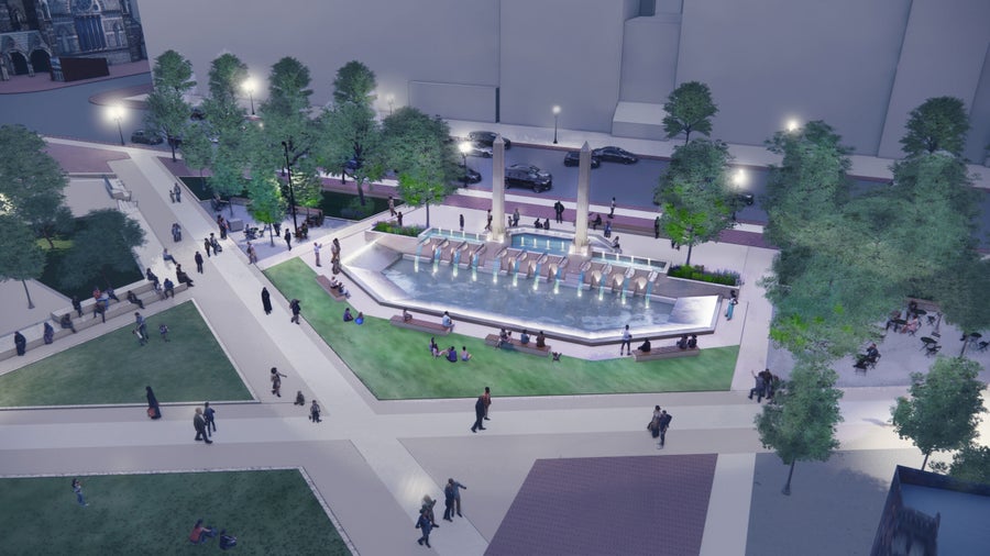
3) I get the impression that Trinity Church itself wanted the flip of lawn and plaza. I don't necessarily disagree with them, since Trinity should by its very nature be a lower energy space. The modeling attached was from an earlier design iteration , but I think the fundamentals are still sound. So yes, I do think that lawn is intended as a isolator that still provides a site line, but means the market stalls, marathon celebrations and other events are stood back rather than at its front door, but I do think it was thought about and is intentional.
4) interestingly enough, the BosTix kiosk got a water line for future cafe conversion.
Attachments
HenryAlan
Senior Member
- Joined
- Dec 15, 2009
- Messages
- 4,446
- Reaction score
- 5,176
I don't have strong opinions on the overall landscaping, but I do think there is a significant upgrade in the orientation of pedestrian paths. The new design follows the natural orientation for walkers transiting the square. That's a good thing that is not random, and is much more favorable to pedestrians than the old design.I'm shocked at how incompetent this revamp actually is. The design approach seems to be to just plop down more inexplicable landscape features and paths in random directions through the square. Raised Grove? WTF is this?
The stream line reference made me smile. Apropos of nothing, I was reminded of those classic Sorkin-authored West Wing episodes when the Ainsley Hayes character was assigned an office in the Steam Pipe Trunk Distribution Venue.So having read the updates, a few notes.
1) think of the raised grove as sort of a deck. The old paving around the trees apparently was stressing the trees due to restricted soil volume, and constricting their root space, and this deck will evidently alleviate that so this is apparently mostly a tree preservation exercise. The same applies to a lot of the tree planters.
2) much like Government Center, the park on top is seemingly getting renovated mostly as a cover for what needed to go under it - new drainage structures and infrastructure, things like a steam line that used to run under Huntington Ave across the site, leading to much of the cost and time.
3) I get the impression that Trinity Church itself wanted the flip of lawn and plaza. I don't necessarily disagree with them, since Trinity should by its very nature be a lower energy space. The modeling attached was from an earlier design iteration , but I think the fundamentals are still sound. So yes, I do think that lawn is intended as a isolator that still provides a site line, but means the market stalls, marathon celebrations and other events are stood back rather than at its front door, but I do think it was thought about and is intentional.
4) interestingly enough, the BosTix kiosk got a water line for future cafe conversion.
(Sorry, I'm punchy and free-associating. Been a long day.)
It's amazing to me that this is a $17 million project. Is there anything really new here, besides some added trees and tables/chairs? Even the fountain will be 'renovated' and not new. Yes, they are shifting some hardscape and grassy areas and adding some pedestrian paths, but none of that would seem to be especially costly.
Looks like something that would amount to $2M worth of work and $15M of lined pockets
FormFollowsBudget
Senior Member
- Joined
- Jan 15, 2015
- Messages
- 2,309
- Reaction score
- 4,100
Would requesting the project budget breakdown be an FOIA request?

