You are using an out of date browser. It may not display this or other websites correctly.
You should upgrade or use an alternative browser.
You should upgrade or use an alternative browser.
Dock Square Parking Garage | 20 Clinton Street | Downtown
- Thread starter dirtywater
- Start date
Equilibria
Senior Member
- Joined
- May 6, 2007
- Messages
- 7,219
- Reaction score
- 8,728
Per UHub, construction in 2020:

 www.universalhub.com
NPC:


Developer hopes to begin work by year's end on transformation of Hard Rock Cafe garage into a brownish residential building
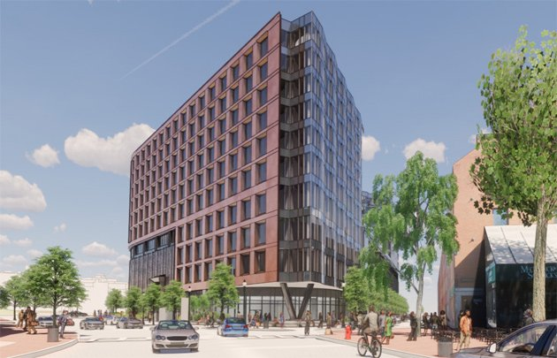
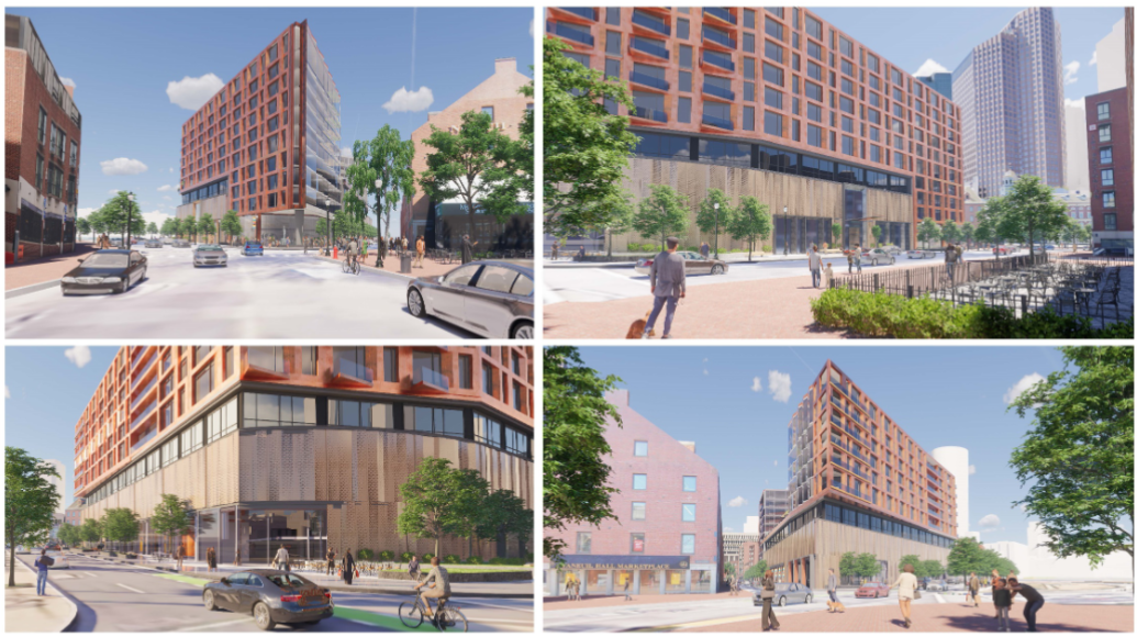
Fortis Property Group of Brooklyn has filed revised plans for the garage next to Faneuil Hall Marketplace that are browner and less curvy than its original proposal and which feature fewer, but larger, residential units in a structure to be place atop the existing seven-level garage. Read more.
NPC:
Last edited:
RandomWalk
Senior Member
- Joined
- Feb 2, 2014
- Messages
- 3,716
- Reaction score
- 6,512
Did someone crib from the Kenmore North design docs?
Did someone crib from the Kenmore North design docs?
Nah, Step 1 of those docs was to "destroy a historic, place-making building" before replacing it with something worse.
- Joined
- May 25, 2006
- Messages
- 7,062
- Reaction score
- 1,976
If they use quality materials this will be very nice.
This NPC sort of concerns me. I'm not sure what sort of negotiations took place with the various groups, but the building size is constant, yet there is a reduction in units by 75 (209 to 134, about 35%). In the midst of a housing shortage, won't this just make the per unit cost at least 35% more expensive than they would have been originally? (unit size changes aside). They don't elaborate on "why" they are making changes.
JeffDowntown
Senior Member
- Joined
- May 28, 2007
- Messages
- 5,007
- Reaction score
- 4,130
Once again, too much of the terracotta / red palette to appease "Boston" sensibilities. This isn't a 5 story walkup row house!
found5dollar
Senior Member
- Joined
- Aug 27, 2007
- Messages
- 1,153
- Reaction score
- 411
Have you thought about why there is a red palette in boston and why it seems to work well/alot of people use it? I know it may not feel that way right now, but Boston is a very dreary city. It is one of the rainiest cities in America and, compared to many of the other major cities, winters are tough and particularly grey. The classical red and green color palette of the city plays against and pops off of the grey skies and grey slush to help keep the city feeling vibrant even on the dreariest of winter days. I dont know the last time you walked through midtown Manhattan in the winter but it is soul crushing. All that grey just puts you in a funk that is hard to shake. The red palette, and yellows and greens, classically found in the city, helps break up the monotony of the winter months and rainy days and pulls your eyes to the warmth of the buildings instead of the cold you are physically feeling.Once again, too much of the terracotta / red palette to appease "Boston" sensibilities. This isn't a 5 story walkup row house!
I agree --- but it's an argument for Scandinavian style _brighter_ colors like are frequently NIMBY'd. More bright Victorians, JP style pls.Have you thought about why there is a red palette in boston and why it seems to work well/alot of people use it? I know it may not feel that way right now, but Boston is a very dreary city. It is one of the rainiest cities in America and, compared to many of the other major cities, winters are tough and particularly grey. The classical red and green color palette of the city plays against and pops off of the grey skies and grey slush to help keep the city feeling vibrant even on the dreariest of winter days. I dont know the last time you walked through midtown Manhattan in the winter but it is soul crushing. All that grey just puts you in a funk that is hard to shake. The red palette, and yellows and greens, classically found in the city, helps break up the monotony of the winter months and rainy days and pulls your eyes to the warmth of the buildings instead of the cold you are physically feeling.
JeffDowntown
Senior Member
- Joined
- May 28, 2007
- Messages
- 5,007
- Reaction score
- 4,130
This is the alternative that is needed more.I agree --- but it's an argument for Scandinavian style _brighter_ colors like are frequently NIMBY'd. More bright Victorians, JP style pls.
I am certainly not advocating for gray and glass. And one would have thought we got over the sea of red approach after the debacle that was the Aztec temple in the red desert (AKA City Hall).
found5dollar
Senior Member
- Joined
- Aug 27, 2007
- Messages
- 1,153
- Reaction score
- 411
Those colors are fine and wonderful but need massive amounts of upkeep with either regular repainting or panel replacement when the pigments fade. The only vivid colors that building materials naturally come in are red, brick or terracotta, and green, patinated copper. That's why those are the go to colors for the city and help it feel like a designed whole.I agree --- but it's an argument for Scandinavian style _brighter_ colors like are frequently NIMBY'd. More bright Victorians, JP style pls.
EDIT: you can also get a fairly bright yellow naturally with brick but it still always feels like a neutral compared to the red and green mentioned above.
"There has been a reduction in residential units from 209 to 134, with none of 27 affordable units being eliminated. This change in unit composition means the total number of affordable units preserved has increased to 20% from the previous 13% preserved for affordability.This is all right, but the original version was significantly better.
According to the project team, while previous plans were to potentially demolish the sixth floor and insert stackers on the fifth floor, the decision not to do so was based on both economic and environmental factors, specifically wanting to avoid excess debris in landfills."
JeffDowntown
Senior Member
- Joined
- May 28, 2007
- Messages
- 5,007
- Reaction score
- 4,130
The other thing that is striking in the change is the upgrade in apparent unit size."There has been a reduction in residential units from 209 to 134, with none of 27 affordable units being eliminated. This change in unit composition means the total number of affordable units preserved has increased to 20% from the previous 13% preserved for affordability.
According to the project team, while previous plans were to potentially demolish the sixth floor and insert stackers on the fifth floor, the decision not to do so was based on both economic and environmental factors, specifically wanting to avoid excess debris in landfills."
View attachment 7678
Unit count went from 236 to 161, but Residential GFA went up from 243,000 to 256,000 sf!
Either they have added in a ton of large sf residential amenities, or the units got a lot bigger (1030 sf/unit to 1590 sf/unit gross allocation).
FormFollowsBudget
Senior Member
- Joined
- Jan 15, 2015
- Messages
- 2,309
- Reaction score
- 4,100
The other thing that is striking in the change is the upgrade in apparent unit size.
Unit count went from 236 to 161, but Residential GFA went up from 243,000 to 256,000 sf!
Either they have added in a ton of large sf residential amenities, or the units got a lot bigger (1030 sf/unit to 1590 sf/unit gross allocation).
Based on the language in the NPC, I think the units got bigger. They simply note the increase in square footage was due to 'a reconfiguration of the floors,' which is vague and confusing to me. I don't think GFA should increase that much with that...
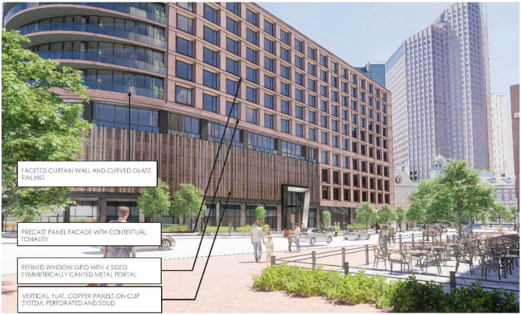
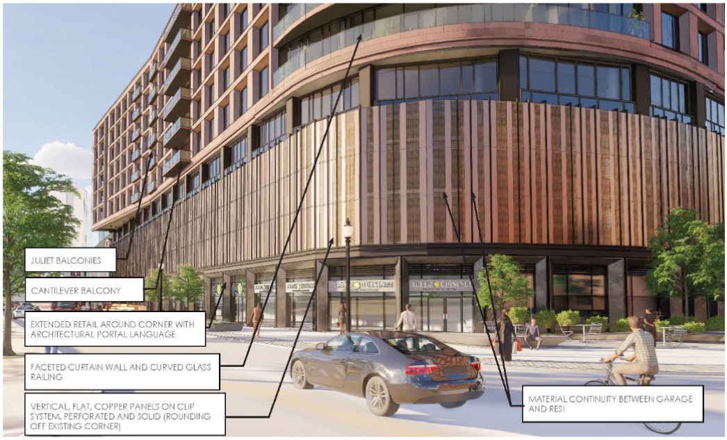
Overall, I think this is yet another one of those projects that is going to come down to the material quality. I have some hopes from the renders, but the metal portion is a little concerning. Not sure if it's the angle and the rendering engine having a hard time (metal is sometimes tricky in photo-real rendering), but the matte finish on the metal isn't what I would have gone with.
RandomWalk
Senior Member
- Joined
- Feb 2, 2014
- Messages
- 3,716
- Reaction score
- 6,512
Physically distanced units in the new post-COVID world?
Physically distanced units in the new post-COVID world?
Home office add-ons..........
Bananarama
Active Member
- Joined
- Mar 18, 2020
- Messages
- 605
- Reaction score
- 1,249
That 4" increase in height is going to DESTROY the character of the neighborhood...
BACsop
Senior Member
- Joined
- Jun 1, 2019
- Messages
- 1,839
- Reaction score
- 7,648
"There has been a reduction in residential units from 209 to 134, with none of 27 affordable units being eliminated. This change in unit composition means the total number of affordable units preserved has increased to 20% from the previous 13% preserved for affordability.
According to the project team, while previous plans were to potentially demolish the sixth floor and insert stackers on the fifth floor, the decision not to do so was based on both economic and environmental factors, specifically wanting to avoid excess debris in landfills."
View attachment 7678
Pretty disappointing they slashed the units significantly but the parking remained completely unchanged.


