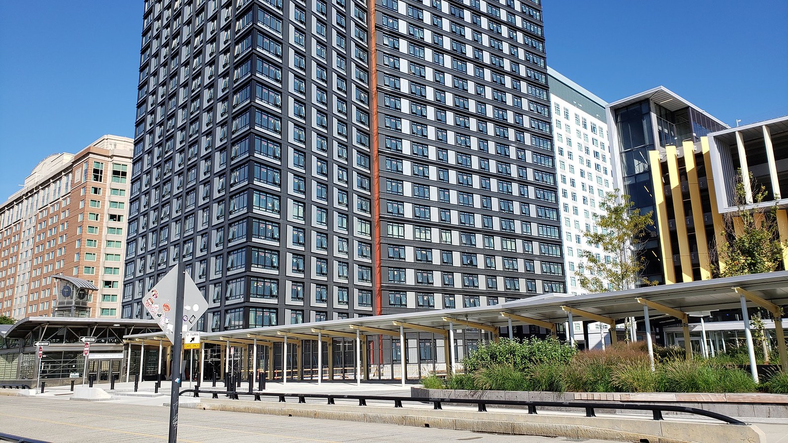
Gables Seaport (née Waterside Place 1B) | 505 Congress Street | Seaport

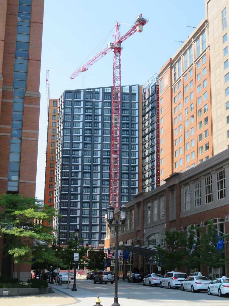
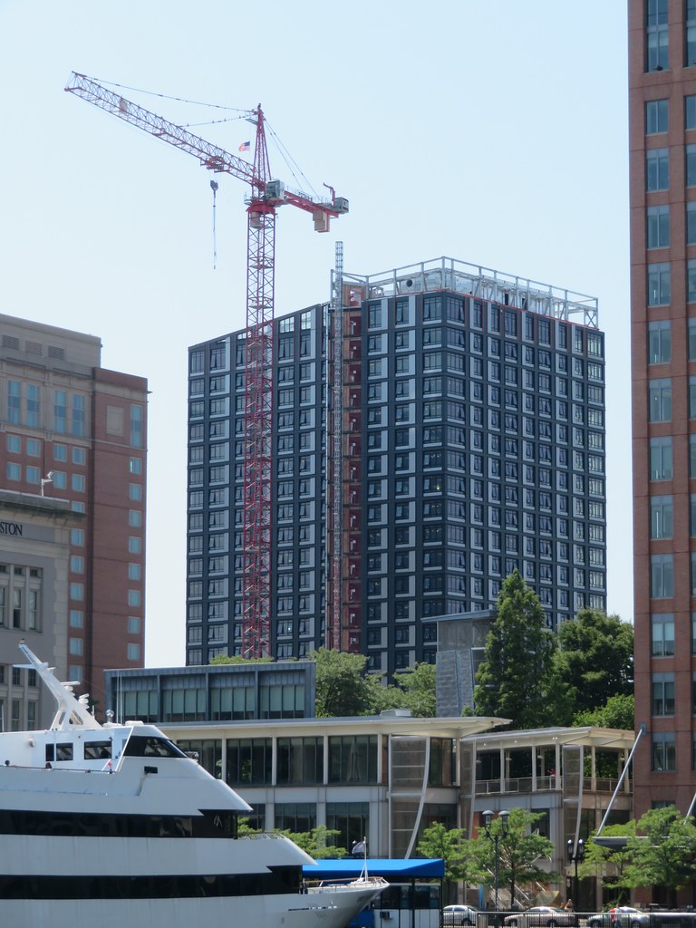
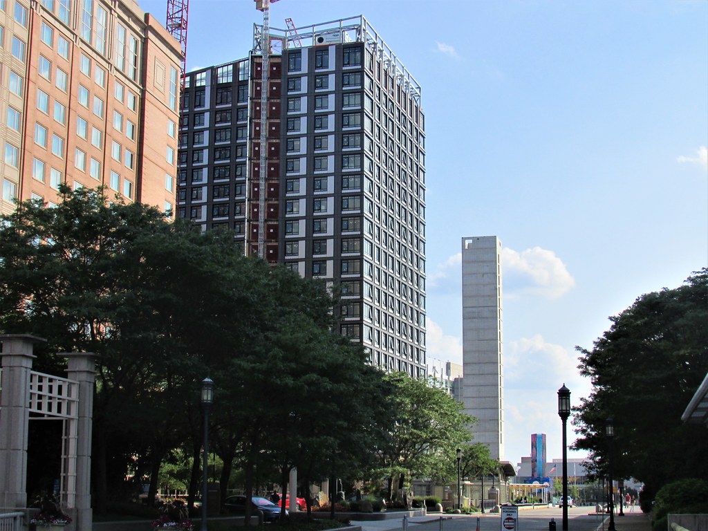
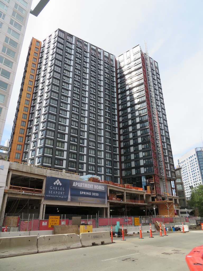
I'd say more orange than red, but if you take a closer look at the rendering below, you can kind of see that the orangey accents are being depicted on the crown, just much easier to miss than the vertical accent stripes that go down the length of the building.

I would say orange would be correct as shown in this photo.
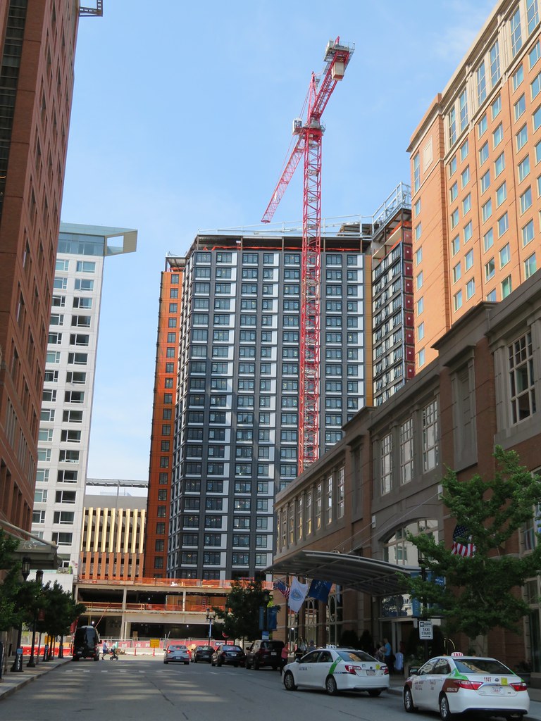
https://flic.kr/p/2gv15Dn
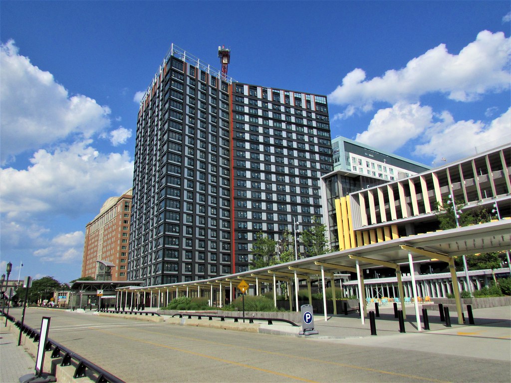
 
*squints looking for gables*

I like this building, but what a dumb name...
 
Slanty Roof!! The Seaport is gettin in on it now too. I think its awesome that Boston has come into its own with its own defining feature for its high rises. It wasnt forced either it came about organically over many years, just like its supposed to. In this day n age where buildings can be so similar, its great to see cities still finding ways to be distinct. Its becoming harder and harder so I think its even more important and its cool that you can still look at a building and see where it would belong and fit in. As far as the slanted roof concept the ritz started it, atlantic wharf perfected it, and MT cemented it.

Chicago is the city with Broad shoulders and their new Nema tower thats just getting finished carries this on masterfully. It also reimagines the stack of staggered boxes concept that the sears tower started. Nyc we all know is the city where old zoning laws created towers that set back after a certain height and then go vertical. That along with intercity competition brought decorative spires competing for precious feet. So they became the city of setbacks and spires. One Vanderbuilt is carrying this legacy forward wonderfully as well. That tower is the definition of a classic new york tower set in a modern glass facade.

Boston over the years has built up quite a lot of slanted roof towers:
Millennium Tower
Ritz Towers
BU Student Village 2
Atlantic Wharf
North Station Tower
The harlo
Moxy
Mass art Treehouse

Proposed:
1000 Boylston
The huntington
40 Trinity
Fenway ctr phase 2 tower

Its gone past the point of coincidence, to a distinct feature of Bostons modern architecture. Pretty cool.
 
Last edited:
This building is bizarre, I saw it looming from the water and had no clue what it was, just looked like a monstrosity in the backround
 
Yes, this one has been a pleasant surprise. I'd like to see how the street level wraps up but this is worlds better than its older sibling down the street.
 
The inward-tapering roof lines pleasantly draws the eye up and away from the long repetitive scheme below. I can't explain why I like it, but I do.
 

Back
Top