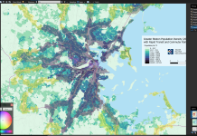
The maps look very good!
I really appreciate
creating the large 495 map, meaning the full MBTA service area (and even past to) Framingham, North Beverly, and Brockton, can be visualized on the map.
One minor issue with the new maps is the the low density tracts do not have enough colors. I would suggest splitting the "2217-7121" bracket into two if possible (maybe even an extra bracket at 1000?).
Would it be possible to re-create
the MBTA's market analysis frequencies map if possible? (
just the map that shows X census track supports 30 vs. 20 or 10 min frequencies, etc, etc,). The data used by the MBTA is about 10 years out of date, plus the fact that the MBTA's map does not extend past Lynn or Quincy Adams, meaning it's hard to see how Framingham/Beverly/Brockton stack up. The combined market analysis map is essentially a merged version of population + employment density to get the "x-supported frequency" for each city block, extending out to the edge of the T's district.
MBTA market analysis frequencies map (
too small 
), and a sample market size analysis table, pulled from the T's market analysis PDF. I have been using the market analysis map and the
urbanization 10m maps to get map data to work off of)
View attachment 50350View attachment 50351