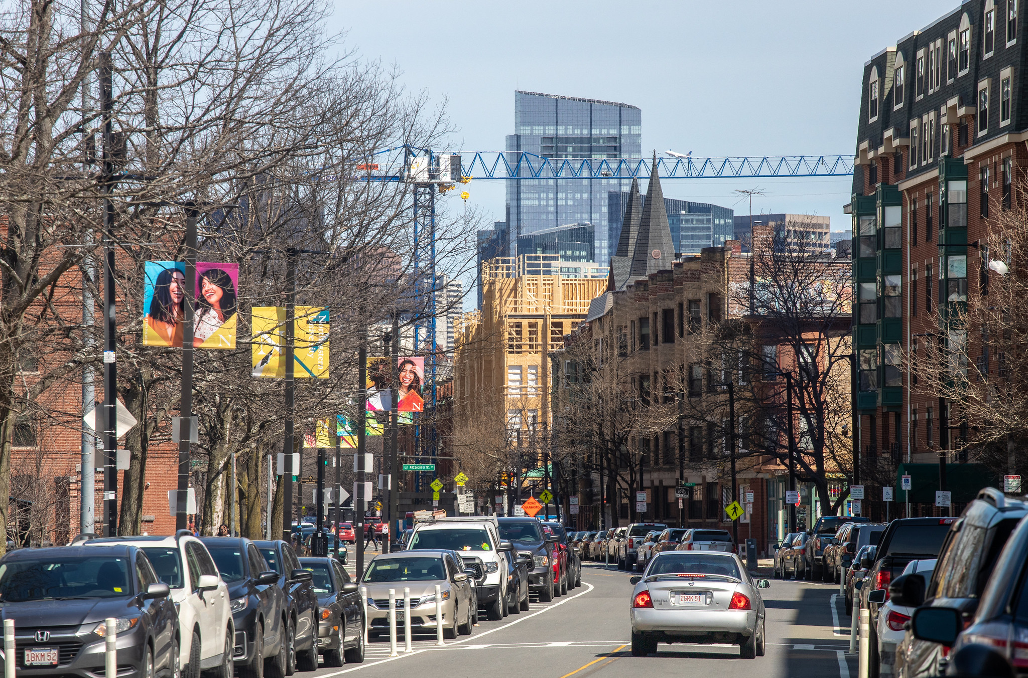
Harriet Tubman House | 566 Columbus Avenue | South End

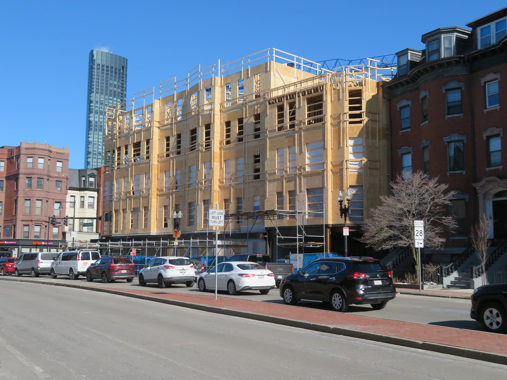
It's actually a reference to where the materials are addressed in building code. The height can vary, but the distinguishing feature regards use of type 1 materials on the first floor, and type 5 materials for additional floors. I do think there is a limit to just how many type 5 floors you can add, though local variances probably vary on this.

“The one-plus-five style of buildings exploded in popularity in the 2010s, following a 2009 revision to the United States-based International Building Code, which allowed up to five stories of wood-framed construction.[4] The mid-rise buildings are normally constructed with four or five wood-frame stories above a concrete podium (usually for retail or resident amenity space).”
https://en.m.wikipedia.org/wiki/One-plus-five

“most of these structures are what’s known as “5 over 1” or “one-plus-five”: wood-framed construction, which contain apartments and is known as Type 5 in the International Building Code, over a concrete base, which usually contains retail or commercial space, or parking structures, known as Type 1.”
https://archive.curbed.com/2018/12/4/18125536/real-estate-modern-apartment-architecture
 
Does anyone know if it is actually a 5 over 1? It could be steel framed. That is some massive steel there.
From the PNF:
1637791074836.png
 
Community involvement has translated into superior construction for once. The crane, the steel...it speaks to a level of attention not often found these days. I love that they are still iterating the design, and have not VE'd. This thing is being built to last. My only hope is for real brick work.
 
The balconies have been removed. The top floor decorative rail, the silver panels, and the angled corner windows are gone too. It's pretty much lost everything that gave it personality and individuality.
 
The balconies have been removed. The top floor decorative rail, the silver panels, and the angled corner windows are gone too. It's pretty much lost everything that gave it personality and individuality.
The brick facade actually has depth now (look at the corbeling above the windows), the lazy "alternating window treatment" has been abandoned, and the silly faux-Gehry tilted windows are gone. This final iteration is daring to be a respectable building.
 
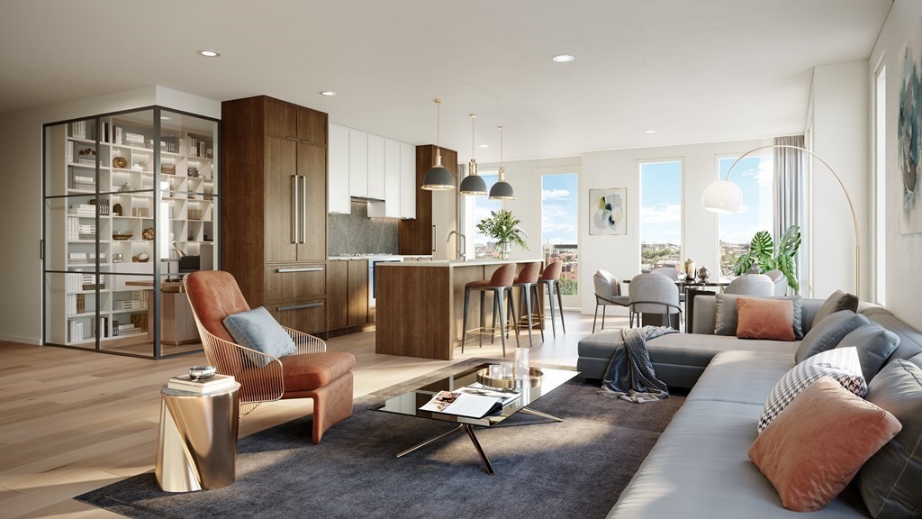
Found a couple units here listed for sale recently. Not cheap, as you can imagine. But quality interiors for sure:


The brick facade actually has depth now (look at the corbeling above the windows), the lazy "alternating window treatment" has been abandoned, and the silly faux-Gehry tilted windows are gone. This final iteration is daring to be a respectable building.
The disrespectable version, with it's 21st century bells and whistles paid better homage to the South End's 19th century bells and whistles than the current version does, which has been made so generic it now falls into the "could be anywhere" category. It will turn out well enough but will not be what it could have been.
 
I feel like in the south end blending in is good, because of how high the bar is there. I honestly am happy with either building. The first version was pretty cool and definitely had a frank ghery vibe. It also had a bit of a trying too hard vibe.

The current building is definitely plain and a bit boring, but I feel like its going to do a great job of blending in to the wonderful fabric of the south end when passing by. If you take a closer look though it has a modern touch that I think looks good and current and makes it stand out from the rest of the older buildings. I think thats a nice balance.
 
The balconies have been removed. The top floor decorative rail, the silver panels, and the angled corner windows are gone too. It's pretty much lost everything that gave it personality and individuality.


Brad - - that earlier render was a Homermobile. And I'm being polite. What a complete hodgepodge mess of different pieces that didn't talk to each other. Was much of that exterior alucobond or vinyl siding???? And the tiilt windows????? And the jarring change of color from artificial bile red/brown to dark gray????? Honestly, I'm trying to get my eyes to unsee that.

(BTW, I love the Frank Gehry Stata Center at MIT in it's particular context).


1644016778044.png
 
Last edited:
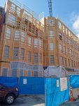
From today. Second pic is from W. Springfield. I had never walked that block before. A very funky mix of buildings. This will have a serious presence. I'm praying for actual brickwork. Does anyone know if it is required in the historical district?
 

Attachments

  • IMG_20220316_132521664_HDR.jpg
    IMG_20220316_132521664_HDR.jpg
    3.5 MB · Views: 92
  • IMG_20220316_132429256_HDR.jpg
    IMG_20220316_132429256_HDR.jpg
    1.8 MB · Views: 95
I am so much happier with the final approved design than the original one. It’s stately yet modern and will anchor that corner nicely. The South End is really all about traditional architecture with high quality materials and detailed ornamentation. It is not about quirky designs, asymmentry, or mixing in modern materials. There are places in Boston where I think that’s appropriate, but not in the South End Landmarks District. We want classic Boston here!
 

Back
Top