You are using an out of date browser. It may not display this or other websites correctly.
You should upgrade or use an alternative browser.
You should upgrade or use an alternative browser.
Harriet Tubman House | 566 Columbus Avenue | South End
- Thread starter cjbski
- Start date
stick n move
Superstar
- Joined
- Oct 14, 2009
- Messages
- 13,487
- Reaction score
- 24,540
This has to be the best brick work done since the bolling municipal building in roxbury. This is incredible, especially the depth in that 2nd pic, just wow.
urbanmansprawler
New member
- Joined
- Oct 8, 2021
- Messages
- 73
- Reaction score
- 150
I really like this. Contextual while maintaining a distinct profile, with detailing that breaks up what might otherwise be a sea of brick, this blends into the neighborhood while quietly presiding over a prominent corner. More of this, please.
Randomgear
Active Member
- Joined
- Jul 7, 2012
- Messages
- 364
- Reaction score
- 46
Really, amazing design and work; especially loving the black manganese? brick at the jambs of the less inset windows, just a beatifully slick visual trick!This has to be the best brick work done since the bolling municipal building in roxbury. This is incredible, especially the depth in that 2nd pic, just wow.
By far my favorite detail of this project has to be this. The fact that the siding on the upper floors is a continuation of the other surrounding buildings is such a minor, but important detail. I live a few blocks from here and walk by almost every day and can’t help but smile. What a great addition to the neighborhood!

reverend_paco
Active Member
- Joined
- Oct 15, 2012
- Messages
- 401
- Reaction score
- 261
 IMG_0408
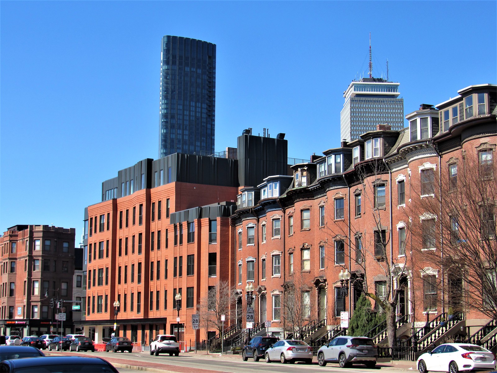 IMG_0409
 IMG_0412
 IMG_0413
stick n move
Superstar
- Joined
- Oct 14, 2009
- Messages
- 13,487
- Reaction score
- 24,540
Build a whole neighborhood of these.
The area of mass ave from Boston Medical Center to Columbia rd in Dorchester would be the perfect spot to start expanding the south ends urbanism into imo. You also have those huge empty lots behind bmc that just recently had an rfp go out. Yea its methadone mile today, but it doesnt have to be forever.
- Joined
- May 25, 2006
- Messages
- 7,064
- Reaction score
- 1,990
If we still did the archBoston awards I'd nominate this for Best New Development.
Bananarama
Active Member
- Joined
- Mar 18, 2020
- Messages
- 609
- Reaction score
- 1,262
I don't want to sound contrarian, but while I appreciate the bland competency of this project urbanisticly, I really find it irrationally overwrought in some its details and overall massing. Somehow it's doing so much at once yet the result is a mixed bag of handsome and cut corners without being architecturally significant or interesting.
To ramble off a few of my issues:
The massing overall doesn't have an easily discernable rhythm because it keeps breaking after 2 repeats and whenever it turns a corner. Meanwhile, the direct neighboring row houses down Mass Ave and Columbus are regimentally standard and clear as a repeated fabric - bow front and straight faceted rowhouses. I think it would've been really interesting if this corner formally spliced those two typologies along the street edge as a larger scale transition. Instead there's just a step down to the Mass Ave side and the Springfield edge gets a mansard with faux shingles (and also what looks like a weird intermediate separate row house as a buffer) - reasonable, but boring .
You can see an attempted rhythm in the way the wider vertical bands push out with an angled face, then back in. There's your rhythmic language, now commit to it. There's too much variation and exceptions to this standard. The upper level is in conversation with what the lower 5 stories are doing, but somehow off a few steps and moving in and out at random and changing material languages.


The 3 flat aluminum panels making up a crude cornice above the dormers are incredibly cheap looking. They went so far to get convincing faux shingles but simplified a detail too far. Looks chunky and inelegant.

This detail is both interesting and grotesque somehow. I get they're trying to match the cornice line of the neighbor, but it's such a tiny sliver of contextualism and very at odds with the conservative sensibilities throughout the rest of the project. The windows slicing through is almost verging into some postmodern humor. If this swath of façade was longer or this motif picked up elsewhere, it would have taken an attitude enough to feel cohesive.
My guess is that the community process during design review for this project demanded a lot of push-pull against the original concept (not to say the original 2019 proposal was discernably better than what's been built). I'm happier with this than a 'landscraper' and appreciate some effort to break the massing down - I just wish it was done less in the vein of making nearly-distinct-adjacent-buildings, like a very mild version of Assembly Square with ubiquitous superstructure behind "unique" storefronts.
It's not going to win any AIA awards and maybe that's just fine.
To ramble off a few of my issues:
The massing overall doesn't have an easily discernable rhythm because it keeps breaking after 2 repeats and whenever it turns a corner. Meanwhile, the direct neighboring row houses down Mass Ave and Columbus are regimentally standard and clear as a repeated fabric - bow front and straight faceted rowhouses. I think it would've been really interesting if this corner formally spliced those two typologies along the street edge as a larger scale transition. Instead there's just a step down to the Mass Ave side and the Springfield edge gets a mansard with faux shingles (and also what looks like a weird intermediate separate row house as a buffer) - reasonable, but boring .
You can see an attempted rhythm in the way the wider vertical bands push out with an angled face, then back in. There's your rhythmic language, now commit to it. There's too much variation and exceptions to this standard. The upper level is in conversation with what the lower 5 stories are doing, but somehow off a few steps and moving in and out at random and changing material languages.
The 3 flat aluminum panels making up a crude cornice above the dormers are incredibly cheap looking. They went so far to get convincing faux shingles but simplified a detail too far. Looks chunky and inelegant.
This detail is both interesting and grotesque somehow. I get they're trying to match the cornice line of the neighbor, but it's such a tiny sliver of contextualism and very at odds with the conservative sensibilities throughout the rest of the project. The windows slicing through is almost verging into some postmodern humor. If this swath of façade was longer or this motif picked up elsewhere, it would have taken an attitude enough to feel cohesive.
My guess is that the community process during design review for this project demanded a lot of push-pull against the original concept (not to say the original 2019 proposal was discernably better than what's been built). I'm happier with this than a 'landscraper' and appreciate some effort to break the massing down - I just wish it was done less in the vein of making nearly-distinct-adjacent-buildings, like a very mild version of Assembly Square with ubiquitous superstructure behind "unique" storefronts.
It's not going to win any AIA awards and maybe that's just fine.
Suffolk 83
Senior Member
- Joined
- Nov 14, 2007
- Messages
- 3,024
- Reaction score
- 2,512
I think its purposely arbitrary in an attempt to camouflage a superblock and mimic the smaller lot sizes and character of its neighbors. Like the Target building in Fenway has 7 different facades but more subtle and less cheesy.
HBH
Senior Member
- Joined
- Apr 17, 2018
- Messages
- 1,564
- Reaction score
- 4,750
My biggest complaint about this project is that it looks like it didn't include any new street trees along its frontage? Is that right?
Looks like the street trees are in now
HenryAlan
Senior Member
- Joined
- Dec 15, 2009
- Messages
- 4,473
- Reaction score
- 5,256
Looks like the sidewalk and bike lanes on the Columbus side are no longer blocked off? I rode through there on Friday, and still had to merge in to the car lane for that stretch, which is definitely not a good safety feature.