Brad Plaid
Senior Member
- Joined
- Jan 17, 2013
- Messages
- 1,310
- Reaction score
- 1,559
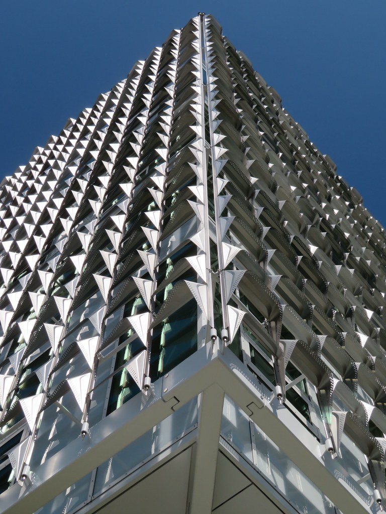
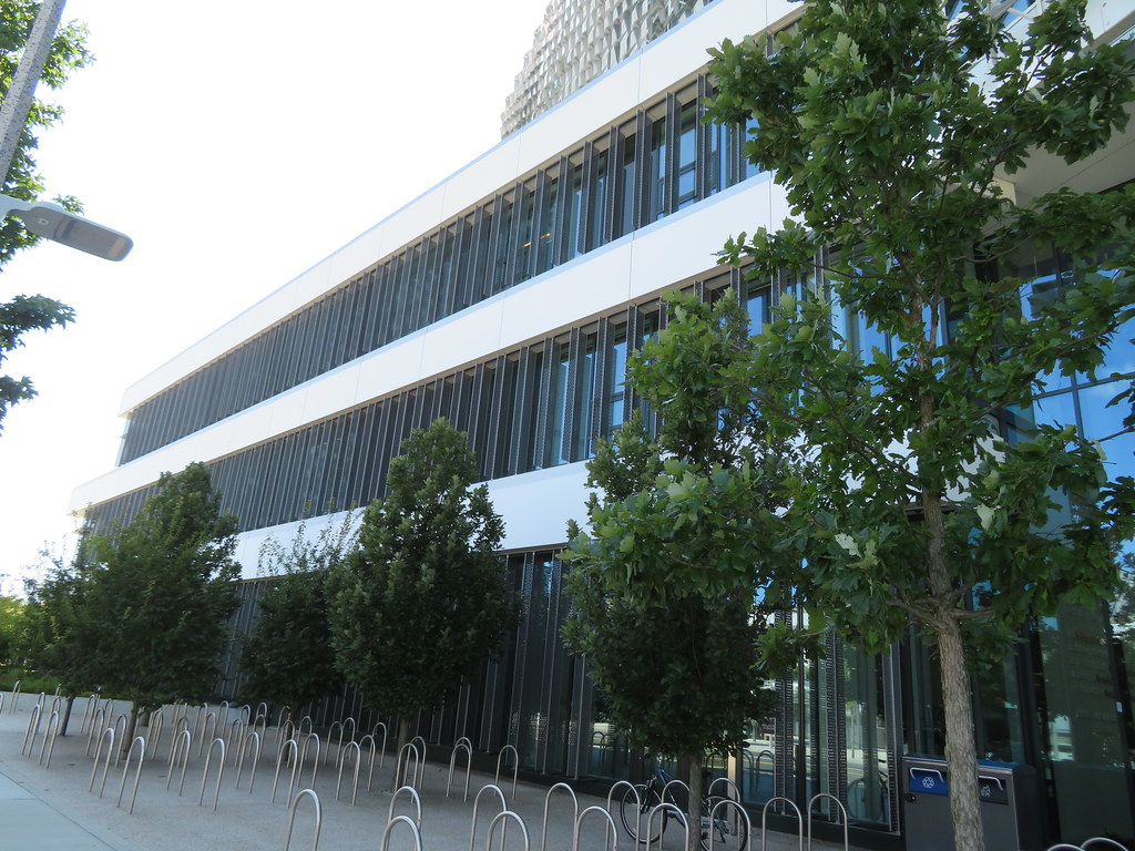
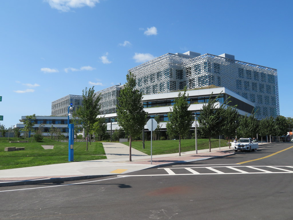
This building gets kudos for originality, and I do like it, but it does look like it's encased in bubble wrap.
I like this photo in particular! Almost Cape Cod -like vibes from that grass!
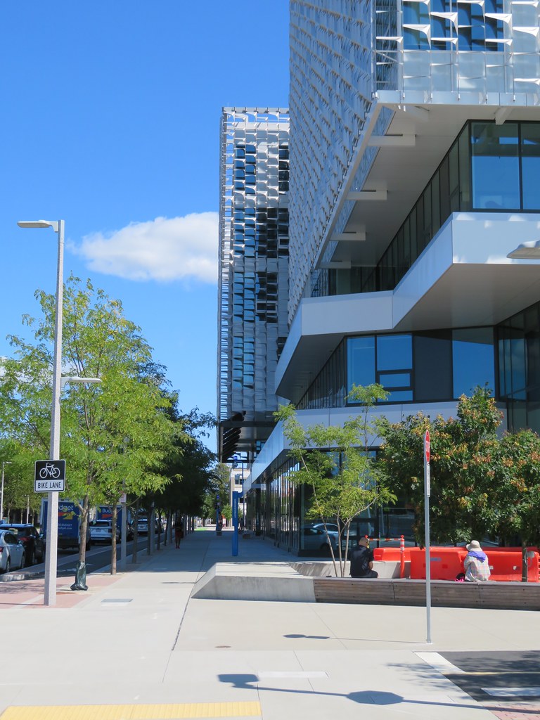
All fair points but it's also isolated in the sense that 3 sides of it face empty lots. When they're developed it will be a lot more cohesive though pretty much all of it will be superblocks.I’m extremely skeptical that this will succeed as an urban building. The landscaping is pretty and the facade is different enough to be interesting, but ultimately this is an absolutely massive landscaper that will feel hostile. The building is far larger than anything on the main campus, and the green space dwarfs anything you’d find in Harvard Yard. Hell, it’s bigger than government center. Visually interesting but unwelcoming in person.
All fair points but it's also isolated in the sense that 3 sides of it face empty lots. When they're developed it will be a lot more cohesive though pretty much all of it will be superblocks.
Yes, there is a lot of open space. The grass on the main lawn is some of the thickest, most luxuriant I've ever come across. Go barefoot there if you get the chance. A few more pics.
View attachment 14966
Still feels like an office park design. The cheese-grater facades don't help.
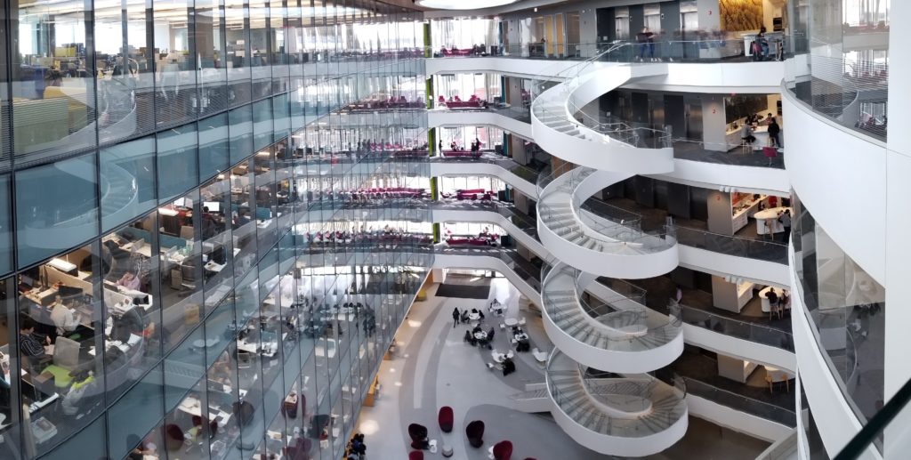
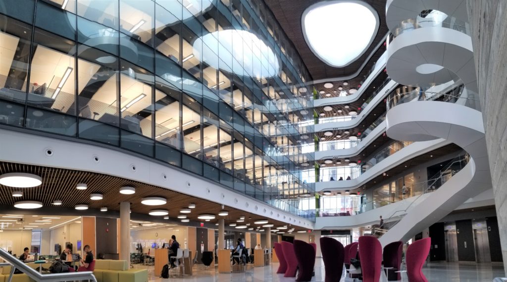
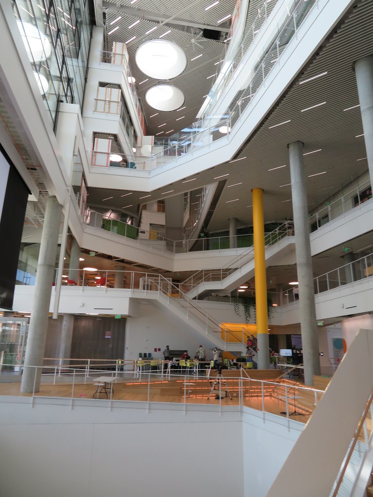
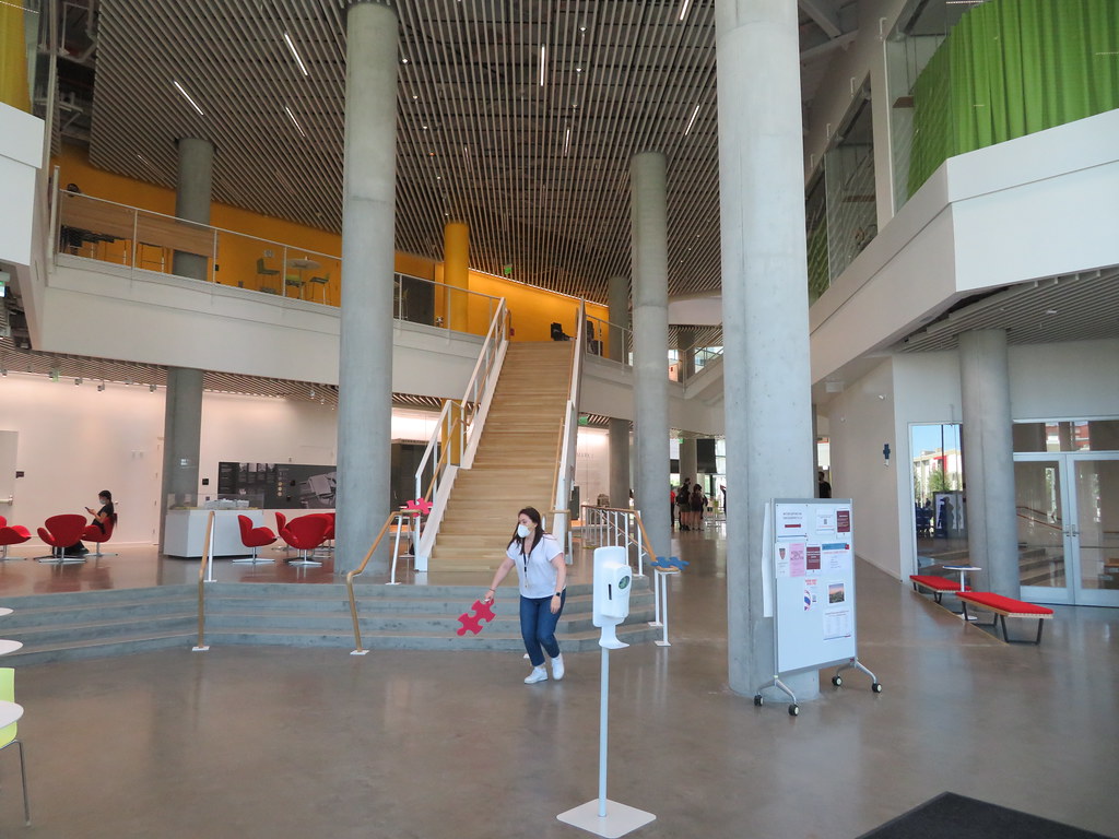
I'm sure the interior is pleasant and well appointed.
This space should be much brighter than the photos show it as and I think the materials and colors choices are unfortunate. The black/dark window mullions were a mistake imo.
View attachment 14975
 IMG_4330 by Bos Beeline, on Flickr
 IMG_4333 by Bos Beeline, on Flickr
 IMG_4336 by Bos Beeline, on Flickr
 IMG_4337 by Bos Beeline, on Flickr
 IMG_4340 by Bos Beeline, on Flickr
 IMG_4339 by Bos Beeline, on Flickr
 IMG_4343 by Bos Beeline, on Flickr
 IMG_4347 by Bos Beeline, on Flickr
 IMG_4342 by Bos Beeline, on Flickr
 IMG_4364 by Bos Beeline, on Flickr
 IMG_4365 by Bos Beeline, on Flickr
 IMG_4368 by Bos Beeline, on Flickr
 IMG_4350 by Bos Beeline, on Flickr
 IMG_4349 by Bos Beeline, on Flickr
 IMG_4353 by Bos Beeline, on Flickr
 IMG_4356 by Bos Beeline, on Flickr
 IMG_4358 by Bos Beeline, on Flickr
 IMG_4359 by Bos Beeline, on Flickr
 IMG_4360 by Bos Beeline, on Flickr
 IMG_4361 by Bos Beeline, on Flickr
“Harvard is performing as a development company, not as an educational institution,” said Anthony D’Isidoro, president of the Allston Civic Association. “They talked about Beacon Park being the next Seaport District. If it’s going to turn out like the Seaport, we don’t want any of that.”
.....
Neighbors found the offer encouraging, though it’s unlikely to assuage concerns that Harvard’s undeveloped portion of Allston is at risk of becoming another Seaport — or in city councilor Liz Breadon’s words, “a playground for folks who are mostly white people who have a lot of money.”
“There’s an expectation that Harvard can do more,” said Breadon, who recently sent the letter to Janey urging city officials to wait until after this fall’s mayoral election to approve the research campus project and a rezoning study for a nearby stretch of Western Ave., where Harvard also owns property.
IMG_4358 by Bos Beeline, on Flickr
