Harvard SEC (Science & Engineering Complex) | Western Ave | Allston

It looks encased in bubble wrap, but some points are given for being different, or at least odd.
 
I hereby christen thee the Harvard CGC (Cheese Grater Complex).
Harvard CGC.jpg
 
Gives me more of a pro wrestling steel cage feeling from the wide shot.
 
Maybe once other buildings are built nearby it will kinda fit.
Remembering that it's a university engineering building - this thing is designed to encourage critique and is doing its job. The internal atrium certainly will be a joy to wander through.
1598640540073.png


This is an interesting "anchor development" for the rest of the engineering campus. The neighborhood will be under constant construction for the next 20 years, and I'll be curious to watch if it's designed like a typical open-space campus quad development or as a Kendall/BU style downtown with accompanying corporate tenants.

Plan Development: https://news.harvard.edu/gazette/story/2018/03/plan-approved-for-harvard-enterprise-research-campus/
1598640129318.png
 
Remembering that it's a university engineering building - this thing is designed to encourage critique and is doing its job. The internal atrium certainly will be a joy to wander through.
View attachment 6910


Is that the finished product??? I'm still in love with Northeastern's ISEC. Each time I visit it, I get weak in the knees.

1598658876768.png


1598659000516.png


1598659329190.png
 
Last edited:
Nothing special about that spiral staircase, can be found in many places.
 
Nothing special about that spiral staircase, can be found in many places.

If the only element you see in those 3 pics of the NU ISEC is a spiral staircase..........

Evidently you feel the atrium pic in post #144 is the better one. It's all good. People have eyes, they can make their own judgements.

BTW, I love Harvard and much of its architecture in Allston - - I see Klarman Hall's auditorum as a modern masterpiece. The SEAS? Not so much.
 
Last edited:
The quality of the interior finishes at the Northeastern ISEC is top notch, and not just in the foyer, either, from my experience. The auditorium/lecture hall on the ground floor is one of the highest quality I've been in, and even people far from architecture/interiors acknowledged it too. I imagine Harvard's finishes will be equally as nice too.
 
Remembering that it's a university engineering building - this thing is designed to encourage critique and is doing its job. The internal atrium certainly will be a joy to wander through.
View attachment 6910

This is an interesting "anchor development" for the rest of the engineering campus. The neighborhood will be under constant construction for the next 20 years, and I'll be curious to watch if it's designed like a typical open-space campus quad development or as a Kendall/BU style downtown with accompanying corporate tenants.

Plan Development: https://news.harvard.edu/gazette/story/2018/03/plan-approved-for-harvard-enterprise-research-campus/
View attachment 6909
The interior looks interesting.
I would have thought a university engineering building would encourage critique by pushing the bounds of design and construction. This, from the exterior, doesn't seem to do that. It's not great when the main critique is 'meh'.
 
I have not checked out the back of the building yet, but did want to comment that when the screen was first going up I really disliked it. Since then it has really grown on me and does look much better in person. It takes on different qualities depending on the light and can be quite beautiful. Lately when the sun is setting the windows have a blue green reflective quality and the fins on the screens glow white or pink depending on the color of the sky. I love looking at it. I live a half block away above the Trader Joe's so I see it all the time.
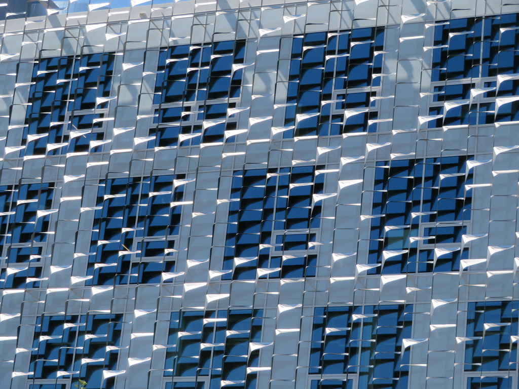
 
I have not checked out the back of the building yet, but did want to comment that when the screen was first going up I really disliked it. Since then it has really grown on me and does look much better in person. It takes on different qualities depending on the light and can be quite beautiful. Lately when the sun is setting the windows have a blue green reflective quality and the fins on the screens glow white or pink depending on the color of the sky. I love looking at it. I live a half block away above the Trader Joe's so I see it all the time.

The circle of life of Boston development.

Anyways I definitely agree. Its pretty iconic, especially where it looms off in the distance for all to see travelling westbound on the pike.
 
50268833433_d19c7565d0_b.jpg


Thanks to Beeline for this image. The reflective metal panels that form the screen differ greatly in how they were individually fabricated, and their subsequent placement seems rather random.

The overall effect is to break up solid massing, and diffuse any light striking the panels. French neo-impressionism

81rWG6R-ObL.jpg
 
I have not checked out the back of the building yet, but did want to comment that when the screen was first going up I really disliked it. Since then it has really grown on me and does look much better in person. It takes on different qualities depending on the light and can be quite beautiful. Lately when the sun is setting the windows have a blue green reflective quality and the fins on the screens glow white or pink depending on the color of the sky. I love looking at it. I live a half block away above the Trader Joe's so I see it all the time.


I'm very glad to hear that. I've only seen it in the pix posted here, and in photos it comes across as an unremarkably pedestrian building and the screening just looks gimmicky. It's great that the screen adds some aesthetic value and wow! factor in addition to utilitarian climate-control functions. Makes me wonder what sort of impression the Artists for Humanity building would have made if built to the original design.
 
Note that I was responding to criticism of the screen. I agree that underneath it's a pretty pedestrian buillding.

Late last night I drove down Windon Street toward the building and was suprised at how large it looks from that approach. It looks massive, almost like a large industrial plant with its lights, looming over the neighborood.
 
The circle of life of Boston development.

Anyways I definitely agree. Its pretty iconic, especially where it looms off in the distance for all to see travelling westbound on the pike.

I caught it coming down Western from Cambridge last month at low sun angle when the entire sky save for the setting sun was clouded over with big black storm clouds from a fast-approaching thunderstorm. The lighting effect was definitely...something. Like "cheese grater on fire". I wish my cell's camera glass weren't cracked and still needing a shop visit for repair, otherwise I would've pounced on the shot ASAP. Wasn't around the week the Western wildfire smoke was redding up our sunsets; that probably would've been a striking sight, too.

I think there's something to be said for having a building that always keeps itself conversational by drawing eyes from the novelty of odd angles like that. The fact that it looks like a tacky screen door some or most of the time is as intentional as it looking like a burning pyre over Lower Allston on those 4 days a year the lighting in is perfect sync. "Abrasive" to its audience without insulting them completely away. You know...like the building equivalent of listening to the first three PiL albums*. :unsure:

(*about 2⅓ people just got that reference. Flowers of Romance FTW.)
 

Back
Top