You are using an out of date browser. It may not display this or other websites correctly.
You should upgrade or use an alternative browser.
You should upgrade or use an alternative browser.
Hong Lok House | 11-31 Essex Street | Chinatown
- Thread starter Mike
- Start date
- Joined
- Jan 7, 2012
- Messages
- 14,072
- Reaction score
- 22,823
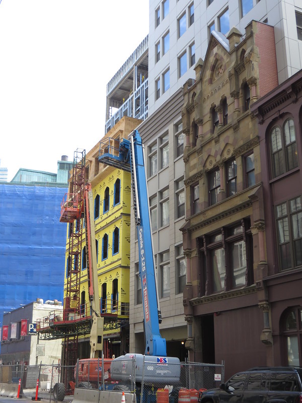
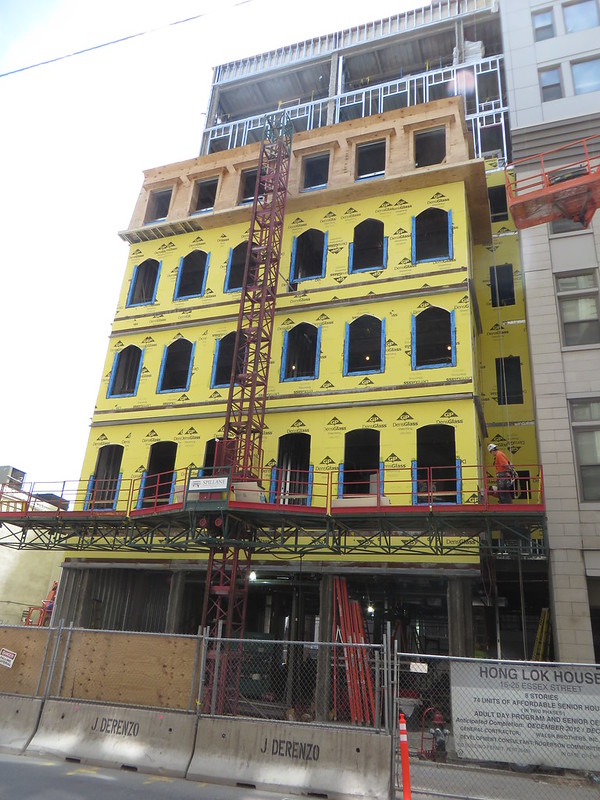
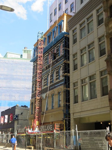
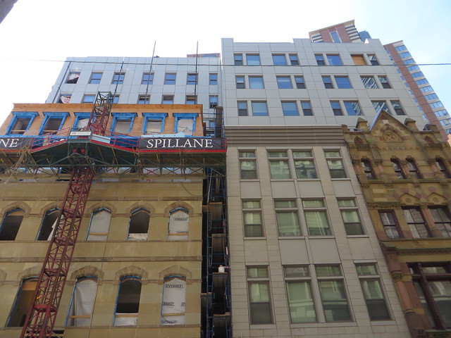
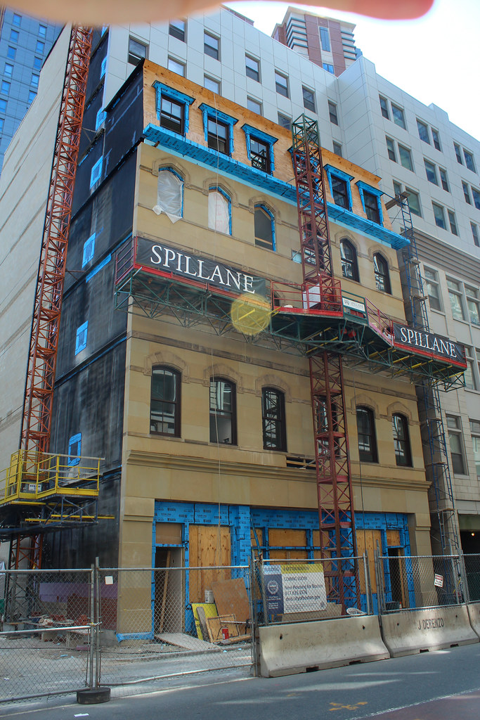
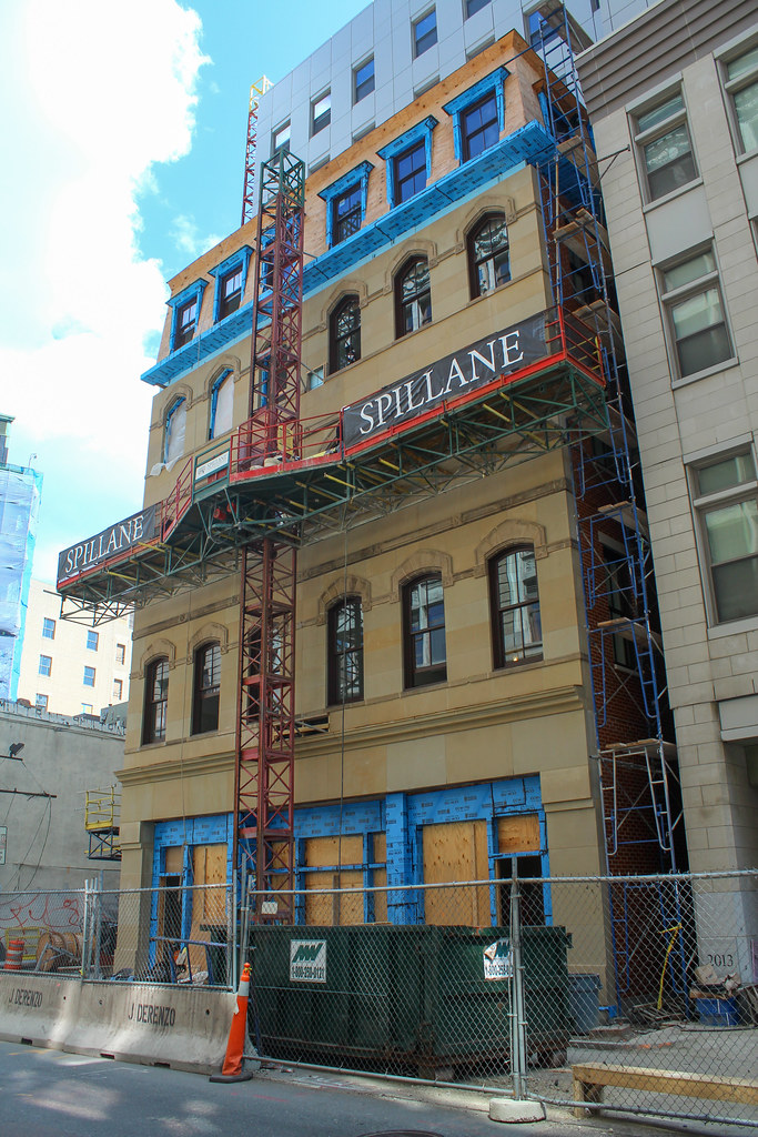
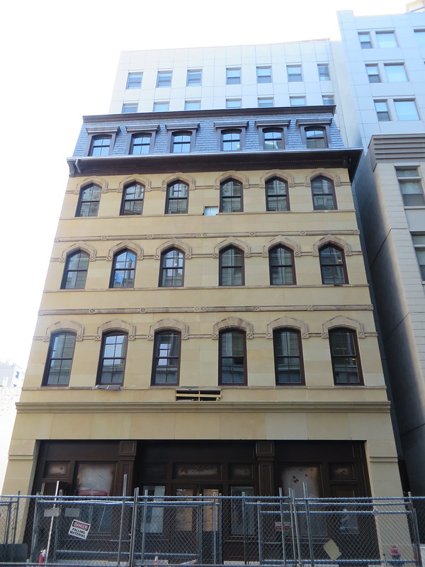
Real design? Like that lovely paneled box rising up over Floor 4?
Given the alternative is cheap-design, cheap-materials "let's build something that looks like a shoebox with windows" modernism, I'll take the half-arsed preservation of a building like this.
Given the alternative is cheap-design, cheap-materials "let's build something that looks like a shoebox with windows" modernism, I'll take the half-arsed preservation of a building like this.
stellarfun
Senior Member
- Joined
- Dec 28, 2006
- Messages
- 5,711
- Reaction score
- 1,544
IIRC, the original proposal for the Dainty Dot left a reduced-in-size facade that was about three feet deep. And that was gushed over.
Right ... but that facadectomy/exterior preservation would have been preferable to what we got, just as this facadectomy/exterior preservation is preferable to what the alternative likely would have been (and let's remember this is senior citizens affordable housing; this would not have been a "costs be damned, I'm going to build something wonderful" structure, if there are such things these days).
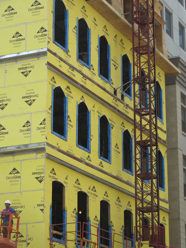
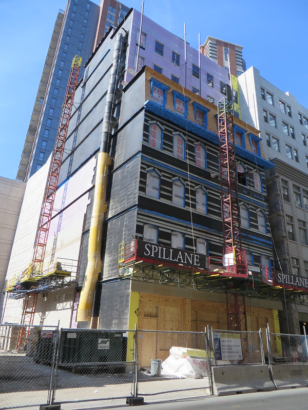
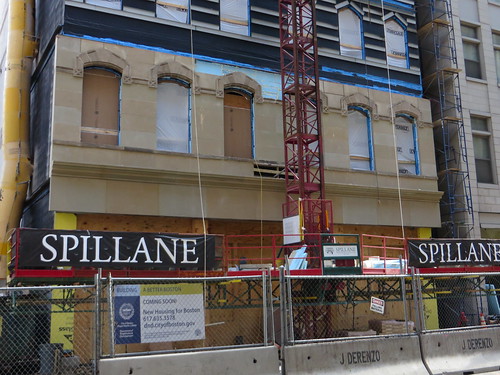
Like anything, there are different levels of competency. They did a really, really shit job here. It looks like they literally stuck the facades on with glue. It's blatantly obvious they in no way relate to the building behind them. By contrast, Atlantic Wharf and what's going on at Dudley at least attempted to incorporate the facades into the building an a way that makes sense, and somewhat respects the original building's vocabulary. I thought the Dainty Dot did a pretty bad job too, I had highlighted earlier in that thread a way a new tower could have been built about the size of the current one while retaining all of the old building and not butchering it.
I'm sorry to pull yet another thread off the rails, but this block deserved a better fate than this, even if that fate was death.
I'm sorry to pull yet another thread off the rails, but this block deserved a better fate than this, even if that fate was death.
Boston02124
Senior Member
- Joined
- Sep 6, 2007
- Messages
- 6,893
- Reaction score
- 6,639
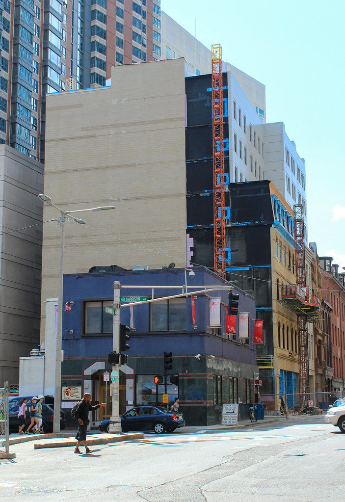
Is there an old pic of this street when it was intact, curious what the 2 story building next door on the left was at one time?
atlantaden
Senior Member
- Joined
- May 31, 2006
- Messages
- 2,606
- Reaction score
- 2,753
Seriously, cut the developers a break, they're a non-profit for God sakes! I don't think they have oodles of money and I think they did a damn good job given their probably limited budget!
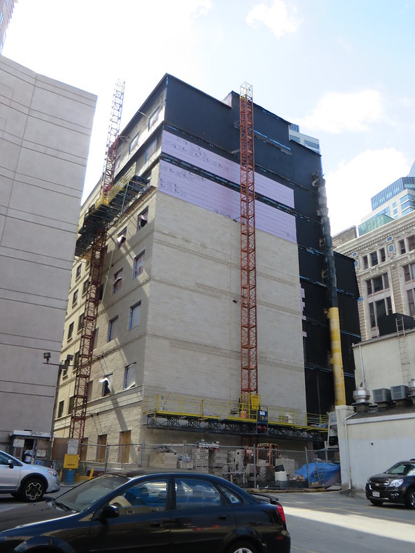
IMO, criticism should be directed not at the facades that were preserved but the hideousness protruding from behind them. Had they demo'ed the faces, we'd have that grotesque structure coming all the way down to street level, trashing the entire area. The facades are the only things keeping this building from jumping the ugly shark.
The facades are the only things keeping this building from jumping the ugly shark.
So lipstick on a pig.
statler
Senior Member
- Joined
- May 25, 2006
- Messages
- 7,939
- Reaction score
- 547
So lipstick on a pig.
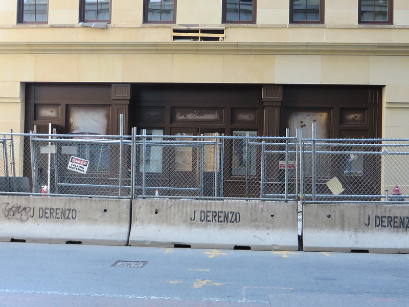
That's not entirely accurate. The street level facade of a building is a big part of its appeal. How a building interacts with the street is a lot bigger deal than a minor cosmetic update.
- Joined
- Jan 7, 2012
- Messages
- 14,072
- Reaction score
- 22,823
- Joined
- Jan 7, 2012
- Messages
- 14,072
- Reaction score
- 22,823
- Joined
- Jan 7, 2012
- Messages
- 14,072
- Reaction score
- 22,823
- Joined
- Jan 7, 2012
- Messages
- 14,072
- Reaction score
- 22,823

