You are using an out of date browser. It may not display this or other websites correctly.
You should upgrade or use an alternative browser.
You should upgrade or use an alternative browser.
Hynes renovation
- Thread starter JS38
- Start date
- Joined
- May 25, 2006
- Messages
- 7,062
- Reaction score
- 1,976
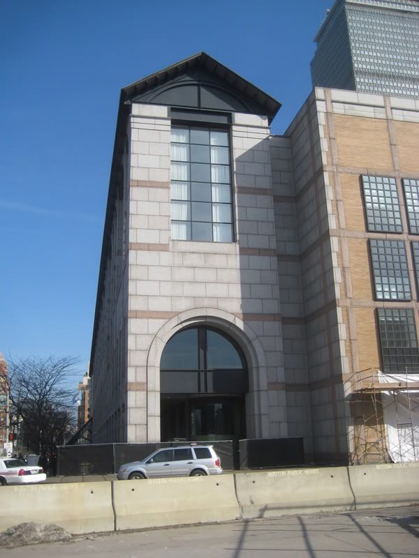
Lipstick on a pig.
On the earlier renderings the entrance was flanked by Egyption pylons. It look great. I also alway wished it had been place at the head of the street. I saw a drawing by the architects showing streetscape for may blocks and this building was very sympathetic to the other buildings.
Lafayette Place should have done the same thing, line the entrance with Temple St and make it more pronounced so that from Tremont St you would see the entrance and known there was a mall there. There's a lot of reasons Lafayette Place failed not all because of the design, but that's for another thread.
Lafayette Place should have done the same thing, line the entrance with Temple St and make it more pronounced so that from Tremont St you would see the entrance and known there was a mall there. There's a lot of reasons Lafayette Place failed not all because of the design, but that's for another thread.
H
Hooplehead
Guest
The Hynes, along with Back Bay Station, are examples of great "Big Ideas" that were fumbled in execution. Both of these buildings, by Kallmann, McKinnell and Wood, re-employ historical Italian urban design elements in contemporary form.
The thought, among architecture students at the time, was that McKinnell adapted thesis projects of his GSD interns, and just plugged them into the site. Back Bay Station, which takes the form of a basilica, brilliantly curves to reflect the track below, then drops the ball by denying the nave with a huge elephant cage enclosing the actual subway entrances.
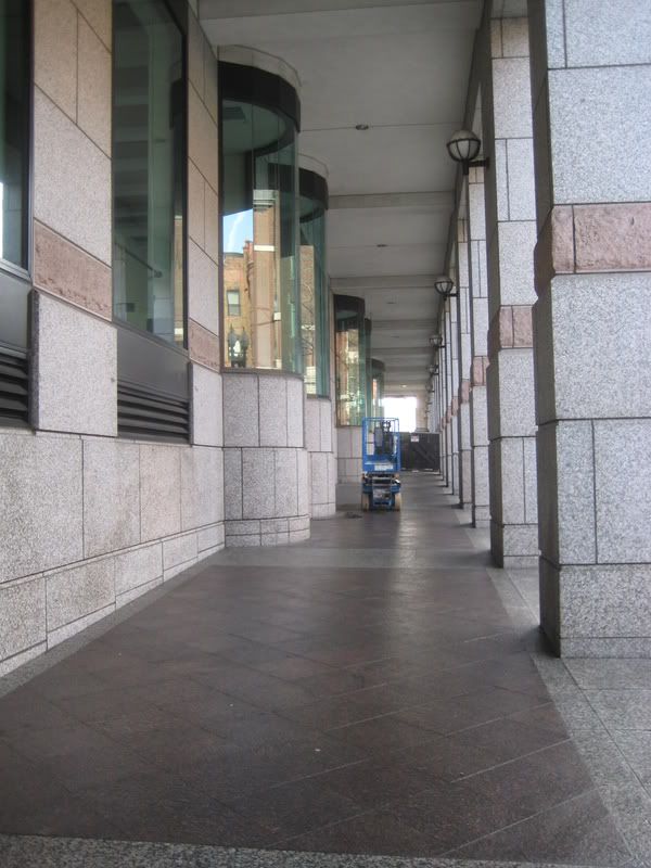
Similarly, the Hynes uses the classic Italian shaded street arcade (think: Piazza San Marco, Bologna, Turin, etc.) but places it on the north side of the building. To add insult to irrelevance, there was nothing opening off of it. And as for the off-Gloucester Street entrance, there was some unconvincing song and dance at the time, but it seems obvious that it was, in reality, a miscalculation.
And I can remember being in the BAC student lounge, drinking and smoking (when such activities did not label you as "worse than Hitler") and laughing at McKinnell's explanation for that side wall. It was explained that the grid represented the memory of buildings formerly on the site. The joke? Before the original 1960's Hynes, there were no buildings on the site.
Other than the arcade what do you see as wrong about this building?
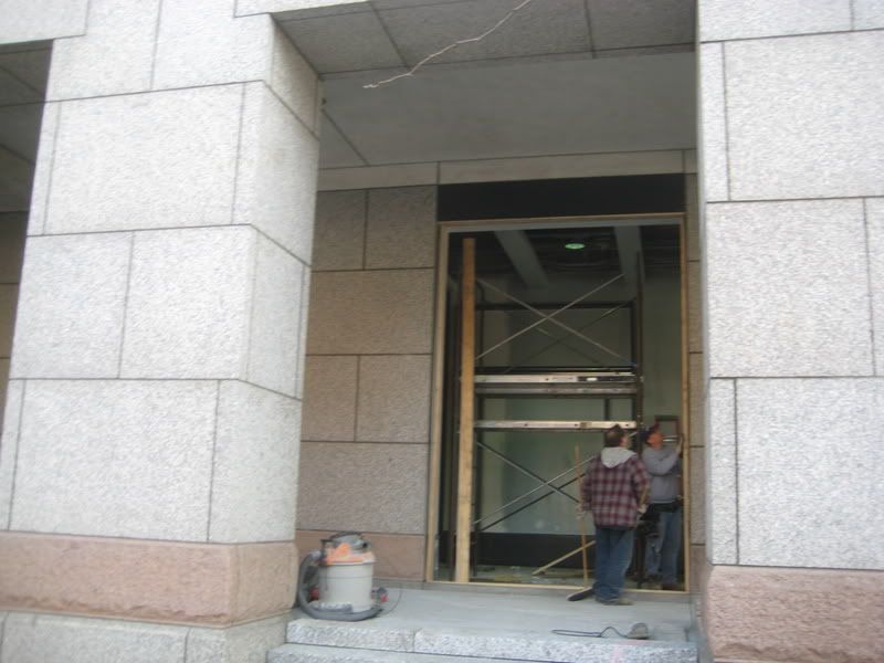
Certainly the problem can be fixed, the new retail should help. Part of the problem is there was never a reason to head in that direction. That's all going to change in the future.
Certainly the problem can be fixed, the new retail should help. Part of the problem is there was never a reason to head in that direction. That's all going to change in the future.
H
Hooplehead
Guest
Actually Paul, I like the building (despite my snarking). If they can really insert some activity behind the arcade.... though I had heard the undercroft along that stretch precluded a ground-level floor.... and if an anchor is developed at the western end, then all could be well. All except the off-centered entrance and the jive-ass nonsense about the side wall.
Probably much of my opinion about the Hynes has to do with my attitude toward McKinnell. That can be traced primarily to Robert Campbell who, at the time, would ignore all objective analysis and greet every McKinnell project with Lewinsky-like enthusiasm.
Probably much of my opinion about the Hynes has to do with my attitude toward McKinnell. That can be traced primarily to Robert Campbell who, at the time, would ignore all objective analysis and greet every McKinnell project with Lewinsky-like enthusiasm.
B
bosma
Guest
you cant shine shit, tear it down
Ron Newman
Senior Member
- Joined
- May 30, 2006
- Messages
- 8,395
- Reaction score
- 14
Huh? This is a well-used building, bringing lots of customers to the surrounding hotels and stores and restaurants. I'm glad the state decided to keep it even after opening a much larger convention center in the Seaport.
Im a big fan of arcades. The biggest failure of the hynes one, besides the lack of stores, is how narrow it is. The only time people use it is when it rains.
And when they are running after Leonardo DiCaprio to offer him anti-depressants in exchange for passionate sex....
I wouldn't shed a tear to see the building go.....one of its biggest shortcomings is the fact that even though it is a public building, the public can't access it. In other words, I can't cut through the building to get into the Pru, which is ridiculous.
There really is no street life in front of the building, and yes, the arcade really is only useful when it is raining or there is ice on the exposed stone pavers.
kz1000ps
Senior Member
- Joined
- May 28, 2006
- Messages
- 9,140
- Reaction score
- 13,323
And when they are running after Leonardo DiCaprio to offer him anti-depressants in exchange for passionate sex....
Ha... that was filmed on the backside of the Brooke Courthouse, right?
Ron Newman
Senior Member
- Joined
- May 30, 2006
- Messages
- 8,395
- Reaction score
- 14
even though it is a public building, the public can't access it. In other words, I can't cut through the building to get into the Pru, which is ridiculous.
I suspect the main reason for this is that many of the conventions hosted in the Hynes require expensive paid admission, indicated by badges that the attendees wear. If only badge-wearers can enter the building, it is not necessary to check badges at entrance to each meeting room.
Preventing theft of equipment from the display halls may also be an issue.
I'll be curious to see what effect the new retail or restaurant spaces have on access control to the Hynes.
That only really started after 09/11 with the Hynes stepping up security a bit. Prior, it was easy to cut through. I agree that it would be a terrific, easy shortcut to get through.


