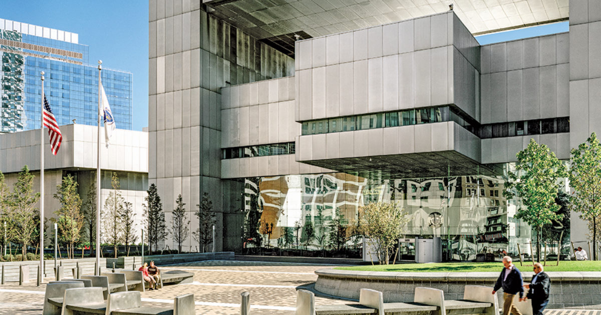
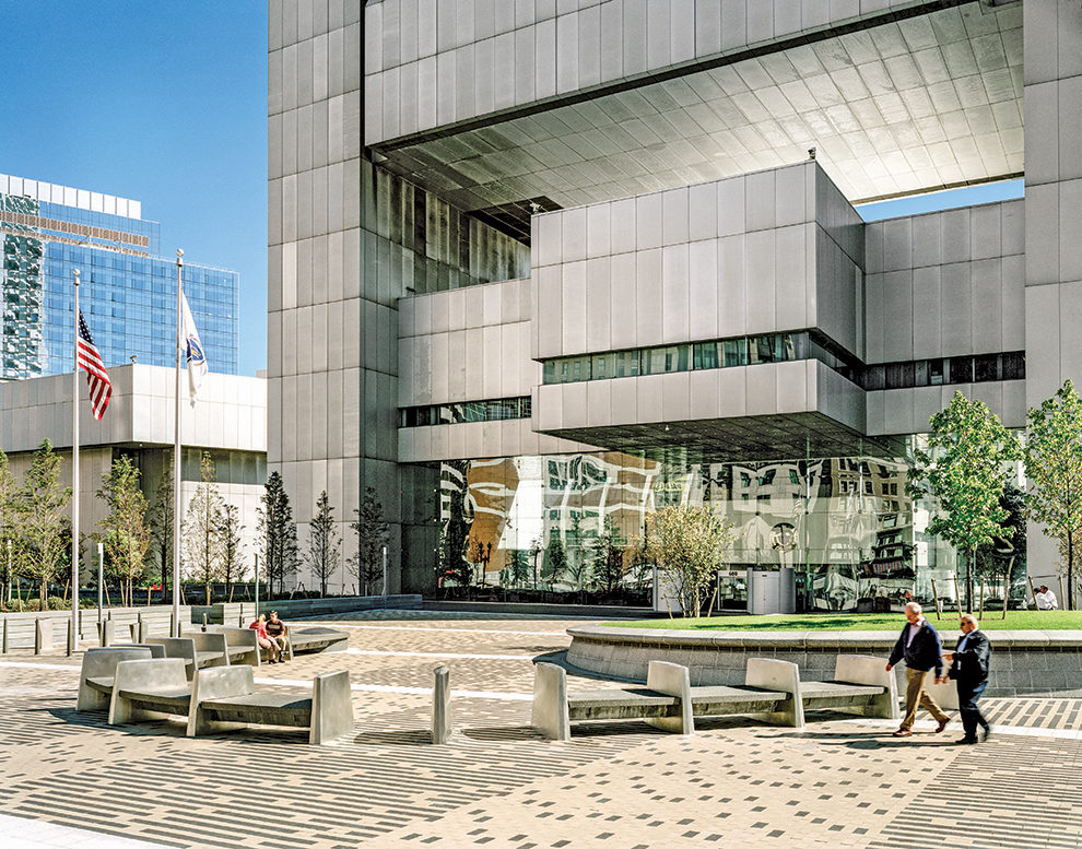
The front plaza of the bank provides outdoor space for more quiet and contemplative gatherings.
Photo: © Anton Grassl/Esto
At the end of the 1990s, the Federal Reserve Bank of Boston began to conceptualize a lofty initiative to improve the quality and public benefits of its plaza, which hadn’t been substantially altered since its construction in the 1970s. The original plaza design was less a destination or gathering space and more of a passageway, and the leadership at the bank wanted to be a contributing partner in providing quality, accessible outdoor space to attract tenants to its leasable office tower and offer places for the public to gather and unwind. The bank had two other reasons for pursuing a plaza redesign: a perceived need to enhance security after the Oklahoma City and first World Trade Center bombings, and the ongoing construction of the Big Dig, which surgically cut off the front 50 feet of the bank’s underground parking along Dewey Square. All these objectives seemed to comfortably coexist.
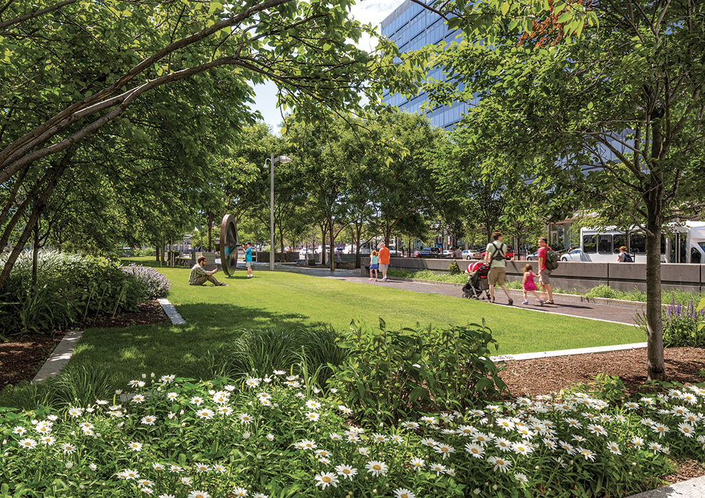
The project has its critics, some of whom claim that the front plaza is underused and lacks activation or connection to ground-floor uses, and—despite best efforts—that the barriers are harsh and unwelcoming. These first two criticisms do have some merit. The building, because of its internal uses, has but one primary public access point at the base of the tower. This limited access, coupled with the secure nature of the facility’s other uses, does not allow the building’s interior and exterior to integrate. However, the main tower lobby is a gem of a space that blends indoors and outdoors as seamlessly as any other building in the city.
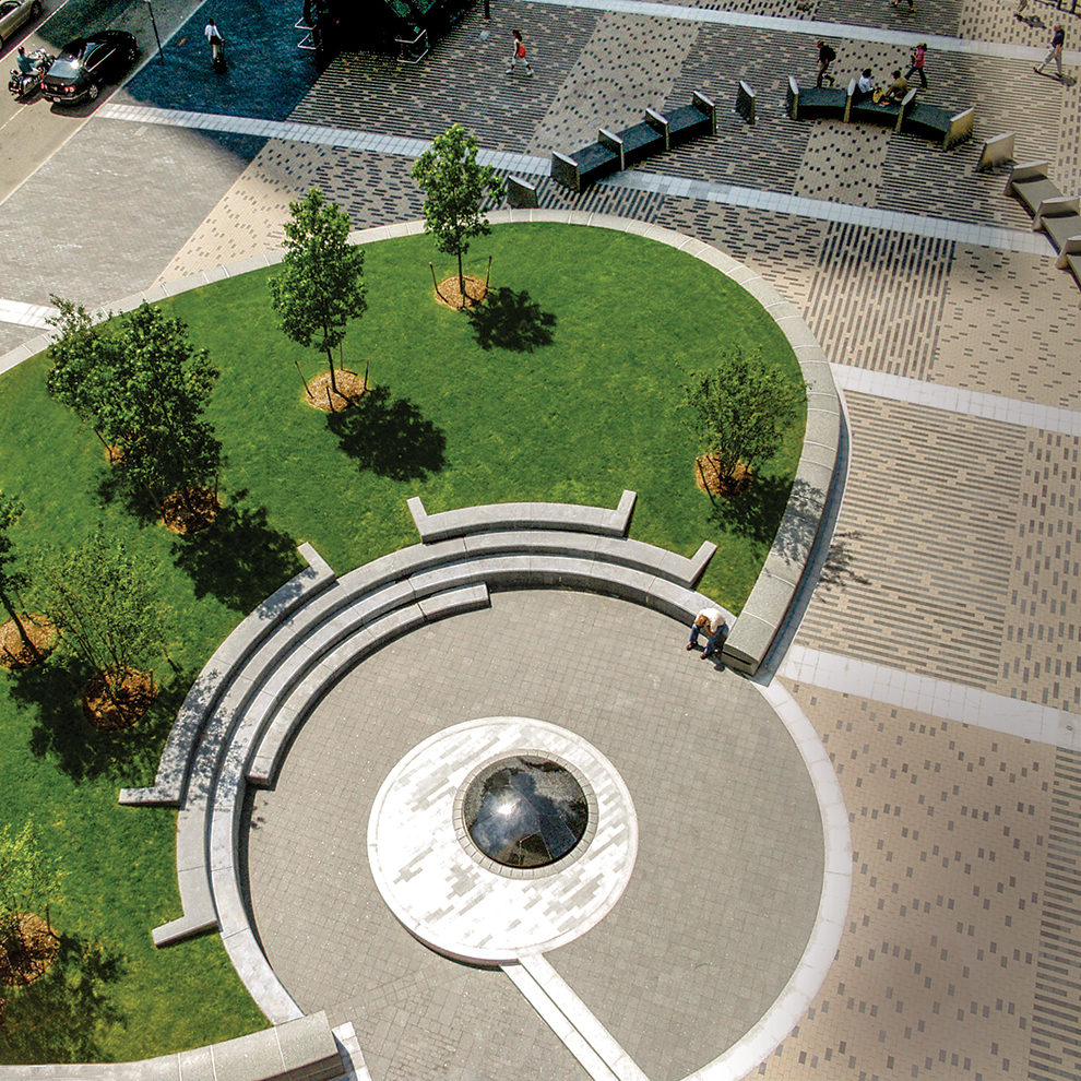
The criticism about the barriers is less defensible. Given the strict security requirements and potential for the plaza to become a walled-off zone, the outcome could have been far worse. The best praise for the plaza is the look of surprise when people are told that there is no gap greater than 4 feet anywhere around the entire perimeter of the building.
The northern side of the plaza connects to Dewey Square, while the remainder of the landscape is more gardenlike — an urban arboretum.
Photos: © Anton Grassl/Esto
The front plaza of the bank provides outdoor space for more quiet and contemplative gatherings.
Photo: © Anton Grassl/Esto
One further example of the Federal Reserve’s commitment to balancing security and welcoming public space has been its continued investment into the care and quality of the trees and plants on the plaza and streetscapes. The grounds are essentially a small urban arboretum, with a grove of sassafras behind the security building, multiple varieties of Styrax, blackgum trees, and a row of dawn redwood flanking the front plaza. A dedicated staff of horticulturalists led by Paul Kelly consistently installs seasonal plantings, monitors plant health, and takes action, as noted by the replacement of the ash trees along Summer Street with technical bare root plantings of disease-resistant elms. In addition, the bank has an extensive art collection within the building and as well as outside, where two public art pieces were relocated to the linear park along Summer Street.
Fifteen years after the completion of the project, the struggle to balance welcoming open space and a secure building continues. While the front plaza of the bank is not the vibrant social and active space that Dewey Square has become, it does play a supporting role by providing secondary space for more quiet and contemplative gatherings. Other recent projects, such as One Boston Place and the Washington Monument in Washington, DC, have incorporated elements similar to the Federal Reserve Bank’s design vocabulary to conjure open public spaces that successfully integrate security. It’s a prime example of the ways in which designers have positively addressed the opposing ideas of security and access, and perhaps even begun to ease this conflict into a well-designed equilibrium.



 IMG_1622
 IMG_1628
 IMG_1629
 IMG_1631
 IMG_3668
 IMG_3670
 IMG_3678
 IMG_3671
 IMG_3675
 IMG_3681
 IMG_3682
 IMG_3683
 IMG_5095
 IMG_5097
 IMG_5104
 IMG_5101
 IMG_5107