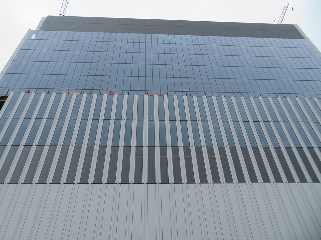
Kendall Common ( née Volpe Redevelopment) | Kendall Sq | Cambridge

Simple, straight-forward, no gimmicks. Boxy, but an elegant box. Fine high-end modernism.

From close up I agree. I'm a little disappointed that from McGrath (the angle I'll see it from most) you don't see the fins much and it presents as a glass box.
 
DSC_0077.jpeg
DSC_0092.jpeg
DSC_0109.jpeg
DSC_0114.jpeg
DSC_0101.jpeg
DSC_0099.jpeg
DSC_0141.jpeg
DSC_0169.jpeg
 
The problem with this design is that it's handsome if you're next to it, but the short sides with the fins don't have a lot of viewing angles, so most views from a distance get the glazed long sides, which aren't anything special. It's not bad like the CX Sanofi buildings (even the backside of this is miles better than those) but you really need to be on Binney to get much out of this.
 
The problem with this design is that it's handsome if you're next to it, but the short sides with the fins don't have a lot of viewing angles, so most views from a distance get the glazed long sides, which aren't anything special. It's not bad like the CX Sanofi buildings (even the backside of this is miles better than those) but you really need to be on Binney to get much out of this.

If the remainder of MITIMCo's Volpe parcel development plans (plus the MXD plans next door) are carried out, though, won't this be surrounded by as-tall/taller buildings on all sides except the Binney frontage anyway? Maybe the view from Binney was prioritized for that reason, especially since this was coordinated with MITIMCo's other projects here.
 
If the remainder of MITIMCo's Volpe parcel development plans (plus the MXD plans next door) are carried out, though, won't this be surrounded by as-tall/taller buildings on all sides except the Binney frontage anyway? Maybe the view from Binney was prioritized for that reason, especially since this was coordinated with MITIMCo's other projects here.

The issue is which Binney frontage. As I've been noticing for a while, the view from this at a distance is the north-facing blank glass wall, not the e/w fin walls. You see those a little approaching Kendall on Broadway (and I'd imagine on Hampshire), and maybe you get a view from across the river, but from Prospect Hill, McGrath, etc. this will just be a hefty glass wall.
 
The issue is which Binney frontage. As I've been noticing for a while, the view from this at a distance is the north-facing blank glass wall, not the e/w fin walls. You see those a little approaching Kendall on Broadway (and I'd imagine on Hampshire), and maybe you get a view from across the river, but from Prospect Hill, McGrath, etc. this will just be a hefty glass wall.

As you walk along Binney itself on the opposite side of the street (i.e., from 6th to 3rd) I find that one catches some great angles of this where you can see both the fins and glass wall. These shots I took are approximately from 6th & Binney (some of Bee's too):


To each their own, but I personally like these views from Binney itself. I understand what you mean regarding poorer appearance from further away, and agree that detracts from the overall package.
 
Last edited:
Update. They claim there's a new presentation on the Volpe website, but afact, the newest one is from July:


I wonder how much new graduate residences will cost. I think if they really try, they can break $3000 for a 1 bedroom this time.
 
Two thoughts:
1) While I legit appreciate gameguy326's snark about MIT not doing enough to subsidize grad student housing, the article does summarize some decent community benefits of the project, including 20% affordable housing (280 out of 1400 units) among other things. Universities rightfully get an earful about not doing enough for the community but IMHO MIT has always been on the better end of the spectrum among the Boston area schools. That is not to say they can't be doing more (they must). In one of the community presentations I watched, they expressed a commitment to leasing ground level retail slots to local small businesses: the real proof will be in the pudding as to whether that materializes.

2) The tall residential tower (presumably at left in Equilibria's 2nd posted render) does indeed look like The Sudbury. Upthread we were commenting that The Sudbury would be an apt aesthetic reference for the type/scale of thing they're planning to build here.
 

Back
Top