Kendall Common ( née Volpe Redevelopment) | Kendall Sq | Cambridge

I understand it's conceptual, but I'm always bothered by a park on the corner of a main intersection. "Squares" have a sense of place because they are an outdoor space, centered around a major intersection, enclosed by buildings with heights proportional to the span of the intersection. Certainly there are exceptions but I don't think it works in this particular spot.
 
I think one of my complaints about MIT is that they consistently overpromise and underdeliver their community benefits. "We're going to build graduate student housing," "most graduate students will be priced out and we we'll struggle to fill the dorm." "We're going to build a fun greenspace in east campus," "It's a patio with no programming, nothing fun, and two tiny patches of greenspace." The city should hold MIT accountable to their promises.
 
I understand it's conceptual, but I'm always bothered by a park on the corner of a main intersection. "Squares" have a sense of place because they are an outdoor space, centered around a major intersection, enclosed by buildings with heights proportional to the span of the intersection. Certainly there are exceptions but I don't think it works in this particular spot.
It's also crazy because busy intersections produce lots of fumes and are noisy. Exactly what you don't want in your greenspace. The best park-squares are on side streets or ringed by buildings.

Classic Cambridge pointless-green-space-fetishism
 
DSC_0204.jpeg
DSC_0233.jpeg
DSC_0279.jpeg
 
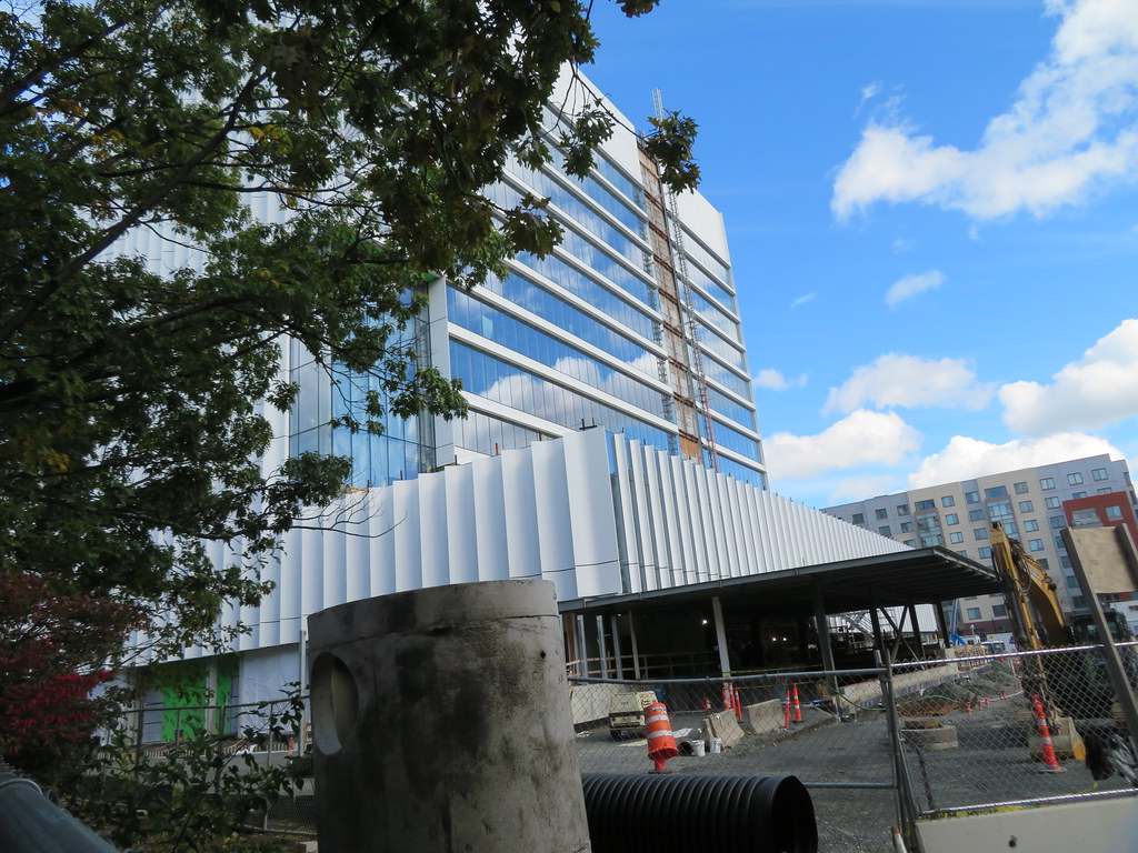
I know I've been told I have to understand why that building has to be built in that way, but man, I can't stand it.
 
It's also crazy because busy intersections produce lots of fumes and are noisy. Exactly what you don't want in your greenspace. The best park-squares are on side streets or ringed by buildings.

Classic Cambridge pointless-green-space-fetishism
I wish we would fetishize good green space, instead of lots of green space.
 
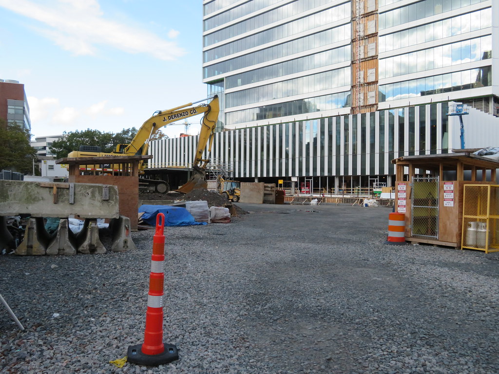
I get (based on upthread comments) that some feel this building is boring and unengaging. However, I am waiting until I see the rest of the Volpe development, the landscaping, and the public art components of this before I critique it's engagingness. I think people are forgetting that this building's "front" faces the main Volpe redevelopment, so we have little sense what that's going to look like now or anytime soon.

Meanwhile, I find the building's design itself to be one of the most crisp and sculptural facades we've seen in this development cycle. It's clean, sharp, classy and retro-futuristic (some mid-century version of what future high-tech would look like).
 
Meanwhile, I find the building's design itself to be one of the most crisp and sculptural facades we've seen in this development cycle. It's clean, sharp, classy and retro-futuristic (some mid-century version of what future high-tech would look like).

This is what a building that is designed by actual architects looks like. I think with all the 325 Mains and Hub on Causeways we've forgotten.
 
It looks a "research center" or "tech lab" or something from a late 90's RTS game.

This is mild praise in case it wasn't clear.
 
I like it.

I would have liked it more if they had pushed the tower all the way over to the binney street side getting rid of the tiny podium break on that side. This would mean only the back side has a podium. Then add the fins to the unbroken binney st side with the glass side and podium on the rear facing towards the volpe site. I think if there were 3 sides that had fins that go unbroken all the way from the street to the roof the aspect ratio would have been much better. Then the podium and glass side on the back could face towards the volpe site to eventually be blocked by the development there.

Either way its good to see something new here with the facade. All of these buildings are pretty height limited so far so its nice to see the different facade treatments to make them stand out. Muuuuch better than just getting 5 blue glass boxes.
 
It’s a stumpy pig of a building. The cladding is well executed, but it’s nice wrapping paper on an awkward massing.

Also, that photo of the Federal Reserve building is a blast from the past.
 
It’s a stumpy pig of a building. The cladding is well executed, but it’s nice wrapping paper on an awkward massing.

Also, that photo of the Federal Reserve building is a blast from the past.

That massing will look just fine with a 400-footer beside it.
 
I’m not so sure. Once the area is built out, it will be a pig hiding in the forest, rather than a pig in a meadow.

The problem is the podium. It muddies the gesture of the tower. The current Volpe tower has a cleaner form, even if uses the dated mid-century urban renewal design language. They could have owned the security requirements of being a Federal building and built the tower without the podium.
 
Its an ugly building, but it is also very Kendall Sq. in terms of style.

Fortunately it's basically on the back of the lot and out of sight out of mind for most people.

Looks like a shrunken version of the Federal Reserve building in Boston.

You might want to get your eyesight checked, I'm not seeing the resemblance :p
 
  • Like
Reactions: W-4

Back
Top