Liberty Mutual Tower | 157 Berkeley Street | Back Bay

Re: Liberty Mutual plans major Boston expansion

Yeah, but compare that corner to the corner that features the Flatiron in New York or Atlanta.
The angle of the Berkeley/Columbus corner is twice as wide as Atlanta or New York.

Not disagreeing, but it's not a perfect right angle, either, as it sometimes appears in cellphone pics.
 
Re: Liberty Mutual plans major Boston expansion

The angle is actually pretty pronounced in my opinion, and I walk by it several times a day. The other thing, is that it appears to me from the rendering that the angle is skewed a bit further after the first 4 or 5 floors. It could be an optical illusion, but to me the building looks narrower, the angle more acute, above the initial ledge.

In other words, it looks like a flat iron building built on top of a more rectangular stage.
 
Re: Liberty Mutual plans major Boston expansion

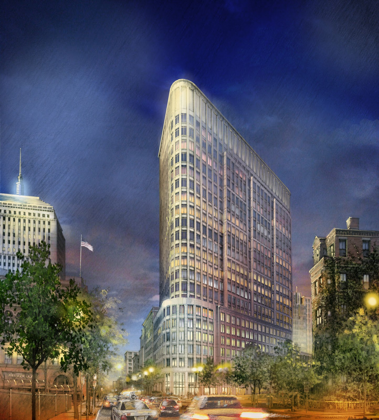
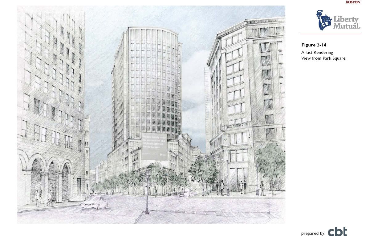
Here's the rendering again. It appears to me that HenryAlan's correct... the base will be less angular, but the angularity of the upper floors will create a more flatiron-like form.

Liberty+Mutual+Final.jpg
 
Re: Liberty Mutual plans major Boston expansion

Maybe I'm wrong. I walk by this corner all the time, too. I feel like the angle of the street is exaggerated in the rendering. Here's the existing (maybe it's gone now) building for comparison. Actually, now that I see the images together I guess it's pretty accurate. I still feel like the building is going to be much thicker then it appears in the rendering.

oneuu.jpg
 
Re: Liberty Mutual plans major Boston expansion

Does it really matter if it's a flatiron or not? Is there some defined line between an acute building and a flatiron? Does the value of said building suddenly skyrocket 20 fold when it crosses that line?

As long as it looks good and isn't made from cheap crap it sounds good to me.

An excellent point.
 
Re: Liberty Mutual plans major Boston expansion

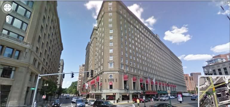
This corner's angle is pretty much exactly identical to the Park Plaza's Columbus Ave and Arlington Street corner:
google_streetview_park_plaza_boston.jpg


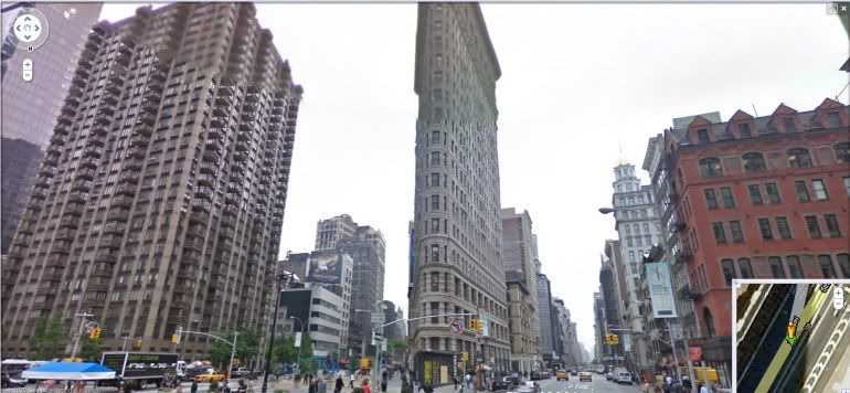
Nothing Flatiron-like at all, IMO:
google_streetview_flatiron_ny.jpg


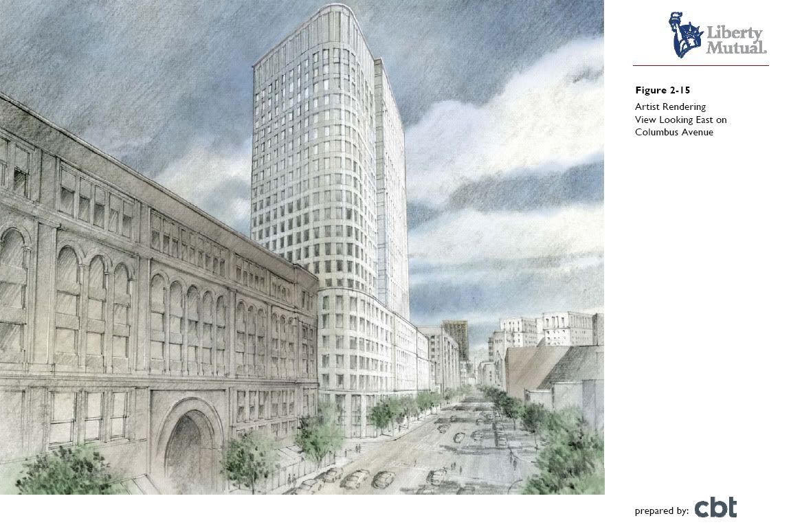
That rendering is rather shameless in its intent to deliberately mislead people. They get cute with the angles in the perspectives in order to minimize the bluntness and stumpiness of what will be a very blunt and stumpy building.

Bostonbred said it best when he dubbed this one the FATiron building. Again, here are few more honest renderings:
175_berkleley_pnf_1.jpg


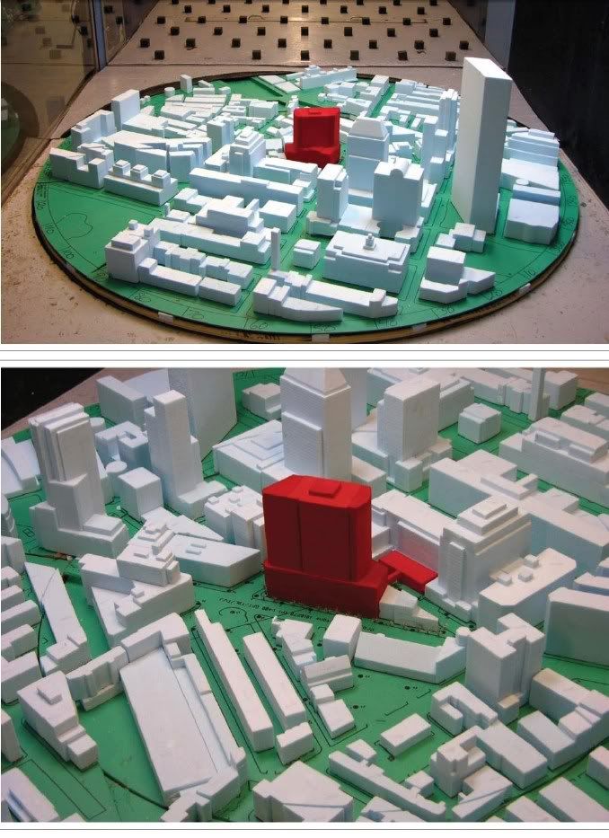
This is going to be one of the widest, most grotesquely proportioned "towers" in the city. I think most people are going to be shocked when they see this gigantic, awkward wall looming over Columbus Ave:
175_berkleley_pnf_3.jpg


175_berkleley_pnf_4.jpg
 
Re: Liberty Mutual plans major Boston expansion

I don't feel misled. The first picture is pretty consistent with the colorful rendering, and the last picture is a view I hadn't seen before, the "back" of the building from Park Square. And actually, I have to say that it's rather stately - especially from that last perspective. I think it's been said before - solid materials will make this a solid building; there's nothing particularly wrong with the design (IMO).

Also, I don't think CBT or LibMu ever called it a Flatiron (I could be wrong). I think we all got a little bit worked up over that expectation.
 
Re: Liberty Mutual plans major Boston expansion

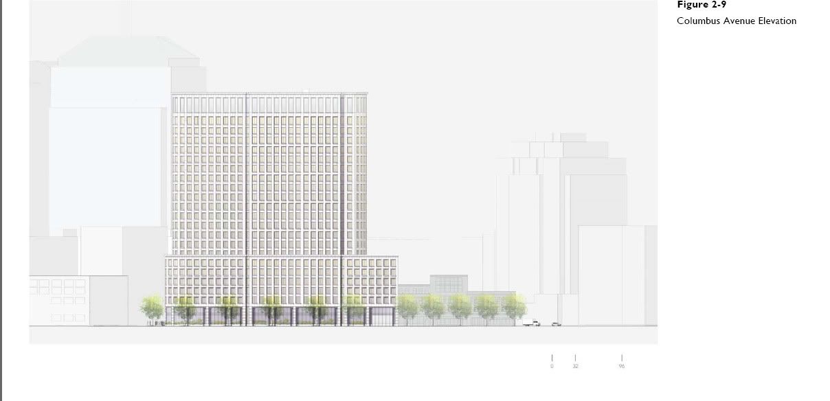
Maybe I'm way off, but this design really bugs the hell out of me. It does seem to me that the Columbus Ave elevation is so carefully avoided in all the perspectives. This elevation happens to be particularly dreadful, IMO.

I really cant find anything stately about this design.
liberty_mutual_tower_model.jpg


And are we supposed to be impressed that they're using real limestone cladding? IMO, it's the detailing that makes limestone--all stone--buildings look so handsome. The detailing on this building appears to be pretty nonexistent. They're essentially using limestone like precast concrete modules, large un-detailed slabs. This is why, to me, it reads like precast. Why did they even bother?
 
Re: Liberty Mutual plans major Boston expansion

I do enjoy how the rendering includes the nice fences on the lower left from the Columbus Center cleanup.
 
Re: Liberty Mutual plans major Boston expansion

this building needs ribboned windows...
 
Re: Liberty Mutual plans major Boston expansion

I still feel misled. That block is an important connecting point between neighborhoods. The city should have pressed Liberty Mutual to do more at the street level. There's going to be a massive wall of office windows that will create a deadzone in a critical part of the city. The trade-off for this was that the public gets a no-name coffee shop in the lobby, which will probably be one of those kiosks that serves coffee and plastic-wrapped muffins to employees entering the building in the morning (maybe I'm wrong).
 
Last edited:
Re: Liberty Mutual plans major Boston expansion

its much better than whats there and im happy with it
 
Re: Liberty Mutual plans major Boston expansion

I still feel misled. That block is an important connecting point between neighborhoods. The city should have pressed Liberty Mutual to do more at the street level. There's going to be a massive wall of office windows create a deadzone in a critical part of the city. The trade-off for this was that the public gets a no-name coffee shop in the lobby, which will probably be one of those kiosks that serves coffee and plastic-wrapped muffins to employees entering the building in the morning (maybe I'm wrong).


I will be surpised if this building ends up being built with quality. It already seems very rushed and poorly planned.
 
Re: Liberty Mutual plans major Boston expansion

I'm not impressed by this design at all. IMO this would have been a great location for something sleek and ultra modern in design. This design is too fat and stubby and even if clad in the finest marble the architecture is, IMO, just plain boring.
 
Re: Liberty Mutual plans major Boston expansion

^^
On what do you base that statement, the Rifleman - did you go to any of the public meetings and participate in the process? I live around the corner and I totally disagree with you after seeing how much care the development team took to respond to the community's coments...thoughts?
 
Re: Liberty Mutual plans major Boston expansion

I totally disagree with you after seeing how much care the development team took to respond to the community's coments...thoughts?
I'm not sure that's a valid measure of a project's ongoing quality. In defense of this building, I'll grant that it's contextual; this is the zone of fat lumps.
 
Re: Liberty Mutual plans major Boston expansion

This does not create a dead zone, it perpetuates an already dead zone. It should improve it.

It only seems rushed by Boston standards. In other parts of the country, this is a little more normal. A year to design and go through approvals, and then build for the next 2 years. 3 years start to finish doesn't sound all that ridiculous.
 
Re: Liberty Mutual plans major Boston expansion

^^
On what do you base that statement, the Rifleman - did you go to any of the public meetings and participate in the process? I live around the corner and I totally disagree with you after seeing how much care the development team took to respond to the community's coments...thoughts?

Would you care to elaborate? It seems to me that the development team pretty much ignored the community's input.
 
Re: Liberty Mutual plans major Boston expansion

Sure, I think the biggest issue we had was on Col ave, and IMHO the addition of a new building entrance on Col and outdoor seating will help. All of you probably haven't been walking past that stretch of Col for years - this will be a huge improvement. Why can't anyone on this board ever be happy that such a good project is moving forward? Nothing's perfect and everyone has a different opinion but it's a hell of a lot better than what's there and it's great for the city. I agree w/Seamus - the fact that things usually take years is a problem, if it's a good project (not perfect, not pleasing everybody because that's IMPOSSIBLE, but good) why not get it done? What do you really think killed Col Ctr? Years of process.
 

Back
Top