You are using an out of date browser. It may not display this or other websites correctly.
You should upgrade or use an alternative browser.
You should upgrade or use an alternative browser.
Longfellow Bridge update
- Thread starter PaulC
- Start date
JeffDowntown
Senior Member
- Joined
- May 28, 2007
- Messages
- 4,798
- Reaction score
- 3,666
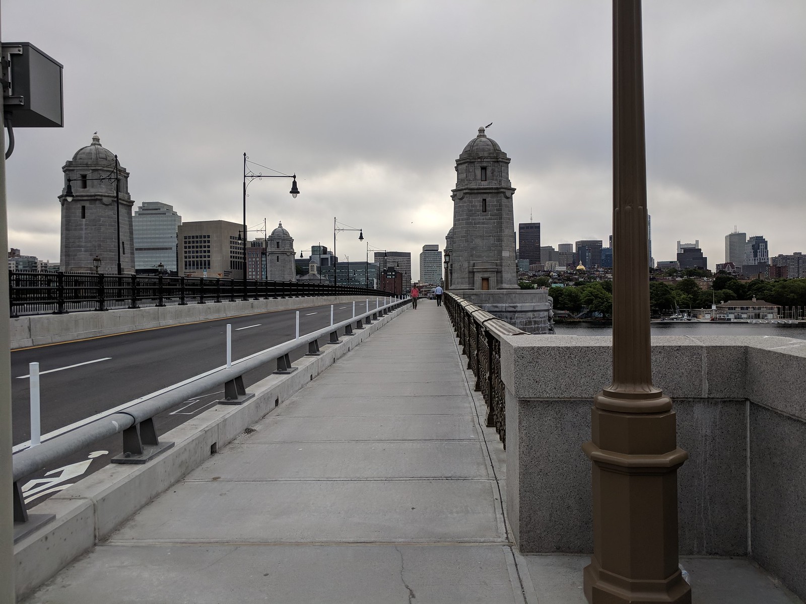
Does it bother anyone else that they painted the inside railing and lighting black but the outside railing and lighting the brown/green color? Shouldn't they all be the same?
I don't mind the the items in the MBTA reservation are black and the more historically accurate exterior rails and lamps are the brown/gold color. To me it highlights the really nice historical restoration part of the project.
stellarfun
Senior Member
- Joined
- Dec 28, 2006
- Messages
- 5,711
- Reaction score
- 1,544
Another photo from the Globe. I think it illustrates the transition from one outbound lane to two as one arrives on the Cambridge side.


stevebikes
Active Member
- Joined
- May 14, 2013
- Messages
- 277
- Reaction score
- 103
The narrowness of the upstream bike lane aside, it seems a weird choice to make the wider sidewalk on the less pretty side of the bridge:


JeffDowntown
Senior Member
- Joined
- May 28, 2007
- Messages
- 4,798
- Reaction score
- 3,666
The narrowness of the upstream bike lane aside, it seems a weird choice to make the wider sidewalk on the less pretty side of the bridge:
I would assume that there is an engineering reason. Perhaps to keep the transit reservation in the center of the load bearing structure. So with two Boston bound lanes and one Cambridge bound lane, the Cambridge bound side gets the wide sidewalk.
bigpicture7
Senior Member
- Joined
- May 5, 2016
- Messages
- 3,906
- Reaction score
- 9,547
The narrowness of the upstream bike lane aside, it seems a weird choice to make the wider sidewalk on the less pretty side of the bridge:
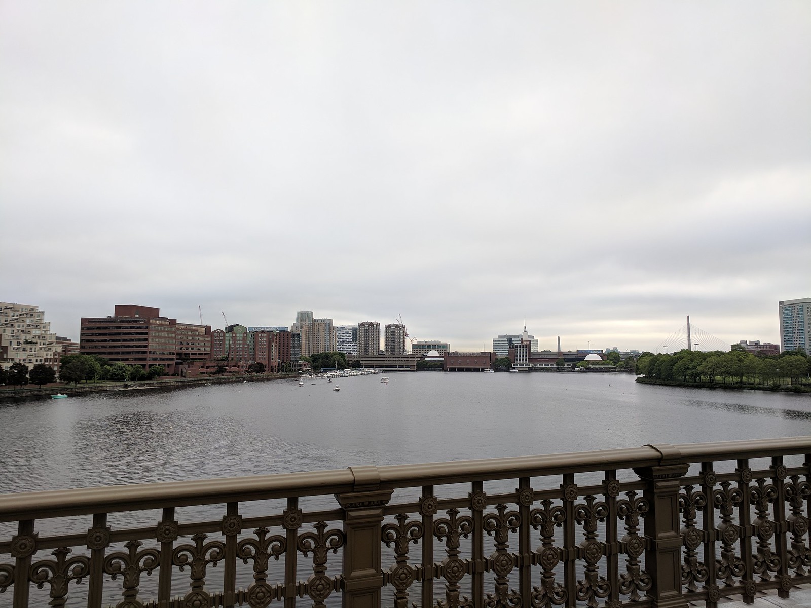
Thanks for the great photos. Aesthetically, I think this rehab turned out beautifully. Say what you will about the schedule, but the craftsmanship seemed to turn out great. I just walked the new side the other day.
The nerd engineer in me is also blow away by how there is zero vibration from the redline felt as you are walking on this. It is smooth as silk. I look forward to increased red line speeds / reduced headways with the new trains.
But to Steve's point...
I too am just confused about the layout. I get that they wanted to balance peds/cars/bikes. But why the wide sidewalk on that side? And with regard to the bike lane, my wife (who walked this with me) is an avid urban cyclist and she said she has no issue with the lane width...sure, she'd like to see it wider... but passing amongst bikes is actually quite possible with some basic "on your left" etiquette. We actually saw a cyclist pass another within the bike lane while we were walking. Nonetheless, the layout choice is confusing. Anyone have some intel on why it was done this way?
I would assume that there is an engineering reason. Perhaps to keep the transit reservation in the center of the load bearing structure. So with two Boston bound lanes and one Cambridge bound lane, the Cambridge bound side gets the wide sidewalk.
^Interesting theory, but wouldn't be my first guess since this bridge is a series of adjacent arches all the way across the full width. It does not appear there would be a substantial moment induced by an off-center load. But I won't pretend to know the underlying details...
bigpicture7
Senior Member
- Joined
- May 5, 2016
- Messages
- 3,906
- Reaction score
- 9,547
I would assume they made sidewalk wider on the side where they reduced traffic lanes to 1 from 2, no?
Yes, but the question is why that extra width didn't go to the bike lane (so commuters could have passing ability)...or why not split the difference between bike & sidewalk...or why not shift the whole bridge layout over so the wider sidewalk could be on the other side of the bridge with the better view...
(btw, I'm not saying I mind this, but the present layout seems to be inducing such questions; especially among cyclists)
It's probably been mentioned here several times...and I apologize if it has...but the brown color they selected is one of the most hideous shades I could possibly imagine. For starters, the notion of slavish historical restoration, down to the colors strikes me as fetishizing the past. Is it inconceivable they made the wrong choice then? Second, I saw swatches of at least five shades on the railings years ago. That implies to me that there was a selection among options. How they ended up with this is beyond me.
statler
Senior Member
- Joined
- May 25, 2006
- Messages
- 7,939
- Reaction score
- 547
It's probably been mentioned here several times...and I apologize if it has...but the brown color they selected is one of the most hideous shades I could possibly imagine. For starters, the notion of slavish historical restoration, down to the colors strikes me as fetishizing the past. Is it inconceivable they made the wrong choice then? Second, I saw swatches of at least five shades on the railings years ago. That implies to me that there was a selection among options. How they ended up with this is beyond me.
I believe it was a selection that was open to some sort of public vote. I was (and remain) very disappointed in the result. How so many people choose that color is beyond me. It is gross. Hopefully it will be corrected next it needs to be painted.
bigpicture7
Senior Member
- Joined
- May 5, 2016
- Messages
- 3,906
- Reaction score
- 9,547
I believe it was a selection that was open to some sort of public vote. I was (and remain) very disappointed in the result. How so many people choose that color is beyond me. It is gross. Hopefully it will be corrected next it needs to be painted.
Here's to hoping it will patina well...resembling a natural looking collage of copper oxide and seagull shit.
I'm only half joking; I bet in a few years it will blend right in.
JeffDowntown
Senior Member
- Joined
- May 28, 2007
- Messages
- 4,798
- Reaction score
- 3,666
Yes, but the question is why that extra width didn't go to the bike lane (so commuters could have passing ability)...or why not split the difference between bike & sidewalk...or why not shift the whole bridge layout over so the wider sidewalk could be on the other side of the bridge with the better view...
(btw, I'm not saying I mind this, but the present layout seems to be inducing such questions; especially among cyclists)
Isn't there also a practical consideration for the transit reservation to align with Charles Station and the tunnel portal on the Kendall side? There could be a jog in the train tracks, but that slows things down (and would create odd interfaces with lanes, sidewalk and bike lanes at each end).
But I have no clue why more of that space wasn't given to the narrow bike lane????
bigpicture7
Senior Member
- Joined
- May 5, 2016
- Messages
- 3,906
- Reaction score
- 9,547
Isn't there also a practical consideration for the transit reservation to align with Charles Station and the tunnel portal on the Kendall side? There could be a jog in the train tracks, but that slows things down (and would create odd interfaces with lanes, sidewalk and bike lanes at each end).
But I have no clue why more of that space wasn't given to the narrow bike lane????
Excellent point.
Java King
Active Member
- Joined
- Apr 6, 2007
- Messages
- 986
- Reaction score
- 2,049
It's probably been mentioned here several times...and I apologize if it has...but the brown color they selected is one of the most hideous shades I could possibly imagine. For starters, the notion of slavish historical restoration, down to the colors strikes me as fetishizing the past. Is it inconceivable they made the wrong choice then? Second, I saw swatches of at least five shades on the railings years ago. That implies to me that there was a selection among options. How they ended up with this is beyond me.
Speaking of colors, has the lighting been designed and implemented? I'm not talking about the surface lighting, but the lighting of the steel arches under the bridge. I've always been surprised that it was SO DARK. The arches should be lit in a tasteful aesthetic way. I reviewed the original bridge proposal and it talks about new design lighting, but I never saw a rendering or proposal. Does anyone know the current status of the structural steel arch lighting under the bridge?
My recollection on the bridge lane design is that two lanes going into Boston is more justifiable given the back up at Charles circle. Given the layout and turn options, 1 Lane would lower the amount of auto throughput and back up the bridge into memorial drive- it already gets pushed back to Kendall at rush hour as is with two lanes. By contrast 1 Lane into Cambridge is feasible because the intersection is much further off the bridge and a straight shot and single turn. The sidewalk width then was just a output of that decision/demand.
If they prohibited right turns from the Longfellow inbound onto Charles St, they could have the Storrow exit ramp and Longfellow inbound run at the same time and eliminate a signal phase. The whole intersection would operate much more efficiently. If that is unpalatable, they could officially allow the "u-turn" on Cambridge St so that Charles-bound drivers can loop to make up for the prohibition.
Additionally, reducing the width of the on-ramps to Storrow westbound and eastbound would allow for shorter crossing distances and thus dramatically reduced pedestrian clearance times. Same with the Charles crosswalk from 3 lanes (+parking) to 2 lanes.
There are some very easy changes they could make here to eliminate the backups.
If I take my car is king hat off for a second, I know the City is also looking at ways to add crosswalks across Cambridge St at W Cedar St since its odd that the entrance to the red line station is within Charles Circle and not facing the neighborhood. This requires DCR coordination however.
Last edited:
If they prohibited right turns from the Longfellow inbound onto Beacon St, they could have the Storrow exit ramp and Longfellow inbound run at the same time and eliminate a signal phase. The whole intersection would operate much more efficiently. If that is unpalatable, they could officially allow the "u-turn" on Cambridge St so that Beacon-bound drivers can loop to make up for the prohibition.
Additionally, reducing the on-ramps to Storrow westbound and eastbound would allow for shorter crossing distances and thus dramatically reduced pedestrian clearance times. Same with the Beacon crosswalk from 3 lanes (+parking) to 2 lanes.
There are some very easy changes they could make here to eliminate the backups.
If I take my car is king hat off for a second, I know the City is also looking at ways to add crosswalks across Cambridge St at W Cedar St since its odd that the entrance to the red line station is within Charles Circle and not facing the neighborhood. This requires DCR coordination however.
Beacon St.?
Beacon St.?
...safe to assume he's talking about Charles St. ...
stevebikes
Active Member
- Joined
- May 14, 2013
- Messages
- 277
- Reaction score
- 103
Isn't there also a practical consideration for the transit reservation to align with Charles Station and the tunnel portal on the Kendall side? There could be a jog in the train tracks, but that slows things down (and would create odd interfaces with lanes, sidewalk and bike lanes at each end).
But I have no clue why more of that space wasn't given to the narrow bike lane????
To clarify, the bike lane on the side with the wide sidewalk is also wide - they gave the extra space to the bike lane and removed a travel lane, on the downstream side.
One of the advantages of the wider sidewalk is that people can stop and hang out on the bridge and check out the sights. But it's aesthetically unfortunate that due to the choice to keep two inbound lanes, the sidewalk on the nicer side doesn't have the extra width. And that also would have allowed for a wider bike lane (which is still an improvement on what was there before). I certainly didn't expect them to mess with the train alignment.
Some more before/after pics:
https://walkboston.org/2018/06/07/longfellow-has-come-a-long-way/
