jjdemello123@gmail.com
Active Member
- Joined
- Jul 16, 2019
- Messages
- 115
- Reaction score
- 932
In traffic today 9/15/23
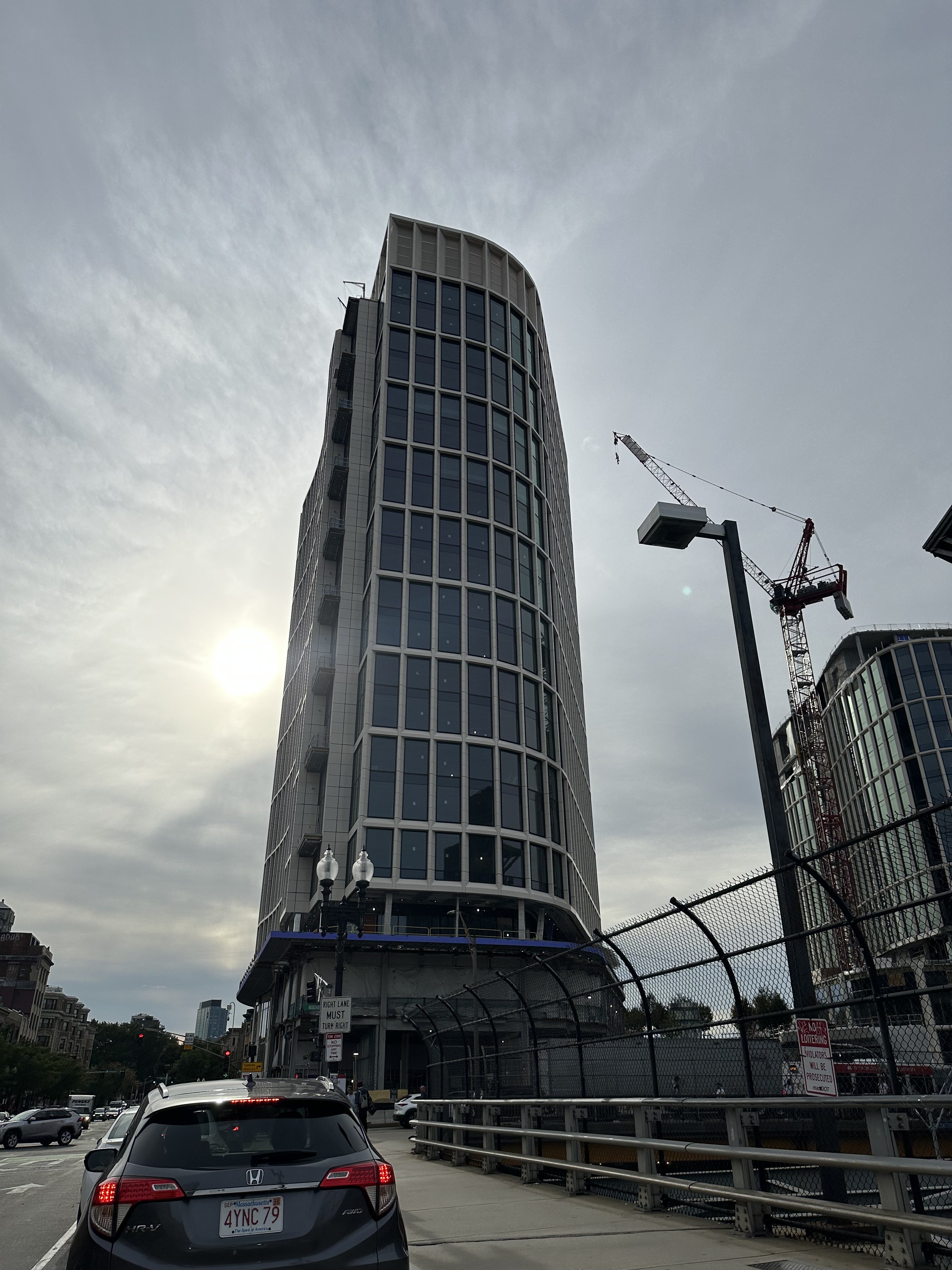
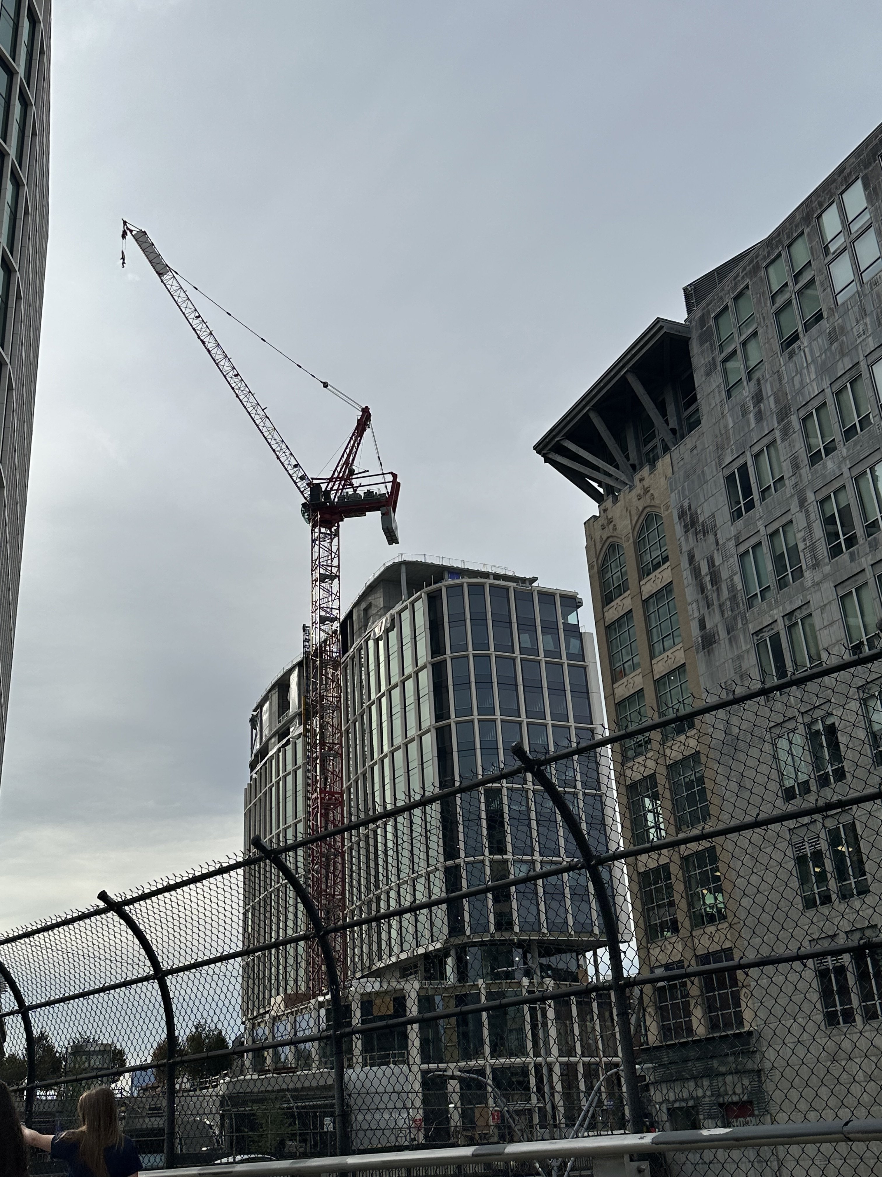
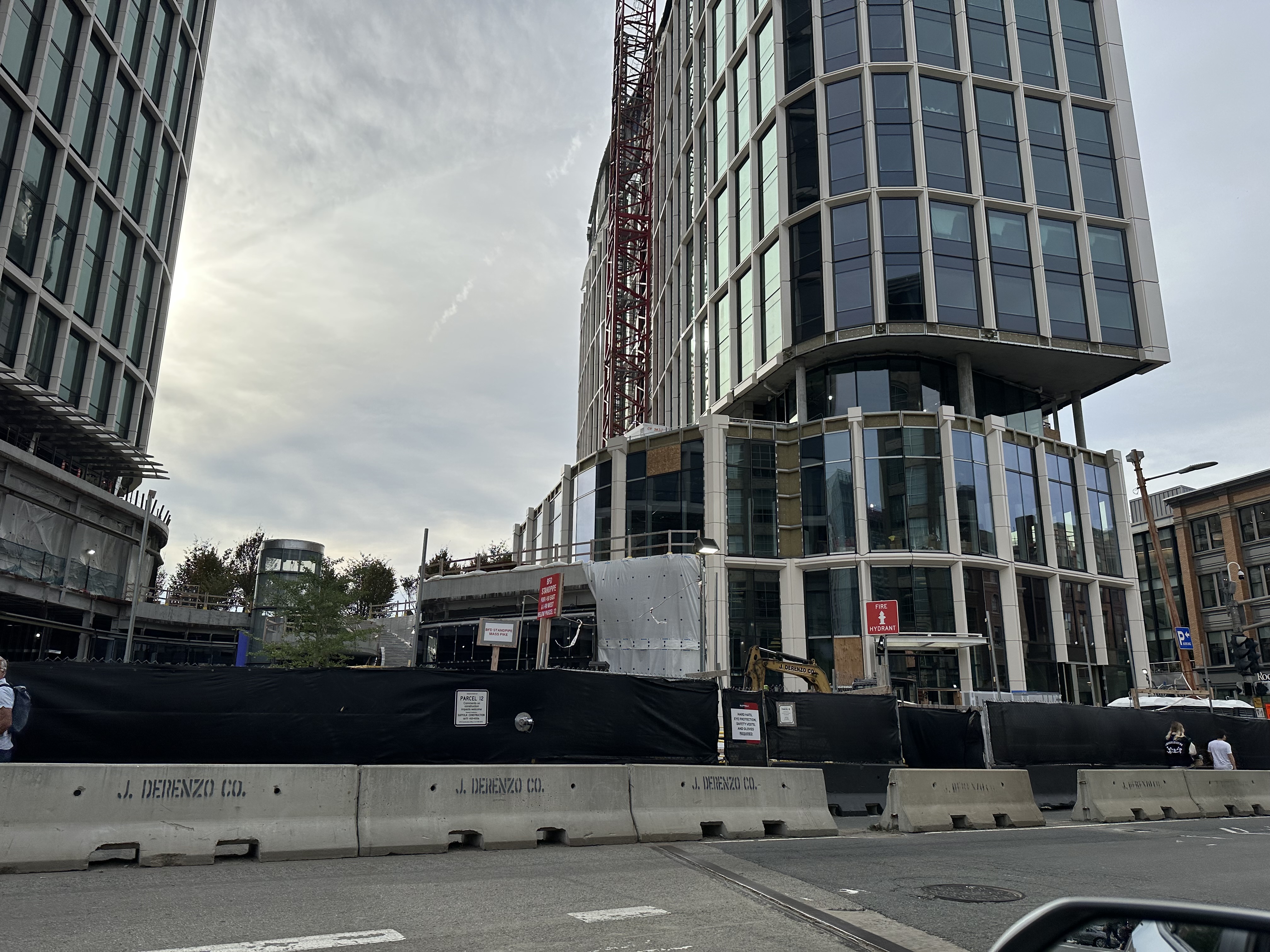
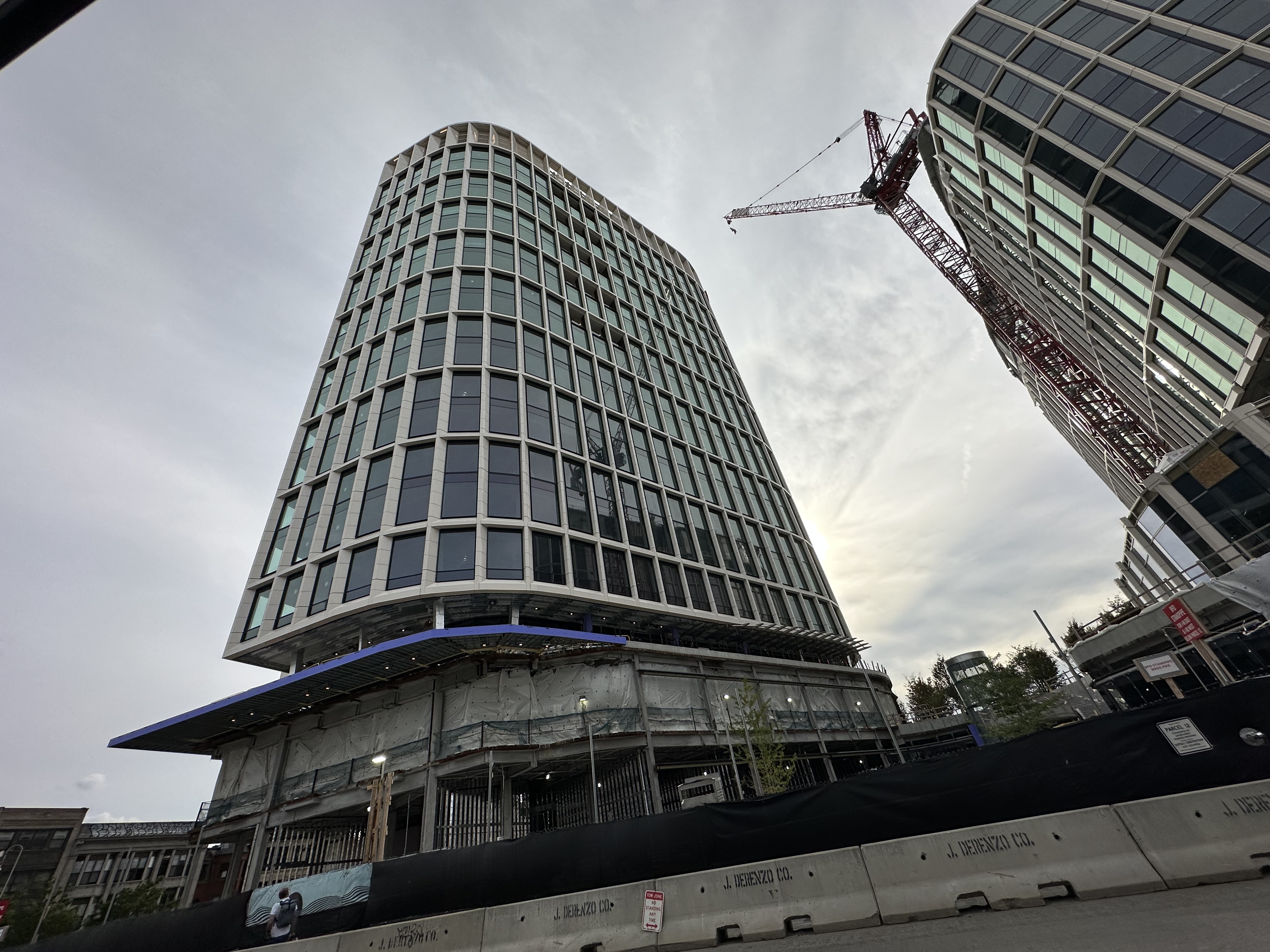
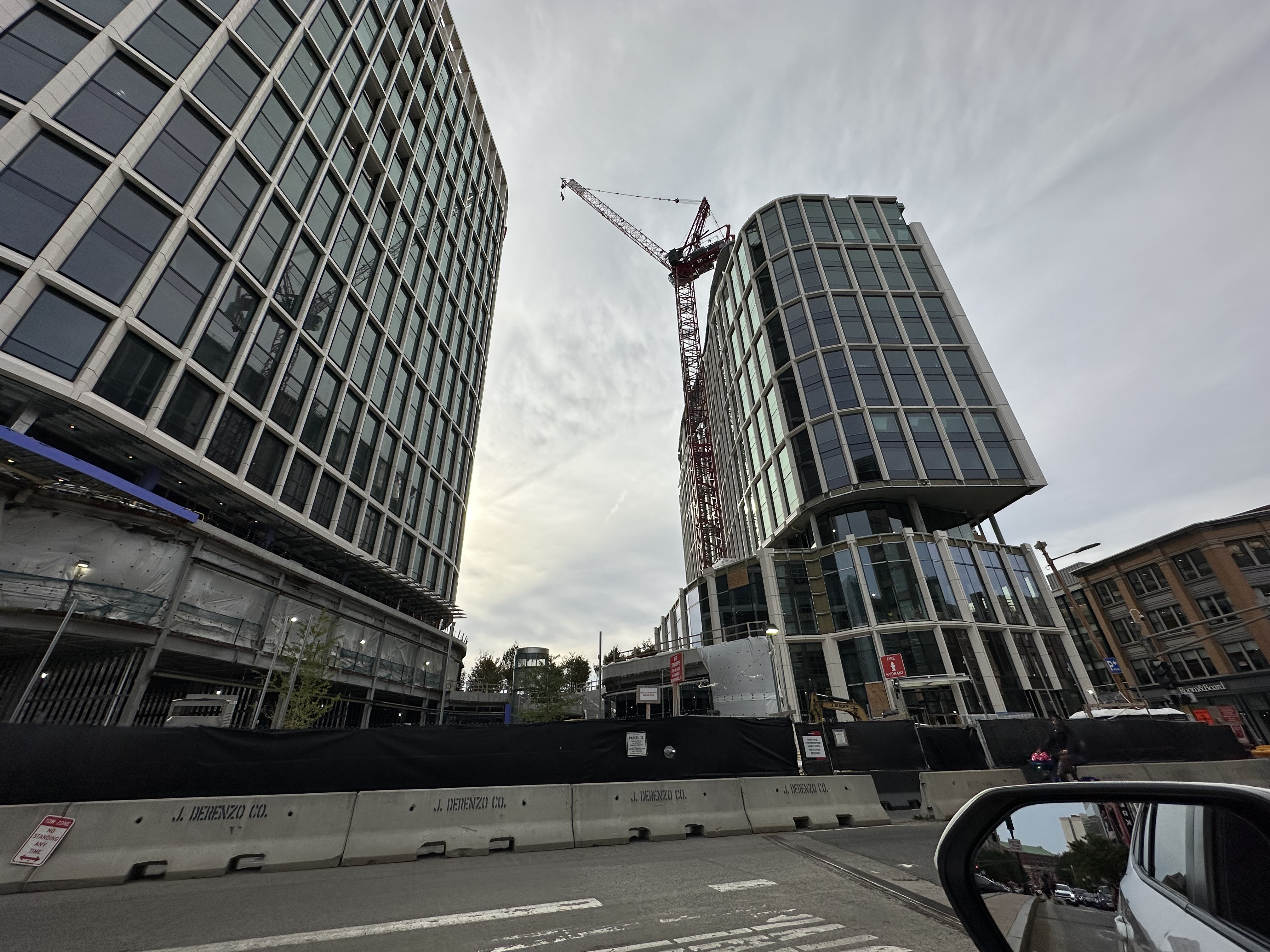
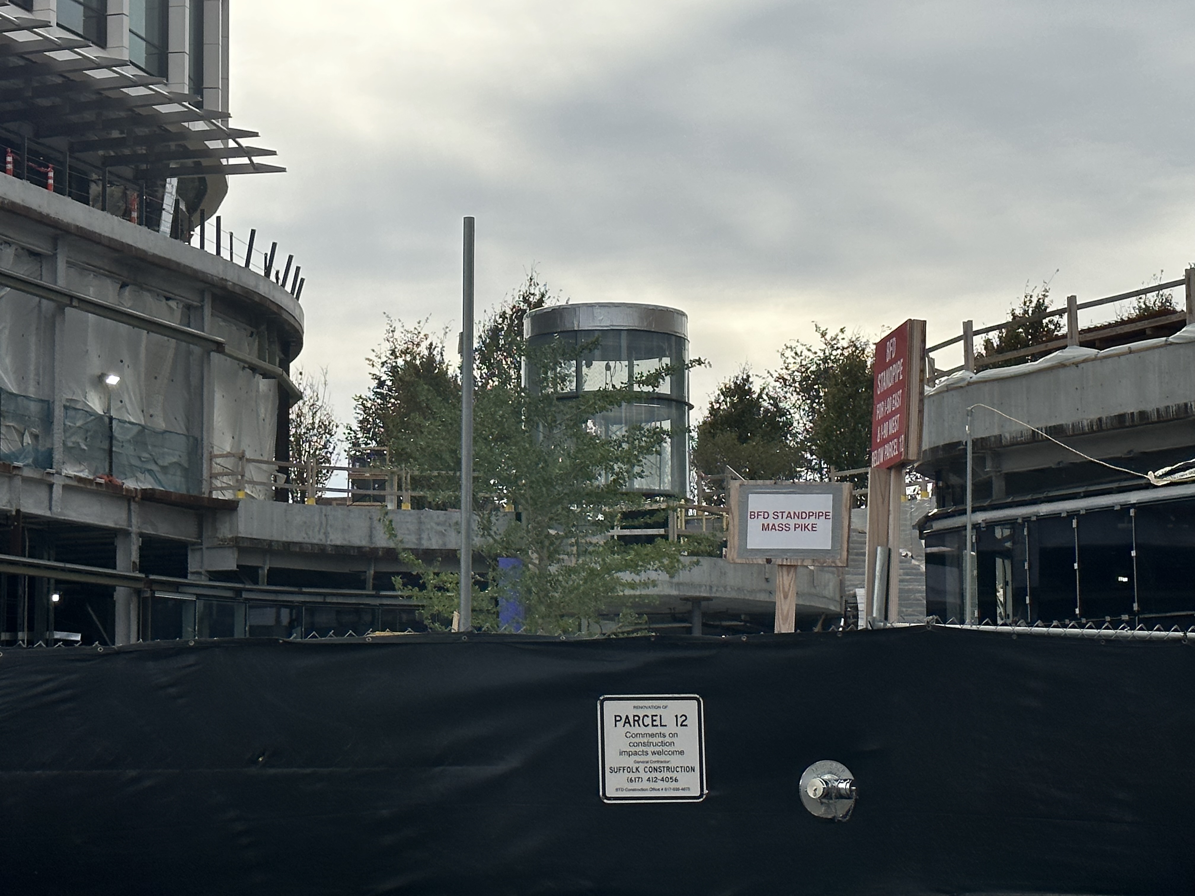
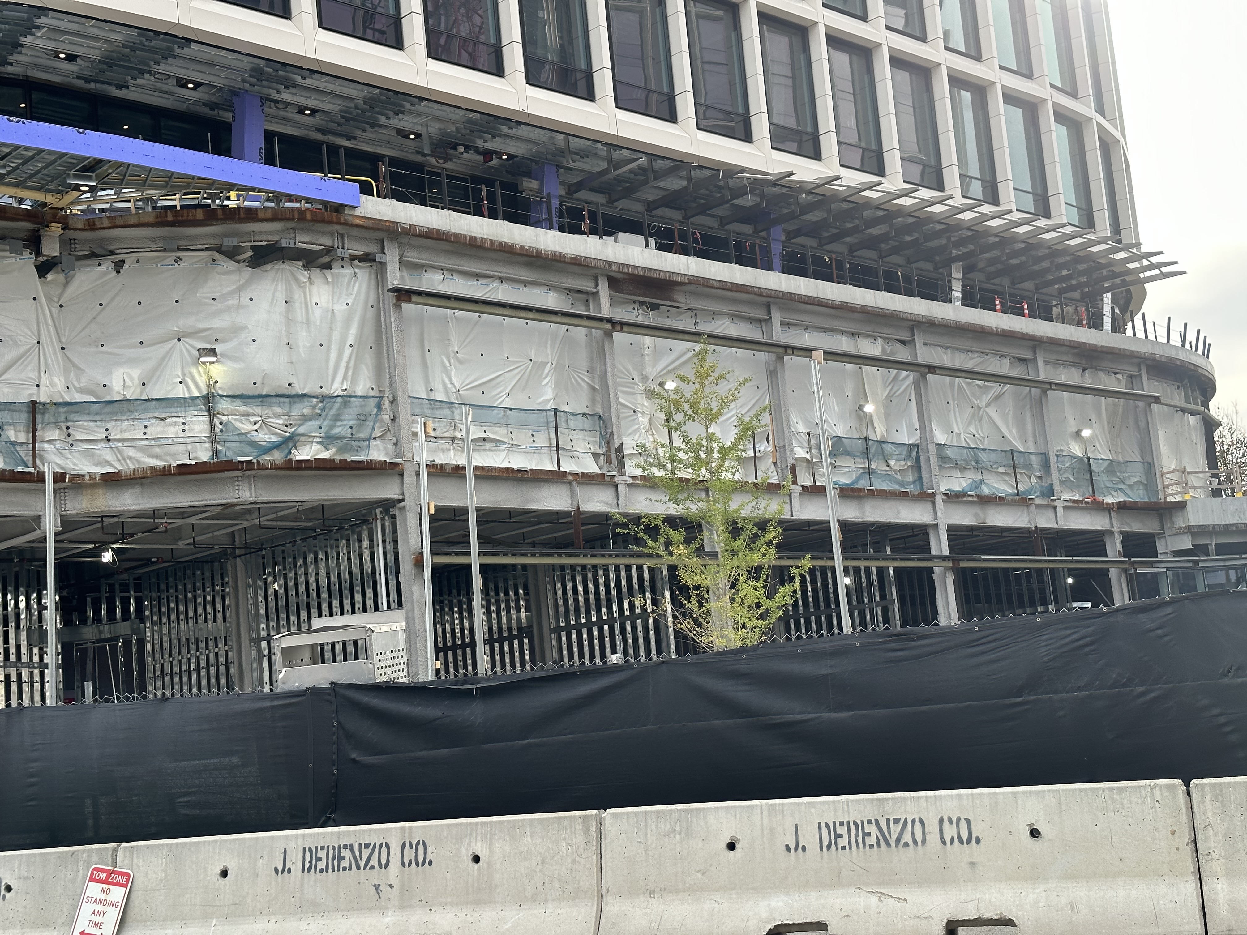
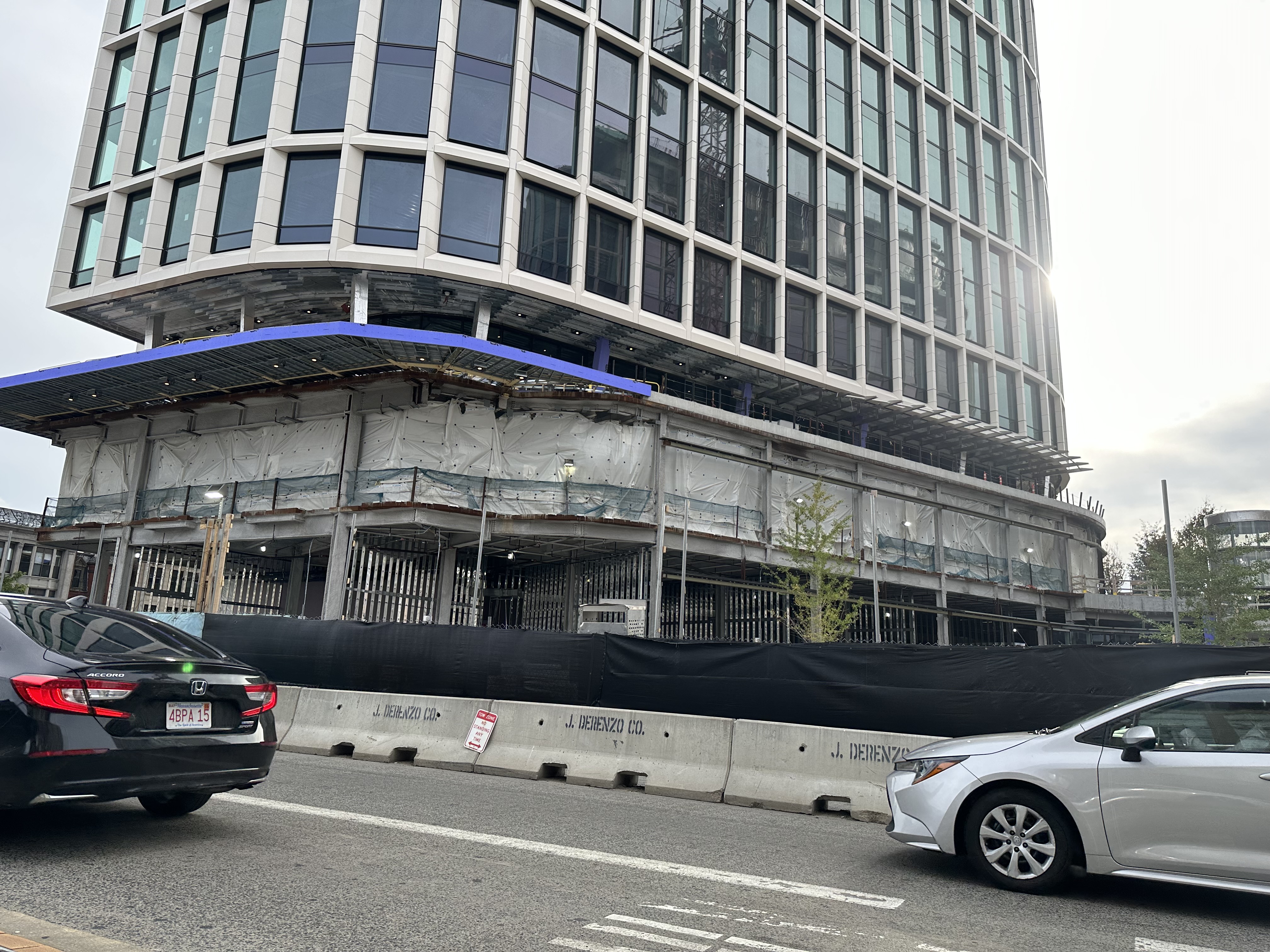
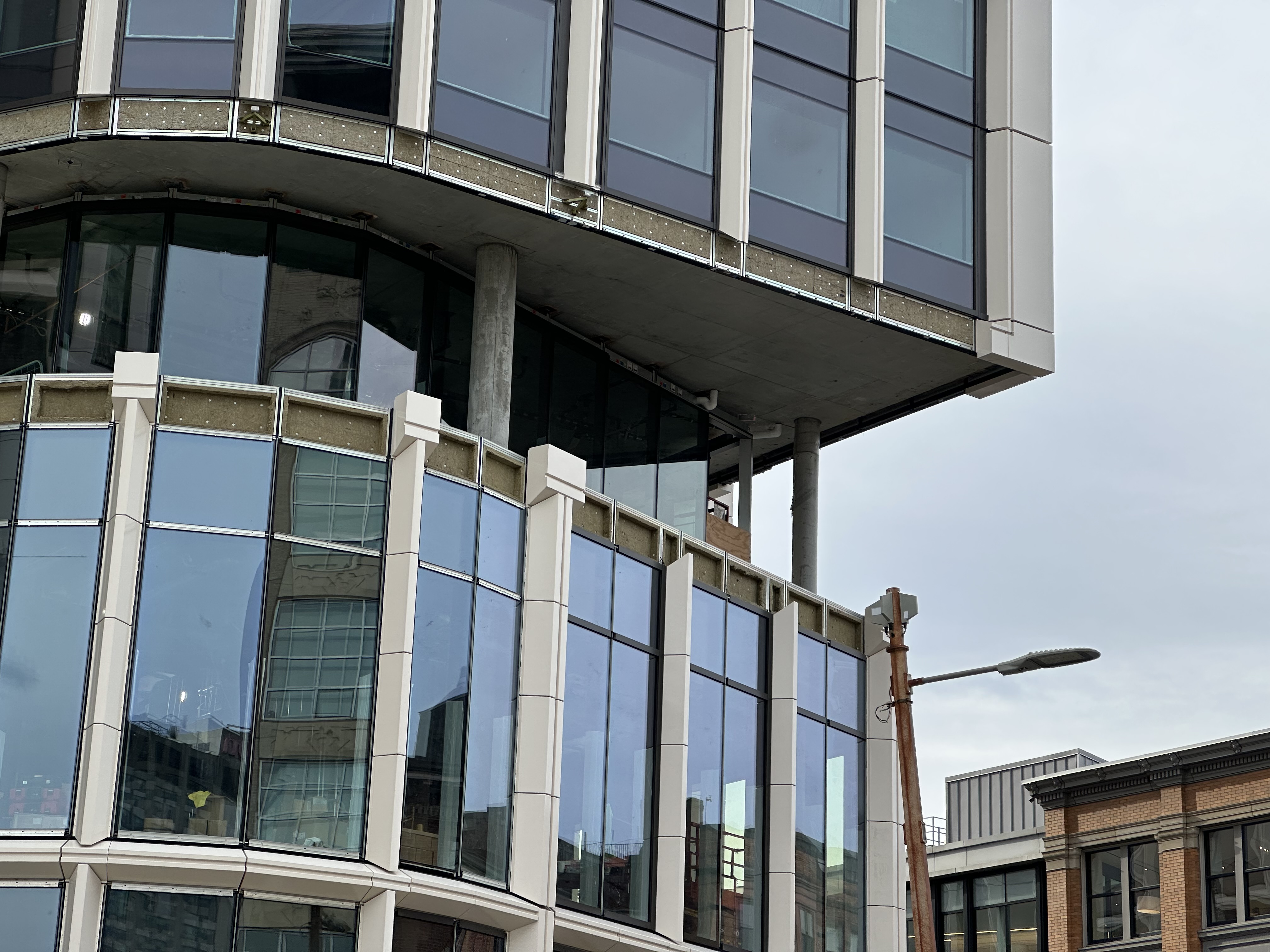
Saw this development from the Pike today. I *hate* these new buildings. And I’m almost always impressed by new developments. They look cheap. The color makes it look like twenty years of dirt has accumulated on it already. At least they added trees and landscaping.
The finished building looks better than the above render. That seems to happen in a lot of cases. The rendering of proposed buildings seems to have lost its flair and imagination since CAD took over.Most of the recently-built structures in Boston, I like, except for one. Thay ugly building that was recently built on Comm. Ave. that's part of Boston University. I think that one is so frigging UGLY!!!!!! It's THIS one!!!!!! Looks like an ugly tall stacked box building that was once thought of for the new World Trade Center in New York!!!View attachment 43116
Everyone's entitled to their opinion. That said, this opinion is incorrect.Most of the recently-built structures in Boston, I like, except for one. Thay ugly building that was recently built on Comm. Ave. that's part of Boston University. I think that one is so frigging UGLY!!!!!! It's THIS one!!!!!! Looks like an ugly tall stacked box building that was once thought of for the new World Trade Center in New York!!!View attachment 43116
Everyone's entitled to their opinion. That said, this opinion is incorrect.

Couldn't they just strip off the ugly cladding and replace it with something better, rather than tearing down the entire building?I personally like the Parcel 12 buildings and design, and I think the BU Computing Center turned out better than the renderings. The LEGO headquarters and the public plaza they are building could be spectacular.
Do any of you remember the Hotel Commonwealth disaster years ago? That was really BAD! I was recently sent this article by a friend in the UK, and it reminded me of the Hotel Commonwealth issue.

London apartment block that deviates from plans must be torn down, says council
‘Blight on the landscape’ in Greenwich lacks promised gardens, children’s play areas and accessibility for wheelchair userswww.theguardian.com
Sorry to derail this excellent project thread a bit.
It's not just the cladding--the massing is off and the public realm is gone. I suspect they are drawing a line in the sand so no one else tries this.Couldn't they just strip off the ugly cladding and replace it with something better, rather than tearing down the entire building?
What's the large white rectangle on the upper left of the left-hand building? Is it temporary, or there to display a business logo?
Theres supposed to be a logo there soon.What's the large white rectangle on the upper left of the left-hand building? Is it temporary, or there to display a business logo?
These buildings are great, nobody cares about your windshield view, and nobody uses CarGurus anyway.I would never use CarGurus simply based on how ugly these buildings are and how they've ruined the view of the drive in Eastbound on the Pike. Absolute garbage.
oh noooo!!! not your view while driving into the city! lets tear these down...along with the other buildings over the highway like the prudential.I would never use CarGurus simply based on how ugly these buildings are and how they've ruined the view of the drive in Eastbound on the Pike. Absolute garbage.
That’ll teach em!I would never use CarGurus simply based on how ugly these buildings are and how they've ruined the view of the drive in Eastbound on the Pike. Absolute garbage.
