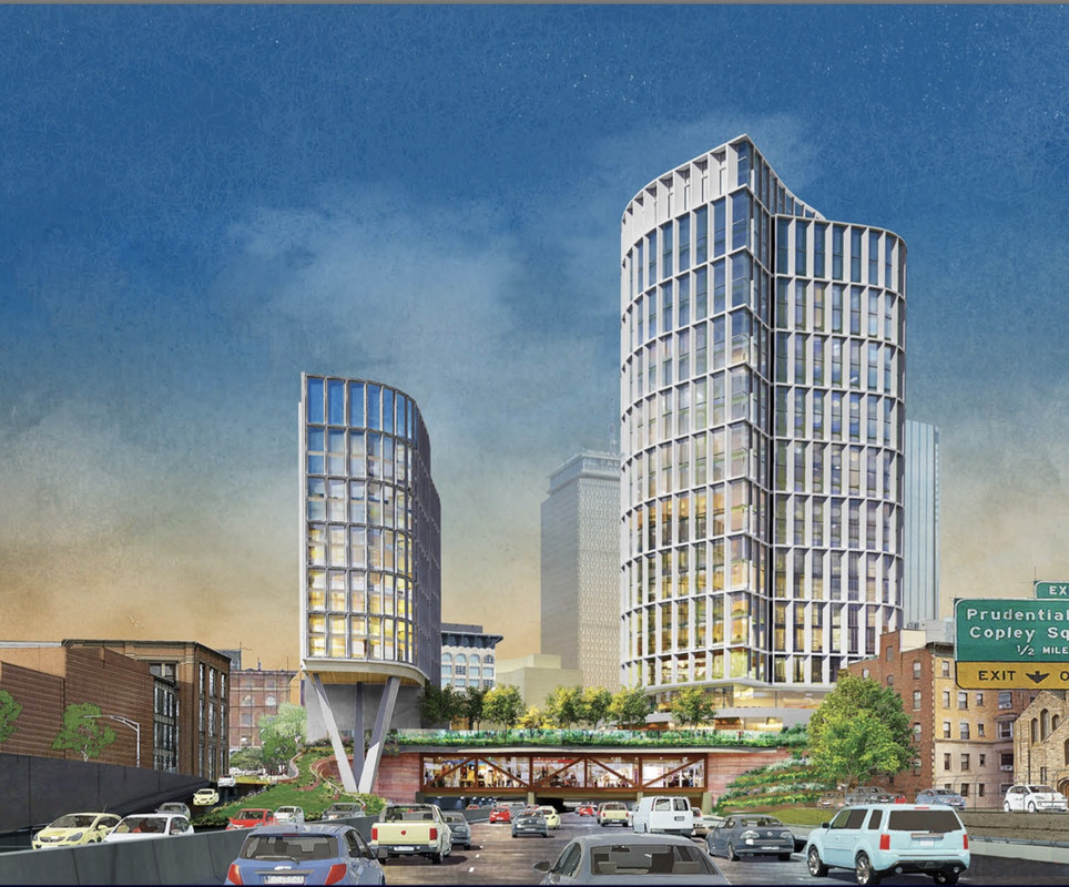
Lyrik Back Bay | 1001 Boylston Street (Parcel 12) | Back Bay

God, that update is terrible. The green was epic.
Nimby Tom Menino would have been all over this.
i'm wondering if Boston has the best BCDC it can have.
659' to 496' at Hub on Causeway LOSE
750' to 601' at GCG LOSE
Winthrop Square Twin Towers WIN
31' off the East Tower at Winthrop Square. LOSE
627' down to 544' (83' shaved off) at 1000 Boylston LOSE
91' off both Tremont Crossing, leaving the City w/ 2 turds LOSE
BU Computer Science Bldg LOSE
Kenmore North LOSE
Dock Square LOSE
Losing the Green trim off these LOSE
oh, and just once i want the BCDC to ask a developer
Ladies and gentlemen, CAN YOU PLEASE BUILD THAT TALLER?
on another topic, what is the time table on the VIOLA?

Holy shit, will you STFU already?!
 
I believe those are massing models. That's the section of the presentation they're in, and earlier in the presentation the renders are still green and brown.

...it's confusing.

The renders in green and brown are all "before" renders. The "after" section has labelled massing models (in all white with no texture), and also those separate "view" renders showing white towers. Note that even in "view" slides with color-less towers, the windows and podium portion of the project do have color.

Hopefully it's just a poorly assembled presentation, but I'm afraid that it isn't.
 
Holy overreaction, It still looks great. Calm down, people.
 
The renders in green and brown are all "before" renders. The "after" section has labelled massing models (in all white with no texture), and also those separate "view" renders showing white towers. Note that even in "view" slides with color-less towers, the windows and podium portion of the project do have color.

Hopefully it's just a poorly assembled presentation, but I'm afraid that it isn't.

Looked at it again and I still disagree. No label on the renders with colored buildings says "before" or "6/4 version" or a meeting name. The white renders are in a section dedicated to discussing the massing of the buildings, so they might have been white for discussion purposes only. To know for sure, we'd need to have heard the presentation.

EDIT: On yet another look, the renders are indeed "before", but the "after" has to do with the lower facade over the Turnpike. It's possible that they made the towers white to focus the eye on what had changed.
 
Apologies for causing so much confusion. I wish I had more context too, but unfortunately I just grabbed this from Twitter. Scanning through it quickly, I had assumed that slide 14 had contained the sole change (the massing) since it was the only one labeled "Revised".

As others have said, my hunch is that the white is to accentuate the massing change in the presentation. But as JumboBuc correctly pointed out they also changed the stilts facing the pike and the boundary of the plaza appears less wazy now, so who knows.
 
The approach on the pike in previous renders was "Emerald City" dramatic. A remarkable new entrance for our city. Hyperbole intended.

This new version is a grave diminishment. The change of color? Why? Platform and stanchion changes? To what end? From dramatic to drab.

Boston Review Board appears to fail us again. How is this an improvement? Who is responsible?

Deeply disappointing because the last renders were so appealing.
 
This is one of those situations where I seriously don't understand what the hell the BCDC reviewers are thinking. From the presentation, it looks like the changes to the plaza's design were made in response to the following three comments (slide 11):

  • "The structural supports subtract from the building's architecture; there are too many architectural moves going on, simplify"
  • "The wave of the upper plaza seems too exposed from the west"
  • "Weave together the podium architecture with the two towers"
In other words: there's too much design here; tone it down and make it more vanilla.

Also, I don't understand why the BCDC picked this Elkus Manfredi design, out of all of them, to give the feedback that "there are too many architectural moves going on, simplify." Really? This one?
 

So this new design is going to make traffic on the mass pike worse. with the previous design the mass of the structure tiered down and back into the tunnel making it appear more like funnel that you are entering. The supports held the park up which tiered back to the retail windows. This new design literally looks like you are driving into a small hole in a wall. There is no stepping back, just a strong horizontal you drive under. While all the dimensions of the opening may be exactly the same, the new design will make drives slow done much more as they approach it as visually the space you are entering appears smaller. I dont know how many of you ever have driven though the tunnels to get into Pittsburgh but this is exactly what happens there every day. traffic slows down at the tunnel not because thre is less room, but because it feels like there is less room.
 
So, in the new report (Parcel 12 Subcommittee 03) to the BCDC, the "What We Heard, Sub-Committee" lists recommendations from who? City engineers? Members of the Committee? Neighbors? The general public? Does one person's comment change a project? I imagine it costs big bucks to take these comments and incorporate them into a new project design.
 
So, in the new report (Parcel 12 Subcommittee 03) to the BCDC, the "What We Heard, Sub-Committee" lists recommendations from who? City engineers? Members of the Committee? Neighbors? The general public? Does one person's comment change a project? I imagine it costs big bucks to take these comments and incorporate them into a new project design.

Members of the committee, specifically a subcommittee thereof:

http://www.bostonplans.org/planning/urban-design/boston-civic-design-commission/commissioner-bios

Not lightweights, these folks. Manfredi is actually on the commission.
 
... and the colors are back off. I think they're really off, too, because if you look closely the facades aren't white but some sort of gray/white alternating stripe paneling BS. What a blow the BCDC dealt to the City with their review of this...

http://www.bostonplans.org/document...ations/parcel-12-bcdc-presentation-2019-08-06

BUILD-IT- ok perhaps it could be better [????] Yet -- its far better than just good enough

Its such a amazing level of improvement over what is there now - just build it before another downturn hits and we have to wait another generation
 
BUILD-IT- ok perhaps it could be better [????] Yet -- its far better than just good enough

Its such a amazing level of improvement over what is there now - just build it before another downturn hits and we have to wait another generation

One of the hiccups is the neighborhood-types are demanding that they improve the southern sidewalk of Boylston Street during the Parcel 12 construction (which isn't in the area of work or the defined scope of the project); they're basically asking for a dedicated bike lane, expanded sidewalk, and a single traffic lane heading east from the Fenway toward Back Bay proper at Mass Ave/Boylston. A few of the more influential neighborhood-types seem to be digging in, resulting in the general cluster-fizzle that is Boston development.
 
This is one of those situations where I seriously don't understand what the hell the BCDC reviewers are thinking. From the presentation, it looks like the changes to the plaza's design were made in response to the following three comments (slide 11):

  • "The structural supports subtract from the building's architecture; there are too many architectural moves going on, simplify"
  • "The wave of the upper plaza seems too exposed from the west"
  • "Weave together the podium architecture with the two towers"
In other words: there's too much design here; tone it down and make it more vanilla.

Also, I don't understand why the BCDC picked this Elkus Manfredi design, out of all of them, to give the feedback that "there are too many architectural moves going on, simplify." Really? This one?

What I've heard was there was some VE by the development team, taking adavtage of some public/agency comments (including one person, who commented that the render was of a westbound pic—which no one would ever see that view—so, why didn't they show an east-bound render?), prompting a supposed directive: "Way too much steel on the west side, find a way to structure it without all the curvy horizontal frills and oblique vertical references to the Gehry building at/supporting the plaza." Don't know if it's true, but it's what I hear in the wind.
 
One of the hiccups is the neighborhood-types are demanding that they improve the southern sidewalk of Boylston Street during the Parcel 12 construction (which isn't in the area of work or the defined scope of the project); they're basically asking for a dedicated bike lane, expanded sidewalk, and a single traffic lane heading east from the Fenway toward Back Bay proper at Mass Ave/Boylston. A few of the more influential neighborhood-types seem to be digging in, resulting in the general cluster-fizzle that is Boston development.

This sounds like something that the city would need to study and plan... and has nothing to do with a building project...
 
Whatever it is - just do it! Get this one going.

Agreed. Sounds like the neighbors are trying to gum up the works. I don't imagine they have a leg to stand on, but what do I know, I'm not well-versed in the many ways a project can get derailed by petty politics.

Seems like something the city ought to just plan for while the project is ongoing and then fix the street towards its conclusion. Though the whole Boylston from Mass Ave east needs a lot of work.
 

Back
Top