Lyrik Back Bay | 1001 Boylston Street (Parcel 12) | Back Bay

You know what nobody in Boston should give a shit about? What the people from towns west of Boston think about how Boston looks driving in on The Pike for their day of playing Big City.

Boston exists for Bostonians, not people who live outside of it.
Thank you for proving my point.
 
You are right, of course, but I share the frustration expressed by 
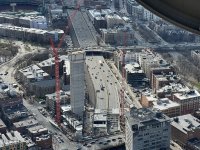
@393b40 regarding the idea that Boston as a city should be tailored to the desires of people who don't actually live here. Yes, a different timeline has Boston enveloping more abutting communities, but regardless, the Pike serves the interests of suburbanites. It does real and actual harm to the residents of the city. One of the lowest priorities on my list for built environment is a consideration for that particular view corridor when I'd rather it not even exist at all.
I agree 100% with you and others that the Parcel 12 development is way more important than a lost view from the Mass Pike, I guess what I saw in that statement about Boston being for Bostonians is the tribalism and splintering of American society I've seen nationally in the last 20 years. I'm an old guy, so maybe I'm just riffing nostalgic, but it seems that we as a nation are dividing ourselves increasingly into antagonistic rival groups. I do appreciate this board in that regard, where people agree to disagree in a civil and respectful way.
 
12/23 Walked around the project last night at golden hour.
 

Attachments

  • IMG_3126.jpeg
    5.4 MB · Views: 138
  • IMG_3146.jpeg
    6.3 MB · Views: 92
  • IMG_3145.jpeg
    IMG_3145.jpeg
    1.5 MB · Views: 171
  • IMG_3144.jpeg
    5.4 MB · Views: 75
  • IMG_3142.jpeg
    5.2 MB · Views: 75
  • IMG_3140.jpeg
    6.5 MB · Views: 71
  • IMG_3139.jpeg
    6.2 MB · Views: 71
  • IMG_3138.jpeg
    IMG_3138.jpeg
    3.1 MB · Views: 158
  • IMG_3136.jpeg
    5.1 MB · Views: 67
  • IMG_3131.jpeg
    IMG_3131.jpeg
    2.2 MB · Views: 151
  • IMG_3130.jpeg
    IMG_3130.jpeg
    2.9 MB · Views: 140
  • IMG_3129.jpeg
    IMG_3129.jpeg
    2.9 MB · Views: 150
  • IMG_3128.jpeg
    5.8 MB · Views: 97
  • IMG_3127.jpeg
    6.7 MB · Views: 93
  • IMG_3125.jpeg
    5 MB · Views: 141
This does seem a bit tribalistic and provincial, and runs contrary to the aspirations of Boston being a world-class city, Also, Boston is only part of the metro area (albeit a major part), as are the other cities and towns around it. In an alternative universe, all the surrounding towns could have been annexed by Boston in the 1800s, and the metro area would have been one big city. So, where Boston begins and ends is a political construct and an accident of history.

The residents of Brookline in the 1800s decided that tribalism and provincialism would rule the metro area for the foreseeable future. You can’t blame Bostonians for asking people to respect the boundaries they were given.

It can’t be “won’t anyone think of the suburbs!?” only when it’s an inconvenience to them and “thank god we don’t share a school system with the city” when it’s not.
 
as in, the sign's existence in Kenmore, or the view of the sign from Waltham?

I was referring to the poorly thought out CarGurus sign. They needed a solid colored flat surface behind the sign to make it legible. I also don't have faith in this company that they're going to want to keep paying for it to stay up there.

Just a coincidence that Citgo is front and center on this image.
 
If you’re talking about it, it wasn’t poorly thought out.

If you can't read it from the highway, it was poorly thought out. On Archboston we're mainly architecture enthusiasts reviewing still images and it's still hard to read the sign on most of them.

If the general public says "I wonder what that sign is supposed to say" and then forgets about it, it was poorly thought out. The best way for a sign to NOT be poorly thought out is for it to be generally legible from unobstructed viewpoints.

Again, literally a brighter white material behind the letters would make them pop 10x more than they do right now. Think of words on paper. Now imagine we could somehow remove those words from the paper and have them floating in midair. They'd be much harder to discern without the proper background. That's what's going on here.
Even in the Elkus Manfredi rendering, you cannot read the sign -- fail 🫣
1705344462060.png


One wonders if the design constraint was actually "Make it easy to replace. They are not going to be around much longer."
 
I have a way more difficult time reading the new(ish) HarbourVest sign than this one.
 

Back
Top